Latest iOS beta version link on TestFlight https://testflight.apple.com/join/IJDl9FXC
This is the third of a weekly series on about a casual mobile game I will try to develop from start to release in #8WeekGameDev. This weeks PC browser demo is up on Kongregate here . This week I worked on graphics and avatar selection.
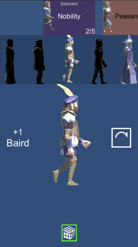
I added many avatars and a system to choose them. I also changed the tiles.
For the avatar selection screen, I have grouped the avatars into themes. Each theme has a number of avatars in it. Currently, themes are only used for grouping avatars. Next weeks work will be implementing features related to themes. The avatars with a solid black material have not yet been acquired yet. Also a feature for a later week. Getting the the picker UI to work with 3D models was not bad I just put the canvas on a camera, not in screen space. The overall structure of the screen code is pretty messy. I learned a lot about what works and what does not, so it will be cleaner if I need to something like this again. Setting the picked item from code was pain and I did not get it working very well. The problem is the order things run in. Most code runs in Awake(), Start(), Update(), LateUpdate() or PhysicsUpdate(). UGUI code does not, it runs in its own set of UGUI calls and you should not do somethings in UGUI code like destroying GameObjects. Also emulating UGUI events like clicks is not well documented.
ExecuteEvents.Execute(button.gameObject, new BaseEventData(eventSystem), ExecuteEvents.submitHandler);
I found is on Unity Answers https://answers.unity.com/questions/945299/how-to-trigger-a-button-click-from-script.html?childToView=1604638#comment-1604638
It is the second answer and works on all UI objects, not just buttons.
Different avatars have different powers. Some powers are new and others duplicate the existing powers. Having a second button with the same power means not having to wait for cool down. For animation I only used basic idle, walk, jog, and sprint animations. I use separate animations for male and female characters but the female walk is pretty exaggerated. There is a problem with this combo of model and animation. When walking, the moving foot's toes go lower than the stationary foot's sole. So they go underground, maybe this can be fixed in the avatar setup, by switching from using heels to toes. It is not really visible at the scale I am using so I doubt I will fix it.

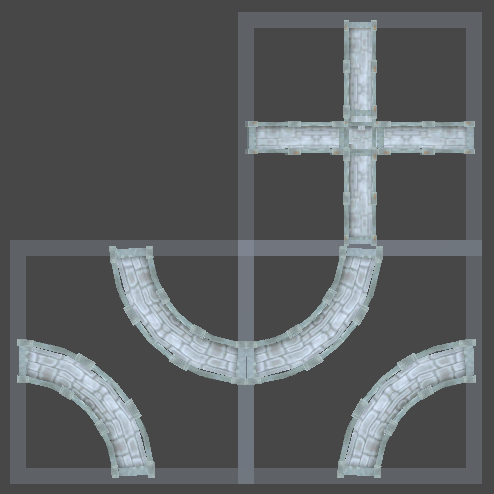
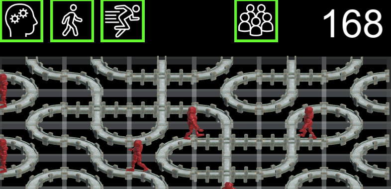
The new tracks took a bit of setup because the old code for tiles could also change the colour of the tracks in 1/8th sections at runtime. This is not needed in this game but being able to make tiles with different graphics, easily at design time is needed. I did not have curved models for tracks so used Mega-Fiers (mesh modifiers) to bend some models 90º. The original models were low poly so I also used Cheetah3D (OSX modeler) to split some triangles so the models would bend nicer.
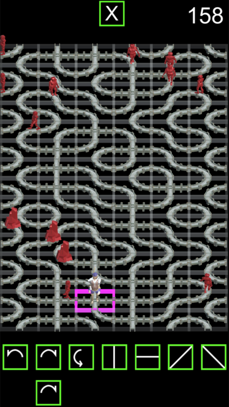
I had the camera at 45º orthogonal but switched to 30º because the avatars look better from the side than the top. This squashed the tiles vertically, so increased the board to 15 rows from 10. 15 rows play tested better because it lets you make a mistake and then recover. I changed the colour of the tile outline to pink from green. I am planning on having green squares used only for buttons. All of the graphics stuff is try and see. My goal was to get something up now and see how I feel about it over the next week or four.
I added three manager objects. AvatarManager to manage avatar data. PartyManager to manage who is in the party, only one avatar so far.
ScreenManager, to manager switching between gameplay and party management. I will also need a screen for acquiring new avatars.

I added lots more icons. The came from icons8.com They were black on transparent pngs. I inverted them in photoshop and am resizing them to powers of 2 for IOS compression.
I added stats to track which avatar is used in each game. Yeah, I love my stats, even though I will probably never use most of them.
What I learned from playing this week.
Bouncing at the top would keep the game challenging at the beginning
A play balance stat on avatars would be useful. For example, rouge is fast and has good power, so setting a balance attribute to -2 would reducing scoring by 2 for each row dropped off the bottom and each edge bounce.
Slow game mode might be too slow
Some links
The avatars are from Synty Studios
PolyGon Fantasy Characters
Polygon Dungeon
Avatar animation from EveryDayMotionPack
The tracks from Tile and Bridge Pack
I bent the curves with Mega-Fiers - Mesh modifiers inside Unity. I increased the triangle count with Cheetah3D (a Mac 3D modeler) because the original work was very low poly which is great for straight sections on a mobile but they need about 4 more triangles to bend nicely.
The avatar selection side-scrolling UI used Picker for UGUI
The new icons (everything except the old powers ) were from icons8.com
Please try out the game on Kongregate here, feedback is always welcome.

