I am happy to finally share some of my progress regarding ship selection and customization. This part was very time consuming for me because it also contains a lot of work on the User Interface, an area that I personally don't enjoy about game dev, but you know....I need a user interface so I have to do it.
It was actually way more work for me to implement then I thought, because of the way the older scripts for weapons and ship controls work. I had to make many changes in that regard not only to make the selection and customization work, but also to apply it in the later gameplay. In addition I still don't really feel comfortable working with interfaces in unity in general so I spent a lot of time on google. But I guess it is best to just show you what I did:
I really wanted to have this preview in the upper left and I am very happy this worked out the way I wanted it.
So why did I have to make changes to my older scripts regarding the weapons?
This is mainly because I wanted the same type of weapon, for example these litte laser shots (the first weapon in the list), to be different depending on which ship equips it. I didn't think about this before so it gave me some trouble with my original scripts. In the video you can see that the second ship for example fires two of these laser shots instead of just one. The third ship (a small destroyer that I did not introduce so far) also fires two laser shots instead of one. The big ship at the end will even get up to 3 shots out at once.
I wanted to have it that way so that every weapon is viable for every ship. Also it would look weird if a big battle ships just shoots the same amount of shots as a small fighter does. The battleship will also use a double shot for the shotgun kind of weapon as you can see in the video. And I have some further things planned to distinguish the ship types from each other.
I think this will also enable the players to engage in different playstyles and encourages them to test out what works best with which kind of ship.
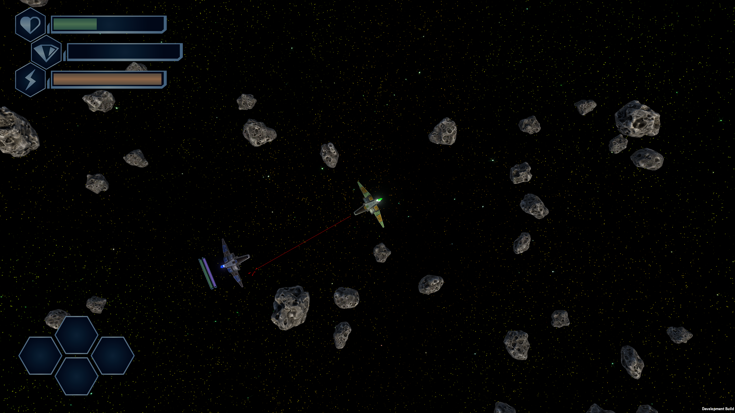
As a little sidenote I also would like to add, that I worked on the user interface in general when it comes to playing the game:

In my older post there was no UI at all, because of this I wanted to give you an update now.
I hope you enjoyed this little post and I will try to get the next one out a bit faster. I am looking forward to the next task ahead and I am also glad I can stop with the UI work for some time :D

