In my last blog post I showcased some of the audio I’ve been working with for my upcoming game 13 RONIN, now it’s time for graphics. But first a celebration. The 4th of October is a day dedicated to the cinnamon roll here in Sweden (yes, it’s true), which we, of course, celebrate by baking, buying and eating lot’s of (you guessed it) cinnamon rolls. Since I’m a fan of the pastry myself, I happily took part in the celebration.
But I also had another reason to celebrate. From October and till the end of the year I’ve reduced the number of hours I’m putting in on my day job from 40 to 32 in favor of spending more time working on 13 RONIN. Big kudos to my boss for approving this!
Main character
How do you go about drawing a samurai with realistic proportions when you don’t know how to draw?
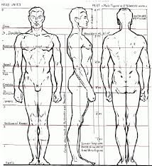
I started by googling images on human proportions and created a reference image I could use as background layer while drawing.
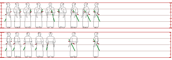
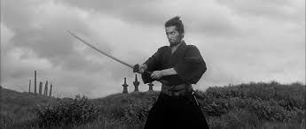
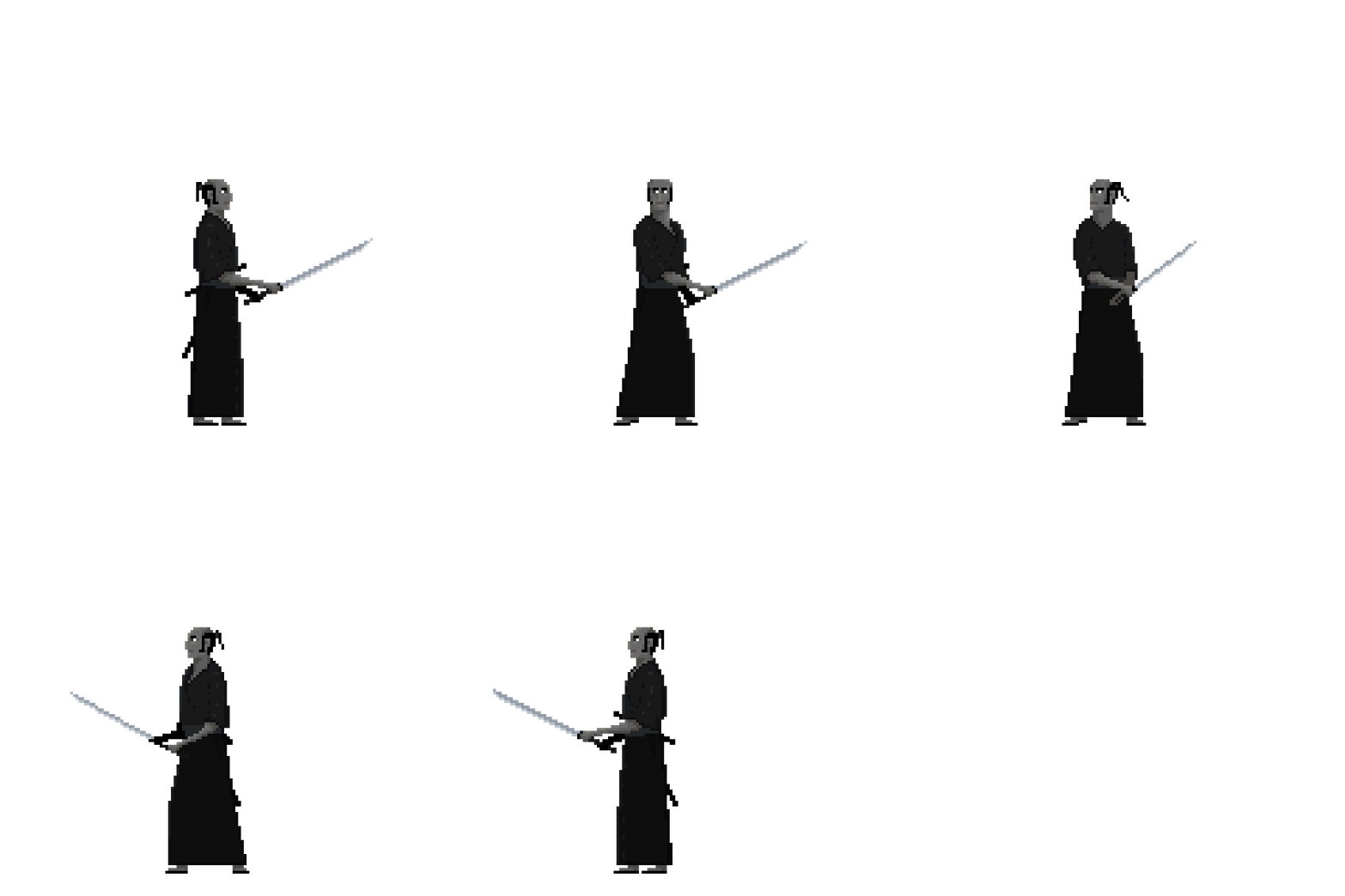
In parallel to this, I watched a lot of old samurai movies and Kendo-tournaments and with still images from these kind of videos as reference I drew my character.
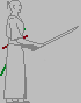
At the beginning of this project, I intended to use silhouette-looking sprites mostly drawn in solid black.
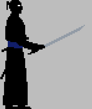
This changed over time, I had a few different ideas, but finally settled on using gray-scaled sprites with very low-saturated colors for light and dark areas.
I decided on this color scheme to keep consistent with the black and white samurai movie theme. The low saturated colors are there to make the sprites stand out from the background, but also to make the visuals more interesting. With this style, I’ve found a reasonable balance between aesthetics and time spent drawing.
Background
In the early days of this project, I was more into ninjas than samurais and the initial idea for the game was that you as a white dressed samurai had to fight a bunch of bad, bad ninjas dressed in colorful outfits. To get started I drew a forest background.
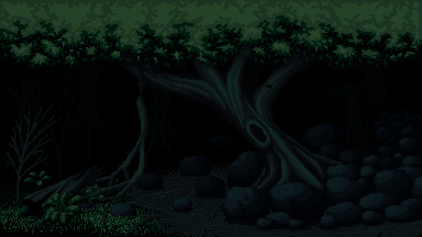
Soon I discovered that even the best of the ninja-movies weren’t that good and I found myself switching to samurai-movies and my approach to the project changed. Now I wanted to create a fighting game looking like Limbo, with black ninjas emerging from the dark. Sometime later I re-discovered my love for low-resolution pixel-art and the Limbo-aesthetics was dropped. The code-project still carries the somewhat humorous working title of the ninja-project, it’s called “Ninja in the dark”.
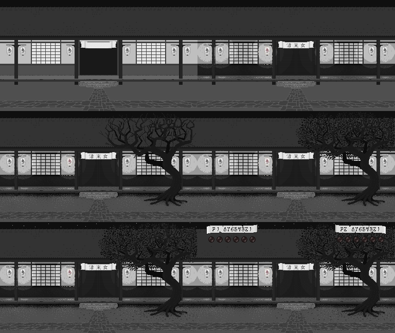
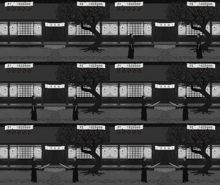
I wanted to start drawing something basic, something I thought I had the skills for and choose to draw a building which I later on turned into a tavern. It’s yet not finished and I can’t promise it will fit into the final game, but it will be the background of the first public build.
Energy and score
After finishing the background I took some time to draw the graphics for player score and energy symbols. I tried a few different ideas and settled on the score written in a custom font upon a scroll-like background.
For energy symbols I also tried a few different ideas before stealing the yin-yang symbols from The way of the exploding fist and turning them red. I do love that game.
In-game graphics
There are a lot of animations to finish before the game is playable, but this is at least a taste of what will come.
Please visit www.eraserheadstudio.com for more about 13 RONIN.
Happy coding!
/jan.
![]()


