
Hello friends,
The last couple of weeks I've been busy drawing pain and death animations for my samurai hero. Once again it became painfully apparent how slow this process is for me. This made me decide to focus on key-frames and use as few in-betweens as possible. By using different duration on different frames and adding some easy in-betweens I still think I can achieve somewhat decent animations. What do you think?
There will be four different pain animations and at least five different death animations with some variations between characters. If the character is standing or crouching and from what direction the attack is coming will control what animation to play.
Pain
These are the four pain animations:
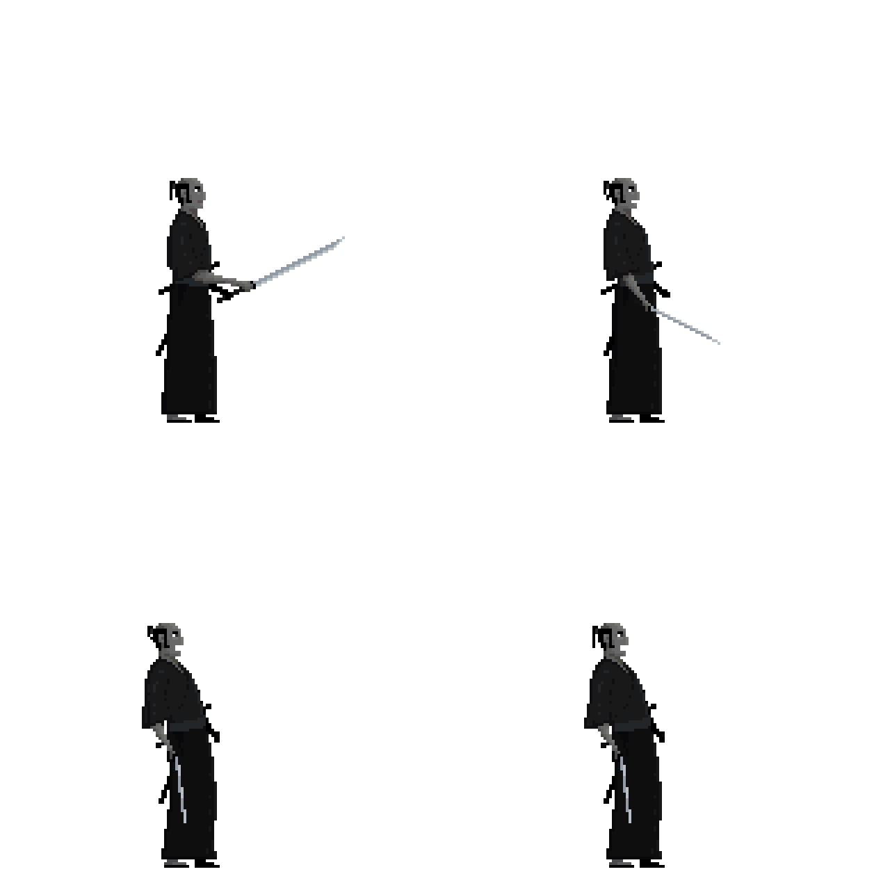
The character is hit in the head or chest.

The character is hit from behind or maybe hit in the stomach (not yet decided). I'm not sure what I think of this animation. What do you think? Should I keep it, or maybe try to draw something else.

The character is hit while crouching.
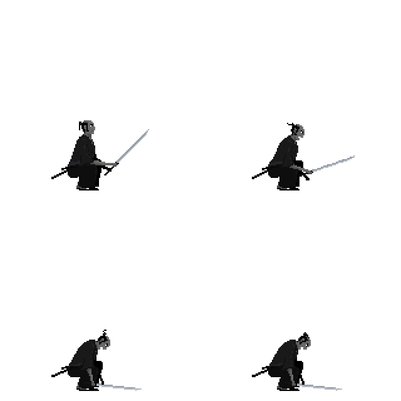
The character is hit from behind while crouching.
Death
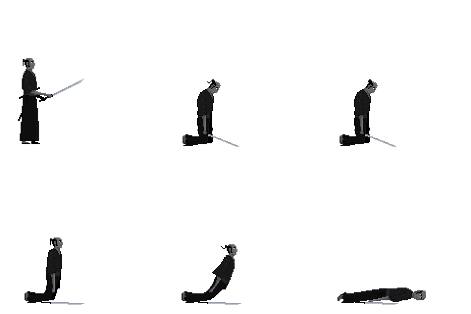
And here are the four death animations:
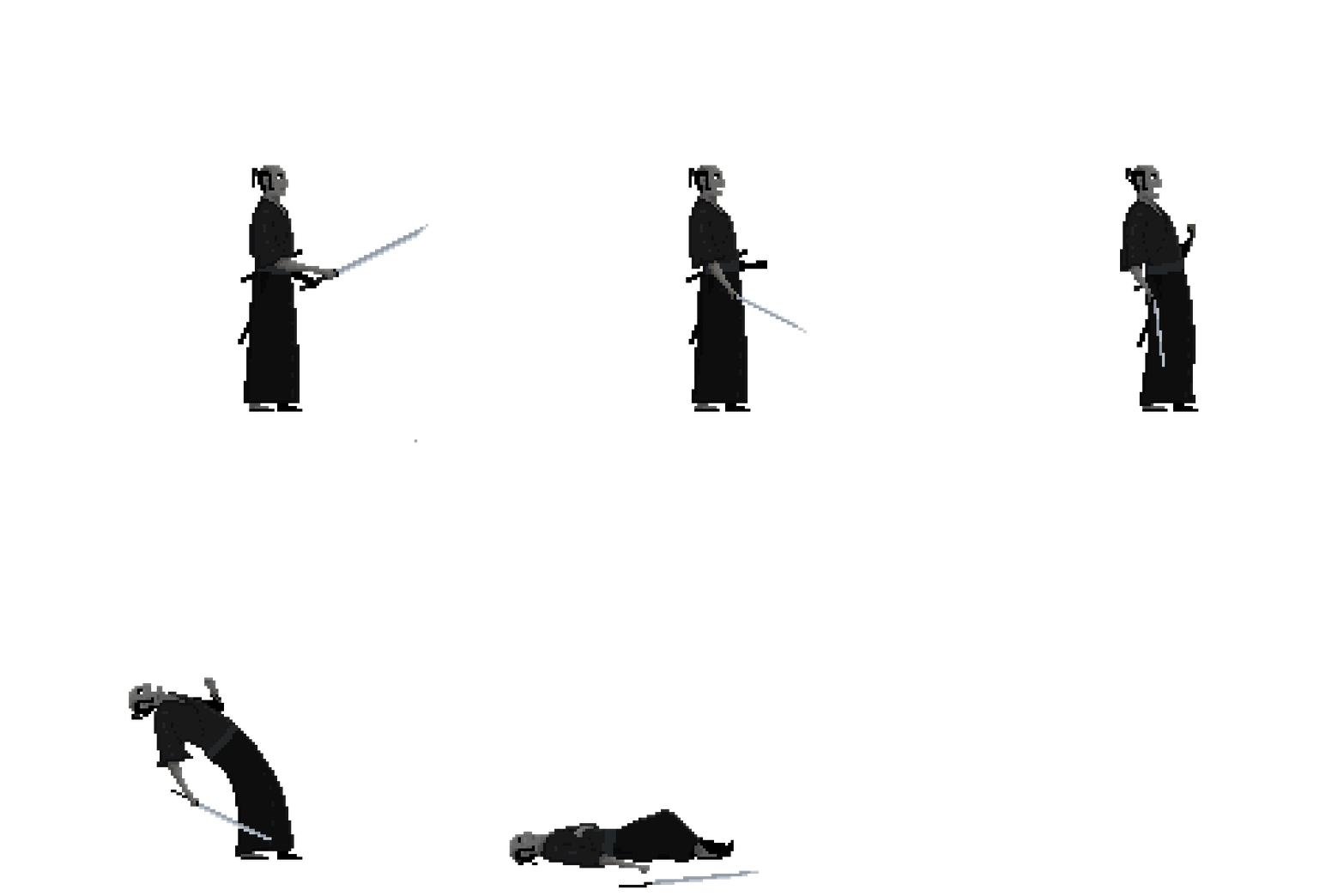
The character is killed from a hit in the head or chest.
The character is killed from behind or maybe with a hit in the stomach (not yet decided).
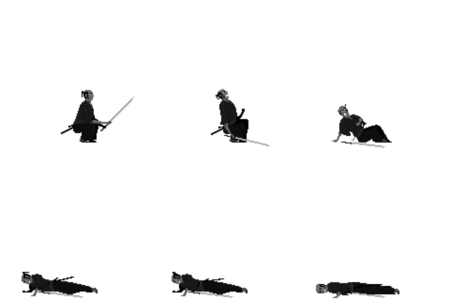
The character is killed while crouching.
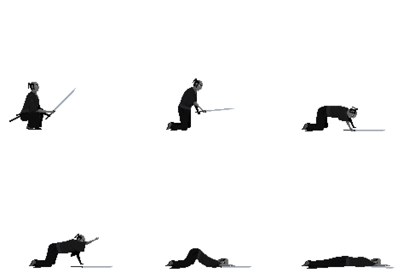
The character is killed from behind while crouching.
Animation process
I've got a lot of questions from friends and colleagues asking me how the animations are done, so here is a quick walkthrough of the process.
When drawing, you can use any drawing software of choice, but I really recommend using a software that is specially made for the purpose of making sprite animations. I use a tool called Pyxel Edit, it's really good and quite affordable, go check it out.
1. Sketch
First I sketch out the key-frames of the animation. This I do rather fast and sloppy. My only goal here is to get the pose and feeling right.
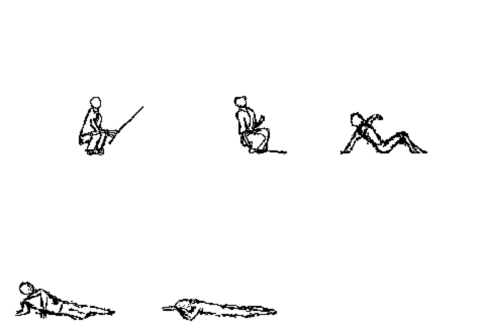
For the first frame I use an existing image, in this case, the first frame from the crouch animation. In that way I know the character will get the same proportions as in already existing animations. But in this example I've, for consistency sake, sketched the first image as well.
2. Fill
Done sketching I draw the character in solid colors. I do this on a separate layer on top of the sketch and adjust the transparency level so I can see the sketch beneath. I repeatedly play the animation and make adjustments until satisfied.

Everything doesn't have to be perfect at this stage, but the motion should be "realistic" and the mass of the character should be the same throughout the animation. In this phase I also start playing with different duration for individual frames.
3. Detail
I copy the animation to yet another layer and start filling in the details. When this is done I see if I can improve the overall feel by adding some easy in-betweens. By "easy in-betweens" I mean a frame I can create by copying an existing image and only change a minor part e.g. the hair or a part of the clothing.

Detailed animation before adding any "easy in-between".

Same animation but with an added frame in the middle. The ponytail lands on the head and the sword sheaths move. This was an "easy in-between." Without it the animation would have looked a little strange, don't you think?
I hope you have enjoyed this and got a better understanding of the animation process. Next dev log will be about blood, it'll be awesome!
Happy coding!
/jan.
![]()


Thanks for sharing about your animation process, that was an interesting read!