Hi everyone,
How does one weigh art styles and perspectives for a new project?
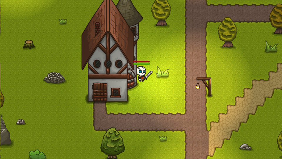
I'm revisiting a GDD and I keep going back and forth on a angled top down art style and an isometric one.
I did a project for a game dev course and I had something like this:

It worked quite well for the MVP, but I was lacking the 8-directional movement I wanted for the player/enemies.
I think this style would suit the game well, but I wanted to compare some pros and cons against an isometric kind of style.
Thank you for the help.


