Advertisement

«Decision 4: Red Daze» introduction

Started by October 12, 2020 02:34 PM
2 comments, last by FlyAnvil 4 years ago

Hello, everyone!

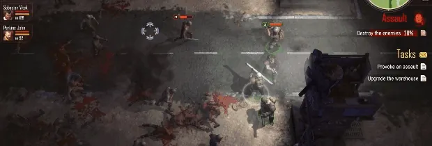
We are a small team of indie game developers FlyAnvil. We would like to share with you a new set of game moments from our game «Decision 4: Red Daze»!

This strategy shooter game has an open World set in a post-apocalyptic setting, where you'll deal with Survival, RPG and Tower Defense Elements.

The game is under development and we plan to launch it on Steam in 2021.

We will be glad to know your opinion about the presentation!

If you liked it please follow FlyAnvil news in social media!
first of all, well done for this accomplishment, one down, millions to go , right ?

i'm commenting purely based on watching this video:

  • graphics:
  • the game appears to run smoothly, the camera shakes appears to respond to actions at the crosshair
  • i like the fact that the crosshair is suggestive rather than dead precise, well animated as well, not sure if it reflects all the actions the player is taking on its "trigger", but looks fine
  • the game appears to have good post apoc atmosphere, blurred where necessary and smoky where else
  • the colours are pleasant, good choice on the palettes, good lighting, good shadows, good textures, good work ?
  • some biped animation appears to be somewhat canned (like the soldier's walk), other anims appear ok (like turning around to aim at a different zombie)
  • good visual effects; xplosions, splats, etc… like 'em
  • audio:
  • the music is also pleasant to listen to, not too durgy, sounds effects good too
  • ai:
  • some zombs appear to get too close and not be shot at or do nothing… bit weird, it would be nice to see some novelty here, say for example, zomb A can clearly “see” that zomb B who is in front of him was shot at, zomb A could then go to a different soldier; something simple like that could do the trick…
  • fonts:
  • good choice for the game, but could be clearer at the edge, it's like there's a touch too much anti-aliasing
  • the game title presentation could use a bit more love (less drop-shadow, and a bit more vibrant if possible)
  • characters:
  • would be nice to see racial and gender diversity in characters (i could be wrong but in this video i've only seen male black and white soldiers?)
  • these characters are well stylized, i like the way they move as well, come-and-getters, i like em ?
  • overall it looks good, hope playing will be just as fun, nice one, well done
  • That's it … all the best ?
Advertisement

@ddlox Thank you so much for your feedback!

We will certainly take into account all your comments and try to correct the shortcomings!

The game is under development, so some content is not yet ready, but we plan to add women, as well as new enemies in the form of dogs and werewolves.

The game is created only by two developers - two brothers, so development takes a long time. But we try very hard to make the game good!

Once again, thank you for your detailed notes on the presentation!

This topic is closed to new replies.

Advertisement