Hi,
Can some people here look over our Indie game website?
We want to have a great website, so be as mean as possible!
Website address is below:
www.FallenAngelSoftware.com
Everything on the above site is 100% FREE.
Some games are even open-source.
Any complaints or suggestions for improvement would be appreciated!
Thanks in advance!
Jesse

20 users logged in
Proud partner of GDC 2025

Before posting, review our community guidelines.
Support GameDev.net with a monthly GDNet+ subscription!
Please Critique Our Indie Game Website!
December 01, 2018 01:09 AM
JeZxLee
Fallen Angel Software
www.FallenAngelSoftware.com
480
December 01, 2018 09:08 AM
Check the grammar on the home page, missing a few words here and there. And the menu didn't work on my Android, had to switch to "Desktop site" in Chrome settings to get past the home page.
Current WIP: https://www.gamedev.net/projects/1006-sling-bot-boarding/
Play it here(Chrome or FF): https://www.kongregate.com/games/WilliamOlyOlson/slingbot-boarding
December 01, 2018 11:44 AM
Hi,
Thanks for the reply...
I booted up the site on Google Android Chrome browser.
You should see a site menu button on top-right?
Let me know if you see it.
Thanks!
Jesse
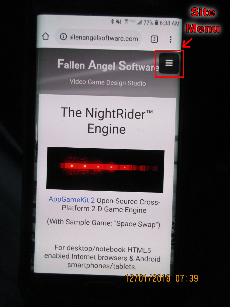
JeZxLee
Fallen Angel Software
www.FallenAngelSoftware.com
December 01, 2018 12:12 PM
We use Sitemagic CMS.
www.Sitemagic.org
Highly recommended if you need a simple website manager.
Jesse
JeZxLee
Fallen Angel Software
www.FallenAngelSoftware.com

4,658
December 01, 2018 05:09 PM
General graphical suggestions:
-
Why do you have a black and white seaside photo as background? It's irrelevant until proved otherwise and ruined by placing text in its middle.
If you want a tower or the light beams from a lighthouse as a motif, place them in a non-obscured and high contrast hand-drawn image or photograph, above or inside the main content box. Examples:http://www.garrettcountylighthouse.org/, old Wizards of the Coast logo -
Find interesting fonts with some identity.
Your stylesheet says font-family: arial, helvetica, sans-serif, which is only appropriate for highly competent designers who know how to recreate the "Swiss" style that made such fonts look good. - A bit technical, but noticeable enough to be weird: links with images containing text with drop shadows are prehistoric technology. Use real text and modern CSS instead.
- Menu dropdowns and hovers have inappropriate green and yellow colours. If you choose black and white you should stick to shades of grey.
Specific pages:
- The homepage is too empty. Mentions of your games with links and some images are expected, otherwise the site seems empty and "under construction" regardless of what hides behind the unseen menus.
- "Top 10 16Bit Games" should not be together with the pages about your games in the same menu; I expected a page with the best 10 of your own 16 bit (old?) games.
- "Top 10 16Bit Games" doesn't have a word of explanation of your game tastes. Not good, since the purpose of such a page should be to showcase your good taste in games.
- "Top 10 16Bit Games" and "Resume" contain huge images of text instead of actual text. It would have been bad 20 years ago; now it's inexcusable. A resume is usually provided as a PDF file to download.
- Game pages and game engine pages are too sparse. You need text to describe games (and probably multiple screenshots) and an explanations of what your game engines are good for
On the whole, I think you should have taken the time to write richer and more polished pages for your site before publishing it. As the saying goes, you cannot make a first impression twice.
Omae Wa Mou Shindeiru
This topic is closed to new replies.
Advertisement
Popular Topics

Advertisement
Recommended Tutorials
Advertisement