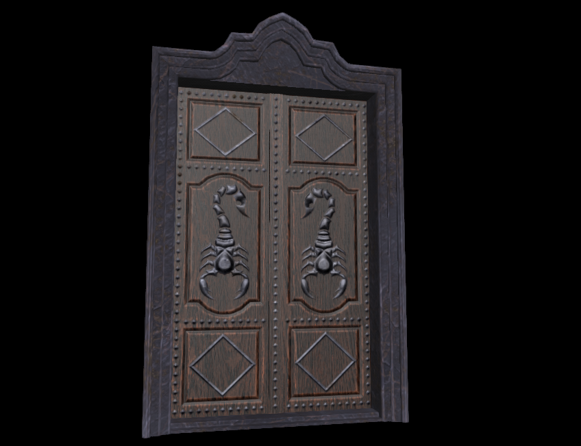
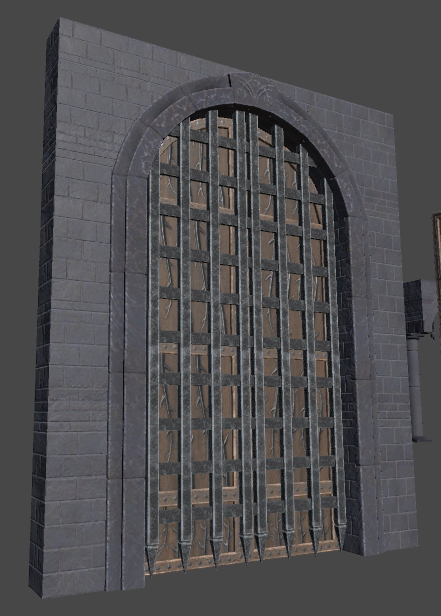
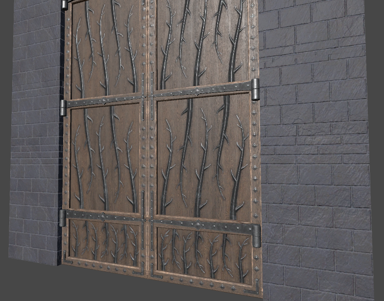
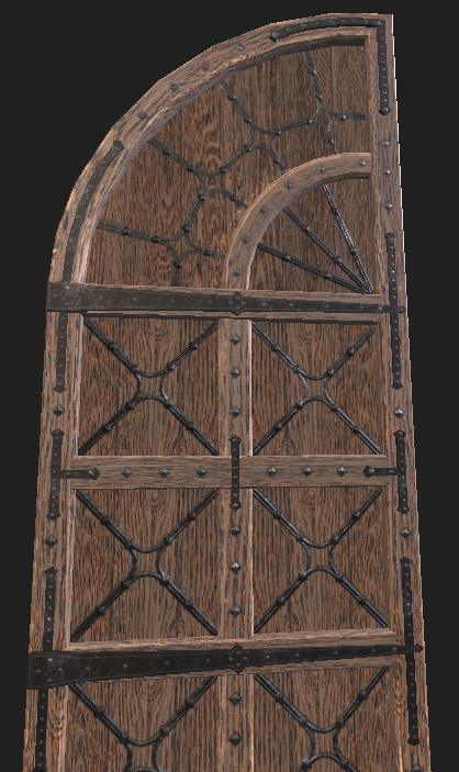
The design of ornaments looks boring to me, it's too symmetric / repetitive / predictable.
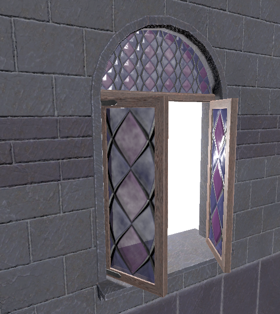
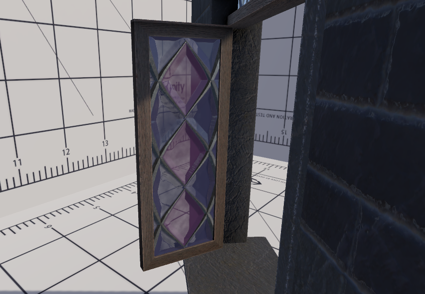
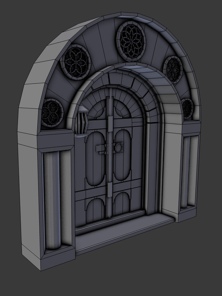
E.g. the bottom door element is the same as the top element; vegetation ranks are copy pasted upside down (which also looks unnatural because a real plant would not grow this way), the scorpion is just mirrored; window top / bottom glass uses the same texture just with a different scale (something that never happens in reality as well). As a result the overall impression feels uninspired, almost lazy.
I allow myself to sound really critical, but i'm bad with this stuff too. For this reason i can not make suggestions on how to improve this other than looking at other peoples work. Sorry for that, maybe somebody who likes to work with ornaments can provide better help...
Minor issue: The scorpion looks as if you use photoshop edge gradients to get a height map. You could improve this by blurring the torso so it becomes more round instead the flat region in the center, and you could reduce contrast in the tail so it does not look 'higher' than the rest of the body.
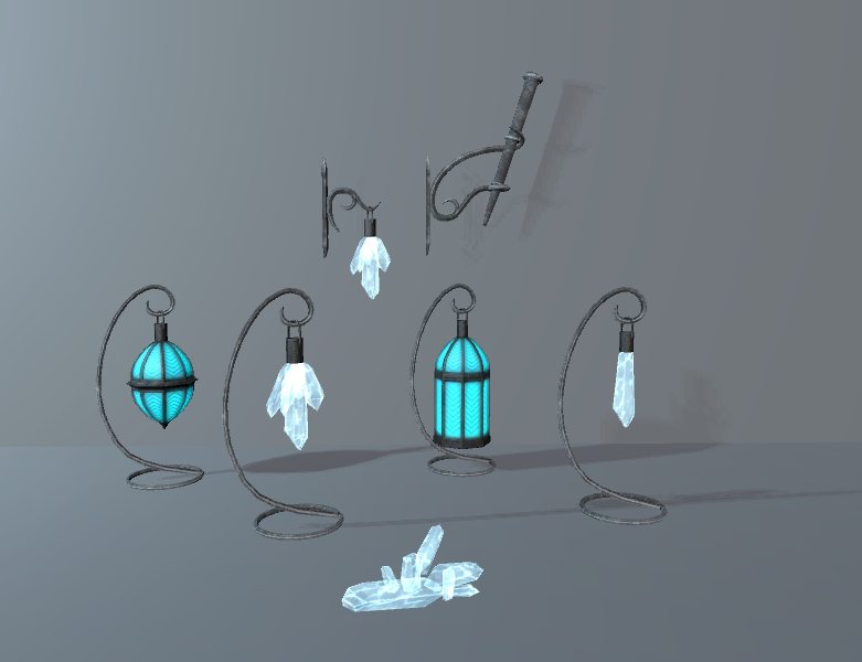
I agree you should present your work better, not only using better lighting, but also using better composition if the final image. Some tips:
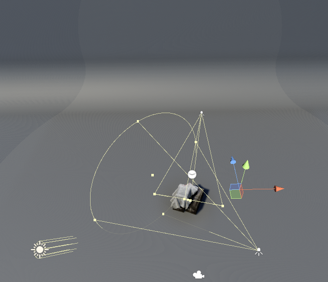
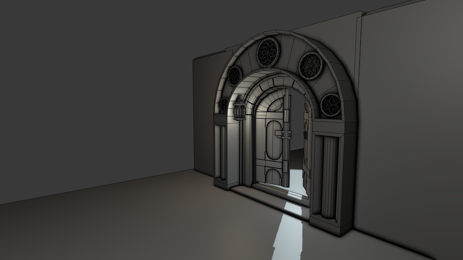
A slightly oblique perspective mostly looks bad. Either use larger angles or exact zero angles between camera and object, for an interesting or straight view.
Same for the position of the object on the image: Either place it exactly at the optical center, or use a larger offset for an intended interesting effect.
The lamps could use some rotation / different placement as well. Think of if you want to paint an image of a bowl of fruits, you first arrange them in a way they look harmonic, interesting or whatever. You spend some time on this and only if you are happy with the composition you start painting.
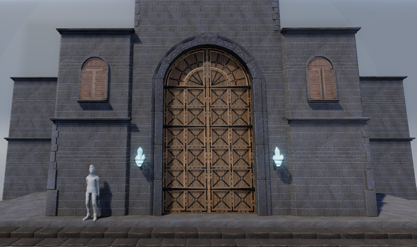
The open window is on the right of the image. It would look better on the left side, so the light 'nicely flows into the image' (it does not matter there is no volumetric light visible, yet - the argument holds even without it). Also it would look better if you would look at if from a lower angle more below, so it appears more mighty and interesting... stuff like that.
Hope this helps - no complaints about gemoetry at least ")