This post was originally published on the Geomerics blog.
Physically-based rendering (PBR) is increasing in popularity and with its vast range of benefits, it is no wonder why. Artists can now remove the guesswork around authoring surface attributes and set up a material once, then reuse it throughout game development, freeing up more time to focus on the more creative aspects of asset creation.
Yet, following the introduction of physically-based rendering, Geomerics has seen artists struggle to identify and fix inconsistencies when they appear. In this blog, we’ll take a focused look at working with physically-based scenes and demonstrate how best to troubleshoot issues when they do inevitably arise.
Before starting this tutorial, we recommend that you are familiar with the basics of physically based rendering and light physics. Allegorithmic has an extremely digestible guide on the subject that we strongly recommend.
What to do if the scene lighting is too dark
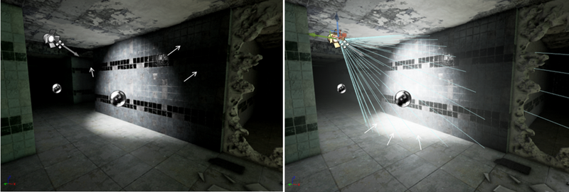
Image 1: Physically inconsistent shadows
In image 1, a material (the wall in this case) looks very bright in the spotlight, yet has distinct dark shadows which are physically inconsistent. Increasing the brightness or aperture to create the correct surrounding shadows leads to the spotlight being too bright, with the light on the floor appearing particularly out of place.
If the lighting or shading looks incorrect in physically-based scenes, always investigate the material or texture properties first. To explore the issue in this case, enter the base colour visualiser.
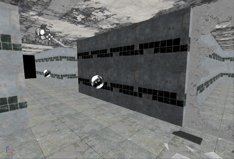
Image 3: Wall with the wrong material properties
By entering this mode you immediately see that the wall in question stands out with the black looking surface indicating that the albedo is incorrectly set. This is the reason for the material absorbing too much light.
Adjust the base colour values to be within a physically correct range in order to ensure the correct response under changing light conditions.
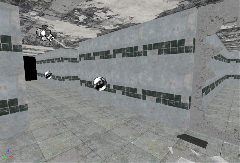
Image 4: Wall with the corrected material properties
The wall’s material properties now look correct in the visualiser and correspond to the neighbouring areas. Going back to the editor, you see that the light has the right output and the shadows are soft with the right amount of bounce. The overly dark shadows that previously bordered the spotlight have been softened. The light shining on the wall and the shadows subsequently cast are physically consistent throughout the scene.
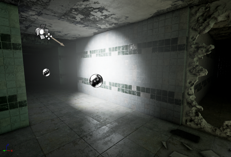
Image 5: Physically correct lighting and shadows
You can verify an accurate material response by moving the light or adjusting its brightness; with these changes the light bounce and shadows should update correctly.
What to do if a material is too shiny
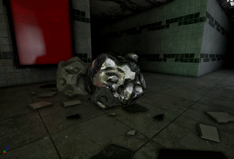
Image 6: Rock with metallic-like reflection
Image 6 shows a scene with notable reflections on the wall, poster and rocks, yet the reflections on the rock in the foreground look dissimilar to those in the background; it appears metallic. Adjusting the reflection capture to nullify the metallic-like reflection on that rock would lead to the reflections on the poster, wall and neighbouring rock to blur and dilute as shown in Image 7. The rock still looks metallic but the rest of the scene looks dull and leaden.
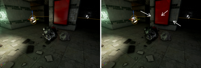
Image 7: The effects of lowering the reflection captures
To address this issue, first check the rock’s material properties by entering the metallic visualiser.
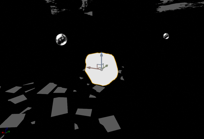
Image 8: Metallic visualiser
Immediately you see the object is quite distinctive in comparison to the rest of the scene. Enter into the material editor to investigate the issue further.
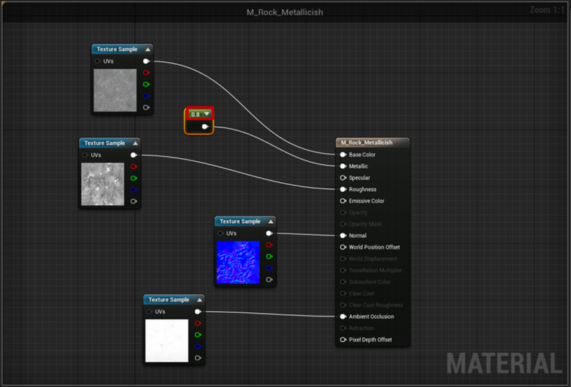
Image 9: Material editor
While the settings look correct, the metallic value, set at 0.8 (or 80% metallic), is wrong for the material. You can fix this by applying the correct material value, 0.0 in this case (rocks are never metallic!)
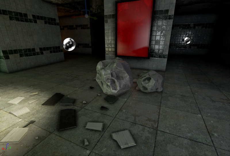
Image 10: Updated material properties with correct reflection levels
Going back into the editor mode, you can see that the issue has been fixed as both rocks and their reflections look consistent, while the shine on the wall looks vibrant. You can check if there is a physically consistent response by moving the rocks around the scene.
What to do if reflections are too bright
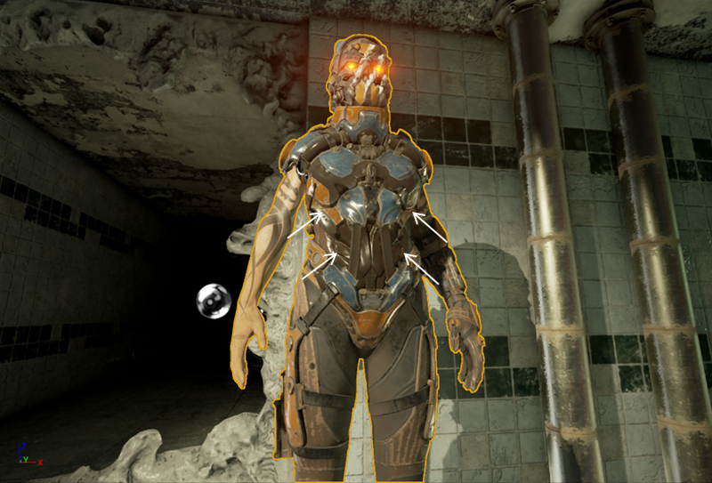
Image 11: Character with inconsistent reflections
Finally the character in Image 11 has physically inconsistent reflections. The body is distinctly too shiny compared to the rest of the body. The rubbery brown texture on the torso should look the same as on the legs. Reducing the intensity of the reflections to compensate would ruin the other surrounding objects in the scene such as the wall, pipes and even the character’s limbs.
As you have done previously, investigate the material properties first before doing anything with the lights. Examine the material with the roughness visualiser, where you immediately see the torso’s roughness is noticeably unlike the rest of the character.
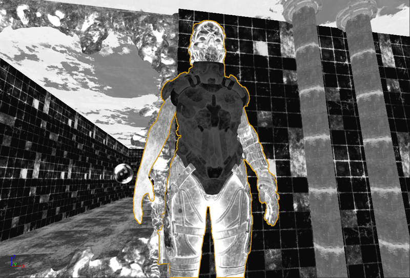
Image 12: Roughness visualiser
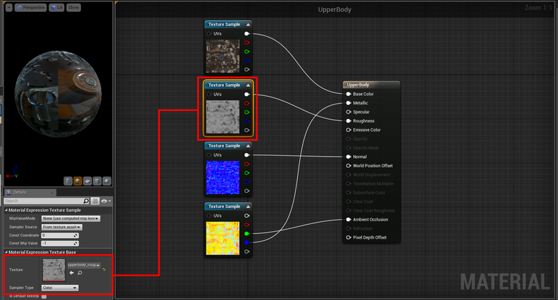
Enter the material editor and everything looks correct, except for the one notable slip that the “sampler type” in the texture base was set as colour. As the texture map is acting as a greyscale mask to define surface roughness, it’s imperative that it is correctly interpreted by the shader and does not shift the values in any way.
Image 13: Material editor
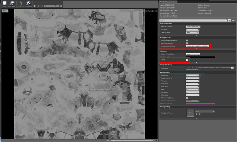
By opening the texture properties you can have a closer look at the texture’s values.
Image 14: Texture properties
The brightness levels are noticeably too low, so adjust them from 0.3 to 1.0 to increase the texture’s roughness to the required level.
You can also see that the texture has been set to sRGB, meaning that gamma correction is applied causing the values of the texture to be incorrect. In physically-based rendering all values are based on the real world, hence no artificial value corrections are needed.
Lastly, as with the sampler type, the compression settings are set to default (DXT1), hence based on a colour texture. Grayscale texture compression must be applied (R8) for it to be consistent with the rest of the character.
Image 15: Corrected texture properties
Now with the correct roughness texture settings, the character’s texture looks uniform in the roughness visualiser. It is now physically consistent and lights and reflections appear realistic and accurate as per Image 16.
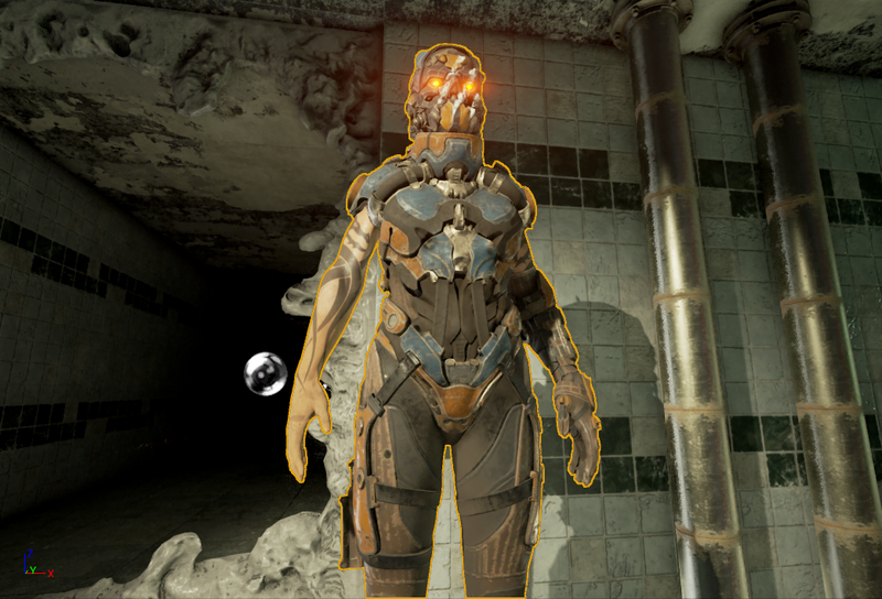
Image 16: Character with correct material settings
Key takeaways
- PBR removes the guesswork around authoring surface attributes to look realistic, easing the creation process.
- PBR materials can often misdirect the artist about the root cause of issues in the scene.
- When materials are not behaving as expected, use the viewport visualisation modes to investigate the integrity of the material properties before adjusting other elements such as lighting or reflection captures.
- If authored correctly, PBR should provide accurate material response independent of lighting conditions.
If lighting does not behave as expected in a scene, artists usually assume that the lighting is the source of the problem; so they move it, change it or adjust the intensity and direction to no avail. Yet the problem is more regularly with the initial material and texture set-up. If authored correctly, physically-based rendering provides accurate material response independent of lighting conditions. By paying close attention to the initial configuration, you can ensure consistent lighting throughout your game.
This blog has outlined some of the most common issues that can arise when material configurations are wrong, and we hope that it will serve you well in creating even greater games with spectacular lighting, stress free.


