Yes.
Excellent work BTW.
New: Poster your Art Here!
January 25, 2001 07:55 PM
I like drawing building/architecture more than drawing people. Here are some of my works. They sucks a lot because the texture are terrible.
building 1
building 2
building 3
building 1
building 2
building 3
I do have a suggestion for the girl FE, it's also a problem I've noticed on some very popular games, but very unrealistic. The stomach looks like the wet suit indents into the muscle, when it should stretch over the top of it, mostly people do this with spandex and belly buttons, they think that spandex sinks in deeply, but it doesn't it just gets flattened over the top with a very small amount of indention... looks similar but not the same. Maybe wet spandex, say a bathing suit would sink in but not wetsuit material. Take into consideration how fabric is stretched over the skin. Also in the center of the chest, unless it is actually sculpted to her body (or has something holding it down) it wouldn't sink in so far.
Maybe it's just me
Edited by - Ladyanon on January 26, 2001 5:14:22 PM
Maybe it's just me
Edited by - Ladyanon on January 26, 2001 5:14:22 PM
~There's always comfort in anonymity~
rubber padding also has grooves in it where the padin comes together. I am not sure too much on how the entry suits are done but im pretty sure they dont really cling as much as they do in the anime. but, you are right about that indent. it is rather large isnt it. well it was the first cg i have done since that purple haired girl so i didnt do that bad,,it was also done entirely with the mouse. no scanning. no nothin.
 I am not text, I am not organized pixels, I am not killed by turning off your monitor, I am not isolated by turning off your computer. I just am.
 I am not text, I am not organized pixels, I am not killed by turning off your monitor, I am not isolated by turning off your computer. I just am.
yeah It''s a stylistic thing... I go against nature sometimes for the look  pretty good for using a mouse.
~There's always comfort in anonymity~
my latest thingy:

please critique!
Edited by - sunandshadow on January 30, 2001 4:06:08 PM

please critique!
Edited by - sunandshadow on January 30, 2001 4:06:08 PM
I want to help design a "sandpark" MMO. Optional interactive story with quests and deeply characterized NPCs, plus sandbox elements like player-craftable housing and lots of other crafting. If you are starting a design of this type, please PM me. I also love pet-breeding games.
That looks really stylish, but I''m curious why he can''t find better fitting underwear... 
Hey Fantasy Edge, that's really good!  Truth be told, I only use a mouse for digital work, I don't think I've posted it here, but the image I did called "Julie" [digital artwork page 2] was done in PaintShop Pro using a mouse and no scans. If I haven't posted it here, I'll post it up for you to look at...in the meantime heres a scan of a "Dragonclaw Slayer"
The image is an original piece done in A3 Black ink (0.4mm) and took 10 hours.
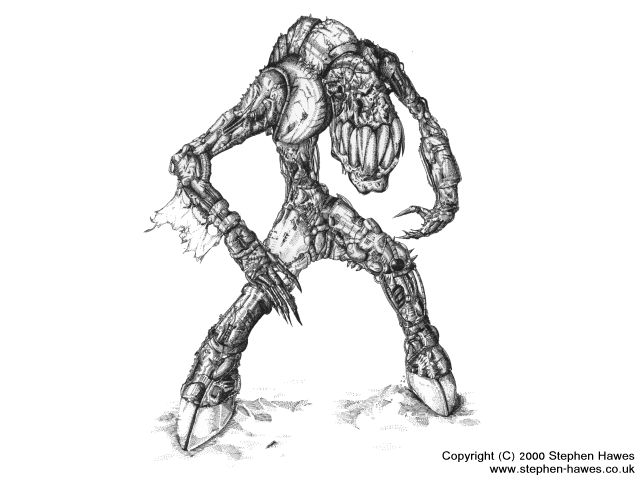
As always, comments welcome
www.stephen-hawes.co.uk
Edited by - Zonbie on January 30, 2001 7:35:59 PM
The image is an original piece done in A3 Black ink (0.4mm) and took 10 hours.

As always, comments welcome
www.stephen-hawes.co.uk
Edited by - Zonbie on January 30, 2001 7:35:59 PM
This topic is closed to new replies.
Advertisement
Popular Topics
Advertisement

