New: Poster your Art Here!
ok, here goes... i hope this works.
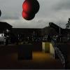
done with photoshop, painter (the sky), and bryce (the water). This one is sort of inspired by Georg Trakls poem "Grodek" (i youre interested you can find it on the web).
this is probably going to be the gameover screen for our new game...
feedback is always welcome... so feel free to criticise
Edited by - Hase on February 12, 2001 10:45:13 PM
February 09, 2001 01:09 AM
quote: Original post by ahw
JSP :
one word, respect
It''s SO not Photoshop like it warms my heart !
I know what you mean with "Photoshop -like", and I do try to avoid that look on purpose. There''s only so many mis-used lens flares you can take! Oh, and that bright globe in the horizon''s not necessarely the sun, although the sun IS in that general direction
quote: I used to hate Photoshop because of the Filter thing, but 2 years ago I had to learn it since that''s the only software we have here ... since then I think I got used to the concept, but it''s still ... mmmh... improvable (See the "Colouring scans" thread)
I make use of most of the filters that come with Photoshop, but with moderation - I don''t try to include them all in every picture I make In this picture I''ve used three filters, I think - noise (beach, rock, water, balloon basket and safety railings), sponge (rock) and lighting effects (water).
I''m also currently working on another picture, which is actually a combination of two pictures I''ve created about a year ago (and it''s high-res too). I''ll propably showcase it here once I get it into presentable form.
--JSP
Adobe Illustrator is a Vectorgraphic program. In other words it works with lines not pixels. It''s like flash but not for animating. It is usually used for print work, flat colour or line work. However the latest vertion brought in some more web styled tools.
As Mr Cup always says,
''''I pretend to work. They pretend to pay me.''''
As Mr Cup always says,
''''I pretend to work. They pretend to pay me.''''
As Mr Cup always says,''I pretend to work. They pretend to pay me.''
Hase,
I think that''s a great picture - good composition, nice use of colors, and excellent small details scattered about (the long reeds (?) in the water, reddish glow in the clouds / smoke, light coming from a uniform direction, the face of the dead person near the "camera"..).
There''s just one thing that catches my eye in a sort of negative way. If you look at the reflection on the surface of the water, it remains pretty "clean" and "clear" all the way to the right, as if the dark smoke in the background wasn''t reflected at all (or very little, actually - I can see a hint of red near the dead trees). If you compare the lack of contrast between the "real" horizon and the smoke to the reflection, you should see how different they are.
In my opinion the reflected smoke should be a lot darker, even though it risks blending the edge of the water into the muddy soil.
--JSP
These are some "sprays" I did for Counter Strike. They look small here but in game size they are about 1m by 2m each.
I'm not the best shot around so when I do actually get cap some LPB I spray big!
As Mr Cup always says,
''I pretend to work. They pretend to pay me.''
Edited by - Mr Cup on February 9, 2001 2:35:12 AM
I'm not the best shot around so when I do actually get cap some LPB I spray big!
As Mr Cup always says,
''I pretend to work. They pretend to pay me.''
Edited by - Mr Cup on February 9, 2001 2:35:12 AM
As Mr Cup always says,''I pretend to work. They pretend to pay me.''
Do let us see the updated version when you get that far, Hase
As I mentioned earlier, I''m working on another picture (a combination of two pictures I created a long time ago). Right now I feel that it''s good enough to show, even though it''s not finished, so if anyone wants to take a peek click the link below. Note that this is a 1/4 resolution version of the original image (which is 2000x1100 pixels in size, at 150 dpi) - a full quality JPG copy of the original PSD file would''ve taken a megabyte, and that''s pretty large. This smaller copy takes roughly 340k:
Spearhead
Just in case there''s someone who thinks they might''ve seen this image somewhere, the two images which I''ve combined were featured in a freely distributable Warhammer40k Codex: Dark Templar. So if you''re a WH40k player and roam the web a lot, you might''ve stumbled on them (wishful thinking ).
--JSP
woah...this thread still lives!
Alright, I posted a b&w pencil drawing several weeks ago and I decided to digitally color it in paint shop pro this morning as a break. So here it is.
Since I'm here, do any of you talented artists care to join the game development team I am a part of? We are a dedicated bunch and got our "stuff" together. Programming and Sound/Music is taken care of, and art is coming along fine too but we always have room for more artists.
Here are some screens just to give an idea of the early placeholder in-game art: http://www.trixoft.com/ma/
Let me know if you are interested.
Edited by - trixter on February 9, 2001 1:27:43 PM
Carl "trixter"[email=carl@trixoft.com]carl@trixoft.com[/email]http://www.trixoft.com
The Mech''s pose is a bit odd, but that''s propably result from the background being pure white (so it''s hard to imagine how the Mech'' would be oriented in relation to its surroundings). As it is, the Mech'' looks like it''s dancing :D
It also took me a while to "see" the upper body of the Mech correctly (the "prongs" that extend to the sides behind his neck didn''t seem quite aligned), but now that I do, it looks great I love the legs, most likely because the highlights and shadows are well done.
What I forgot to mention about the previous picture of mine I posted a link to (Spearhead) is that it was originally a pencil work (two separate pictures) which were then scanned in and colored in Photoshop. In the end, I removed the scanned lineart alltogether, so that the end result looks more like it was painted rather than just "colored between the lines"
--JSP
If you were ever a fan of robotech or transformers, you''d see how the mech is aligned very easily. They weren''t stiff mechs that only pivot at the waist on 1 axis.
I''d say the mech is in a "glamour" pose, running/gliding through the air at low altitude. You could call that dancing if you like.
It''s the first scan I ever colored also. I never really got around to coloring scans before. I may do a few more sometime.
I''d say the mech is in a "glamour" pose, running/gliding through the air at low altitude. You could call that dancing if you like.
It''s the first scan I ever colored also. I never really got around to coloring scans before. I may do a few more sometime.
Carl "trixter"[email=carl@trixoft.com]carl@trixoft.com[/email]http://www.trixoft.com
This topic is closed to new replies.
Advertisement
Popular Topics
Advertisement