AAA Workflow with Indie Resources
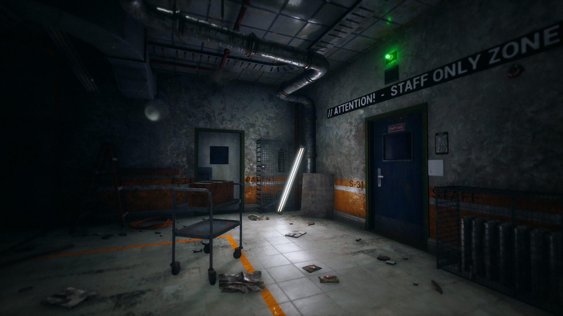
I recently took this photo a few weeks back to mark the moment I achieved peak graphics quality for my game. It might not look very impressive when compared to some amazing projects by others, but this was a big moment for me. You see I was using some tools without fully understanding them, but in this moment I understood how the mysterious "Skylight" truly worked. I'll spare the technical details unless y'all like that kinda thing, but in the photo above I had working reflections, run-time captured lighting, better shadows, more contrast, and a few smaller things as well. So where's the problem?
Well this took a long time to achieve. There's a lot of polish and refinement needed to get quality of modern graphics. Once I started going down this path I realized the skylight was only the beginning. I now need to know things like subsurface scattering, PBR materials, a better understanding of lighting, higher quality models, the list goes on. The problem is the photo is missing some of those things, so it doesn't look AAA, despite using many of the same techniques and engine. That also comes down to level design and art principles, but let's take that out of the equation for now, and focus on graphics only as we look at the next photo one year before.

Technique vs. Vision
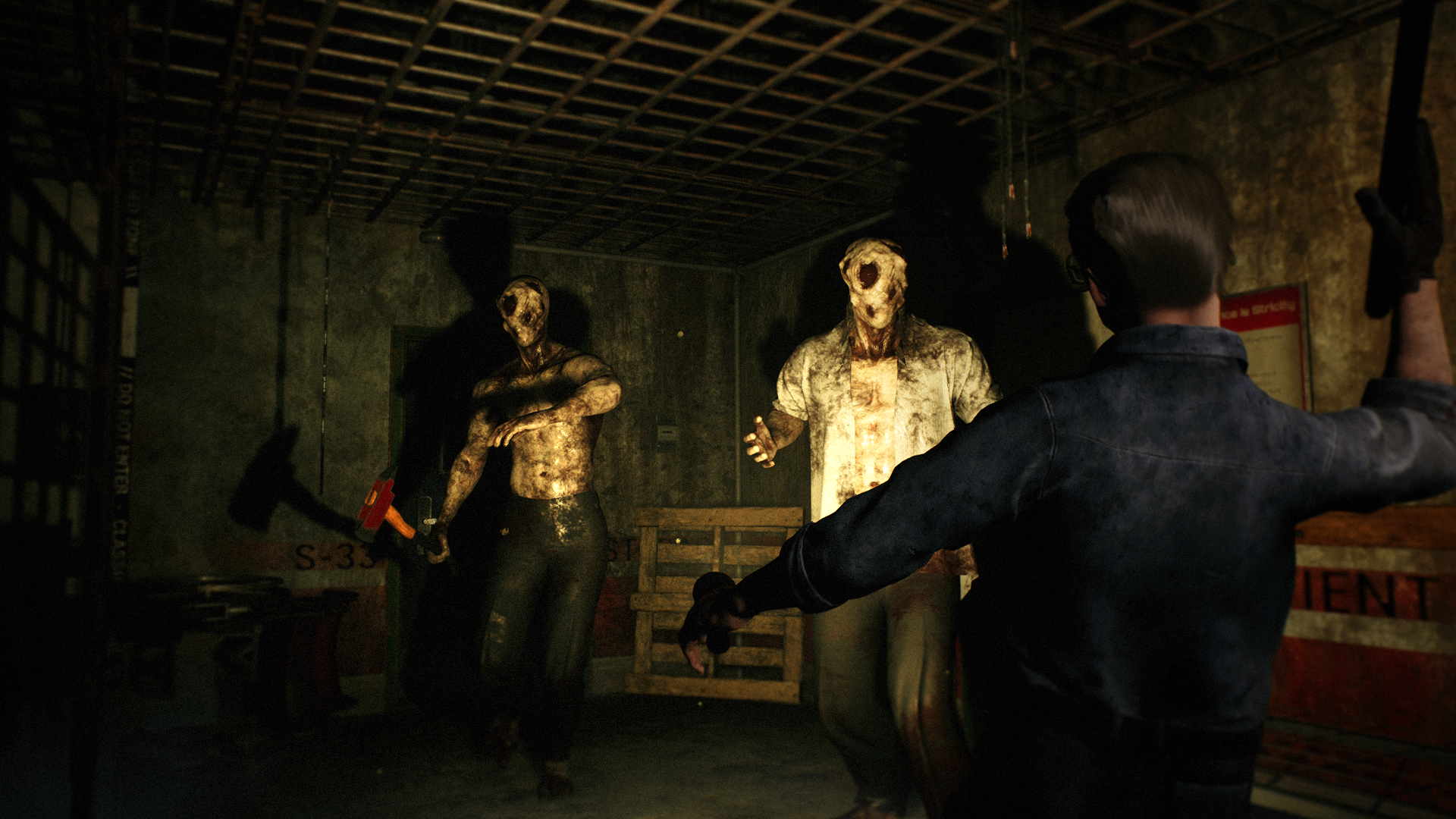
Right away you can tell this photo uses different lighting which makes the changes a little less clear, but there are some differences you can spot. The flashlight is behaving very unrealistic in this photo. It lights the entire scene and is even casting shadows that should not be cast (bars on the left). The color is very yellow and the image has lots of grain (this is post process related, but we'll ignore this too for now). At this time the "Skylight" was not functioning properly, but can you tell? The shine on metal and other surfaces is non-existent, but I ask myself, does that really matter? It would take hours and hours to rebuild lighting, reparent and improve materials for a PBR workflow, replace cheaper models, etc. Would that time be better spent learning improved level design? I could have contrasting lighting, tell more about the world through the environment, and develop a scene with something more interesting. It might not have proper reflections and shadows, but it would have something much more noticeable - better design.
I think I may have gotten too focused on the small things, trying to utilize them to improve bigger things, but the average player will not notice those improvements, and still only see the problem they were meant to solve. I've asked for feedback from non-gamer friends and family when it comes to me updating my scenes with better graphics, and it'd blow my mind when they'd say they like the old image better. I could explain that it uses realistic reflections, and this technique, and that, but they'd just say it's the look or idea of the scene that made them chose the old image. It wasn't about technique, but rather the idea behind it, and maybe I focused too much in one direction.

Moving Forward
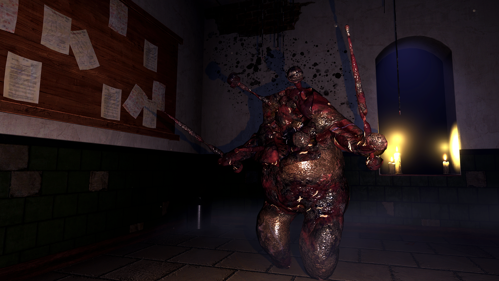
Here's an early photo, when I had worse techniques than shown before. I don't even think I used a "Skylight", but a bunch of lights with no source to keep the scene from being dark, although there are some candle lights (which are "stylized" to say the least). I lacked technique when I took this photo, but I had a vision, and maybe I didn't give that enough credit at the time. This scene set in the asylum's intensive ward was supposed to be under construction. The result of the asylum having a lack of funds, falling into disrepair, funds being found, construction started, runs over budget, and the work is stopped, leading to a dangerous environment where patients have died as a result. Now where on earth is that in this photo. Even back then I knew my technique was not standard, so I spent so much time trying to shed that "indie" look, but maybe that was never the main problem.
Rather than focus on how the light shines off a wall, I should've focused more on how the world came to exist. Story details, fun ideas, interesting scenes, etc. Only hardcore gamers can spot the small techniques, but everyone can spot a interesting story or idea, even if it lacks refinement. That's why I'm officially moving on from learning further techniques during the remaining development of my game, and rather working towards interesting images, and using them to tell the story of Whispers of West Grove.
Let me know if you agree or not, I'd love to re-create some of my old images to compare!

