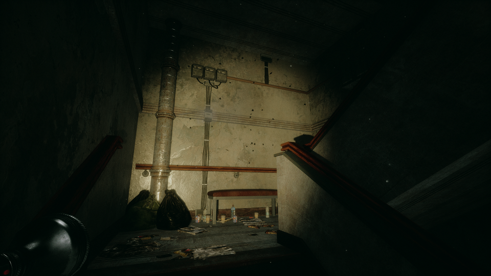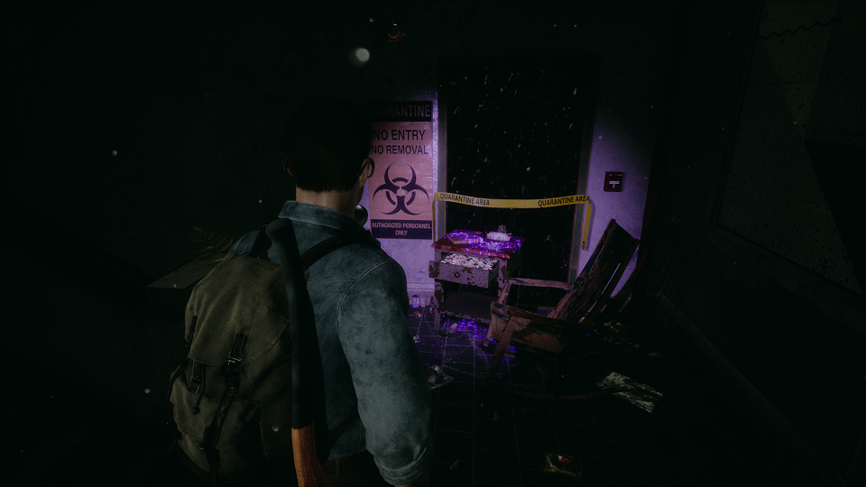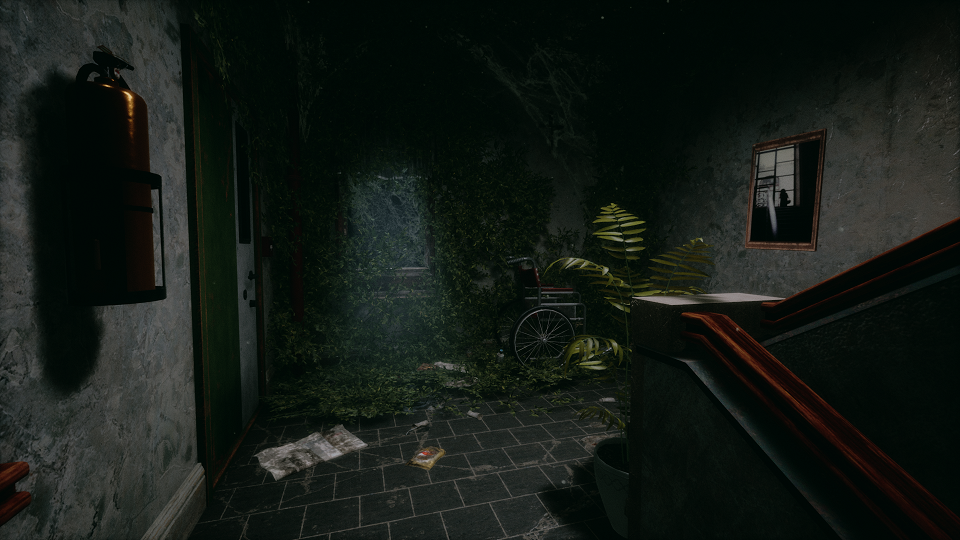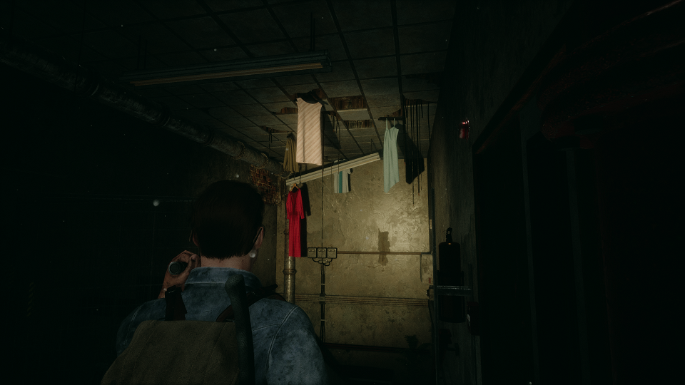
The importance of overexposure and bloom
Contrary to what you might be thinking, all of my new screenshots are heavily overexposed and use an extreme amount of bloom. The key to making this technique work is to modify the final image with post processing which tints and darkens the image again. Why would you do this? The trick is that bloom looks great, but setting it to a higher value can cause an imbalance with the rest of your scene. Same with lighting, the more light - the more detail and shine on objects, but too much will ruin the atmosphere. By masking these changes with post processing you can better fine tune the effect and achieve a highly defined, more realistic look for your game.
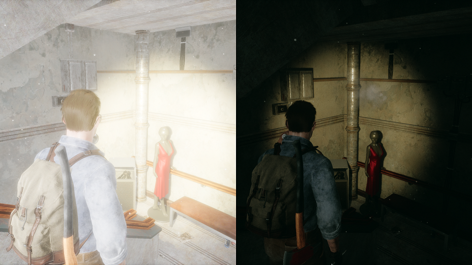
Improving a scene with more detail
When doing level design I always try and think about living in the world I'm creating. Would there be garbage scattered about? How dirty would the walls be? Should the room be disorganized or tidy? Thinking about those things helps me better understand the space I'm working in and how the previous inhabitants would have treated it. For the staircase room I wanted it to degrade as you moved downward towards the basement. The top floor is cleaner and under renovation, while the bottom floor is abandoned, flooded, and destroyed. There are symbols and themes I'm using that use the concept of the lower you go the worse off it becomes. I wanted that subtly reflected in this room, and with that established I could then answer my questions from before. On top of that I try and tie in symbols from the characters life, this is a psychological horror after all, so this helps create unique items of interest that may seem odd now, but will make sense with a greater understanding of the character and where they find themselves existing.
