No more faff
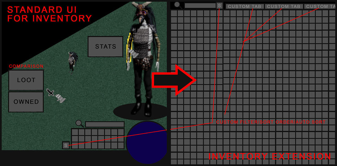
Inventory management is always a chore, and it usually gets worse as the game progresses. For one thing, it always covers up a huge portion of the screen (if not all of it), and pulls you out of the action. Which can be troublesome, when you wish to grab something from the ground, in the middle of a dungeon. You can barely see where the enemy is coming from, and you can get easily confused, thus having to bother closing/reopening the inventory from time-to-time. But that shouldn't be the case, in fact your user experience with the interface should be more fluent and straightforward. It is something that shouldn't be treated as an afterthought. That is why I abolished most of the inventory from the screen, keeping only the player and a small callback section, to quickly find the things you're looking for. Other than that, it would have the option to auto sort/stack items or custom filter based on preset values. But what if you wish to browse them all? Well there would be a separate button for that, which would open up a whole new page, entirely dedicated to your inventory. Lots of space, which would be of course upgradable along your journey. Also, to limit the work of having to find out which gear is the best, the game would automatically show you, either based on the default settings, or by your personal taste.


