Revealing a new champion, new game plan, new (kind of) game design document and new title for this complete revamp. It seems that the arrival of the New Year's has brought some fundamental and groundbreaking changes to my last project. Anyone fancy to play as a giant?
Table of contents
1. A refresher - getting you up to speed and thinking business
2. Building it up again – how the idea came to be
3. A kind of a Game Design Document
3.1 The master plan – about the game
3.2 Game modes – an overview
3.2.1 Choose your champion – select your character
3.3 Gameplay overview – quick guide
3.4 Procedural generation – quick ideas
3.4.1 Why dungeons? - how it works
3.5 Title and logo design – in brief
4. The making of the giant – the longest in the making!
5. Roadmap – quick production schedule
6. Closing words
1. A refresher
What has happened so far? Last year, was hard at work in completing a commercial project. However, due to unforeseen events, as indie productions are rough on the business side, production had to be shut down indefinitely at ~95% completion. Suffice to say that the mountainous efforts put into that project left a bad taste in the mouth; knowing how close it was to being shipped.
There is always something missing from the production, when working as a solo developer. It takes years and years of dedicated effort, to learn not just the ins-and-outs, but to navigate in the field and use what was given. Truth comes in the realization that what worked for others, might not necessarily work for you. In the grand scheme of things, it does not matter if you have the skills and the knowledge, because there are certain elements that work behind the scenes and thus cannot be ignored. Some you may influence, but most you will have to accept and adapt to!
After the turbulent events–of last year's–there was little hope left on an already empty plate: Continue or not to? A daunting question that many ask over and over. This is more of a business dilemma than a creative one actually. You have to climb the mountain, just to discover that summiting one, does not mean the end of the road. In fact, it only marks the beginning; because there are plenty of other peaks to climb. Treating game development as a business is often mislabeled, as it not necessarily reflect what one might think of. Obviously, there are certain aspects, certain rules that one must abide to (because how oversaturated the market is, and how difficult it is to market), like having cohesive visuals and fun/engaging gameplay, however, there are also the factors of complexity. Something that usually is often overshadowed by the critiques of veteran developers, as the majority of times it is committed by complete beginners; who have no idea how difficult making games are, let alone know what the procedures are.
Most of the time, the projects that break up the mold (survive obscurity and become well known), seem "easy" as they usually center around a relatively simple concept; spanned over a great distance, both in terms of invested time and resources. For people, admittedly like myself, the glamour of being able to create something is all to enticing, and creates this false sense of hope that anyone, anywhere can make it. It is both true and not at the same time. It involves a lot more skills and knowledge about the circumstances that formed the production; often great timing, connections are also part of it. Nevertheless, chances are that at some point that bubble will pop though: Most of the indie games never make nearly close enough to recoup their investments; let alone make a profit.
For those who wish to pursue this profession as a means of providing for themselves, it is vital to take this into consideration. This is where the mindset of the other side of business comes into play: You need to cater for the needs of others, in projects that are usually out of reach. Making simple, pong like games, no longer suffice (this applies for both mechanics and graphics); generally speaking. Even with mobile titles, the pay-to-market (advertisements, reach), riddled with in-app-purchases (and other monetization practices) can only hold the attention for so long (speaking of playtime). Platforms matter and vary a lot, but there is a fine line, which must be crossed in order to prevail: The scope has to match what is expected as a base line. As the industry has matured enough, it long passed the point, where games were novelty and cheap mechanics were enough to cater for its audience. Fatigue, boredom and irrelevance are what driving consumers today. Also, trends, catchy visuals, gimmicks, and so forth, determine the general flow: Why waste time on something that has been done before, or does not prove the worth of someone's time? Or is better marketed and has more reviews.
From a laic's point of view, simple ideas (in today's market) are a niche: Expensive, and difficult to pull off, and requires a team of dedicated people to be able ship them successfully (again, generalizing here). As it requires a great deal of relevancy, urgency (keeping the player hooked) and be able to compete with thousands of other similar titles, it makes less and less sense investing in such simple games. On top of saying that creating games on assembly lines are time and resource intensive operations; every week or so there is a new post about someone disapproving their work environment in those "sweat shops".
That being said, as simple ideas no longer worth the investment (games are no longer made under a few months), the question of "What to do next?" remained, as there was a fine balance that had to be struck as a solo developer. Ever since the decision of going full-time, with each and every project, every prototype that hoped to become something more, it became more and more apparent that at some point the scope of making games will no longer suffice. At a point, this was at stark contrast with what was possible (skills and resources) and what life demanded. In addition, as once have said this before, in another blog post, the limiting factor was no longer one's abilities, or the matter of one's endurance; but that is another story.
Have seen other developers describe the very same phenomenon of needing to "think big", despite the general idea of keeping-it-simple, and the consent of not doing so otherwise (for various, often-thoughtful reasons). This method of "staying within reason" was the driving force behind many of my previous projects: The scopes were generally catered to what one person could handle (within a reasonable timeframe). However, this mindset came at a price: When you strip down an idea to the bare minimum, it often loses its purpose and charm. Some limits were, arguably, rules that were more bendable rather than ones set in stone, but by the use of artificial limiting, some creative decisions ended up hurting those projects (a lot); thus decreasing even further the probability of success.
When all this started to crystalize, the idea of a stylized game was born (the one that was originally here, a simple button masher, which was just replaced by this new title). Although, as one could image, making an art "heavy" project was the least of my desires as a solo developer. [Making art is easy. Making art that looks good, near damn impossible and takes years and years of practice! Not being a trained artist (as most of my traditional sense of art comes from intuition and some form of visual/hands-on "training" via experiences and perceived knowledge/taste) meant that approaching any project that needed above average art, will be a huge time consumer. Not to mention the challenges involved.] On a personal note, going the Art route was thought of something that could not be done and should not be done (from a business point of view). Again, for the obvious reasons of time & effort (and skills) that it required to do so. Not excluding the proper tools that it also requires (e.g, stylus pen, or professional grade 3D software solutions for sculpting), that often differentiates professionals from beginners.
Going hand drawn was a choice of least resistance. Stylized art requires good lighting, excellent form, and great attention to details (whether it may be on the micro or macro level). Wanting to break away from realism inadvertently brought the baggage of expression, via the means of art. Suddenly, every inch of a character (per se) now required to have a meaning as well as a purpose (e.g., flow of lines, overall aesthetics). And as sculpting, which should have been the more sensible and least labor intensive approach, was out of the question (due to hardware limitations, and workflow restrictions), the path of hand-painted was chosen instead.
That was when the idea of creating a small, but stylized game (that button masher) came to be. That being said, after spending almost 2 months on creating simple assets (an island with some trees and foliage, and some sky for a circadian cycle; albeit high in detail that looked tolerable), the frightening and anxiety inducing notion of not being able to create good-enough art (with an equally enticing project) lingered above my head.
One interesting aspect was of this new "game", the concept and the main loop just started to feel awkward and displaced. The excitement for smashing creatures to grow a tree no longer felt fun, simply because–technically–it was not far off from a cookie clicker; even with the added complexity of lanes, resource management, weather effects and the "story" behind it (the task to protect the tree from the elements to prevail). Furthermore, at some point into making the initial assets, have come across a game called Kena: Bridge of spirits (a stylized game made by an animation studio, look it up, worth the effort). Which made me want to create a proper (family friendly) adventure/action game (where you would play the role of a seed, opposed to having to do so in this stripped-down of a version; where you just see one grow from a distance, and not be literally in the driving seat), which began to reinforce my anxiety of the worth of this project.
Because at the end of the day it has to be considered that "What are the metrics telling me? How do others view this game? How much do they value it? Is there a discussion about it?" [Excluding one often discussed debate/need for money=time (the quantification of enjoyment), as the direct correlation between one's time and one's expenditures should not be the same (in gaming) as it would be with any other shelf bought product (say tomatoes). While it is true that time is precious and people wish to spend it wholesomely (why would not they, because usually they have other matters to attend to), but have found these direct comparisons rather abrasive. Solely because that way of thinking hurts consumers, more than one might think! The illusion of worth is a double-edged sword that has the potential to degrade the experience. Wonder why so many games are bloated and have artificially extended gameplay, with gimmicks that waste your time, mechanics that often feel unnecessary and contrived, or straight up do not belong there? A simple way to cover the lack of depth and design with such practices. But, to cut it short, of course, the debate for the lack of meaningful content (in the first place) is still standing strong on the other side, as value goes far beyond the physical measurement of money and time.] And that this "worth" is something to think about. A lot. Because creating something meaningful that evokes emotions (e.g., sense of belonging, joy, satisfaction), or sparks discussions, and more, is no simple feat. That is why some games are barely playable on the first run, or put down half way through, just to never be touched ever again. The secret is designing something that encourages the player to return, and not "gain the system" with predatory (often financial) incentives that rely on the exploitation of the human psyche. The latter is not just artificial, but creates straight up junk. Which ultimately lowers the whole value of games; a perpetual occurrence really. [Much like what the metrics for the landing page and the shared concepts over online told me (for the previous iteration of this project). While the art assets did spark a shallow interest (in form of likes on numerous sites), only a few decided to take a look at the project (reported by Itch, under "referrals" for the title). And technically nobody sought it out on their own (there was no driving force when it came to marketing). No discussion meant that there were no visits and no rankings. Which is a huge red-flag on its own and hindered the discoverability of the project. This also explained that the possibility for growth never existed in the first place. If after months of work, the projected conversion rate is still zero (well the click through rate in this case), than that is a big problem (especially, without a marketing budget). Most of the time, you can get by with a subpar release, if you have the means to back it up (and shove it down on consumers throats), but as an indie developer, you have to crate the very best, the top of the line really, in order to have a glimpse of a chance to gain exposure. Not success, but exposure. Success comes after. And that is a big if.]

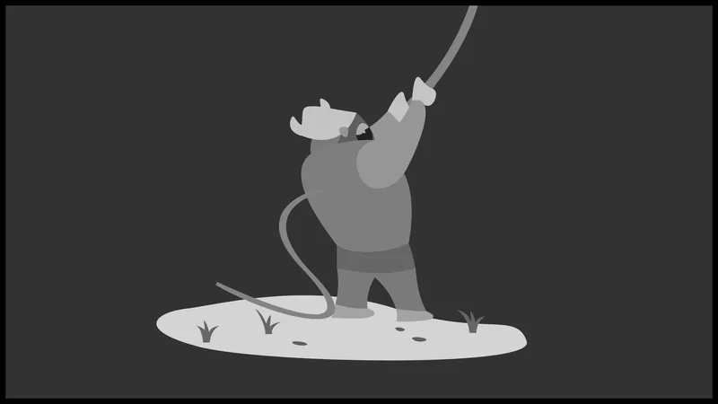
And after having spent 65 days on making the first character (shown below), two things became apparent. One was that the game had to go and start over from scratch, with the advance of discovering a new method to fake a certain brush effect (with a mouse and keyboard). Notice how the lines on the right (in the picture above) feel more wholesome, and have a more natural flow to it. This new approach technically rendered all previous assets obsolete. Not because it would have looked that much different (both were hand-drawn, but with different styles of brushes, which as you can see makes a huge difference) but would have been picked up by anyone. The discrepancies within the art, of the new and the old, would have stuck out like a sore thumb (as people are prone to notice the difference within the tiniest of details). Which could have caused more headaches in the long run (as in the pressure in needing to repaint those assets at some point). The other matter was that most of the time my projects have been cut extremely-short, way-beyond recognition, all in the name of managing scope and expectations. This was fair for a time, but going overboard with restrictions began to hurt, as my skills have gotten better with time. And after reaching a tipping point, where scope no longer stood in the way (within reason of course, with the aid of Unreal Engine 4), this all became an issue for my business.
Thus, after some consideration, the decision was to make a (part of a) game that is a mixture of genres (e.g., dungeon crawler, RPG, RTS) in the concept of "defending and taking objectives" by hunting down and throwing the enemy of orcs, beasts and dark wizards around. All in the name of saving their part of the world from being destroyed (for the chosen race that is). While this phase mainly focuses one ally (+1 for the opposition), a whole range could be added in the future. The main focus will be on the single player campaigns, with specific sets of unique missions and environments to suite said missions. Below you will see a sort of a "Game design document", with a breakdown of what-is-what (e.g., gameplay mechanics, logo design, procedural world generation), followed by showing off the first champion called "Olimbor the wise".
2. Building it up again
When someone finds themselves cornered, there is a big chance of making a huge mistake. However, when one finds themselves repeatedly in the same situation, the pieces seem to fall into the right places. It is another way of saying, speaking of being an indie developer, "if nobody will be interested in those small ideas, then why not just make something that is totally out of place and breaks with traditional practices". As far as the outcome concerned. [Would note that this is an overly simplified explanation to a quite the complex topic. Making games are difficult, and should be treated as a business. There is so much to it, that solo developers often are unable to see it all: The quality, the design, the marketing, the monetization, etc. An overwhelming experience that can take years to process and develop into something cohesive. It takes time to get to the above conclusion. People do not take interest simply because the game in question is not marketable (or lack the proper reach).] After coming to this conclusion, it was time to double down on the idea of turning that button masher into something completely different, by throwing everything away.
The holidays were coming up quick, and whilst the work was seemingly endless on the character (explained below), the cogs started to spin to find a new reason to continue with the project. All the evidence, the gameplay "testing" suggested that the "predecessor", with all its gimmicks would not be enjoyable after a while; in a way it could be said that the "honeymoon-phase" ended by that time. Especially after the last massive project (the commercial one), now more and more effort was put into dissecting the game into pieces, to make sure there was "value" to it. Which slowly but surely reinforced the notion of needing to move on. Furthermore, there was the consideration of marketing (e.g., Who would play this game anyways? – as is where to market lied), and the fact that an enormous amount of energy was put into making those assets (was the first time "allowing" myself to work months on assets; it was usually done in a week or two at most). This started to overshadow and question the sheer existence of that previous title. It all seemed wasteful, and signaled that an urgent change is needed.
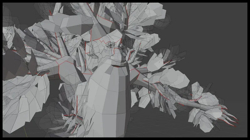
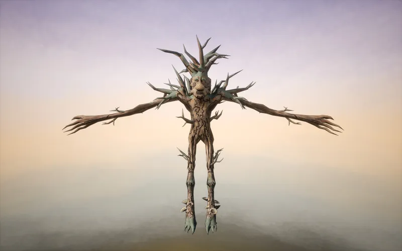
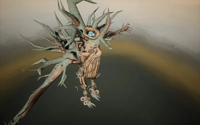
Originally, the intention was to "just create" a mob (to get a demo out), but as the work progressed, the idea of turning this "simple" mob into a playable character made more and more sense (seen in the picture above). On one hand, this tree creature was designed to be tall from the get-go, well because it was a tree giant, which prompted the question of what to do with it. And not just how to utilize a now standalone asset, but how to build a complete game around it. How to make it all fun? Just from having one asset.
Remembered that back in the days (when it first became more prominent perhaps) interacting with the environment became a phenomenon. My most notable memories are from the Molyneux games such as Black & White and Dungeon Keeper 2 (DK2), where in both instances you could literally pick up a character and throw them around to relocate or to punish them. Games, those strategy games no longer felt like watching a screen to order and push some pixels around: they managed to break the fourth wall. And that is something that encapsulated my imagination.
On top of it, as Warcraft 3 played a huge role in the precursor of this project (it was the main inspiration for the art direction), it felt natural to somehow merry the two by creating a more immersive experience. However, the goal was not to make another DK2 title (there are a lot of clones for that), but in fact to cater to the idea of "What if I were a giant, who happened to throw orcs and other beasts around, whilst defending the forest?" It took only a few moments to connect the dots: A real time "strategy" game, where the player is literally on the field (in third person) and has to command from the battlefield. Sort of making it more of an action title (where the "base of command" is the player themselves) than a classic (overhead) strategy game; barred behind a massive user interface (with a ton of information). But this was not the end of it.
Much like the previous project(s) (that commercial one was especially), all were subject to my design philosophy to innovate. At that time it came in the form of player progression (in the form of unlocking new resources/tools. Which was actually a 3D minigame, designed as a maze, not a classic countdown to halt progression. The player had to work for their reward!), which concept was carried over to this title as well. On top came the challenge of figuring out a fun way of doing it (to incorporate minigames that is), as well as solving the issue with resource gathering; because wanted to divert from the traditional "send units to grab things" (Where is the fun in that? seeing things that you have seen hundreds of times before). Then it started to get wild with the idea of getting more use out of being on the field. Big "what-ifs" started to fly around, and soon the game started to split into the genre of dungeon crawlers/rogelites (with encounters, loot to horde, areas to explore, bosses to fight, etc.). This was by no coincident, as have been making RPG prototypes for a while (some were more interesting than others), and always wanted to make a proper RPG of some sorts. Also, wanted to do more with the character, not just having it sit on the map and be a tool to plop down units and buildings from, and be a simple projected extension of the player. More so, to make it be more of an adventure (encouraging exploration and engagement, and essentially making having an XP system somewhat obsolete), that could be both challenging and rewarding at the same time. All of this will be explained later, but the gist is that now the player had a reason to be in the game world, which "technically" introduced a whole new set of mechanics and strategy; to what would normally be just another RTS title with some pretty graphics, with less emphasis on building, more on troop "management" so to speak; other mechanics may or may not be in the works.
So the focus from now on is on this first phase (the implementation of these forest creatures), then building up the base gameplay and utilize the possibilities to their finest. [Implying here that probably the controlling of the enemy's will not be under the spotlight. But we will see how the production goes, because certain features must be incorporated, and at that point technically the opposing force will become playable as well.]
3. A kind of a Game Design Document
3.1 The master plan
" I want to be a giant and throw orcs around and do stuff,"
The game is a 3rd person stylized game that is action packed (close combat), part dungeon crawler/RPG, part open world, and part strategy game with direct controls over a giant champion and their abilities to command units and occasionally throw them around on the battlefield. The goal is to defeat the enemy and complete the objectives. Each side has their own procedural generated playfield: One where the actual battle is taking place and One where the player conducts progress with "dungeon-runs" in a more open environment (with indoor and outdoor areas, free to choose from) to collect resources, fight minions and bosses, and find items and upgrades to aid their war efforts while the battle is taking place. Furthermore, all units will have a more robust AI system that will enable troop movement on their own (e.g., attacking or falling back based on certain conditions), with the ability to order units around with a variety of commands (flags of interests); if the situation requires it. Progression is solely dependent on how bold the player is in exploring the wilderness (venturing deeper into the unknown), taking risks and completing the mission(s) for the campaign; rather than relying on farming creeps for experience. Question is, Will you be up to the challenge to use clever tactics and be brave enough to fight what lurks in the shadows?
3.2 Game modes
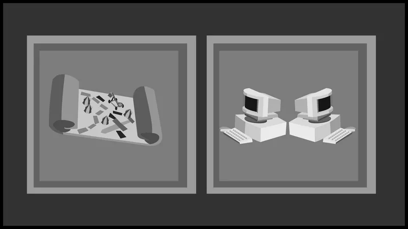
Because of the nature of RTS games, the projects is being built upon the foundations of multiplayer, even though it will not utilize it right out of the gate. [The nature of multiplayer requires an entirely different architecture, most notably (not an expert in multiplayer architecture by the way, this is fairly new stuff for me as well), for what is called "replication", where the game is split into different instances (for all machines), of which the server is in control of. A whole new set of code and rules need to be applied, to determine what and where is sent (data) and in what context (e.g., seen by all, or by one client). Which also determines how the gameplay logic is handled (e.g., if a door is only operable by on player, the other player might get stuck), and at what performance. As optimization has been forever the staple of my work, some due to the fact of using visual scripting, it has become a requirement to pull off more advanced logic (like procedural generation, or when developing for mobile) in a more lean sort of way. Hope is that with that knowledge in hand, combined with the relatively low spec requirements for the game (mainly because working with low-poly assets) the multiplayer experience will be somewhat of an enjoyable ride (whilst playing).]
Two main modes will be available:
- Single player campaign: The main focus for the game (at this stage of development), where first the player chooses a race (first these tree creatures will be available, called "Thearns"), just to decide afterwards on which campaign to choose from an interactive 3D map; which represents the territory of aformentioned race. Each region will correspondent to a unique sets of missions, defined by the story of the world. For the "Thearns", the first campaign that will be developed, is a simple "defend and oppose" the enemy. Where the main goal is to stop the culling of the trees and push back the intrusion. In the case any of said goals fail (not timed events), the whole campaign will fall. The same applies for any other mission critical additions.
- Multiplayer: This feature will not be worked on until the game has reached a stable state; speaking of finding a game, lobby, scoreboards, custom games, etc. It is not yet decided which features to add in as an extra: Should the possibility included to replay the campaigns without AI (player vs. player), and add custom modes, such as the classic "battle field" mode (completely different maps, where the only goal is supremacy), or not. Which would require additional tweaking on the systems, and so forth. Will be heavily relying on what the community seeks for the multiplayer, when it becomes a topic of debate.
3.2.1 Choose your champion
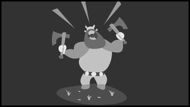
After deciding which campaign to choose (whether it is single player or multiplayer, with a custom mode), comes the decision to select one of the available champions from the league. Each character will have their own set of unique abilities (strength and weaknesses, as well as special traits), alongside their basic tools (as part of being a giant).
Having played and seen a lot of MOBAs, if there is one thing to be taken into consideration is to not to make the mistake of making a character obsolete (by introducing one that is superior by all means), or to cause anxiety over choosing one. Balancing is already difficult on its own, but E-sports is not what this game is aiming for. The focus will be more on special traits (e.g., being faster, but more fragile, or be better at "dungeon-runs" (more of that later)), and not so much as to give each champion a ridiculously-overpowered quasi ability that could be spammed at every second. Giants are already insanely powerful, there is little need to throw off the balance even more. It is already a challenge to mitigate these circumstances, of which there are some ideas already in the making.
3.3 Gameplay overview
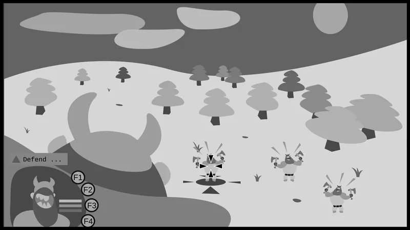
The image above is a simple mockup to better illustrate the overall experience. It is far from complete, as the game is in its earliest stages. For one, the UI will most definitely change, "To what extent?" you might ask; not have the slightest of idea . . . for a number of reasons: actual gameplay has to exist in order to determine the final UI, on top of wanting to deliver a player friendly experience (finding the balance between too much and too little information) that is easy to read and is in accordance with the gameplay and design intentions (slick design that is). Furthermore, as this game is not a typical strategy game, some information (like unit health, spawn time, etc.) could be shown to the player on the battlefield itself (e.g., by looking at a character, and perhaps holding down a button to reveal the stats; as am not a huge fan of overhead displays, as those can quickly clutter the view and make the field unreadable), or other ways not yet thought of (at the writing of this blog). A lot of thought has to go into this, as there are numerous ways to deliver certain information (e.g., with visual or audio queues, changes in color or texture or the model itself, or just with plain symbols) thus the final form is yet to be seen. However, one thing is certain that because of the 3rd person (over the shoulder) view a lot of dead space (wink) will take place on the left side of the screen (thinking of making this toggle-able to the right) which could house the giant's vitals as well as extra abilities and some other information like ongoing quests.
And in the case you are wondering why the choice of over-the-shoulder: After some initial testing, have found that this was the best way to portray what would be like in the boots of a giant. This becomes apparent when the creature moves or turns around: It gives a sort of "momentum" to the scene, by how much the landscape changes when turning per se; further adding to the "greatness" of the beast. Something that a classical top-down view would not have been able to reproduce. By moving the camera much closer, almost as close as it can get, it gives the viewer a sense of intimacy to the subject, and not think of it as a moving command center (as discussed above).
Another aspect to look into are the controls: As the main driving force of this game is a character, the traditional button layout (WASD) and mouse will be used (all three buttons), on top of other function keys (as in other keyboard keys, not just the actual function keys themselves, such as F1, F2) to interact with the game (e.g., the famous "E" button). That being said, having a locked mouse (to the view) might not be a forever occurrence, as there are planned mechanics that will need to be–somehow–accessed at some point (like inventory management if that becomes a thing). A good example would be sorting out the tech tree (which unit to build from the collected resources) or finalizing upgrades. It yet to be decided simple include tokens to spend on whatever ability fancied by the player, or have fixed ability tokens in the world, to grab and upgrade from at the time of consumption. Heavily leaning towards the latter, however somehow the player still needs to know what upgrades are available for their class. One solution could be to use radial menus, and decouple the mouse (from the view) under certain conditions.
Circling back to the gameplay: The goal is to both complete the mission objectives and defeat the enemy's "base". Either by completely obliterating its structures (spawn areas, whatever that might be at this point), and by defeating their champion. Furthermore, if a champion dies during a "jungle" run (gathering resources and upgrades), it might as well as count as a defeat; or the very least introduce hefty penalties. [The death during runs is up to debate, and will require thorough testing in the future, especially knowing that parts of it will be done by units themselves. More on that later.] In this first phase, for the "Thearns", the objectives will be to defend, probably a few trees from being cut down, and to push back those pesky enemies.
The plan for resource gathering is to venture into the "jungle" and start exploring. There will be no traditional "send units to gather/farm resources", rather the player will have to actively forage and seek out all possible locations (in the form of an object, say hidden in a chest, or under a bush). More on the "jungle" below, but suffice to say that both resources and upgrades will not be renewable. [Mostly to not just limit the length of a play-session, but to encourage tactical thinking and strategic spending.] Speaking of upgrades, the tech-tree will most likely to consist of unit purchases and upgrades. There will be no linear upgrade path (some parts of it may or may not be skipped if the player takes great risks and is good enough to handle the challenge involved), as the "research" will be conducted by the player, and progression will be more horizontal than vertical (by focusing on different units). The balance for this decision comes from the simple fact that each higher tier resource and upgrade will be further and further away from The Hub, and consequently, will be more challenging to get to (and find). So in theory, one player could risk to just B-line straight to the best units, and make everything obsolete. However, dungeons will be randomized, as the distance from The Hub will determine the probability of spawns (currently planned anyway), and am thinking of introducing several "gating" mechanics to prevent such "speed-running". One is that the enemies will get tougher, the terrain more harsh and the loot more scares. And also, it is being planned that some of the rewards will only be attainable if certain prerequisites are met: Say having an item that the player found earlier in another dungeon. Of course, this will still not defeat metagaming, but will greatly limit its effectiveness (especially when certain loot can be only obtained from certain mobs). When RNG is a big factor in a game, it is difficult to account for it. Obviously, hoping to find a balance between letting the player progress on their own, at their own pace, and let others take (early) risks if they choose so; to give them an edge through their means of tactics. Gating, in this sense, should serve the players rather than the other way.
This is where another side of game design comes into play: puzzles and minigames. In that previous project (aforementioned at the beginning), for example there was a way to collect additional cash in order to help defend the planet (it was a space game) by manually driving a satellite and pointing it at targets. The challenge came with not just finding your targets, but to lock onto them, whilst periodically a meteor shower flew past by, which in turn could damage and destroy said satellite (as the premise of the game was to defend Earth from incoming objects, which neatly tied into this mechanic/minigame). Thus creating a risk/reward situation that the player had to face if their reserves were on the low; which was also a part of the experience. Suffice to say that the goal is to make the runs fun and challenging, as well as in accordance with the rules of the (game) world.
And as a side note, on the topic of units, the primary way of ordering them around will be via "command flags" that will be needed to be placed on the ground to take effect; also to be a visual queue to the player of previous commands. It is being planned that the range, the type of such commands will be customizable, and it remains an open question to include unit selection. The goal of the game is to be a "person in charge", but not on the micro level, managing every unit. Although have programmed AI routines before (in a recent prototype, where the wounded would fall back, for example), it will be a challenge to pull this off successfully; thus approaching this with caution (also knowing some not-so-good examples in games, where ordering units just was the most horrendous experience; part of because of incorrect pathfinding, and inadequate routines). Which brings us to the question of numbers (population caps): Judging from the complexity of the tasks, envisioning a fairly small (sub ~20-10) population limit for the very first iterations. Which is fine, as quality is the preferred way to go. Plus the units will have to operate on their own as well (especially when the player is in the "jungle"). [Also, it is planned to have some sort of ranking system in place that would increase certain attributes of said units. It has not been decided how this will be presented to the player: via pesky overlays (like stars above the unit), or by upgrading their gear, or by color grading of some sorts. Because often times, it is difficult to tell which level foe you are facing on the battlefield.]
3.4 Procedural generation
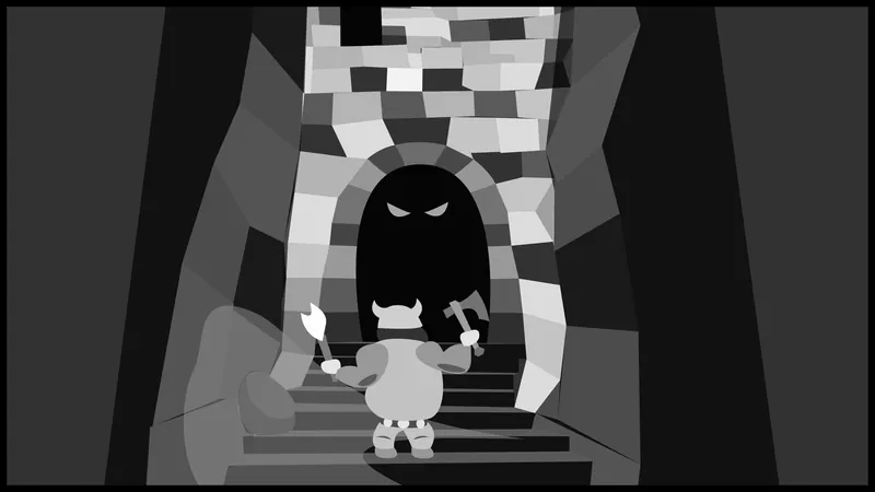
Generating random maps is something that has been in the works for a while (across multiple prototypes). Some were easier than others, but managed to get to a reasonable level for creating somewhat simple yet organic maps. Have done it with simple squares, as well as with hexagons, of which the plan is to return to with some more advanced methods; namely to start including elevation within these maps. Because generating small tiles (say 50x50cm, that is ~20x20inch) is rather resource intensive (and causes a headache with prefabs), thus have started to use large ones in my last couple of projects (like how many of the developers in the industry do). As it was way-more efficient to plop down one large tile (say 10x10m, it is ~33x33feet) and then let each tile "decide" what to populate itself with. Which means that adding elevation to the mix should be relatively easy and straightforward; that is if we consider random generating maps "easy" with all the creating, executing and validating aspect. In theory that should add a bit more of a flavor to the levels, as originally the idea was to not to use one (when it still was just a top-down game), or be restrictive with it (by faking the elevation difference).
What will not change is the battlefield itself: It will be only generated once per session. Everything other than that should be completely new with each startup (even after loading a save for example). When someone enters "The Hub" zone, they will be presented with numerous choices in a semi-open world fashion. There will be caves, cellars, abandoned ruins, and so forth to explore, and depending on the find, a new area might open up. And, as alluded to this earlier, the further someone ventures into the "jungle", the tougher the experience and more rewarding the loot will become. [The possibility of equipping armor and weapons will be decided in the future, as it is not a priority at the moment; due to the uniqueness of these tree monsters (although the units might have one, those used for dungeon runs). Also, apart from a tool, there is not so much a giant can make use of; as they are already powerful enough.] What this means is, from a technical point of view, that there will be zones, from which the player can go in and out; but not necessarily be rendered in the same way each time (to avoid metagaming). Also, it is yet to be tested, how each individual encounter (small maps) will be created. As the core game is built upon multiplayer, it would be difficult to foresee how this would impact gameplay, in a positive way (speaking of FPS). This has to be tested out, because it is more likely that when this happens (as in a player enters a new zone), the game would need to be paused for the opponent as well (otherwise gain supremacy over the other). Which in the end would just be jarring, with all the pausing and un-pausing; that being said, calculating all the different paths at the beginning of the game sounds a bit too much (talking about minutes here). We will see how this will turn out. In the case loading times go through the roof, there is the possibility to side-generate them (by limiting the time allocated to each process, a technique that saves any project from crashes due to surpassing the iteration limit within Unreal). A true solution would be to use asynchronous techniques (utilizing other CPU cores), but that is not available for Blueprint projects, and requites an in depth knowledge of task scheduling (for multiple cores), which is way above my pay grade.
3.4.1 Why dungeons?
Roaming as a giant can be entertaining, but it also comes with a lot of limiting factors. One is that everything on the map has to accommodate the differences in size, which can cut off a lot of potential content; often those that is most interesting. Enclosed places, for example, are technically impossible (apart from large caves), unless used with some trickery (e.g., shrinking the player). And because of the possibilities of fast dungeon runs is something that has to be in the game (for reasons not quite sure, but it has to), there are more options on the table to play with. One is the inclusion of mazes (or partial mazes), which could also introduce puzzles and other fun mechanics. The goal is not to artificially slow down progress (beyond reason, turning it into a normal RPG), but to add flavor and new challenges that happen in this so-called "jungle" area. And as a fan of such things, it has to be incorporated. As simple as that.
That being said, these dungeons will be more about action (close combat), rather than contemplation. Something to keep an eye when designing the algorithm, as nobody wishes to spend an additional 40 minutes clearing a cellar, just to find a basic upgrade (like a club of some sorts). Not to mention that all this is happening in real time, while the battle is taking place on the other side of the map. A short run through, with some challenges is all it needs really (in most cases). To achieve this feat, a small trick will be used: The player will be able to call upon one unit of theirs (not contributing to the population limit), that is "invincible" in the sense that upon death, the player will be able to summon them again (with some penalties perhaps). It would be a way of calling reinforcements by the leader of the army, to do their bidding in situations that they cannot physically enter. This also means that the player will possess those units, for the duration of each run. This also means that the better units the player has, the easier a dungeon will become (if the difficulty level of the dungeon does not increase).
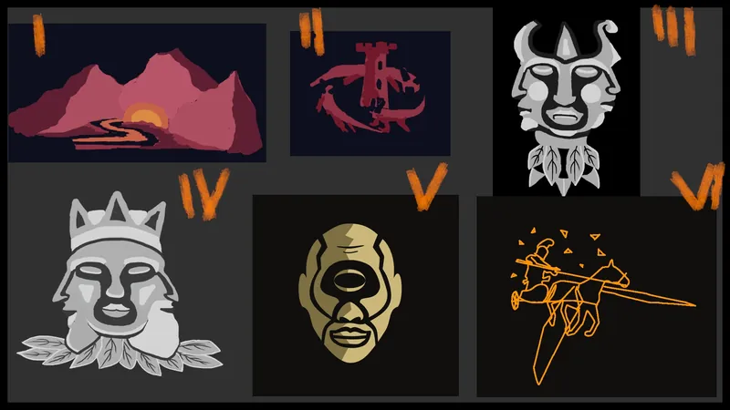
3.5 Title and logo design
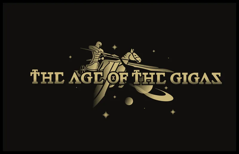
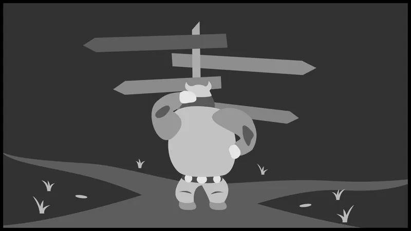
Thought to include another interesting bit, to show how the logo and the title came to be (shown some of the steps in the above picture). Obviously, this is not the full picture, as there were some in-between line sketches, but this gives a sort of overview of the process. To tell you the truth, it was a headache. Creating logos, as well as title fonts is just immensely difficult. Have grown a sort of distaste of doing it, because there are so many nuances to both of them that is overwhelming at times; moving a curve on a font by just a smidge can turn it into something completely different. The stress of coming up with a design, hopefully somewhat of a novel one, is never a pleasant experience. On top of it having good aesthetics, be in accordance with the project, serve its purpose (be informative), be scale-able, and much more. There is a good reason why logo design, well illustration in general, is a full time profession.
One of the toughest issues was what to name the game. It is fine, but not perfect. Have gone through a lot of versions: Some would have had a completely different tone, some were plain ridiculous. First the subject, which was initially just these tree monsters, but then thought "What if there's a 1% chance that people will like this, and if so there might be more to this game (like adding other factions), or what if the gameplay itself changes over course of development?". If so, then locking in to say "The battle of the trees" or something silly, would not go down so well; and would require a lot of explanation later. Also, when coming up names, especially these days, one has to think about the competition, and naming schemes. Turns out, in this day of age, most verbs and nouns have been used already, so going for a simple and memorable title is less and less of an option (if you wish to be unique, or avoid copyright infringement if you make something similar that it might infringe upon), and requires more and more creativity. Which means that now you have to come up with these elaborate, longer titles if you wish to keep it simple and somewhat memorable. And also, had to somehow encompass a generic fantasy world (that had no backstory to it): "The land of the phantasm" or whatever. Just to somehow convey the information that this is a magical world of some sorts, where giants are the main attraction. Speaking of giants: Had numerous ideas of putting a giant on the logo (like stomping someone), but then again, that would have only covered a fraction of the idea. You have to think about these things, from a psychological perspective as well, as to how others will interpret your designs. What will they think when they read, and see your creation(s).
Believe it or not, "The age of the Gigas" came as a last resort, after becoming frustrated from days of having unsuccessful ideas. It might sound generic, but did not want to go full blown fantasy, with an unpronounceable name like "O'trornfols land of the W'ruthr'lang"; exaggerating here, hope you get the point! Also, a key factor was familiarity, as Gigas was the name of one of the "giants". Which is also a fun fact that originally (to-this-day even), these Greek giants are not taller than the average person; they are usually depicted as armored men with great strength (and their uniqueness is just simply named "giants"; because "titans" are the big ones). Which in a way sounded perfect, as hoped to choose something that also represented non-grand magical beings (say fairies). So because the "Book of the Gigas" was taken, "The age" was chosen instead.
And the type font: have chickened out a little bit, and went for something simple, and something lazy. Have used Latin fonts before, and because of their predominance in conveying grandiose ideas with a touch of ancient history, it felt like a great fit; also was ashamed of the other font designs that came before that (some where round, others just . . .). Thus, after some modifications to the original fonts, have come up with the ones that made the cut (that are more accordance with the design for the logo).
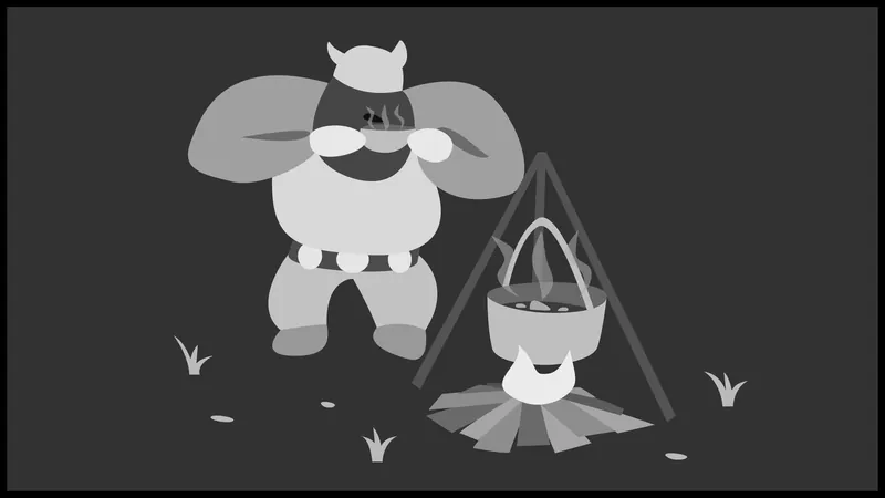
4. The making of the giant
[The entire process has been documented on a board, check it out to see what were the steps of making this character: Trello. It might not load all the history, so you might need to click on the "Show all history" text at the bottom of the page (after it loads up a portion of the timeline, and you scroll to the end). Have included numerous comments, to explain some of the design decisions (e.g., why a particular piece was changed); which would be far too much to go over with!]
Last November, after finishing the sky-dome for the "predecessor" of this project, have decided to move on and start working on the first model for the game. Back then, it was supposed to be a simple minion that runs from point A to point B, in several lanes; while the player actively tried to whack them with a stick (sort of). The initial concept was to create a creature that is old and is on its four limbs (because originally there was supposed to be numerous ones, all with different attributes and speed, thus being old fit the bill perfectly for a test subject). Or at least something that is showing the weight of age, not lastly because these creatures were supposed to carry resources on their back. Which made more sense that they would be hunching over. The initial block-outs were nothing that you see here; in fact they looked rather, how to put it, unconventional (looked more like a fat pig, with thick hooves). So instead of going with something that is crawling, the concept quickly shifted towards to an old person with a cane. Like what? An old tree with a cane? Mind you, it was just the block-out phase, but it really did not work. In fact a point came where all of it was scrapped, and started a new. In the video below, you will see some of the main steps of re-creating the model.
Link if video broken: https://www.youtube.com/watch?v=pzxLk2MR9FY
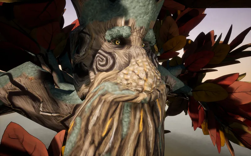
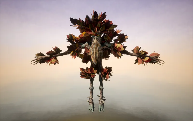
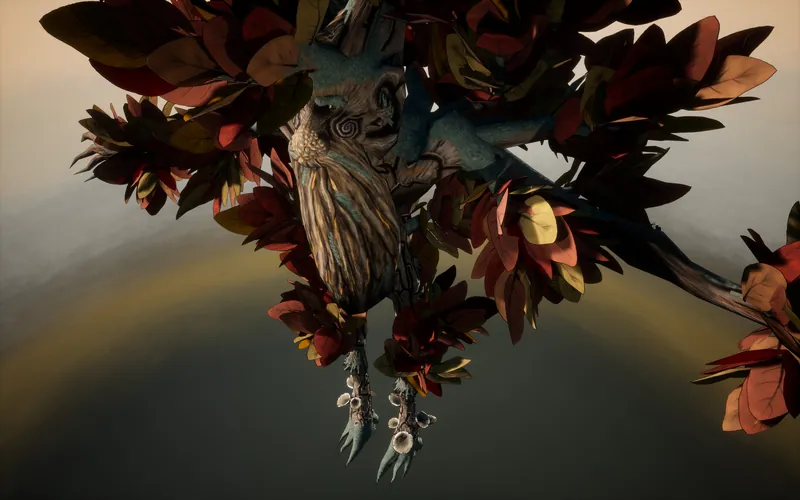
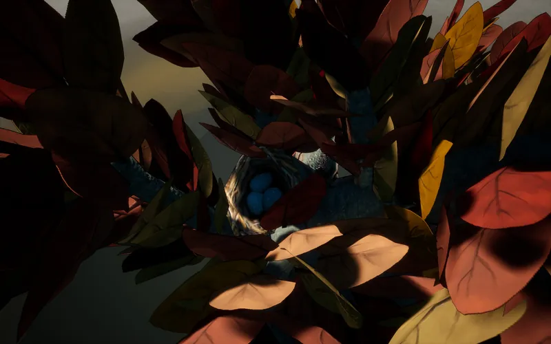
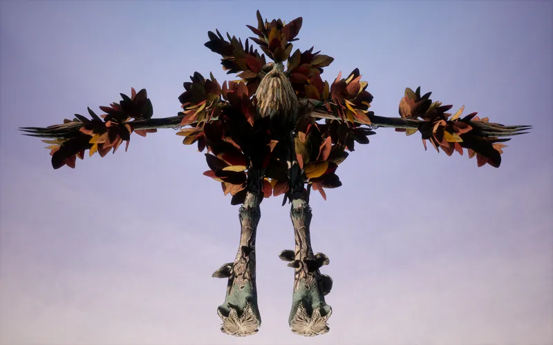
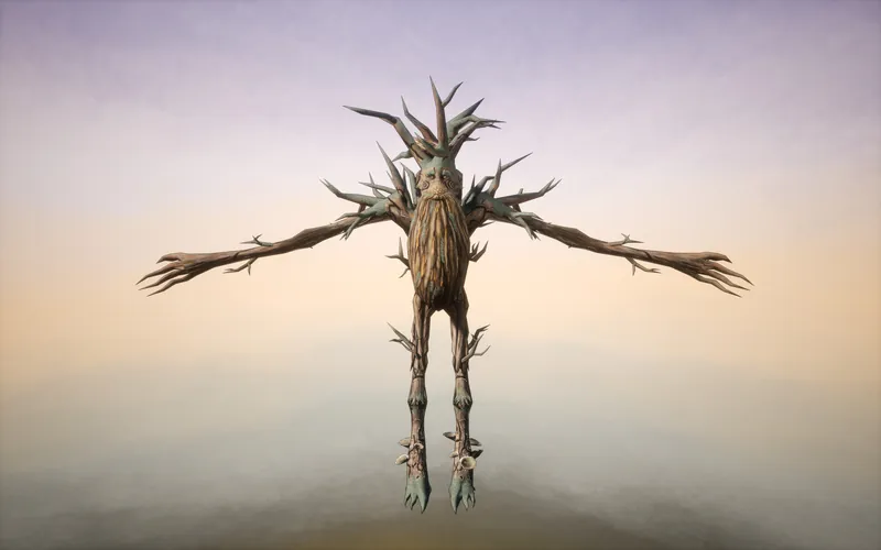
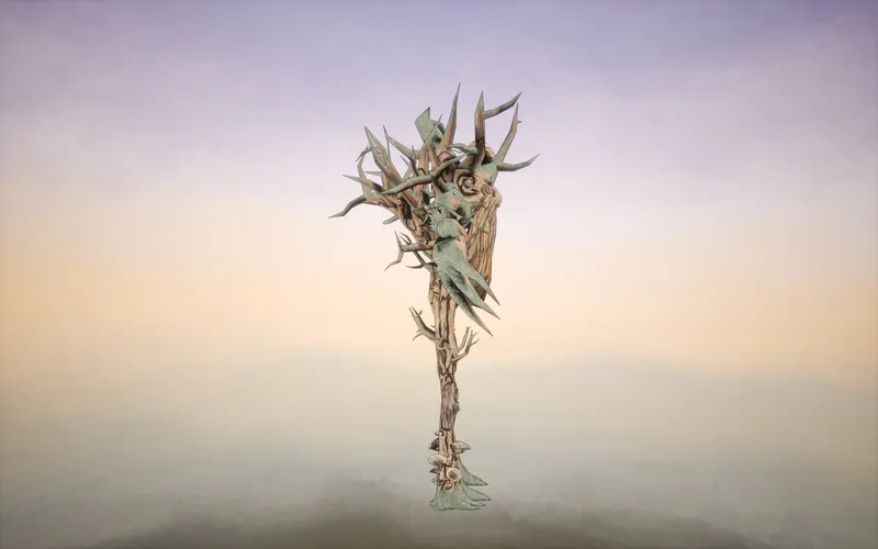
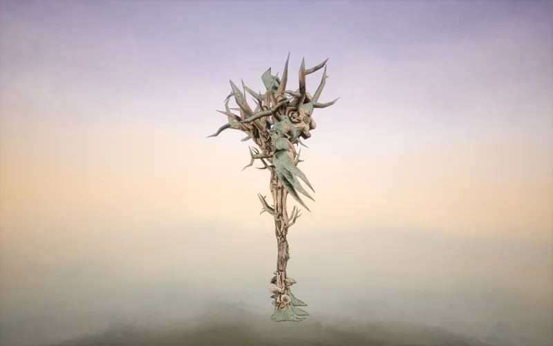
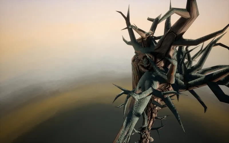
The time-lapse, from a bird's eye view, does not give justice to the fine details that were changed on the regular. Over and over. In fact, some of the design elements, such as the beard, changed midway painting or just before the release of this blog post (the color of the leaves were changed whilst writing this entry). Which was both a good and a risky thing to do, as both the UV layout and the already painted art was in place, and thus "technically" not movable. Usually would not have done such a thing, but because there was no concept art for this project, everything had to be made up on the fly (which again highlights the importance of good planning and prep work). Which put an immense pressure on me, as the outcome had to look exceptional by my standards, had to be consistent with the design and the style and above all (this is extremely important), had to look good enough for others take notice. Which translates to aiming for making AAA art as a solo developer (let me know if the mission has succeeded or not!). Solely because this is the only way of hoping (notice the word usage), that someone will take notice of the project (and see potential in it). [Barging in: Again, this comes from a business perspective. If it is good enough, that people will notice, which gives it an advantage over the sheer amount of games that are being released every day. This, it is immensely important to get it right.] That is why 65 days were spent from start to finish (averaging about 12hrs per day), going into excruciating details, in the name of presenting something that is worthwhile. Some work were reasonable, as a completely new approach was used and needed adjustments with that new brush technique, some were crucial (how to represent textures, color and light), while others were more of an artistic choice rather than necessity (e.g. how to show the bending of wood at the joints). Every inch of this model has been worked on for days/weeks and have been meticulously crafted, to bring forth the reality of a "living" tree (take notice in the forms for example, or the expression of the eyes). All that said, it was a challenge to not just figure out the details, but make it work on such large scale. Having done a fairly large amount of work over these past few months, has enabled me to have a better understanding of how to keep things consistent (because weeks and months can pass between parts of the model). Which in turn aided the production, as it is no longer a mountain to climb; despite the fact that this model has a "monstrous" two! 4096x4096 textures, which is gigantic to paint on with a ~10px wide brush.
You see, some of the time "nobody" was painting, because it was "time to solve problems". A lot of the time questions such as "How this fits together with this?" or "How this shape going to turn out?" or "What this material should look like?" came to be. A lot of these questions could have been mitigated by having the foresight (well to be fair, the experience, the visual experience that us) in predicting all the features of this creature; and how it all would fit together. The fact that only about 2 weeks were spent on modeling is quite the telling; which is also a blessing in disguise (in some ways), as filling the world with close-to-final assets is very much going to be a breeze this way (minus the painting of course). Which in turn aids the production as a whole as you can imagine. [A fun fact about the character is that it also has a simple mouth and some stone teeth, hidden underneath the beard, on the rare occasion that those would be missing otherwise (when the head is being animated).]
And now for the thing we all have been waiting for! The actual character in the flesh. Renders are made in engine; as in representative of the final product.
5. Roadmap
After the completion of the first champion, production will ramp up. Below are the short-to-medium term goals for the project that are also subject to change. [Worth to note that this is just a generalization for the development (also focusing on single player only for the time being), as there are plenty of smaller details to take care of (more boring yet crucial behind the scenes logic, etc.), which in some cases could get out of hand (e.g., performance optimization) and could take up a lot more time than anticipated. Also, the cycle of development tends to change whilst production, so have learnt over the years that nothing is set in stone, and one must be flexible in solving the problems and adjust accordingly.]
- First the character needs to be animated. It needs a handful of states, namely: idle, walk, running, primary attack (and variants for punching), secondary attack (and variants for stomping), tertiary attack (which is the main attraction of the show: throwing), and hit/damage, crouching and facial animations (with basic emotions: happiness, fear, anger, casual). Also thinking of adding in unique abilities (like planting seeds for units to grow), or states when say the tree is examining something (like lifting up a rotten log, in search for loot).
- Making a simple test level: Putting all this together and see it in motion (with correct camera work). That is where the concept will be first playable (it will be also shared on the product page on Itch.io) and will be released forwards until completion.
- Main level generation and basic architecture to support it (e.g. save games, simple menu system). This will probably include constructing models for the map, creating prefabs that the game will be able to use. It is undecided, at this point, whether those will be textured immediately, or not. Will depends on the complexity of the scene. As cobbling all this together will take a few weeks.
- Laying down the foundations for the "jungle". Creating zones, finalizing styles (Is it a forest, a desert, or a snow biome? – just as an example) and connecting those into one cohesive structure. Also, it is yet to be decided if these maps are traversable only by foot, or there will be methods for fast traveling.
- Refining the "jungle", completing the inner workings of the generation (e.g., making dungeons). And merging it with the main level (mission objectives, etc.).
- Crafting of additional units (such as the enemy giant), and implementing mission goals and AI routines. Guessing that this will take more time than just a few days, as the concept of operation has not been fully fledged out. As an example, it is not clear how a unit will respond to commands: How do they prioritize, what their perception reach is, etc. It will all come together when there are more than one unit on screen (which means a lot of dependencies to think of). Also, it remains how deep this AI routine will go for the time being.
- Implementing/developing combat mechanics for both the battlefield and the dungeons (like implementing the grab-a-unit mechanic or investigating objects). Fine-tuning the speed of said dungeons. Creating and implementing a user interface.
- Adding skills, new units, the ability to command, loot, upgrades, skill tree and balancing.
- Reaching a state where the game becomes truly playable, from start to finish.
Could list a lot more things do to, but it will all depend on how the project is progressing, or what difficulties the project is going to face. With that last big project of mine, making sure that everything runs smoothly, in a fairly-complex system, took the longest; because hunting for bugs took up a lot of precious time.
6. Closing words
As always, hoping that you enjoyed this small adventure, giving you a glimpse of what this project is all about. While admittedly there were parts that were somewhat boring (cannot help it, that is the nature of developing a game, as not all is super exciting) thought to include it all, to show the ins-and-outs of the process; in case you also wish to embark on the long journey! Furthermore, counting on that the mentality of bringing the best to the world has seeped through this blog entry, keeping up with the tradition, and solidified my intentions with this projects.
Also, excited to find out what others think about this project. It is not everyday you can tackle such things in the first place! So feel free to leave a comment or two, to let me know how you feel or what do you think should be added. And before leaving, updates will be more frequent from now on, as there will be more and more stuff to share; as outlined within the Roadmap.
Until then, take care and see you next time!
Useful links
Official page (releases, blogs, etc.): Itch.io
Official blog: Gamedev.net
Live dev board (documented): Trello
Twitter: @theaaronstory


wow you must be working hard on this it looks great im looking forward to it being published in the near future