Hello, and welcome to this weeks Dev Diary!
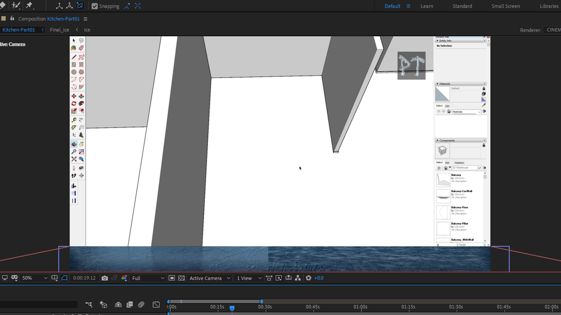
Unfortunately the video has been really slow in the making, as the After Effects seems to be bogged down more and more. The last weeks remedy worked for a while and the program hasn't crashed after that, but overall, it is still very slow to render anything, regardless of having GPU rendering enabled and every conceivable quality slider to the minimum. One thing that helped to speed things up a little bit was to disable most of the material settings from the video image behind the floor graphics. I might try out if it would be better to make most of the floor graphics on Photoshop first (instead of just the textures.
To depict how slow things are working right now, the rendering of a 20 second video clip took over 12 hours, most of it being a still image. Only part that would be considered and animation, was the fade-in effect of the floor and background image that lasted for 1 second.
The Results So Far
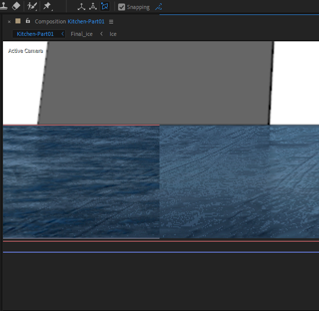
This is how the ice looks currently. On the left side is the clear ice, and right side is the ice with the frosting effect. These pictures were taken when the rendering quality was set to maximum settings. The darkness of the frost layer can be adjusted by how reflecting it is and I'll be fiddling more with it on this coming week to see, if I will use it at all. The frosting adds a nice amount of detail to the ice, but it might be too gritty for my liking at it's current form. Here's a closeup split-screen to show how the frosting effects the reflection.

Upcoming Steps
• Trying how adding a subtle fog layer looks on top of the ice.
As it would be great to have some realistic, atmospheric effect on the ice, I decided to try and make a 3D fog layer on the ice, which would hopefully increase the depth perception of the status bar.
• 3D texts for the "Now Playing" information.
I will try to make the icy 3D text with textures, with some common font style. Hopefully the fog effect will be compatible with 3D texts in such a tight space.
I just hope my computer can handle the burden this causes, as it is struggling even now. After this first version is ready, I will try and make a better one with Blender sometime in the future and see if that would be faster at rendering all the layers. After this video is ready though, I will start making the Mobile title, as mentioned earlier - that haven't changed.
But for now, this is it for this weeks Dev Diary! thank you for tuning in and I'll see you next week ![]()
You can check out every possible mid week announcements about the project on these official channels;
• YouTube • Facebook • Twitter • Discord • Reddit • Pinterest • SoundCloud • LinkedIn •


