Hello again and welcome to this weeks Dev Diary!
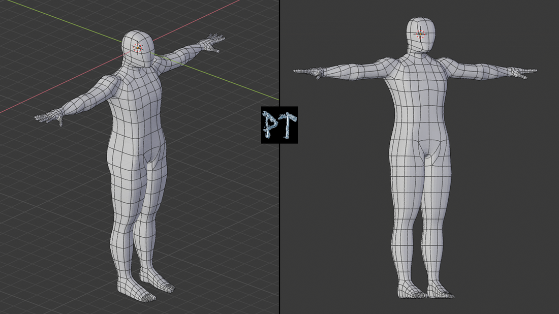
Today I will show you my Template for all the characters of the game and a picture from the main menu as it looks now. But first, say hello to Mr. "Bare Man"!
The model was done using YouTube tutorial and the reason the model is so bulky and unnatural, other than being a low polygon model, is to leave some editing room for several differing body types, a nice middle-ground, so to say. I will also try sculpting to finish the model, but for now, all the test versions will be using this model as-is as a placeholder for the main character, until further notice.
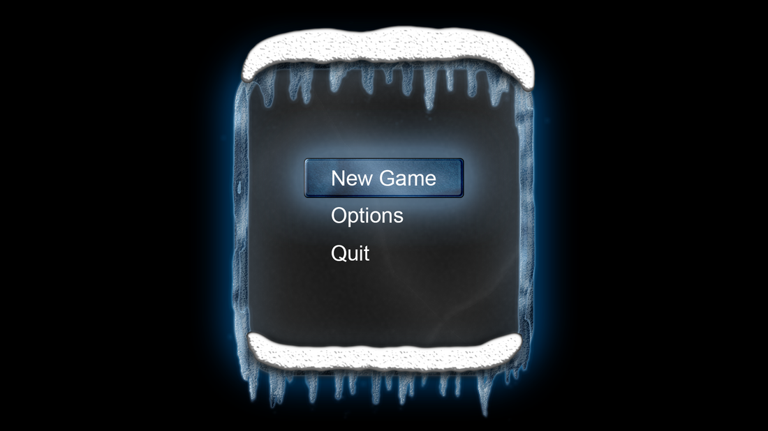
The Main Menu
Currently the main menu looks way better with the snow than in the previous showcase picture - I managed to get the snow look a bit more natural, but still I'm not completely happy with end result, I'm starting to feel like I'm succumbing to the same error as many game devs - that is, trying to have perfect results while in early development. But for now, this is fine enough at the current stage ![]()
Even though i managed to get more depth to the snow, it somehow feels too separate from the underlying picture. Also, the texture should be lighter in color, but I didn't manage to get it done before this Dev Diary was supposed to go Live. The way I did the snow this time, was selecting the entire area of snow and painting it pure white - I didn't use blur effects at any point. The current look is due to adding internal shadows and glow, as well as bezels and satin properties. The outlines were modified by hand to make it look more uneven and bit more natural than a ready made effect. Still, it looks kinda pasty at times. because of the way it is shaped, almost like someone squeezed it out of a tube or something. I have a couple of ideas on how to fix that, but we'll see if anything comes of it.
I also added a little more detail to the underlying/internal cracks, so they look more pronounced.
The Story Elements
Since I can't talk in too much detail on how I have progressed on this aspect, I can only say that I have been fiddling with various different ideas for months now and the last two weeks I made some mind-maps to help me visualize the various aspects I have thought up could fit in the game - and to see, if they really could fit in the game. Turns out, that many of my ideas are more fit for an RPG, than a horror game, which is probably the dearest genre for me personally - especially the open world RPG games, like Skyrim, Kingdom Come: Deliverance and the Witcher 3. More dear to me is survival RPG, especially the sandboxy ones, like 7 Days to Die - which is one inspiration for me to someday make a huge world map with plenty to discover and build.
But for now, back to the topic of this current game. I have given it some serious thought, and it seems, that to keep it simple with this first title might play better with a horror title. I will still try and make the story as deep as I wish it to be, but that is why I need to make several games, that are more or less connected to the same universe as this horror game. So you can expect a lot of teasers about future projects in this game, even though it might not be obvious which ones are the teaser elements ![]()
That is it for this weeks Dev Diary and I will see you on the next one!
You can keep your self up-to-date about the project on these official channels;
• YouTube
• Facebook
• Twitter
• Discord
• Reddit
• Pinterest
• SoundCloud
• LinkedIn


