Hello there, welcome the 18th edition of your favourite weekly update! ?
Last week was really intense. A lot of things were going on at once, so without any further ado, let's cut to the chase!
Pieces of equipment
First, there's now pieces of equipment in the game.
Players can now stumble upon t-shirts, runnings shoes, gloves and baseball caps during their run.
Here's a picture of pieces of equipment in malls:

In essence, pieces of equipment give the player unitary stat bonuses (things like +1 or +3) when worn.
Pieces of equipment can also have a focus alignment: when worn by the player, his focus will be progressively pulled towards its focus alignment. There'll also be additional stats bonuses (and even capacities) when his focus is aligned with a piece of equipment.
This means that managing your equipment is critical to have a good run.
The player can hold different kinds (or slots if you want) of pieces of equipment. These are:
- Headware (caps, hats and whatnot);
- Neckwear(necklaces, neck chains, etc.)
- Chestwear (T-shirts, chest plates and so on);
- Handwear (Gloves, rings, etc.;);
- Footwear (boots, shoes and whatnot).
The player can only hold one piece of equipment per slot. He can, however, replace his equipment by simply grabbing another one.
GUI refactored
Second, I've also done a big GUI overall.
Although often forgotten by both gamers and developers, the GUI has an important role in games: they are often the primary way for games to tell their player critical pieces of information like their current health, money or current stats.
The GUI was actually a copy-paste from the game's previous iteration with Lemur and JMonkeyEngine. With this refactoring, I've tried to use Unity's GUI components at their fullest.
I personally think I've cut the mustard with this one.
Status Screen
Let's take a look at the status tab of the pause menu:
.png.8c9b50ef6a4be12a8e0aba043eb3c728.png)
As you can see, everything was kinda bare. There were no ways to tell where everything was, and quite frankly it was all over the place.
Here's a look at the newly redesigned one:
.png.e46023eade6aa74a46f6dea7fed8075c.png)
Now that's prettier! Things are nicely labelled, aligned and positioned. There are even components that were previously hidden, like the Relics section and the Focus section.
There's even an Equipment section, along with a new Item section.
Also, the status screen is more interactive than ever before! Some components have tooltips, showing useful things like name, description and many more.
Relics
Let's take a closer look at the relic section:
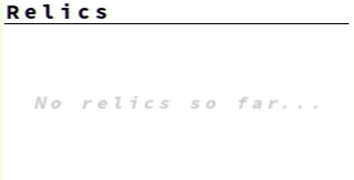
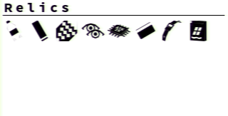
This is where all collected relics go. If no relics were collected yet, a placeholder text is displayed. Each relic is displayed using a nice pictogram from my custom Open Type font.
As a bonus, the section is scrollable. This means that if there's a whole lot of relics the view can be truncated and controlled using a scrollbar.
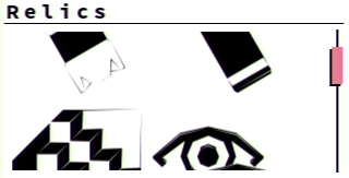
(Keep in mind that I've enlarged the icons sizes to show the scroll bar)
Equipment
The display is quite simple: it's a minimal silhouette of a human body.
Each equipment slots are placed according to their type (e.x. the headwear is on the head, etc.)
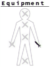
When a slot is empty, a pale "X" is displayed.
Otherwise, a glyph representing the grabbed piece of equipment is displayed.
Each of these has tooltips attached to them, showing the pieces' name, description and quality.
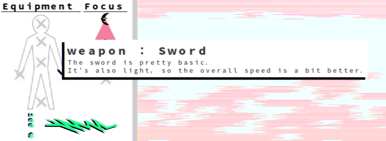
Focus

This is a barycentric coordinate component rendered as a triangle representing the player's focus.
The only thing new is that it's now properly aligned and labelled...
(Now look how happy it is with its proper title!)
Item

This component shows the currently hold activatable item.
Not unlike equipment slots, having no held activatable items yields a pale "X".
It also has a tooltip displaying the item's name and description.

Foods
Previously, foods timers were rather obnoxious: their timers were displayed right in the middle of the screen. If many foods were eaten at once then all their timers would overlap.

Now, food timers are properly displayed with tooltips.
When the player eats a food item it will place itself to the right of the pause menu in a vertical stack.

This is not unlike how Minecraft deals with its potions effects.

Once a food timer runs out, the component is removed.
Dialogue box
Previously, dialogue boxes were of static sizes. They were really big with a whole lot of empty space everywhere.
Now that I use Unity's GUI layout at their fullest, dialogue boxes can be resized according to their content. Gone are the static sizes!
Here's how it looked before:
As you can see, there was a lot of wasted space. It also arbitrarily breaks its text for no other reason than to keep its dimensions.
And now look at the new one:
Now there's almost no wasted space. Everything fits snuggly now and feels more believable.
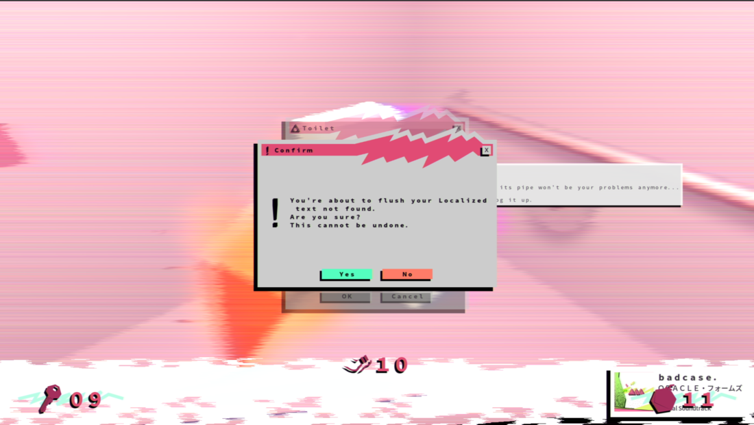
Restroom
I've previously added a restroom room but it wasn't functional yet...
With the inclusion of pieces of equipment, the toilet can now fulfil its role as intended.
The idea is that the player can discard one of his equipment by flushing it down the drain. The toilet will obviously clog afterwards, as generally speaking toilets aren't made for this kind of stuff, making it a one-time use. Flushed pieces won't appear later on in landfills so this is permanent.
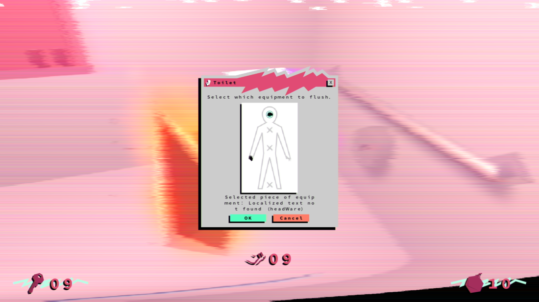
Here's a look at its dialogue box:
Within the dialogue there are some similar components to those used in the pause menu's Equipment section, but with a twist.
Each of these components acts as toggles (or radio toggles if you want). When the player chooses one of his equipment to flush a visual queue is displayed within.
Below that, there's a bit of text that indicates which piece is currently selected.
After everything is said and done the player can then click the "OK" button at the bottom of the box.
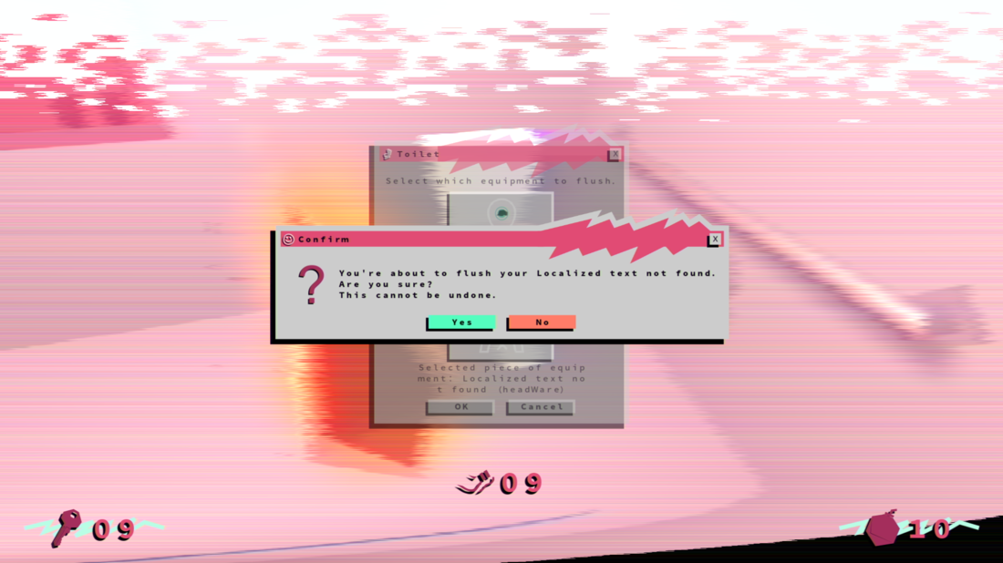
This will spawn a confirmation popup:
The player can then just confirm everything by pressing "yes", after which the equipment is flushed and the toilet is clogged.
Minor Updates
- Random collectables are now chosen by asserting how much the player needs a particular collectable:
- We then can do a luck test to see if the player actually gets to have what he needs or not:
- Yes, this is cruel for some, but also rewarding to others.
- We then can do a luck test to see if the player actually gets to have what he needs or not:
- Fixed some shader stuff;
- Optimized the GUI (Dhu ??
- Previously I wanted to reuse dialogue boxes. This was however kind of hard and cumbersome, especially for dialogue boxes that were rarely used at all:
- It was also a pain to deal with this with the Restroom's dialogue (because the whole process uses TWO boxes).
- Previously I wanted to reuse dialogue boxes. This was however kind of hard and cumbersome, especially for dialogue boxes that were rarely used at all:
- Abstracted GUI window controller classes:
- Horray for abstraction! ?
- Re-added the Clothes Mall, which was removed due to lack of equipment;
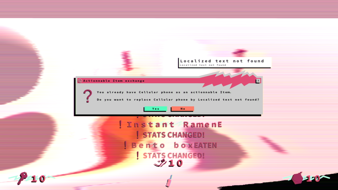
- Added a bunch of placeholder notification everywhere:
- These would be polished later on.
- foreshadowing??? ?
- These would be polished later on.
- Added a whole lot of localized text:
- Now begone "Localized text not found"! ?
New Music
I've also had the time to compose some stuff during last week.
Take a look:
I'm not quite sure where to use this, even if I titled it as "Tutorial", I'm not even sure if there's gonna be one.
Next Week
Boy, this was a mouthful! But when it rains it pours, and this was really a necessary evil.
I doubt the next one would be as filled to the rim as last one.
However, there are still things to do. It ain't over till the fat lady sings.
I think I'll work on notifications next: They are in a dire need of polish.
I also need to continue the polishing of GUI: I didn't walk the whole nine yards.
Afterwards, it's the usual suspects: Rooms, Relics, Capacities, etc. But then again I have bigger fishes to fry. ?


