Hello again.
I haven't spent as much time as I would like on ToyMission.
I have been working on the main menu since the last Journal entry.
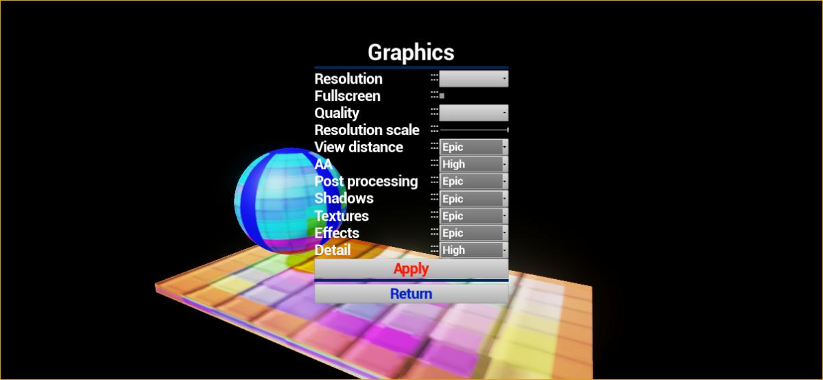
I spent a lot of time trying different ways of laying out the graphics options menu.
Vertical boxes, Multi tab groups.
I ended up using Horizontal boxes in Vertical boxes for the layout of the items so that each option is consistent in layout.
Applying the graphics settings with Blueprints is proving to be frustrating.
Mainly because BP do not (yet) have templates or a std::map, So I could not make a nice abstract way of handling the different console commands to change the Engine Scalability.
So I am going to create some C++ functions to handle the engine scalability for me where each option does not require a small hill of different variables for book keeping.
I need to find a way of enlarging the size of the check box (It's the tiny square used for the full screen option), Or making my own UMG widget for the check box.
The default combo box (string) that comes with UMG hase text that is tiny AND cannot be resized ![]() , So it requires you to create a widget with a background and text to get text that is big enough to easily read.
, So it requires you to create a widget with a background and text to get text that is big enough to easily read.
I now need to add some tool tips to each option.
Here is a screenshot of how the graphics options menu currently looks.
I want to change the font and add some textures for a border.
I plan on having some more ingame screenshots for next time, I will probably have to use FRAPS to record a short piece of gameplay to find a nice screenshot.
I also have a map with the ball and some lights in that I am working on for a splash screen or banner.
Thanks for reading.
That's all for now.


I have to admit, one of the things that always drives me nuts when doing GUI using an editor like Unreal or Unity is just how terrible the UI support is. I constantly get annoyed with Unity with little things like when all I want to do is have 3 buttons evenly spaced apart vertically. I guess I'm totally spoiled by XAML and WinForms.