Hi,
First note that I'm not professional, these are only my personal opinions.
What I like:
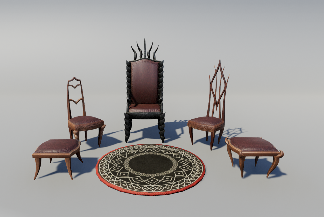
- Lamps from first post, there are some nice shape there and I also like the crystal material
- Window and colored glass
- Combination of cloth and crates
What I would change:
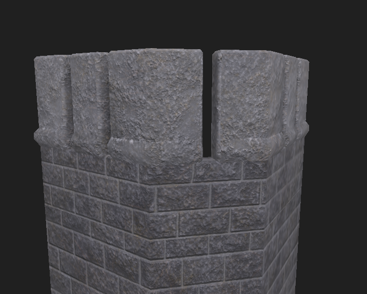
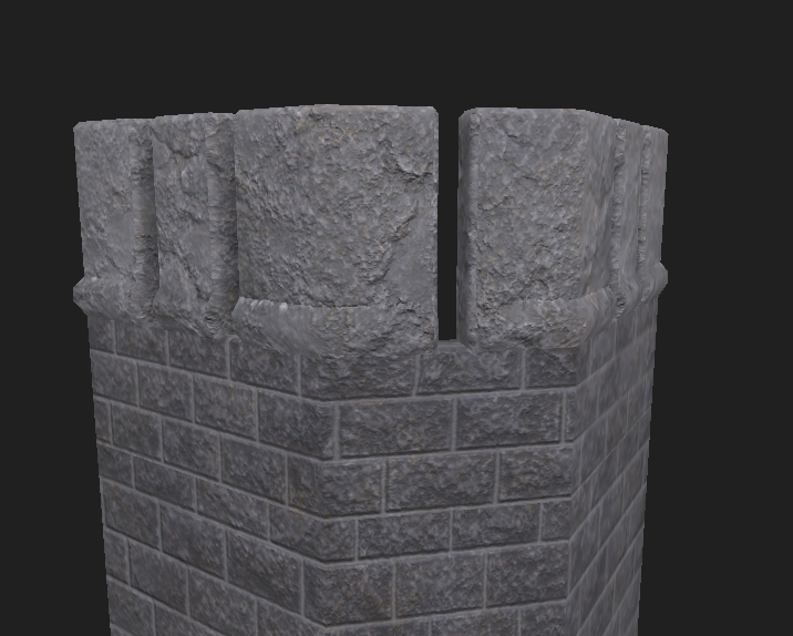
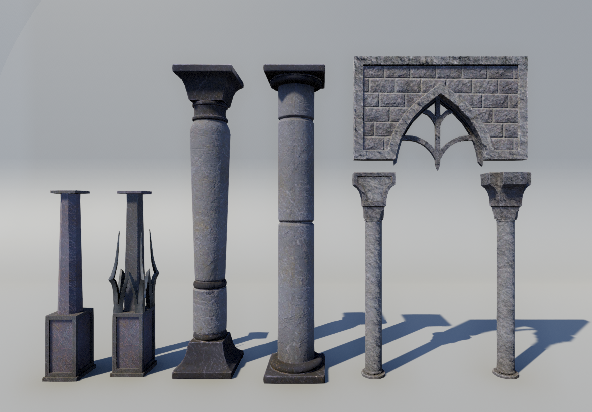
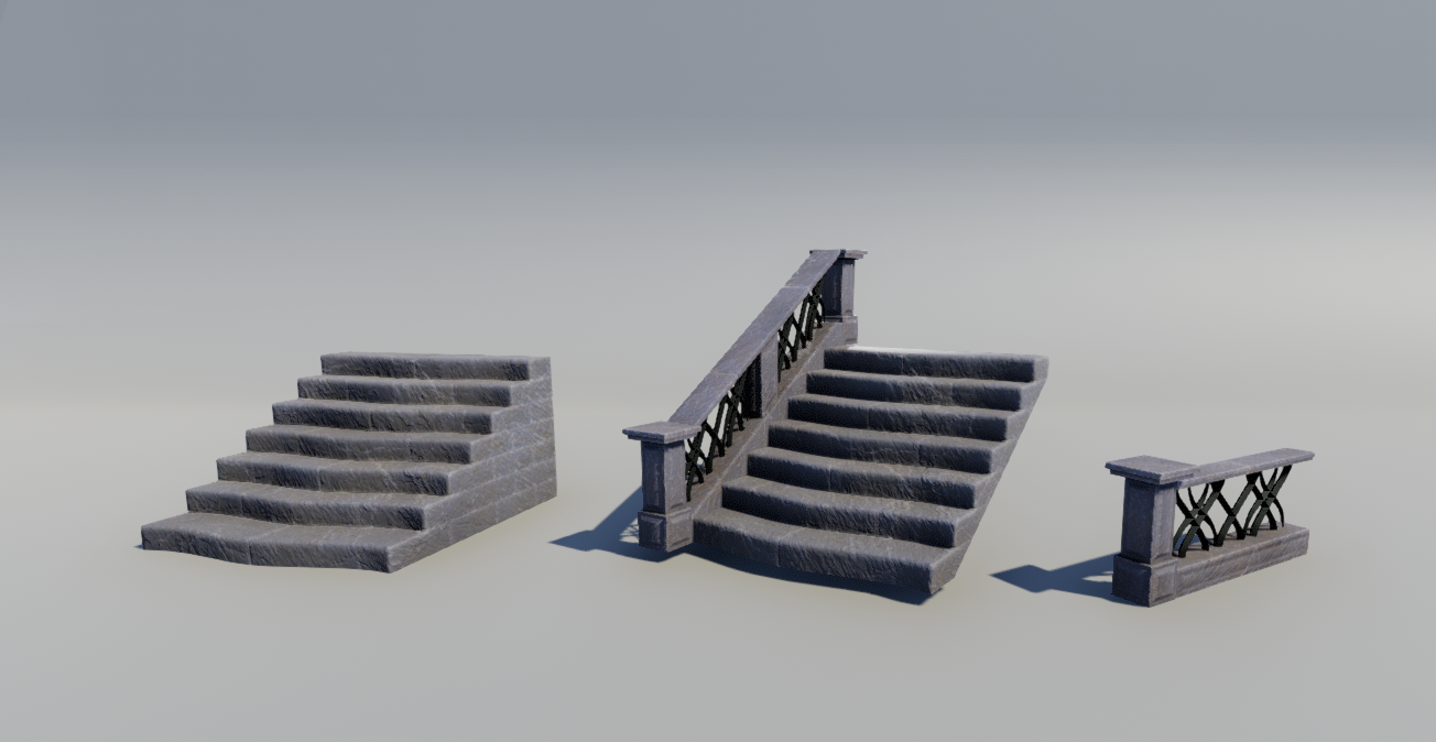
- Symmetry and repetitiveness. In real life nothing is perfect. Even if the building is planned to be symmetrical you can break it with lighting or adding additional details (dirt, damage, props, decals).
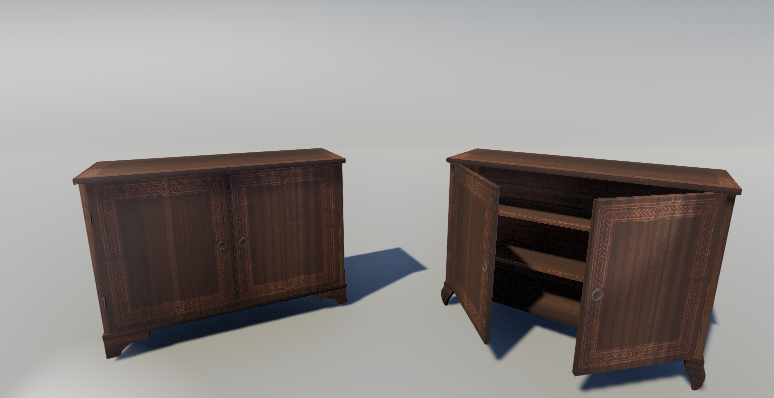
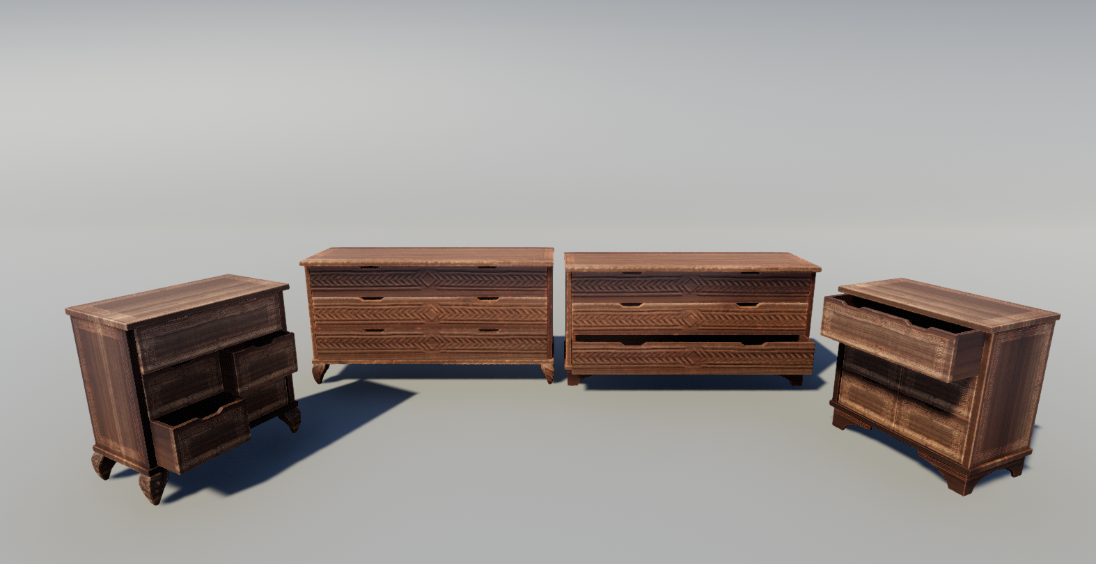
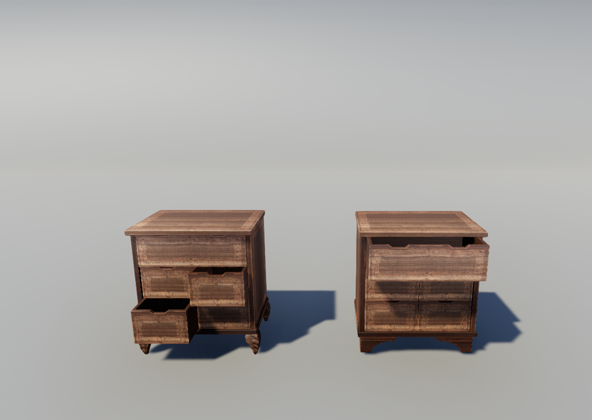
- Use of ornaments. Check some real life ornament work and steal ideas. Ornaments have meaning if you want to use them you should understand at least some aspect. If you are using shapes from nature you should apply rules from nature to them.
- Story and realism: even if it's fantasy thinking about what is there and why can give you ideas. Two example:
Lamps from post 1: the bases of some lamps are too small, in real life those lamps would be unstable. This is not a mistake but might give you some tip on how to design the shape.
Castle: what is inside and what is the function of the building parts? Thinking about this can also give some hint. Like are there two floors where the doors are? There can't be two where the gate is, behind that one would expect a large hall or something. If the window parts are separate then they can be hallways I would guess but I still feel like the outer look allow really small spaces inside the building compered to what I would think behind a gate like that.
-Translucency: I really like your crystal material but in the bottom of the picture where there are more and you see a crystal through another it becomes super bright which ruins the effect. If you stick to translucency I would try to avoid situations where this can happen.
Anyway keep up the good work. I also use blender for environment asset creation nice to see that more and more people use blender. .)