Advertisement

Need feedback for game introduction video

Started by March 18, 2018 12:45 AM
12 comments, last by Kai Keeper 6 years, 9 months ago

I finished this game a while ago, now I'm trying to make an introduction video before I put it on Steam, looking for feedback.

I have already got some feedback from other people, and this is what they felt or some of the things I think the video doesn't do a good job:

1. I don't understand the core concept of the game. I think another video that explains the core concept of this game would be better.
2. I feel that the video was too long, it showed way too many features.
 

If you feel the same way, please let me know. If you have any other suggestions/feedback please don't hold back.

8 hours ago, Kai Keeper said:

I finished this game a while ago, now I'm trying to make an introduction video before I put it on Steam, looking for feedback.

I have already got some feedback from other people, and this is what they felt or some of the things I think the video doesn't do a good job:

1. I don't understand the core concept of the game. I think another video that explains the core concept of this game would be better.
2. I feel that the video was too long, it showed way too many features.
 

If you feel the same way, please let me know. If you have any other suggestions/feedback please don't hold back.

I see what you mean, you can make the trailer shorter and maybe ad some of your favorite things in the trailer and use some text frames for a few seconds, so you wont have the whole thing gameplay :)

Advertisement
2 hours ago, TwinklyLucasK said:

I see what you mean, you can make the trailer shorter and maybe ad some of your favorite things in the trailer and use some text frames for a few seconds, so you wont have the whole thing gameplay :)

Yeah I was thinking about the same thing man!!! thanks for the feedback :)

Yes just explain the main goal instead of every single feature. This is more a tutorial video which is useful too but serve a different purpose. Give us a bit info about a story. Who you are why you are here and what is your goal. 

Stéphane L'Abbé, owner
www.GONINTERACTIVE.com Third Encounter Of A Kind
25 minutes ago, Gon'Interactive said:

Yes just explain the main goal instead of every single feature. This is more a tutorial video which is useful too but serve a different purpose. Give us a bit info about a story. Who you are why you are here and what is your goal. 

You mean introduce the story more instead of every single feature? Yeah, I think most trailer videos are like that. Maybe I should do that + show the core concept(the space connector) just a little. Then in another video I can give a more detailed explanation.

Yes exactly, I want to understand what's the point of the game what's the story before entering in the details. If the trailer is interesting enough they will then invest time in discovering the feature. The core feature are essential to get a bit of the main gameplay concept. It's a very hard task to produce a good trailer. Good luck

Stéphane L'Abbé, owner
www.GONINTERACTIVE.com Third Encounter Of A Kind
Advertisement

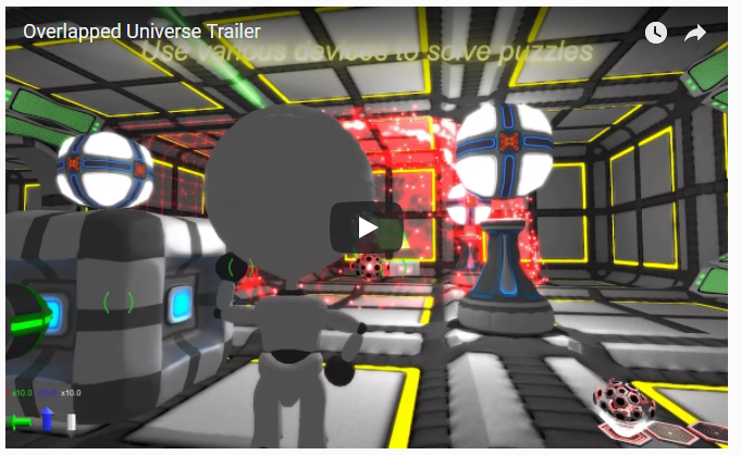
Aside from the refining the content of your trailer, the yellow text at the top of the screen is not clear enough.

Your game is very colorful! It looks like fireworks, as such people will not read your video's text.

Make it stand out more.

Either put it on a blank transition screen (without the gameplay footage) . Or make the text move &  transition.

Or, use a font with an outline to make it stand out from your colourful game play.

https://www.google.de/search?biw=1280&bih=893&tbm=isch&sa=1&ei=LhGwWvCEHMq2kwWYppjgCQ&q=font+with++outline&oq=font+with++outline&gs_l=psy-ab.3..0l5j0i7i30k1l3j0i7i5i30k1l2.164717.164717.0.164873.1.1.0.0.0.0.80.80.1.1.0....0...1c.1.64.psy-ab..0.1.79....0.4xFWovkM96E

Whatever you do, do not put a "fadey" "glowy" font over all of those soft and colourful particle effects.

Can you easily read the yellow text below? Can you make the second word out at all?

This is especially problematic, if it's important instructional text.

image.png.c32ad4475e909ac45402d022d32a335a.png

My Oculus Rift Game: RaiderV

My Android VR games: Time-Rider& Dozer Driver

My browser game: Vitrage - A game of stained glass

My android games : Enemies of the Crown & Killer Bees

Yeah, actually I had the same problem for the in game UI system. I really like addition blending, it looks cool, but in the end the user can't see the elements clearly so I changed them to alpha blending(or faded to a black background if I used addition blending UI elements).
Funny how I totally forgot about this when I made this video :P
Thanks man.

Also, just using the default fonts is not enough. A font with an outline will do wonders for readability as it always contrasts with the background, regardless the colour scheme.

As your graphics very colourful and highly saturated (containing all RGB values), I highly recommend against the use of a solid colour font (even if it isn't blended).

Image result for outline fonts vs non outline

My Oculus Rift Game: RaiderV

My Android VR games: Time-Rider& Dozer Driver

My browser game: Vitrage - A game of stained glass

My android games : Enemies of the Crown & Killer Bees

Yeah I can see what you're saying, it would be still hard to read the text even if it is fully opaque because the background has too many colors in it and the text might get mixed up with the background.
Actually I do this for the interaction UI in game, the center of the text is always a light color and on the edge it fades to a dark color using alpha blend, creating somewhat of a "gradient outline". It's just that I totally forgot about this during the making of the video :P

This topic is closed to new replies.

Advertisement