 It's kinda work in progress: overall shapes of letters are nailed, letters gonna get some more texture and background border is temporary, but I'd like to get other people's opinion on it. I'm going for that scary mood of simplicistic black & white, if you know what I mean (think Lionhead logo).
Do you like it? If not, why, and how could it be improved?
// Btw, I'm programmer not an artist...
Rate my "Bad Dreams" logo
Hi guys, I'm working on a logo for my one-men-production studio ;-) and here's what I got so far.
 It's kinda work in progress: overall shapes of letters are nailed, letters gonna get some more texture and background border is temporary, but I'd like to get other people's opinion on it. I'm going for that scary mood of simplicistic black & white, if you know what I mean (think Lionhead logo).
Do you like it? If not, why, and how could it be improved?
// Btw, I'm programmer not an artist...
I think you should keep it black and white, and the 'S' is really good.
I'm not sure if you're going for a cartoony feeling, but you are, then it's great.
Kinda reminds me of "The Nightmare Before Christmas."
I'm not sure if you're going for a cartoony feeling, but you are, then it's great.
Kinda reminds me of "The Nightmare Before Christmas."
Check out my devlog.
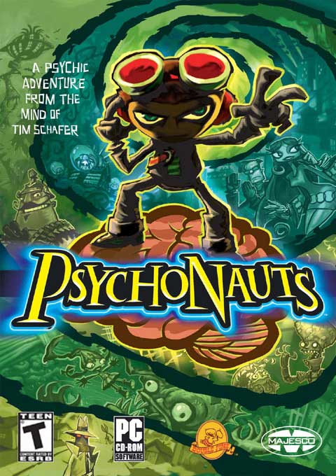
The locations and sizes of the letters seem a bit off. My eyes don't want to follow the letters of "Bad Dreams" in the right order. I think some coloring could help here too --- maybe something along the style of this logo:

....[size="1"]Brent Gunning
Barking_Mad: eyes - I had the same idea, but couldn't figure where and how to add them. But a pair of cruel eyes on one of the letters or in the background definitely will help.
blueapple - thx for the S, it took me quite a while to get it this way :-) Some sort of cartoonish feeling might be ok.
think_different - hmmm, to me positions look rather right, and if there's a tension inside (V shape), it was intended. Anyway, it's not final and I'll be moving things around here and there. Coloring: yes, you're right, now I think that adding some blue highlights around letters / little lightnings like in Blizzard logo would make it much better.
Thx for bouncing ideas :-) anyone else?
I think the M is too big - when you pronounce 'dreams', you hardly hear the m, so that's a bit counter-intuitive. The characters also point in all sort of directions, and combined with the 'v' shape of the words, it creates a chaotic result. For example, the lower part of the B and the a point in opposite directions - the B points at the D, the a at the a from dreams. It's not a natural flow. I think that's why it didn't immediatly click for me the first time I saw the logo. Also, the D looks more like a N. The r also has a different style than the other characters, with it's sharp corners.
Perhaps by combining the words with a visual depiction of 'bad' and 'dreams' the immediate impact can be better. Perhaps you can put the words inside a cartoony thought cloud, with some claws sticking out on either side of it, while also keeping the flow in mind?
Perhaps by combining the words with a visual depiction of 'bad' and 'dreams' the immediate impact can be better. Perhaps you can put the words inside a cartoony thought cloud, with some claws sticking out on either side of it, while also keeping the flow in mind?
Create-ivity - a game development blog Mouseover for more information.
Ok, I'm back online.
Captain P: thanks for oppinion, much appreciated :-)
dmwalles: yeah, but have you seen what did they done to Starcraft? And they didn't fix this "bug" even in second version! ;-)

Seriously though, most other letters aren't closed and I think that our minds are able to get real shape of letter despite the missing parts. Ie, you didn't complain that 'a' isn't closed :-)
Captain P: thanks for oppinion, much appreciated :-)
dmwalles: yeah, but have you seen what did they done to Starcraft? And they didn't fix this "bug" even in second version! ;-)

Seriously though, most other letters aren't closed and I think that our minds are able to get real shape of letter despite the missing parts. Ie, you didn't complain that 'a' isn't closed :-)
I like the letters but composition could be better, try moving the 'Bad' to the left side of the dreams. The top of 'd' and 'D' make a nice curve this way. And then it might be good idea to slightly change the color of either word to make it more readable.
Quote: Original post by KoshmaarWhat bug? It says STARCRAFT: BROOD WAR, plain as the eye can see. It reads perfectly fine. Your logo doesn't, you went too stylized, and the letters don't flow properly.
dmwalles: yeah, but have you seen what did they done to Starcraft? And they didn't fix this "bug" even in second version! ;-)
This topic is closed to new replies.
Advertisement
Popular Topics
Advertisement
Recommended Tutorials
Advertisement
