Hi, and welcome to the 18th Dev Diary! I honestly thought that this week was going to be all about the 3D texts, but as it happens, there seems to be always a surprise or two behind the corner when you least expect it.
a Forced Re-Design
I started watching some tutorials for how to make 3D text in After effects. After several hours of watching and doing after their teachings, I saw that the techniques didn't go well with the setting of my video, as the letters color was not shown correctly and they conflicted with the coloring layers that was used in floor versions 1 through 6. This was done to have a greater control over the color theme of the ice. But as it happened, the way I did it was not a good one.
After learning that making realistic 3D letters are very dependent on lighting and texturing, I needed better control over the camera angles. Prior V7, I didn't use any cameras, as that didn't seem t be necessary back then. After creating the Camera first time, the floor didn't align with the background anymore, and required re calibration. On top of that, as I tried to color the floor in a different way originally, the floor was in a bright gray tone. Hence, I needed to do the colors all over again and the 3D texts was not on the agenda anymore for time being.
An Opportunity in Disguise
As I'm still learning the ropes, it didn't really surprise me that much, that something would need to be re-done eventually - it only makes sense, that you can easily overlook something, when you are not as aware of how things should be done, as a more experienced user would do. Even with experience, mistakes will happen and as such, this is a learning experience.
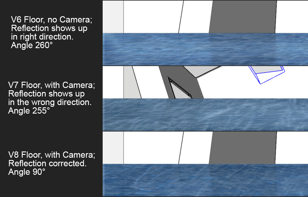
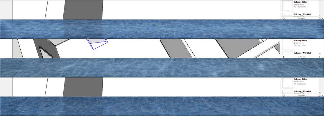
The above picture shows this also, as you can see - the V6 and and V7 floors seem much more squashed than the V8 floor and if look closely, you can see the Bump map is much more visible in the V8 (the bottom one). The whole texture is not visible, as it extends beyond the screen boundaries, but this goes to show, that the high resolution textures have more detail to them, when they are not forced in a very small space, like with the V6 and V7.

I also needed to play with the angles of the floor, as for some reason, when I added the Camera to my Composition, the reflection on the ice started to show up in a wrong direction. Fortunately flipping the floor to 90° fixed this issue. Weird how the reflections were working correctly before adding the camera, even though the floor was very close to the same degree before adding it.
One difference to before I stopped using the coloring layers for the ice, is that the Caustics settings have very different looking results now, that most of the color settings can be done through the "Caustics" effect. The reflections can be set to be much more sharper and clearer than before, for instance, allowing much greater degree of tuning them. After some more fine tuning the color and appearance of the caustics, I should be able to continue implementing the 3D texts to the video.
That's all from the last week, in a nutshell. Thank you for tuning in and I'll see you on the next one! ![]()
And as always, you can check out every possible mid week announcements about the project on these official channels;
• YouTube • Facebook • Twitter • Discord • Reddit • Pinterest • SoundCloud • LinkedIn •
