It's been a while since the last update so time for a bit of news.
Looking first at the game engine changes have been made to improve player movement with it now being possible to run or walk - when dodging traps running usually helps, but the player can reduce movement down to a crawl when trying to avoid falling off narrow walkways.
Next up was the introduction of more content into the game. The map is constantly expanding in size with the general approach being to have one 'story path' across the map with frequent branches allowing the player to discover additional puzzles and rewards. In addition I've been creating additional building components to add a bit of variety to the different zones around the map. Of most note is the creation of a set of modular components that can be combined to create 'Donkey Kong' towers (several towers linked together by walkways, lifts and so on). Finally, I've reintroduced creatures into the game - with the final game map taking shape it's been possible to add creatures to each zone and really test them as part of the proper game (rather than in a sandbox environment). As a result of this I'm currently fine-tuning the AI to improve navigation and ensure that creatures do not chase the player endlessly across the map (this either ends up with long streams of creatures all chasing the player or Lemming like behaviour where the AI can't cope with certain areas and the creatures take suicidal jumps off bits of scenery)
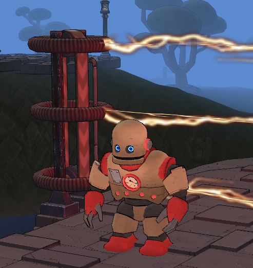
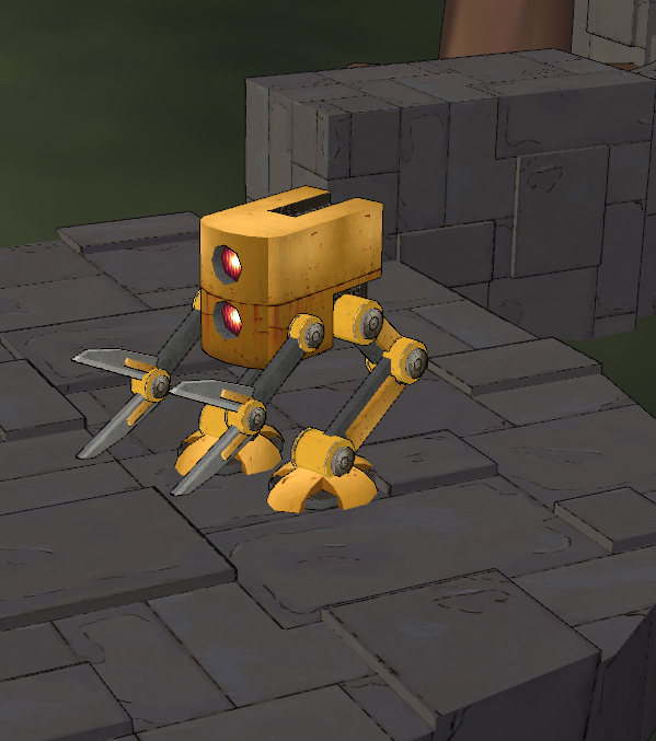
However, most attention has been placed on creating the character models. First step was creating the models themselves and for a while whatever I did just didn't seem right for the game. Eventually I came to the conclusion that the models were all too thin and tall - it was difficult to see the models clearly without zooming in too much and zooming in changed the feel of playing the game. Consequently I tried removing the knees/lower legs and wrists from models while bulking out the rest of the mesh a bit. Result is that the models are much more visible and to scale with the rest the game world.
Next step was the texturing ... as mentioned in a previous post this is not a strong point for me, but I've finally (and painfully) managed to get to a point where the textures are good enough and I can move onto other stuff ... for the moment.
Finally I've been working on the character animation. As the overall objective is to have a light and fun atmosphere to the game I'm over exaggerating the animation a bit with movement being slightly 'bouncy' ... at least compared to the more 'serious' games I've worked on in the past.


To give a couple of examples the screenshots above are of the main character (COG) and a Gardener (a low level creature the player will encounter in the early part of the game). The idea isn't to create Steampunk robots but slightly worn out robots that have built the Steampunk world around them. Both images are taken from in game - an additional problem I had when working on the texturing is that what looked okay in a 3D modelling app (typically something with 'busy' texturing) wouldn't look at all the same in game (where simpler texturing as shown here actually works better).
Feedback obviously welcome.


Everything looks good to me! Looking forward to more content.