Time for an update.
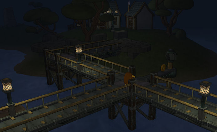
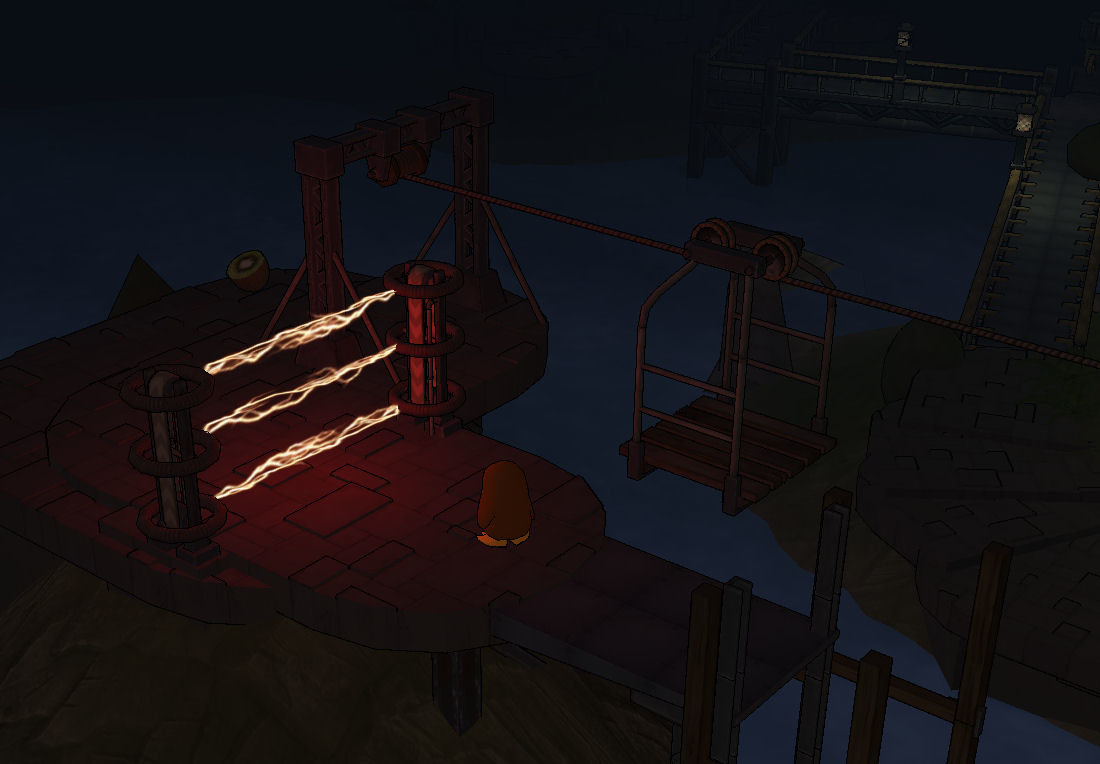
So what have I been working on in the last couple of weeks? Firstly the lighting and particle systems are activated. The particle system is pretty unintrusive with the most notable aspect being the chimney smoke rising from the different steampunk engines. Alongside this there is now a bit of splashing water and a few sparks flying around. Much more noticeable is the lighting system as demonstrated in the new screenshots. Here there is now a day / night cycle - I spent quite a long time making sure that the night was not too dark and I already have a game setting allowing this to be turned off (while this will lose a lot of the atmosphere just having day light slightly improves performance ... no other lights need to be active ... and maximises visibility). Introducing other lights was a bit more problematic than expected. Firstly, it took a while to get the light fall off fine-tuned correctly and secondly I upgraded the code quite a bit. Originally, the light manager would always choose the lights nearest to the player, meaning that a maximum of 7 lights (beyond the sunlight) could be active in any scene. Okay, but it did mean that more distant lights would suddenly flick on. The new logic activates lights nearest to each game object or map tile currently being drawn, allowing a much greater number of lights to be shown in any scene. In general the list of lights to activate are pre-calculated as each map section is loaded, with only lighting for moving objects being calculated on the fly. So far seems to be working nicely - if I overloaded a particular area with lights there could still be light pop-up, but with sensible level design this can be avoided. I did consider pre-baking the lighting but with the day/night cycle and the desire to alter light intensity and even colour on the fly this was going to be too complex and the performance of the current solution seems to be very good.
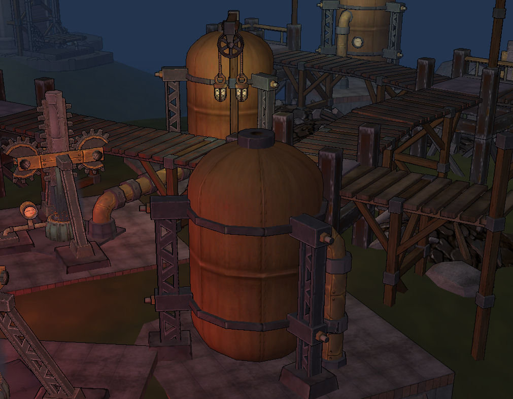
The other task I've been working on is the introduction of two new map zones. The objective was to introduce something distinct from what had been done so far and to this end I have been working on a wilderness and an industrial zone. And the wilderness zone completely failed to work. It's a beginner zone so there wasn't any intention to overload it with complex gameplay, but even so it's just empty and uninteresting - back to the drawing board on that one. As for the industrial zone this one is going better. There are a number of new models being used and a few more to add with a couple of objectives in mind. First off the aim is to create a little bit the confusion of a steampunk factory - pipes, big machines, smoke and steam. Secondly, to hint at the down side of (steampunk) industrialisation with the texturing more grimy and even the addition of waste stacks (handily blocking off the player's progression requiring them to navigate their way round more carefully). An early draft is shown in the screenshot below - the ground texturing needs to be changed with green grass needing to be replaced by rock and sand and I will also be working on the lighting and fog - to draw in the view and create a darker scene even in the middle of the day. The scene may be a bit too busy at the moment, but I will see how I feel once these changes are made.

Hope the update was interesting - as before any feedback most welcome.


