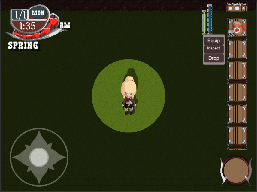
Our first Improvement was an Item tag system. Each color represents a Grade. (F = Red, D = Yellow, C = Green, B = Cyan, A = Blue, S = Pink) These are place holder colors but they don't look to bad.
.gif.997ce53361f2a967b998f755865d5bde.gif)
Second We have a new Item interface. which is accesses with a double click. It dynamically populates the options based on the Item, E.G for a tool or seed the item would equip it to your hand. If the item was consumable, the buttons label would read "Eat" and it would be consumed instead of equipped.

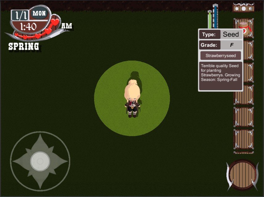
and Finally the Item information Panel.

Like it, hate it? Let me know in the comments below.
—Brua-1589.