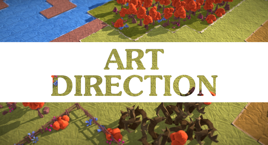
"Paper" please
When Epistory was just in the shape of a playable prototype, we were just finishing a serious game on 1st world war. Despite the seriousness of the theme, the Art Direction of this project was really cute, showing flat scrapbooking characters and paper styled interfaces.
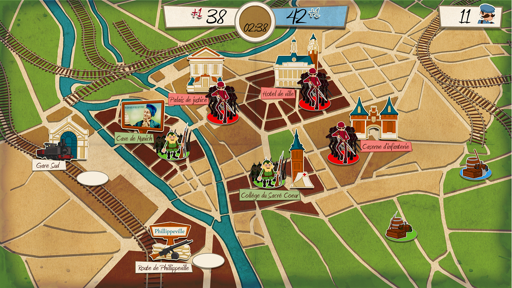
Our game about 1st world war. Notice the "scrapbooking" art style !
We really enjoyed making all the game assets with this look, but couldn't push the style beyond the limits. Then Epistory came within our grasp: "A muse lost into a writer's mind, creating the world as he imagine the story, fighting against the blank page fear" ? Hell yeah ! We immediately saw that we could continue with the paper style thing, but pushing it a lot further into a full 3D game !
Art "right" Direction
We first started to look for interesting references and we made moodboards with it.
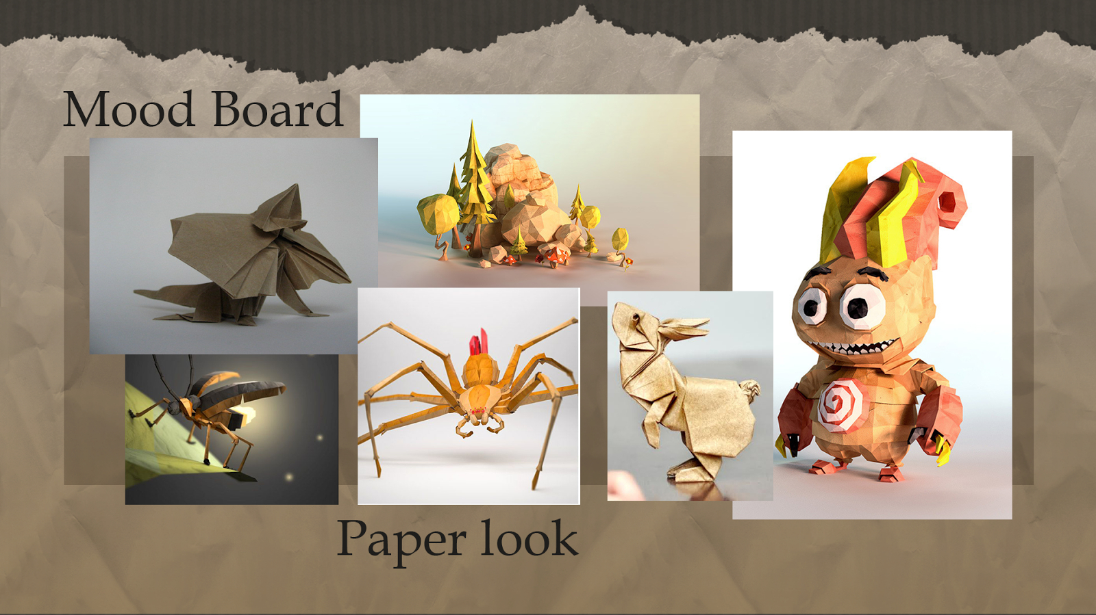
Some of our "papercraft" styled references
We quickly noticed that the scrapbooking style couldn't be enough. Despite the 2D movements of the avatar, we had to make full 3D environments, and relying only on 2D paper collages would appear flat and boring. We decided to go for a more "papercraft" approach, with some additional elements taken from the origami techniques.
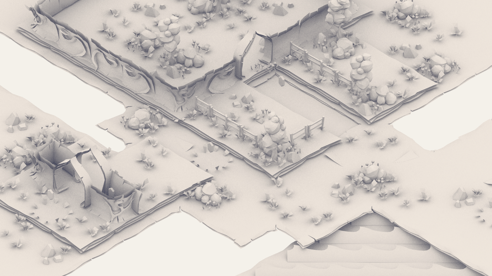
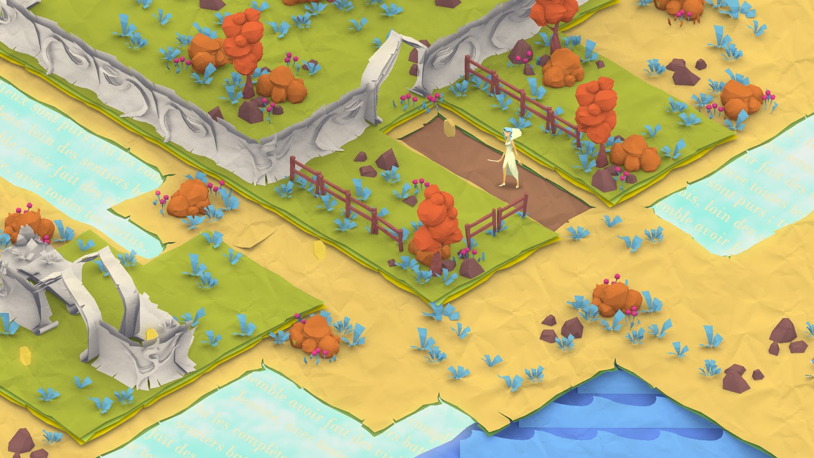
First 3D test to see what we could do with those papercrafting/origami techniques. Once we defined the shapes, we worked on a basic colored layout.
Paper pot
After testing differents approaches we ended up with a mix of different paper techniques:
> Scrapbooking for the environments ground tiles:
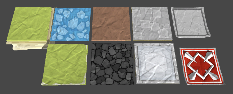
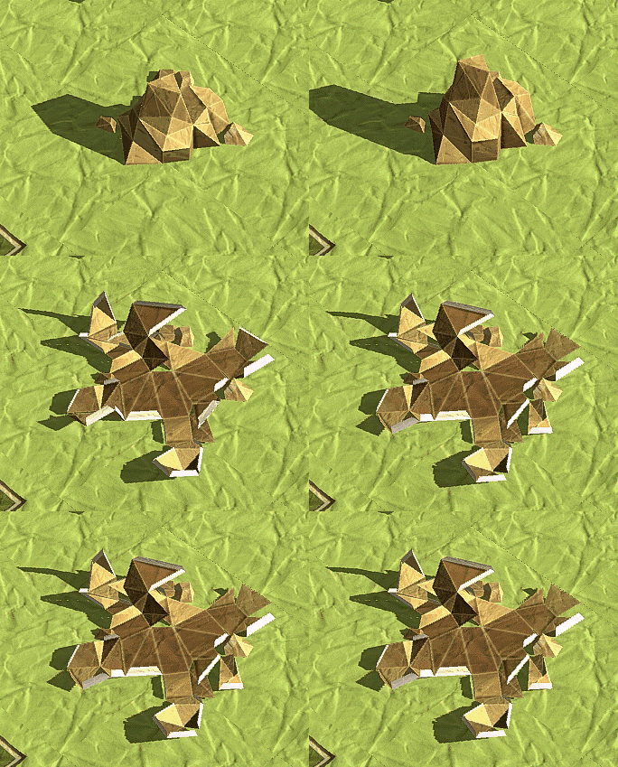
> Folded paper for texts and logos:

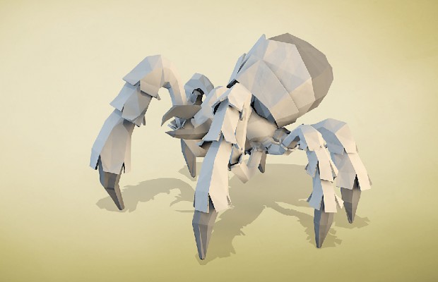
Once we had chosen the path of paper, all the assets had to stick with it, even special effects and particle systems ! We made "folded paper" styled textures, and used almost no alpha or additive techniques. It was complicated at first to find elemental paper styled effects to replace "classic video game effects", but once we did the first ones we just had to stick to the technique.
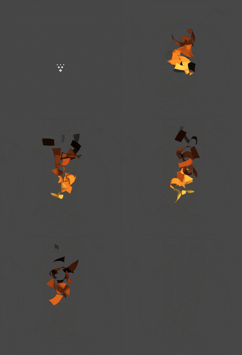
Fire effect without using the classic additive method, only with plain opaque paper sheets !
"Crapbooking"
The major drawback of this Art Direction is that it is often difficult to create assets "looking like paper" but with a non realistic look. We wanted to keep things cartoonish, with strong shapes and colorful
environments, but when you have to make a style of paper you can find in real life, the risk is to end up with a great but too realistic asset. The difficulty is to make believable paper looking assets, but still looking cartoon... It's an everyday fight to maintain consistency between the assets, but
the challenge is motivating and we believe the final visuals of the game will make it really unique !



Wow, I just love the style. The fire is especially cute.