[size="5"]Painting angels on the head of a pin
[size="5"]
Key Chapter Questions
- What are some key restrictions placed on art for mobile devices?
- How can screen size and resolution affect a game's visual design?
- What art asset requirements are associated with different mobile devices?
- What are some effective character design techniques used by mobile game artists?
- What are the benefits and disadvantages of 2D vs. 3D for a mobile game? You might think that art crammed onto a screen smaller than your hand is not much to speak of--but with a bit of innovation and some practical tips and tricks, the art in a mobile game can turn out to be quite dynamic and engaging. With the advent of more screen real estate, greater color depth, and expanded memory with an eye toward capturing video and photos, mobile devices are fully capable of delivering a visually delightful game experience.
[size="5"]Art for Mobile
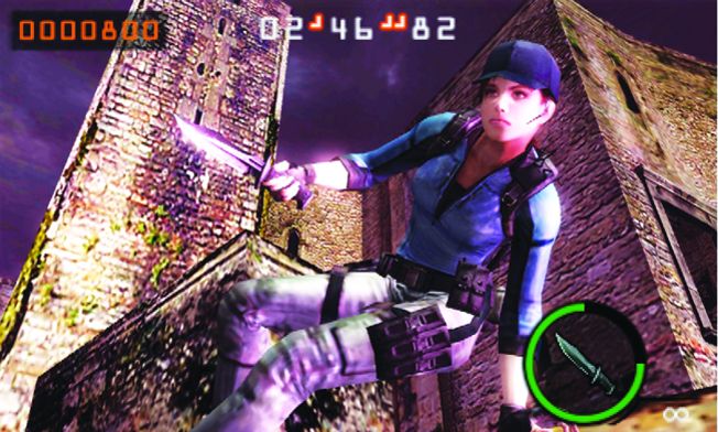
[color="black"][size="2"]Art for mobile games derives from the same "old school" roots as art for more modern PC and console titles. Back when games were being pushed to mobile, scale and scope restrictions made the days of the Atari 2600 look positively epic by comparison. Two-color LCD screens the size of a thumb, memory restrictions, load requirements: These problems had been solved before, but they represented brand new ways of thinking to the current crop of game developers. The visuals, much like early classic games, were often generated programmatically rather than developed by an artist. In fact, many of the early mobile titles were direct knockoffs of classics such as Caterpillar and Tetris--games already associated with tight restrictions that served as examples of "what to do" as this new market began to take off. As mobile games grew more powerful (with photo and video capabilities, music, and larger and more dynamic color screens), they were able to grow and adapt with equal speed--rapidly expanding into 3D and including social features such as leaderboards and player matching.[/color]Quality of art has clearly improved from older mobile games (Tetris Worlds, left, for GBA)
to newer games (Resident Evil: The Mercenaries, right, for 3DS)[size="1"]
Courtesy: THQ & Capcom
There is a tendency, particularly among those who are technologically inclined, to focus on the new and nifty--to focus only on the highest end systems available. With thousands of mobile units in the marketplace that are either older or equipped with different features, there are many potential customers that developers would ignore if they only paid attention to the newest devices. Considering the fact that many carriers still want that depth of coverage, developers ignoring these other devices are looking at a sea of lost potential. The advent of app stores that focus on a single technology and manufacturer has made it easy to pay attention to that one device. However, it is worth noting that the publishers (the companies that are making considerable profit on mobile games) still maintain a focus on carrier decks and creating versions of games that are playable on many different devices--not just the shiny new toys.
[size="3"]Standard Software
[color="black"][size="2"]A good copy of Photoshop can go a long way in game design; it has become the ubiquitous "do everything" program that nearly every game artist uses on a regular basis. However, while Photoshop may be superior for the task of creating and editing images for mobile, Equilibrium's DeBabelizer has the upper hand when it comes to file compression. For example, a file saved out of Photoshop as a .png can often be a kilobyte or two larger than a .png file saved out of DeBabelizer--and when it comes to mobile, every kilobyte counts![/color]
[color="black"][size="2"]For 3D, both Maya and 3ds Max will do the trick--since most programs and programmers are familiar with how they handle the data, and importing/exporting Max or Maya files to game engines or custom coded games is standard practice. There are less expensive options available as well--such as MilkShape, which is a popular tool among indie developers.[/color]
[size="3"]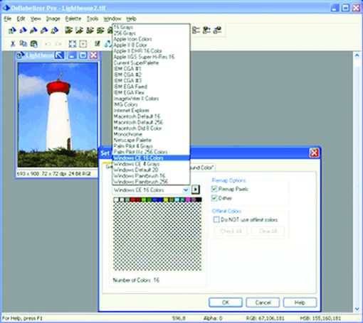
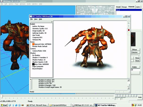
The 2D art tool, DeBabelizer (left), is superior to Photoshop when it comes to file compression--while
MilkShape (right) is an affordable alternative to the 3D standards, 3ds Max and Maya.
[size="1"]Courtesy: Equilibrium & [size="1"]Mete Ciragan, chUmbaLum sOft
Screen Sizes & Resolution Issues
[color="black"][size="2"]For mobile phones, there is no official overall standard when it comes to screen size--but as the industry has matured, manufacturers have begun to adopt similar parameters. However, screens associated with older devices are smaller with more variety and less standardization. On phones that are still more "phone" than PDA (which are still the most common units available), the current standard is around 176 x 220 with 12 pixels of that height being taken up by phone-centric elements (e.g., battery, signal)--leaving an effective screen space of 176 x 208. The newest generation of 3G and 4G mobile devices such as iOS- and Android-based phones and tablets not only possess larger screen resolutions (anywhere from 320 x 240 to1024 x 768), but this entire space is available for development. Take a look at the different styles of mobile devices shown in the images on the next page for a comparison of screen sizes.[/color]
[size="1"]Courtesy: LG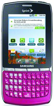
[size="1"]Courtesy: Samsung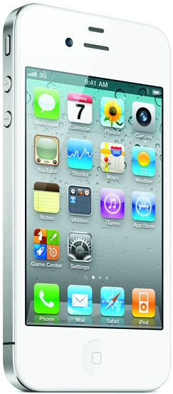
[size="1"]Courtesy: Apple Inc.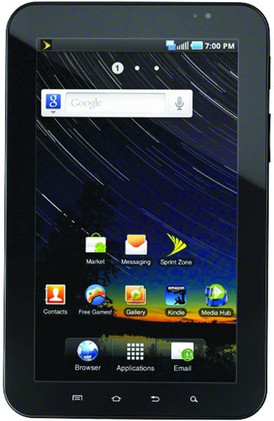
[size="1"]Courtesy: Samsung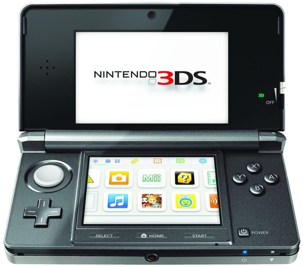
[size="1"]Courtesy: Nintendo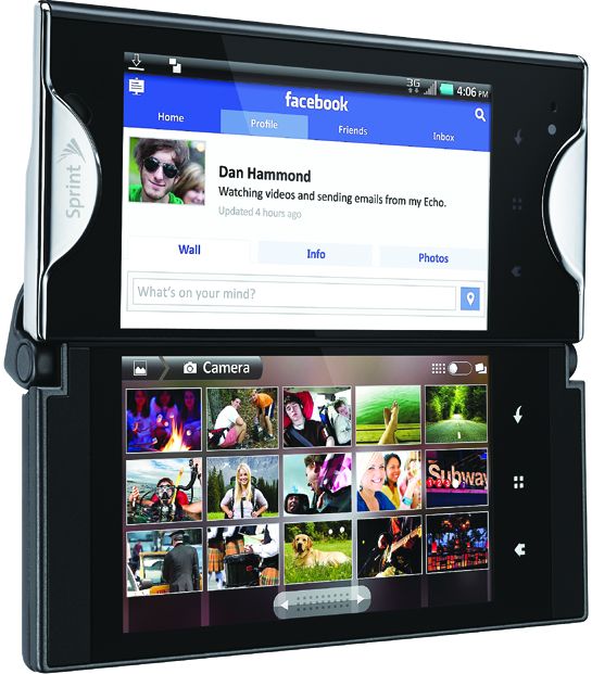
[size="1"]Courtesy: Kyocera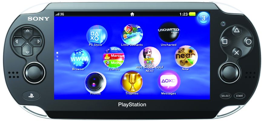
[size="1"]Courtesy: Sony Computer Entertainment AmericaMobile devices come in many different sizes. Devices shown above include the LG LX400, Samsung
Replenish, Apple iPhone 4, Samsung Galaxy Tab, 3DS, Kyocera Echo, and Sony PlayStation Vita.
[color="black"][size="2"]Even with the larger resolution, there are still extra considerations when it comes to the art and design aspects of a mobile title. In AAA console titles, it's all about the hyper-real--including photorealistic textures, skin tones, particle effects, shadows, and lip synching. Photorealistic graphics shrunk down to the size of a screen that is as small as the palm of a player's hand will be muddy and difficult to see; due to this, the screen size and resolution should play a major part in any decision regarding the visual look and feel of the game.[/color]
[bquote] Art certainly needs to be smaller and readable at high pixel densities. One of the reasons we like iOS is the quality of the displays on Apple devices. We can make small art that still really pops with detail.--Quinn Dunki (Chief Sarcasm Officer; One Girl, One Laptop Productions)[/bquote][size="3"]Visual Style
[color="black"][size="2"]Games cover a wide variety of possible visual styles; in fact, the overall look and feel of the game will set the tone and expectations for players before they even have a chance to read the title screen. Best practices suggest that the overall style should best match the game's genre (e.g., a noir look for a mystery game or a cartoony look for a carnival shooter). However, more often we see successful examples of games with visuals that clash with the gameplay--such as sword and sorcery games with a bright, cartoony palette or murder mysteries that are couched in a sunny suburban backdrop.[/color][attachment=6212:05-10 AssassinsCreedAlta?rsChronicles.jpg]
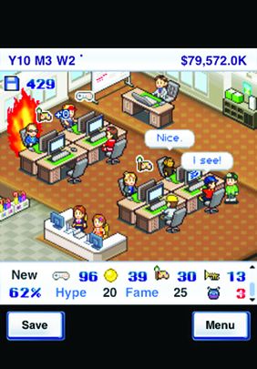
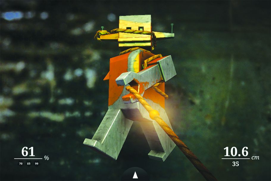
There are almost as many different visual styles as there are game genres. Examples shown here include Assassin's
Creed: Alta?r's Chronicles (left, for DS), Game Dev Story (center, for iPhone), and Zen Bound 2 (right, for iPad).
[size="1"]Courtesy: Ubisoft & [size="1"]Kairosoft Co., Ltd & [size="1"]Secret Exit
[hr]
Outwitters: Creating 2D Art for iOS
For our most recent iOS project, Outwitters, the characters and environments I've designed are simply being scaled by a certain percentage between iPhone, iPad, and retina sizes. The final asset generation has been automated with Photoshop scripts. I just make one file and prefix it with what kind of sizes I need spit out (e.g., iPhone, iPad, universal). The character designs in particular were created in vector format in the same way I used to create logos--periodically zooming way out to ensure that the important details would hold up at smaller sizes. Scale had to be determined for each device early on and double-checked for each character before anything was animated. The user interface (UI) between iPhone and iPad are designed separately, out of necessity. On iOS, screen sizes between phones are consistent--so we don't have to worry about accommodating weird, "red-headed step children" sizes. We just have to adjust the menus between phone and tablet.--Adam Stewart (Co-Owner, One Man Left Studios)
[hr]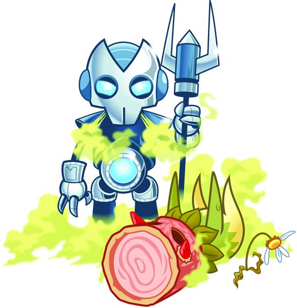
[size="1"]Courtesy: One Man Left
[size="5"]Character Design
[color="black"][size="2"]All games should have a memorable character--and we mean this in the broadest sense of the word. There should be a core element that sets a visual tone and style--whether it's a distinct character, an iconic game piece, or a significant recurring background component. The goal is for the player to see, instantly recognize, and identify with this element.[/color]
[size="3"] Silhouette
One of the precepts of character design both in traditional art (e.g., animation, fine art, comic books) and in games is the use of a strong silhouette. The game's main character or character class needs to be clearly recognizable against the game background, and it needs to stand out against the other characters in the scene. This is one of the reasons background or "filler" characters look somewhat generic in comparison to the hero of the scene. It is also a sure-fire way to help players identify one set of characters over another. Human beings are designed to recognize patterns; it's hard-wired into our brains. If members of the Bad Guy Squad wear hats with horns on them--and members of the Good Guy Squad have funny dome-shaped helmets--then it's a quick and easy task to tell them apart when the rockets are flying. Silhouettes are often based on bold, primary shapes (e.g., squares, triangles, circles), and each shape tends to evoke a certain idea--in part because we have already been trained by all media to recognize a certain silhouette as a powerful "hero" type, or a brick-like, impenetrable "warrior" type.
[color="black"][size="2"]Silhouette Check
[/color]
[color="black"][size="2"]A quick way to see if you have an effective design is to do what is called a "silhouette check." Shade your characters completely black and look to see if you can tell them apart just from the silhouette they show.[/color]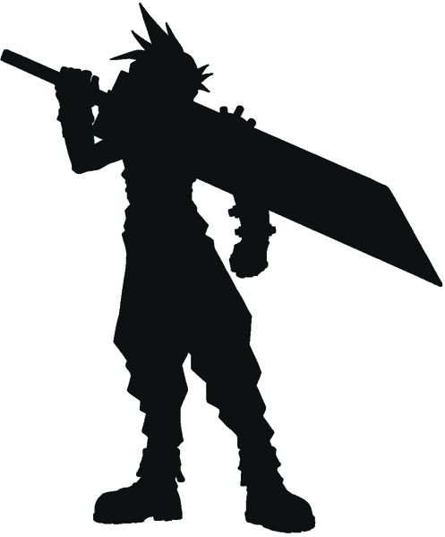
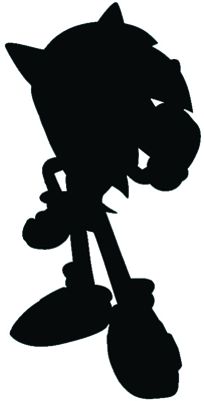
Do you recognize these characters by just looking at their silhouettes?
[size="1"]Courtesy: Square Enix & Sega
[color="black"][size="2"]When you have a strong silhouette to start with, it becomes a simpler thing to reduce that character down to a miniscule size while still maintaining those distinctive features that make them stand out from a distance. This is the reason the "bobblehead" character design is so popular on smaller screen sizes. Reducing the body down to a generalized stick figure, and focusing on the defining characteristics of the face, sets up a clearly recognizable form with which the player will be able to identify in an instant. The same goes for large-scale or exotic weaponry; visually distinctive elements such as the "buster" swords from the Final Fantasy franchise become part of that character silhouette and should be taken into account as such.[/color]
[size="3"] Color
[color="black"][size="2"]With the smallest screen sizes, having a distinctive silhouette simply isn't enough. There's barely enough room to determine one eight-pixel tall warrior from another. This is when the internal design of the character comes into play--such as using unified colors to represent a particular group of characters, or coloring the main character in a different palette than the rest of the world (e.g., placing a flaming orange t-shirt on a character when all the backgrounds have been colored in shades of blue). These design precepts can be applied to non-character elements that are important for players to observe and identify--such as vehicles, structures, props, spaceships, giant stone obelisks, or sliding puzzle pieces.[/color]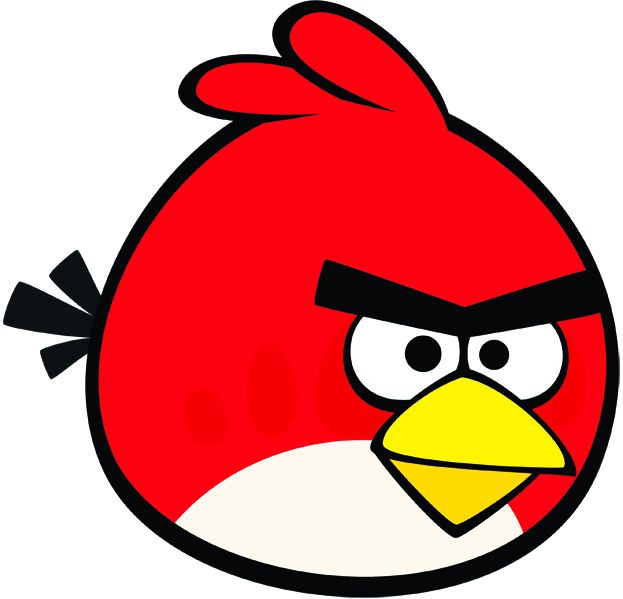
[size="1"]Courtesy: Rovio Ltd.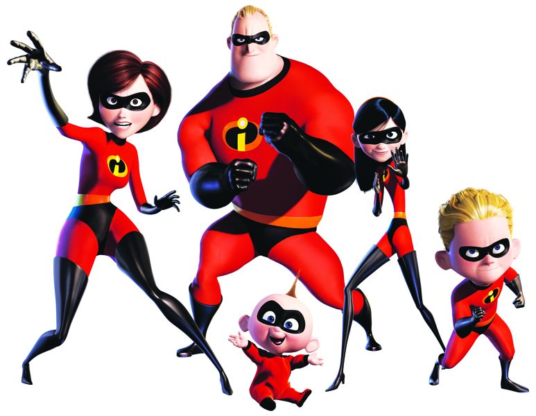
[size="1"]Courtesy: THQ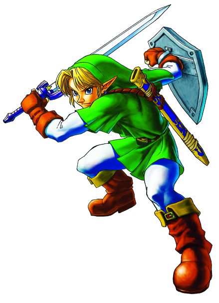
[size="1"]Courtesy: Nintendo
The color palette and costuming of game characters can often be as great an identifier as their overall body shapes and silhouettes (Angry Bird, The Incredibles, and Link, shown).
[size="5"]A Dimension's Worth of Difference
[color="black"][size="2"]The real distinction between 2D and 3D games is the programming that lies beneath--or the game's engine. In console and PC titles, the game engine comprises core bases of code that can be used to build a whole range of different games. In a 3D game, the code handles polygons--either created on the fly or imported from an extraneous program such as 3ds Max or Maya--while in a 2D game, it relies on sprites. (A sprite is a "cutout" image--whereas a polygon is an actual piece of geometry, defined by the placement of three corner points called vertices.) Even if the end result seems to be 2D, it is entirely possible that a 3D code base is being used; this might seem like a waste, but it has been and is still being done. Many times, the use of a 3D engine can allow designers greater freedom and flexibility than they might have with a 2D engine--not only within the confines of a single game, but as a production house as well. The 2.5D "hybrid child" (discussed on the following page) that is beloved by the role-playing game (RPG) genre is actually a function of the visual design rather than a defining characteristic of the underlying programming. In all cases, however, the graphics must be designed to take advantage of the strengths and weaknesses of each type of base code.[/color]
[size="3"] 2D
[color="black"][size="2"]Although 2D might be considered the "older" way of doing things, most games for mobile--particularly the older smart and feature phones--are built in 2D. In many cases, the graphics are entirely drawn and animated by the underlying programming. In the case of mid-grade to higher-end smartphones, the art is created separately by the artist. Flat, two-dimensional animated sprites are moved around on painted backgrounds. ("Flat" does not mean lifeless and stiff; in fact, there are a number of 2D games with spectacular painted or pre-rendered backgrounds and innovative gameplay.) An illusion of 3D depth is created by applying various perspective and parallax tricks, but the code underlying them is geared toward moving 2D animated elements around in the x/y axis only. Any illusion of depth is created in the art itself, rather than being handled by the programming.[/color]
[bquote]Speed is a feature. The advantage of 2D is that games are running at 60fps and faster--something harder to achieve with detailed 3D graphics. Smaller screens require instantly understandable user interfaces (UIs).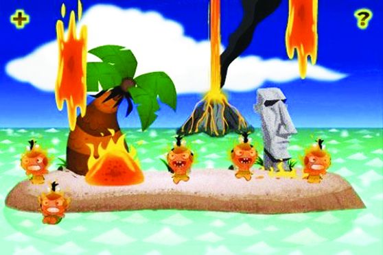
Simple parallaxing and creative visuals in games such as Pocket God
can give depth to a game without moving to a true 3D environment.
[size="1"]Courtesy: Bolt Creative--Chris Ulm (Chief Executive Officer; Appy Entertainment, Inc)[/bquote][size="3"]3D
[color="black"][size="2"]The rule of thumb has been that unless some aspect of 3D is needed to make the gameplay function, it's better to go with 2D. It's important to carefully consider the cost of a larger game size against the effect it will have on the gameplay of the mobile game. At the moment, 3D is reserved for leading edge smartphones with larger screen sizes. In 3D, there are several different solutions; for example, some games are technically 3D--using polygons to allow the movement of a 2D sprite in all three axes--but they still heavily employ painted 2D backgrounds and sprites. In the case of 3D, the programming has been designed to handle polygons and to work with an x, y and z axis space (rather than just the x and y axes of 2D). The polygons are either created by the programming or with their animations in another program and brought into the game engine, where they function very much like sprites; the programming slides them sideways, up, and down--but the animation (limbs moving, guns firing) is all created by the artist.[/color]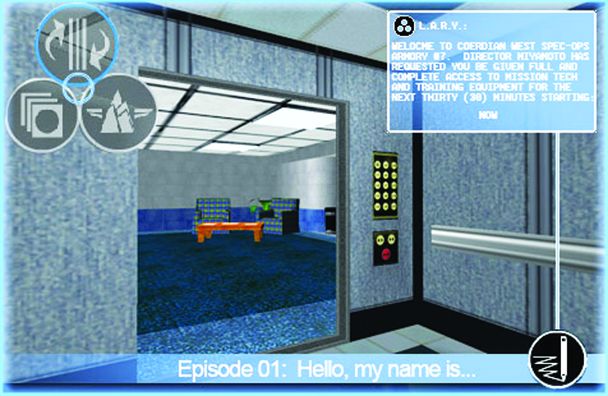
Games such as The Agiliste rely on 3D geometry to deliver a deeper visual experience.
[size="1"]Courtesy: Bushi-go, Inc.
[size="3"]2.5D
[color="black"][size="2"]Pseudo 3D[/color][color="black"][size="2"] or 2.5D is an old and established way of giving a 3D look and feel to what is essentially a 2D game. Especially popular in "sim" type farming games and "plate-spinning" style puzzlers, 2.5D involves backgrounds that have been painted in perspective and sprites that are scaled (sized up and down) by the underlying game programming in order to give the illusion of moving forward and backward in space. Now that smartphones are capable of full 3D, many games incorporate painted 2.5D backgrounds with animated 3D characters--or tiled 2D backgrounds with 3D animated characters--to help push the illusion even farther while still keeping file sizes to a minimum.[/color]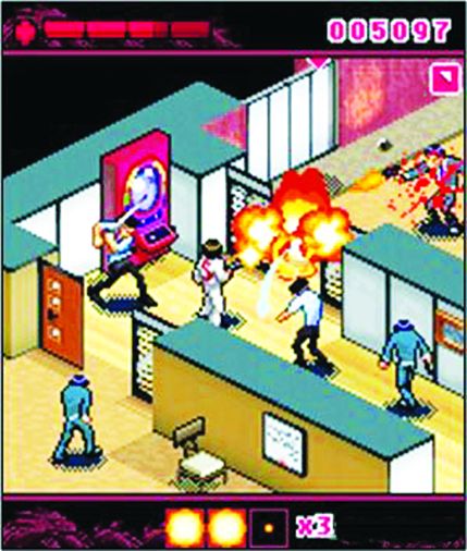
Pseudo 3D or 2.5D, used in games such as Mafia Wars: Yakuza, is an excellent
way to add depth to a game environment without pushing a game into true 3D.
[size="1"]Courtesy: Digital Chocolate, Inc.
[hr]
Layering Program Graphics & Art
[color="black"][size="2"]One area that doesn't get explored very often is the layering of program-generated art with painted 2D art and sprites which keeps the game size small while still allowing for larger gameplay areas. A good example of this is Digital Chocolate's 3D Beach Mini Golf--which uses programmed art for the backgrounds and animation associated with the waves, sky, sand, and green. However, more detailed elements such as golfers and mini golf obstacles were created as 2D sprites and have been layered on top of the programmed background art--which served to significantly reduce the size of the game while still giving a very effective, pseudo 3D look. Sometimes, the effect is reversed--and programmed game art is layered on top of painted 2D art to enable random generation of different elements. For example, in 3D Rollercoaster Rush, the tracks of the rollercoaster are generated by the underlying programming. There is no "right" way to create many of these games. Layering 2D, 3D, and programmatic elements can be effective ways of building the visuals in a game while still keeping the file sizes as small as possible.[/color]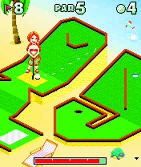
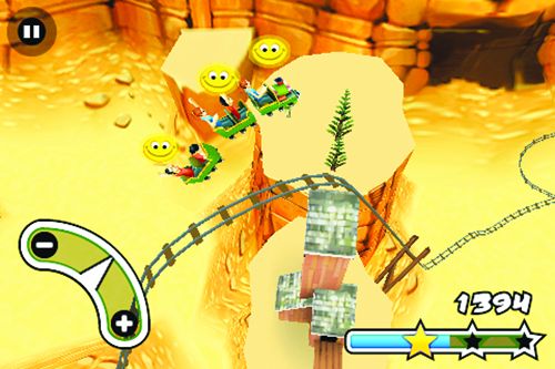
In 3D Beach Mini Golf (left), 2D characters and props are layered over programmed art backgrounds,
while in 3D Rollercoaster Rush (right), programmed art is layered over 2D art.
[size="1"]Courtesy: Digital Chocolate, Inc.
[hr]
[bquote]Why 3D?
I'm working on one project right now that is trying to push the limits of 3D rendering. In the case of mobile development, I sometimes think 2D or 2.5D is best--since having a truly 3D experience with the current technology can really impede other areas of the game (CPU power, performance, controls and playability) and create a game with a very large data size. While I appreciate the team's passion and drive to create something amazing, sometimes less is more. You have to draw a line in the sand to re-evaluate whether having 3D is really worth all of the costs and limitations placed on other parts of the game.--Nathan Madsen (Composer & Sound Designer, Madsen Studios LLC)[/bquote][bquote] "It's All About the Gameplay"
I've been in the game industry for so long that mobile art seems more like a throwback than a restriction. I actually like mobile art a lot; instead of sweating over graphic power and amazing shaders, it's all about the gameplay. In a small screen size, you can make things really pretty without having to go crazy on the poly count. Whether 3D or 2D, mobile gaming is about the experience--not full immersion.--Alex Bortoluzzi (Chief Executive Officer, Xoobis)[/bquote]
[size="5"]Pixel Art vs. Vector Graphics
[color="black"][size="2"]Pixel art[/color][color="black"][size="2"] is somewhat of a misnomer, since practically all still images are made up of pixels. Early game artists were referred to as "pixel painters" because their work consisted primarily of drawing characters and backgrounds pixel by pixel. As the memory available for graphics expanded, and the tools for drawing and painting digitally became more advanced, pixel painting has given way to more advanced techniques. With the advent of mobile games, however, a new market for an old skillset emerged--and the term "pixel art" stuck. The big problem with what is known as "pixel art" is that it's limited by the information contained in the pixels; "bitmap art" is more fitting. When the art is scaled up, the new space must be filled by a (somewhat sophisticated) guess: The program takes the existing pixels (e.g., a black and white pixel side by side) and averages out the color in a technique known as anti-aliasing to create the new pixels. The larger a bitmap image is scaled up, the blurrier it gets. However, this technique works well for reducing graphics down to their smallest possible size; manipulating the image on the pixel level, choosing which pixel to cut, and determining whether to make the pixel 80% black or 60% black will provide the greatest degree of control while minimizing the size of the game.[/color]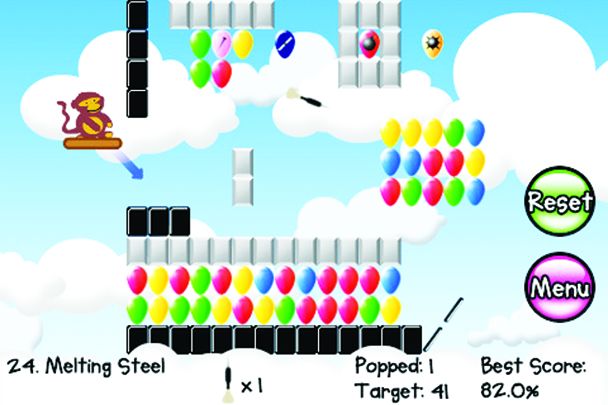
The smooth, vector-based 2D images in Bloons are scaled up and down to fit the screen--and they
can be pulled and used in print and web advertising for the game without a loss in quality.
[size="1"]Courtesy: Kiwi Ninja
[color="black"][size="2"]Vector graphics[/color][color="black"][size="2"] comprise entirely different types of images. In layman's terms, vector graphics are generated by a mathematical function or series of functions. Since the images are created on the fly by the program, based on a set of numbers, they can be scaled up and down with only a bare minimum of loss. Programs such as Flash and Illustrator use vector graphics to great effect for clean, easily scaled graphics for web and print use. Web-based games use vector graphics so heavily in part because the image file size is based on the vector file--not the size of the end graphic. This is a key component in many games developed using Flash for delivery on web and mobile platforms.[/color]
[color="black"][size="2"]As efficient as this all sounds, it is far more common in mobile for vector graphics to be used in the initial creation of the visuals, which are then rendered out into a bitmap or pixel-based format for use in a mobile game. Utilizing the original art as a vector file opens up a wealth of opportunities for the creation of high-end print, web, and broadcast marketing materials.[/color]
[bquote]User Your Space Wisely
As memory space continues to expand, there is a tendency to let best practices slip and file sizes bloat to fill the space. Artists and programmers should keep in mind that space is precious--and every bit wasted could have been used to add value to the game.[/bquote][size="3"]Palette Tricks
[color="black"][size="2"]Palettizing[/color][color="black"][size="2"] is perhaps the oldest trick in the book. Early game developers used it to reduce the file size for an entire level's worth of images, dramatically cutting down the information that needed to be stored within those files. The fewer individual colors available in any given image, the smaller the file size for that image. For example, an image with a 128-color palette is smaller than an image with a 256-color palette--and if the colors can be cut down to 32, 16 or even 8, a large amount of space will be saved.[/color]
full-color image, 549kb / 256-color image, 184kb / 32-color image, 92kb / 8-color image, 52kb
[size="1"]Courtesy: KU
full-color image, 549kb / 256-color image, 143kb / 32-color image, 86kb / 8-color image, 39kb
[size="1"]Courtesy: KU
Reducing the number of colors used to create an image also reduces the file size (top row). Hand-retouching images to consolidate colors as they are reduced in the palette can also help to reduce file size (bottom row).
[color="black"][size="2"]The images in the top row above show adjustments to the palette, allowing the program (Photoshop in this case) to handle all of the decision-making during this process. Note the big differences in file size as the palette is reduced to eight colors. Notice how the image gets more "speckled" as it is reduced to fewer and fewer colors? Each of these images reflects a reduction to a smaller palette directly from the original image; for example, the final image reflects a 24-bit color image that has been reduced to eight colors in a single action. [/color]
[color="black"][size="2"]Now for a little hand-retouching: A process known as walking down has been applied to the images in the bottom row. Starting with a single, 24-bit color image and reducing its number of colors results in a file size reduction but preserves some of the quality as well. Although this is a much more time-consuming method of adjusting images, the final product looks far superior. Adding the step of hand-retouching each image before reducing the palette results in a higher level of quality.[/color]
[color="black"][size="2"]This time, the change in file sizes occurs not only due to storing color data but location data; the file stores the location of each individual pixel and its color--but when those colors are consolidated, making the image more cartoony, the image doesn't have to save the color of all those pixels but the information for the entire swatch of color (which can be far less). This same trick can be applied to characters and other smaller sprites. In the case of animation sequences, an even greater decrease in file size can be achieved by combining all the animation frames into a single file with a single palette; this reduces the number of colors and the overall number of palettes that need to be saved.[/color]
[size="3"] Masking
[color="black"][size="2"]When mobile graphics are set up with an element of transparency, the end result is commonly referred to as masking--which involves trimming or blocking out areas of the bitmap that should not be visible--much like using masking tape to cover up parts of the wall you don't want to get paint on. While this may not seem like such a big deal at the outset, this technique is at the core of many visual tricks that can be used to enhance both 2D and 3D games without doing too much damage to the file size.[/color]
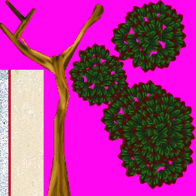
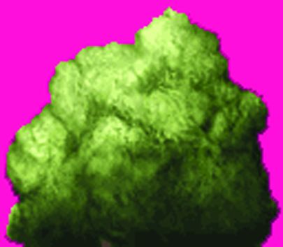
[color="black"][size="2"]There are two ways to handle the edges on a masked object; the method used will depend on the mobile device and associated programming. Older smartphones will be restricted to hard-edged, aliased masking. The instance in the accompanying image depicts a hard-edged mask; a stair-step effect results where the square pixel of the character's color backs up against the square pixel of the background color (which will ultimately be invisible). This is called aliasing--and the larger the image, the less noticeable the effect. However, for mobile games sizes as small as 8x8 pixels, this effect will be very noticeable and will help to define the end result of the art.[/color]The pink-colored portions of the above images will be transparent when they are used in the game.
Setting a rarely used color offsets the risk that your game will show false transparencies.[size="1"]Courtesy: KU
[color="black"][size="2"]The color used for the background or masked color can be set in a number of ways. Sometimes, the color is set in the code--and it will be necessary to check with the programmers to see what was used; this happens quite a bit on smaller smartphones. When using a custom-built game engine, it's often possible to choose the color. In this case, we recommend a color that is not used in the game--such as RGB 236, 16, 137--a particularly deep shade of pink); this will ensure that the color isn't accidentally used elsewhere, and it will also make it easier to spot in more complex background images.[/color]
[color="black"][size="2"]To choose a color, access the palette in Photoshop and manually set the first color in the palette to that color. When a file is set to use masking, Photoshop will automatically assign that first color slot to be transparent. When the file is saved, Photoshop will ask if transparency should be used. (Double-check this with the programmers, since sometimes the masking information saved into the file by the graphics editing programs will clash with what the programmers are doing.)[/color]
[color="black"][size="2"]If the file will be saved in .png format (the most common compressed file type currently used in mobile development), there will also be an option of creating an "anti-aliased" edge on the graphic. Since animated sprite sizes are so small, it is not usually recommended to use anti-aliasing on characters--but it helps to smooth out the transition for backgrounds and larger animated images. In this case, the file is being anti-aliased to a transparent background rather than a background color.[/color]
[hr]
Fun with Sprites
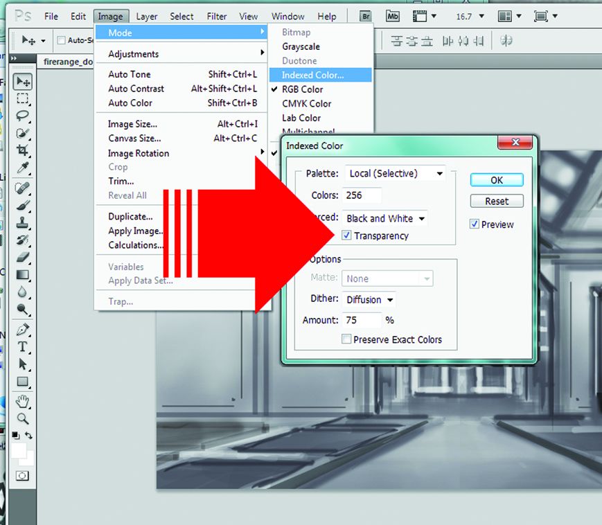
[color="black"][size="2"]A quick way to handle transparency colors in Photoshop is to create a sprite in layers, but be sure to leave the background layer empty. After creating the sprite, delete the background layer under the "Layers" tab to the right. The resulting sprite will be on a background that looks like a soft grey checkerboard. When indexing the file, be sure "transparent" is checked--and it will save with the anti-aliasing intact. Note that this trick will not work when using a masked color; the program will only mask out the specific color assigned and leave any blended colors behind.[/color][size="1"]Courtesy: KU
Many programs will automatically use the first position in a 256-color palette as the "transparent" color. Checking the "transparency" box during indexing will ensure that no color ends up in that box, which stays empty.
[hr]
[size="3"]Scrolling Backgrounds & Parallax Motion
[color="black"][size="2"]Let's be blunt, shall we? The 176 x 208 resolution still reflects a tiny screen size. Odds are that the entire game won't fit on a single screen. It's big enough for classic puzzle games such as Tetris. However, for larger games such as RPGs, more space will be needed--and this means utilizing scrolling backgrounds. The classic form of a scrolling background is an image that is long enough so that it won't be very noticeable when it repeats--and where the front and back edges have been matched up so it can tile seamlessly from end to end.[/color]
This background (from Ghost Train Ride--a Halloween-themed version of Rollercoaster Rush)
has been matched up edge to edge so that it can be looped seamlessly.
[size="1"]Courtesy: Digital Chocolate, Inc.
[color="black"][size="2"]Remember those old Hanna-Barbera cartoons where the same door and end table showed up over and over again in the background as one character chased another down a never-ending hallway? This is the same sort of thing. The real key is to make the background seamless enough so that it doesn't distract the player from the game.[/color]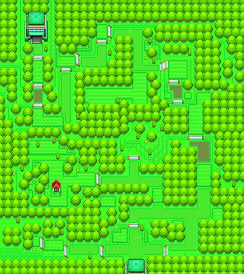
This background is composed of different tiles that can be matched up
edge to edge, like puzzle pieces, to create a complete image.[size="1"]Courtesy: KU
[color="black"][size="2"]It's also possible to have a background that scrolls in all directions--up and down, side to side--but in this case, there is usually a finite edge rather than a looped background. A smartphone screen operates like a little window onto the larger playfield. These large backgrounds are often constructed of tiles--small image squares that can be repeated by the program where needed. The advantage is that the game only needs one copy of each of these tiles, which can then be repeated as often as they are needed to fill the spaces defined by the level designer.[/color]
[bquote]Like a Puzzle
There are a number of free or inexpensively licensed tile editors such as Tile Ed and Mappy that will allow developers to load in 32 x 32 tiles and use them to lay out a complete map. Once the map is designed, the tile location data can be exported in a format the programmers can use to build the map in the game. [/bquote][color="black"][size="2"]The trick that makes these backgrounds come to life is called parallax motion, which relies heavily on masking to give the illusion of realistic depth of field to a scene. Screen elements are layered and moved at slightly different speeds in order to add this illusion of depth. Parallax motion has been used in games since the 1980s to achieve additional depth of field. It can work equally well on side-scrolling backgrounds or the larger format tiling backgrounds just discussed.[/color]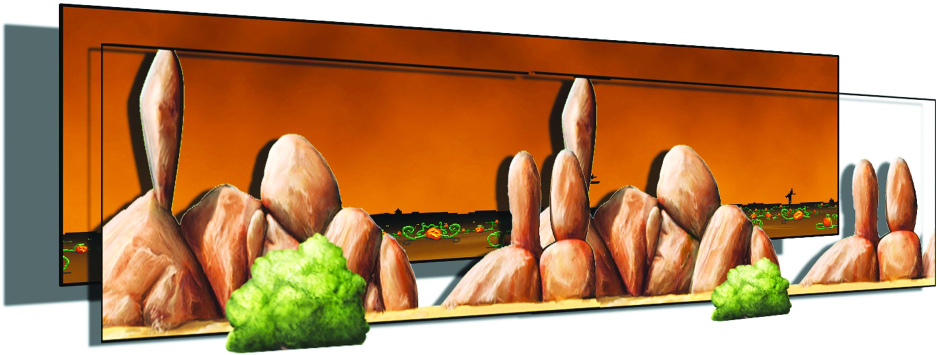
Different layers scroll past the player at varying speeds
in order to give an illusion of depth.[size="1"]Courtesy: KU
[color="black"][size="2"]In the background image above, each of the elements shown is a looping, side-scrolling background. As the player moves along the screen, each of these backgrounds scrolls at a different rate; the one in front is usually fastest, while the one furthest back is the slowest. Another option might be to overlay layers on top of a tiled background. The motion will be different, and it is likely that a subtler hand will be needed than with side-scrolling--but this can add a great deal of vertical depth.[/color]
[size="3"]Sprites & How to Make Them
[color="black"][size="2"]Animated characters and objects are usually handled by creating sprites. The actual movement of the object on the screen is done by the programming, but the internal movement (e.g., the back and forth movement of a character's legs, the unfurling of wings, swinging of swords, the folding and unfolding of the puzzle piece) is a part of the animated sequence for files or frames.[/color]
[color="black"][size="2"]Depending on the programming for a game, sprites can be handled in several ways. First, there could be a list of individual frames; each file is named in sequence (e.g. walk001.png, walk002.png, walk_003.png), and the program calls a particular sequence when it needs it.[/color]Sprite animation sequences can be saved as separate files with sequential
filenames (e.g. Trumpet001.bmp, Trumpet002.bmp, Trumpet03.bmp).
[size="1"]Courtesy: KU
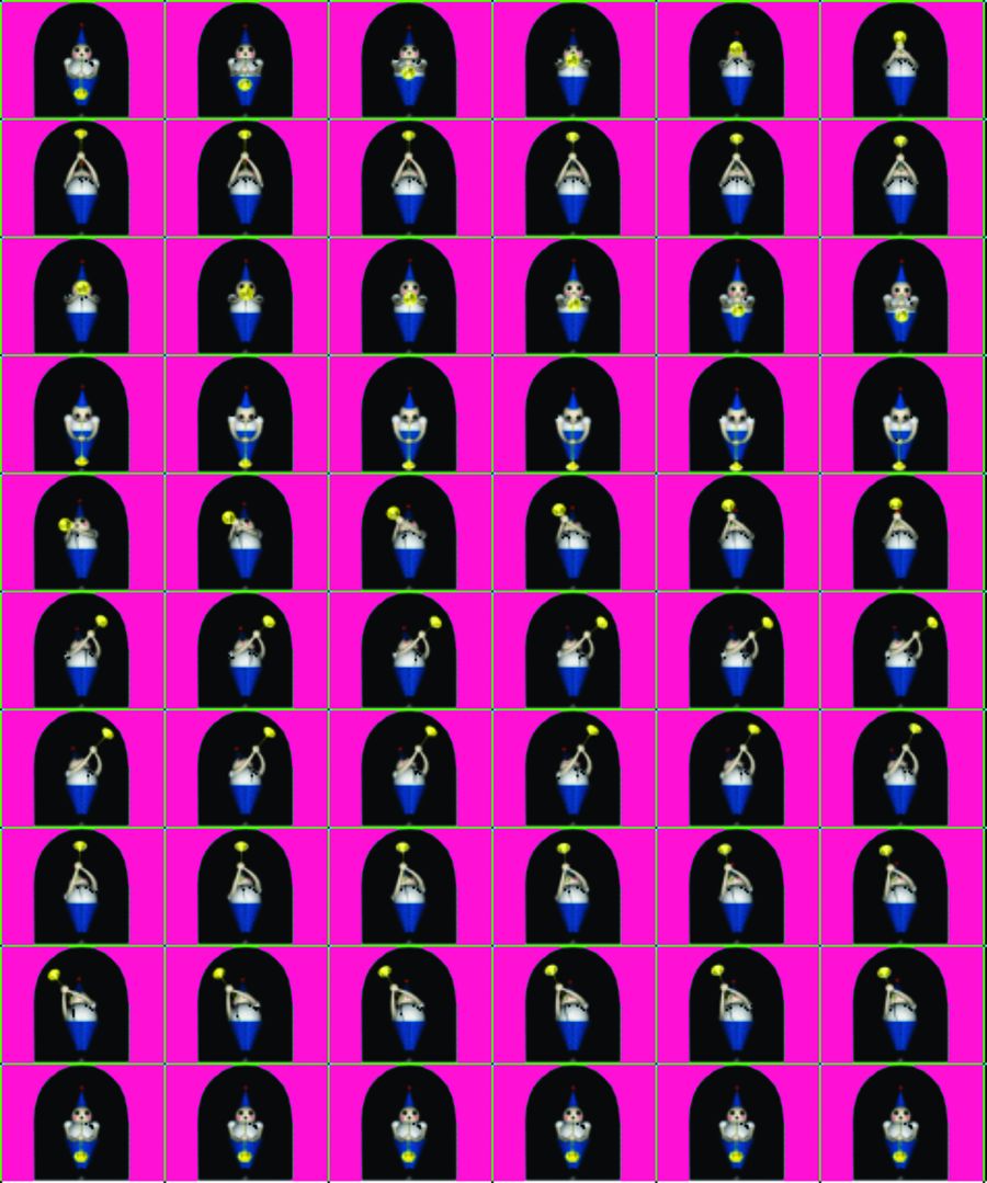
[color="black"][size="2"]Secondly, a separate filmstrip can be used for each animation. It will be necessary to discuss this with the game's programmers; some code for a specific file width (each frame of the animation is presumed to be a specific size), while others code so that specific colors can be used to indicate the location of the center point of the sprite. The latter is helpful for clever secondary animation tricks where the edges of the frame need to be (which is especially useful when there are animation frames of different sizes).[/color]Sprite animation sequences can be saved as a single strip of images. Note the green-colored,
one-pixel wide markers, telling the program where one frame starts and the other ends.
[size="1"]Courtesy: KU
[color="black"][size="2"]Thirdly, in a holdover from RPGs on handheld devices, an animation block can be used--where every single animation frame for a specific character is placed. The end result is a large block of animation files that are on the unwieldy side, particularly for mobile titles--but they allow the file size to be reduced by palletizing all the frames at once.[/color]Sprite animation sequences can be saved as a large block of images. Note the same green-colored, one-pixel wide markers;
[bquote] Processing power and data throughput are always going to be concerns when developing for mobile platforms. We try to create our art in as efficient a manner as possible, and we heavily manage our data.
these tell the program where one frame starts and the other ends. Blocks can be unwieldy and hard to use for mobile.
[size="1"]Courtesy: KU--Gary Gattis (Chief Executive Officer; Spacetime Studios)[/bquote] [bquote]Break It Up
For a very large sprite with only portions of the character animated (e.g., a big boss), it can be beneficial to break the image up into individual animated pieces and reassemble them in-game rather than trying to animate the entire character over a series of overly large sprite images.[/bquote]
[size="5"]Christopher Onstad on Mobile Art Asset Restrictions
Christopher P. Onstad (Lead 3D Modeler & Texture Artist, Mega Pickle Entertainment)[size="1"]Courtesy: CO
Christopher Onstad is a 2D/3D artist and game developer who loves all aspects of production. Currently a freelancer, Christopher has worked as a lead modeler, production artist, graphic artist, illustrator, and web designer. He lives in San Francisco, California with his wife, Kerri, and his son, Warren.
There are numerous restrictions on art assets when developing for mobile platforms--far more than for games developed for consoles or the PC. First and foremost, there's file size. Whether you're using Unity to develop a 3D game for iOS, or Flash/HTML5 for a heavily stylized 2D game, file sizes must be kept to the absolute minimum--as small as possible without lessening the quality of the images produced. In some cases (and in my own experience), even the best-looking designs need to be redesigned occasionally in order to maintain a fast frame rate. No player wants to encounter choppy frames while navigating the world or engaging in a battle with an enemy. The bottom line is playability. A great looking game on the iPhone 4 will only be as successful as its gameplay and "hook." Great art enhances the experience, but it has the potential to hamper it. Artistic designers understand and take technical limitations into consideration while they develop graphics, 3D models, and texture maps so that re-designs are only merely done to adjust aesthetics.
Screen size and resolution directly influence the design direction of any game. Moreover, the more pixels one has to play with, the more one can push the limits of the aesthetics. The iPhone 4, for instance, has more pixels on its display than prior generation iPhones and smartphones--so more details can be seen on textured 3D models and 2D graphics look crisper, sharper, and cleaner. This means that as an artist you can add more details to your assets and only worry about the pure processing capabilities rather than final output of displayed images. With 3D on mobile platforms, there's the advantage of developing full-blown first-person shooters (FPSs) and third-person games that closely mirror those played on the PS2 and Xbox. Mid-core games, as they are now being called, are on the rise--and they offer compelling full-blown stories to accompany highly developed art assets in three dimensions. The only technical limitation is on the device itself (processing power), which requires artists and designers to produce a lower level of detail (LOD) in order to achieve playable frame rates.
The advantage of 2D art is that it takes much less time to revise and animate, since you're only working in two dimensions on any device. What you see is what you get, literally. Every pixel needs to be accounted for--and players are less forgiving of poorly executed 2D graphics than they are with a seam in a 3D textured object.
[size="5"]3D Art Options
[color="black"][size="2"]There is 3D and then there's 3D. On the older or less game-oriented phones, 3D simply isn't an option. On the higher-end smartphones, 3D needs to be handled with custom programming and is often restricted to primitive shapes rather than the detailed worlds we are used to thinking of when we hear "3D." On the highest-end units, 2D and 3D game engines are emerging much like those found in game console development--as well as custom application programming interfaces (APIs) for mobile development environments such as Java ME. Working in 3D for mobile requires a different set of constraints, but many of the tricks for 2D discussed in this chapter cross-apply to 3D. Animated 2D sprites can be applied to flat, moving polygons to help provide added visual effects without going through the trouble of creating 3D models.[/color]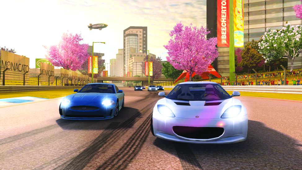
In games such as Real Racing 2, 2D masked images and sprites can be combined with 3D to add extra depth and detail.
[size="1"]Courtesy: Firemint
[color="black"][size="2"]To the right end of the accompanying screenshot, there are crowds of people watching the player put the pedal to the metal and rip down the track. Rather than individual characters, however, the player sees a flat plane with a masked image of a crowd placed on it. This gives the player the feel of a crowded space without the cost of modeling 20 or 30 people. Remember, just because the game is 3D doesn't mean every little bit of it has to be a 3D mesh.[/color]
[bquote] Mobile Art Guidelines
A good rule of thumb is that a mobile game must look like a higher-end 2D SNES game, at the very least--something that would sell for at least $30 but realistically only costs a buck or two. Design and layout must be at the forefront of aesthetic considerations, and elements must all work on a tiny screen without looking excessively cluttered. Generally, 2D implies "easier to jump into and control," whereas 3D might mean "early PlayStation gaming"--which implies more value if done with a budget. Higher budget 3D often looks quite stellar and can command higher price points, even (and often) at the expense of gameplay depth.--Ron Alpert (Co-Founder, Headcase Games)[/bquote][size="3"] Powers of Two
[color="black"][size="2"]One of the key restrictions of dealing with a 3D engine (as opposed to custom-coded 3D) is that the graphics need to be developed in powers of two. This can result in a little extra waste on the sprites, but it will allow the opportunity for extra space savings on the textures used for the environment. Numbers that are powers of two (2, 4, 8, 16, 32, 64, 128, 256, 512, 1024) are the ideal measurements for most computer memory to process, and mobile units are no different.[/color]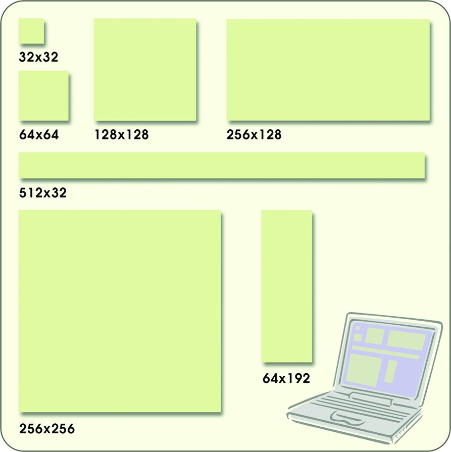
"Powers of two" refers to the number of pixels on a side. Image sizes can be square as well as rectangular.
[size="1"]Courtesy: Diagram by Per Olin
[color="black"][size="2"]It is worth noting that the dimensions of the file must be in powers of two, but these can be mixed and matched to use rectangular as well as square files. Stretch or squash the textures to fit so that a texture of a door that might be 128 x 300 could be squashed down to fit onto a 128 x 256 texture, then stretched back out to fit when applied to the in-game 3D object. By its very nature, the stretch and squash distorts the image--so it's better to place a masked sprite into a file with larger dimensions to retain the integrity of the hard-edged mask.[/color]
[bquote]Limited Palette
Be sure to palettize textures before applying them to 3D models. This will help ensure that they are as small as possible before the files are sent to the game engine.[/bquote] [size="3"]Batching Files
[color="black"][size="2"]Let's say that each of 100 animation frames needs to be reduced to the exact same 64-color palette and each needs to have the background color (currently a lurid green) replaced with pepto-pink that has been coded by the programmers. Sounds pretty tedious, doesn't it? Without planning ahead (and let's face it: planning ahead isn't always in the plan!), each individual file will most likely need to be opened, modified, and re-saved. Fortunately, this problem was solved a long time ago by art programs such as Photoshop and DeBabelizer[/color]--[size="2"]which have the ability to batch files. Batching involves setting up a macro to execute a certain set of instructions and then asking the program to execute that set of instructions on an entire folder full of files. Photoshop makes this easy by allowing a set of actions to be recorded as they are executed. For example:
[color="black"][size="2"]Open File ? Select Color ? Delete Color ? Reduce File to 32 Colors ? Save File with a New Name ? Close File[/color]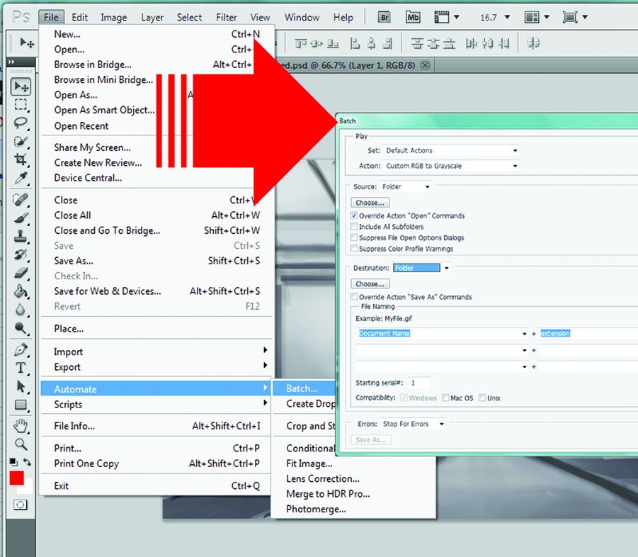
The ability to "batch" files--making the exact same alteration to many images--through a program
such as DeBabelizer or Photoshop, can shave hours off a product's development time.
[size="1"]Courtesy: KU
[color="black"][size="2"]Art generation for mobile devices is almost uniquely universal. First and foremost, mobile game artists must take into account the resolution (pixels per inch) of the target device--which means that a single set of high-resolution art assets can be created, then adjusted for different handheld devices rather than having to create a custom set of assets for each iteration.[/color]
[size="5"]Something Old, Something New
Developing art assets for a mobile title is a blend of both old and new techniques. Tricks that worked for developers back when Pac-Man was king are still just as valid today and can help go a long way toward keeping file sizes as low as possible. There are new uses for old ideas in game art development being put forth all the time; the openness of mobile games allows a lot of room for innovation--for mixing and matching and trying new ways of building games while still staying within the constraints of file and screen size.
[color="black"][size="2"]Now that we've taken a look at the wants and needs of the artistic development side of the mobile game process, it's time to tackle the programming. Chapter 6 focuses on engineering development tools and techniques associated with different operating systems and mobile devices.[/color]






Those are definitely lacking in this site. As a technical guy: Thanks, you always learn something new. For instance, I didn't know about the silhouette test and it's definitely very important! Thanks again