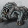
Thanks guys for your feedback!
Well, I know 2D art is not too fashioned nowadays, but you now...there are still splash screens not animated for menus and such, that I tried to cover with this pic...
thanks for the encouragement, people!
What do you think about this illustration?
Hmmm. see. i dont nessisarily agree with the statements that it isnt game art. anything that you produce for a game project or meaning to pitch for a game is game art. I think it is excellent and you totally have skills. game artists are not much different than ordinary artists. we just use different tools. digital tools. this is easy to learn. you could so make it with tallent like this.
 >I am not text, I am not organized pixels, I am not killed by turning off your monitor, I am not isolated by turning off your computer. I just am.
 >I am not text, I am not organized pixels, I am not killed by turning off your monitor, I am not isolated by turning off your computer. I just am.
I'll try and give constructive criticism without saying "That's amazing" because you've pretty much gone over that part 
The only suggestion I have for your soldier would be to make him a bit more dirty like his helmet but I guess that might go against the whole theme of the picture, might be more dramatic if he has the same expression on his face despite all the dirt etc.
Background is good except the texture and the paintbrush grass look kind of out of place, I think the background would be better if it were smudged a bit to get a more consistent style.
I guess you weren't looking for suggestions just asking about quality, yeah I think it has the 'required quality'
[edited by - David20321 on April 13, 2002 2:48:00 AM]
Very nice work. I see that quality as something we''d see on the cover of some game box at a store. Keep up the good work and high quality.
Spent a couple minutes butchering your pic by illustrating my suggestion, wow i have too much free time.
http://david.emuscene.com/messedupsoldier.jpg
http://david.emuscene.com/messedupsoldier.jpg
Yeah David, that dirt definetely adds realism to the pic. I like it.
What I don''t like so much is the blurred background. It is true I didn''t put too much effort in it (it was finished in just 3 minutes) as I wanted to show the soldier off the background. But that blurring adds even more "unfinished touch" to the bg (in my humble opinion).
Anyway, I think your dirt touches are really a *BIG* improvemnt to the overall pic.
"Nec spes, nec metus" - Gladiators'' motto
Cool 
I was trying to do a sort of depth of field effect, but I''m not an artist so it looks pretty bad. Anyways these are just random suggestions coming from a programmer so I won''t be offended if you don''t use all of them
-David-
I was trying to do a sort of depth of field effect, but I''m not an artist so it looks pretty bad. Anyways these are just random suggestions coming from a programmer so I won''t be offended if you don''t use all of them
-David-
Great picture, I hope I can have that "kind" of splash screen image for "My" game ... Good, Good ...
...Thx
This topic is closed to new replies.
Advertisement
Popular Topics
Advertisement


