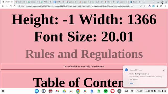
I have this code:
function resizePage() {
    var screenHeight = window.screen.height;
    var screenWidth = window.screen.width;
    var docHeight = $(document).height();
    var docWidth = $(document).width();
    var dbsFS = Math.round(100*(20*((docHeight+docWidth)/((screenHeight-(120))+screenWidth))))/100;
    document.body.style.fontSize = dbsFS+"px";
    alert("Height: "+((screenHeight-120)-docHeight)+" Width: "+docWidth+" Font Size: "+dbsFS);
}
resizePage();
$(window).resize(function() {resizePage();});
It doesn't work correctly, but it should, whenever I resize the window, instead of the text getting smaller, it gets bigger, but it works as intended when you refresh the page, it doesn't make sense.
So here is a gif of what it's doing:

As you can see, when I resize the window instead of changing the font size to match the viewport it just makes the font size bigger, but when I refresh the page it goes to what the font size should be at, I don't know why it is doing this. Can anyone help me understand what is happening and how to fix it? I am stumped.


