Hmm.
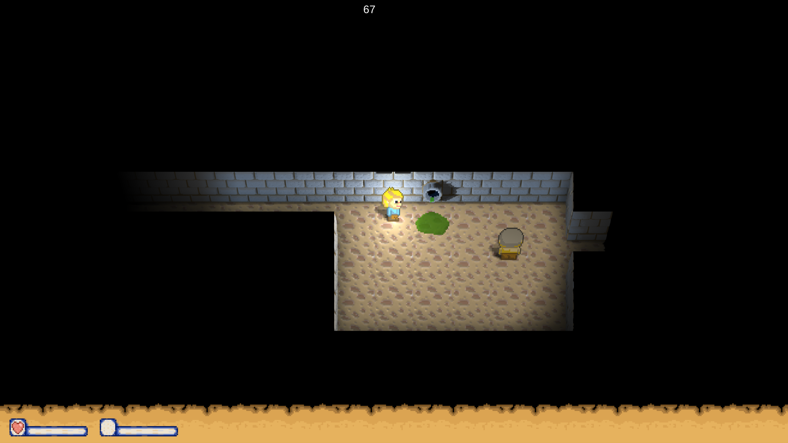
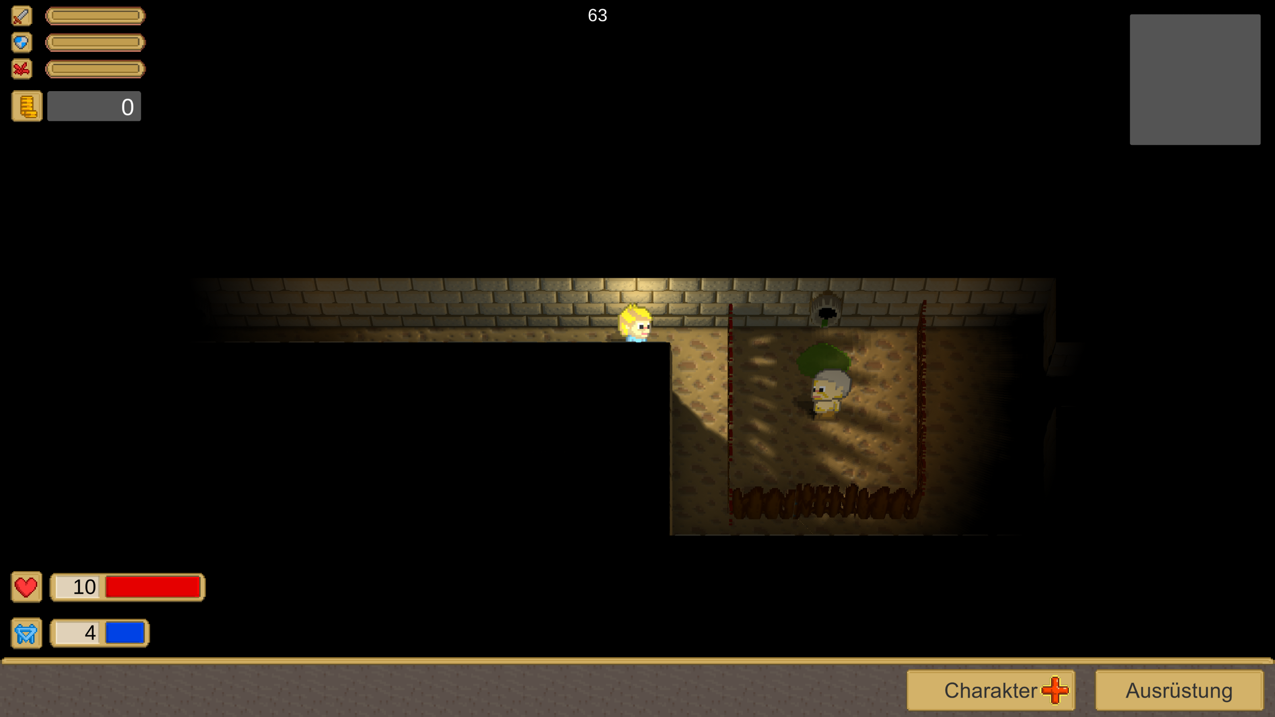
- To me the most glaring issue is, as harsh as this might sound, the textures. The UI has quite a retro feel because of the colors and general look, which for me fights with the game's look. The floor texture could be swapped out, and on top of a new one you could bring in some variety - either by using several textures, or by rotating the texture occasionally, or both - anything to break up the sameness and repetitiveness. Walls are also a bit boring (negative adjectives aren't fun to write, I'm sorry), but I don't think the texture necessarily needs variety or extra detail (unless it fits the game) - instead, something like supporting pillars or such could be added. Those would bring some depth and make it more interesting, but at the cost of complicating the collision situation, which, though, considering you have tile based movement, you might be able to ignore? Even if just in the corners of the room, it could be nice.
- Missing polishing, which is both a good and a bad thing: if your game has a lot of important things that need to be done, these aren't super relevant yet. The text ‘The door is locked’ should only appear once, and graphically there are also at least these:

this is also game design I think - by revealing them, you implicitly sort of hint there might be a way
to get there, even if not intended by the designer. And even if that was the intent, I'd look for another
way to give the hint - right now I have no idea if this is a graphical bug or intended.
- The floor looks too reflective - tune down the specular (there should probably be probably no specular at all for this type of ground)
- The overall color scheme is kind of boring but I don't know if this is feeling is a root issue or a consequence of everything else? Right now it's mostly gray, black and brown with what seems like a pretty much white light. White, gray and black making up most of the screen is probably the main issue. Could experiment with cold/warm colors to give better hints about the atmosphere you want to have. Opposite colors are often perceived as interesting/fitting: for example, google ‘movie posters’ and ‘color wheel’ and see how many posters use the opposite color trick. Especially orange & blue is used a ton! Orange is warm and blue cold, so on top of being opposite colors they have a notion of temperature. Lights and FX are also a way to add color, but won't fix a boring atmosphere!
- The rooms are rather, bland? There's not much ‘food for the eye’ so to speak. A decorated environment will not only bring more colors but also in general make it more interesting; who cares about an empty room?! ?
- Personal opinion but not a fan of the font and the use of it in the UI. It's lifeless and generic, and the UI elements look like boxes with text on them (which they are! but that's not the way I'm supposed to feel).
My suggestion would be: search for games that have a look you like, and specifically a look that would fit your game. Save the images, pick your top ones and place them next to each other. Try to identify what it is you like about them (and do it carefully! Look at contrast, look at the colors from a color theory perspective in general, think about the environment, the scale of things on the screen, the number of things going on, the camera angle, particles, …). Keep these as references and try to get to the desired result in your game. It is totally fine to “copy” a feel, as long as you keep it your game. Don't copy by making sure every single color is the exact same, textures are the exact same/same style, but copy the feel. Do keep in mind at all times what you're going for with your game!
Good luck!