Advertisement

Mixing low poly with other styles

Started by July 23, 2018 10:00 PM
2 comments, last by NubDevice 6 years, 5 months ago

So for a number of reasons I'd really like to go with a low poly/vertex lit terrain for my game.  But I don't necessarily want that everywhere.  Like characters I definitely do not. Water not either.  The following screens show my test scene with low poly and normal surface shaded heightmap terrain.  Trees are purely placeholders for functionality.

Low poly terrain has a number of significant advantages to this specific game.  It will be far less time intensive to create the number and type of terrains needed, texturing and lighting becomes much simpler.  I just don't know enough to know if it can be pulled off.  Mixing the low poly terrain look with stylized but surface shaded assets.  Mainly characters and water are where I simply can't go low poly.  Or rather I strongly believe at that point it wouldn't be a good trade off for other design reasons.
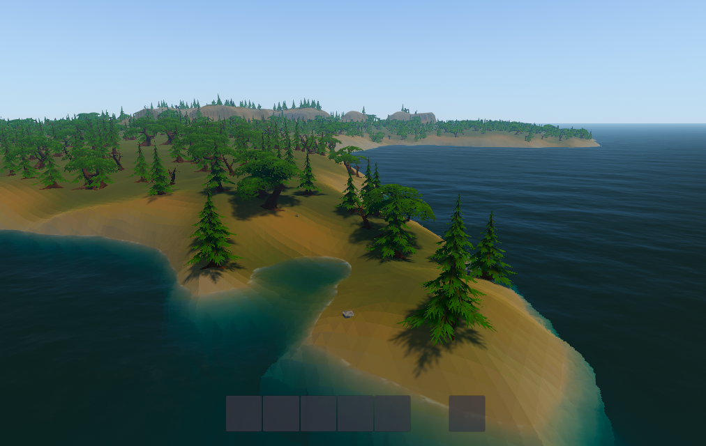
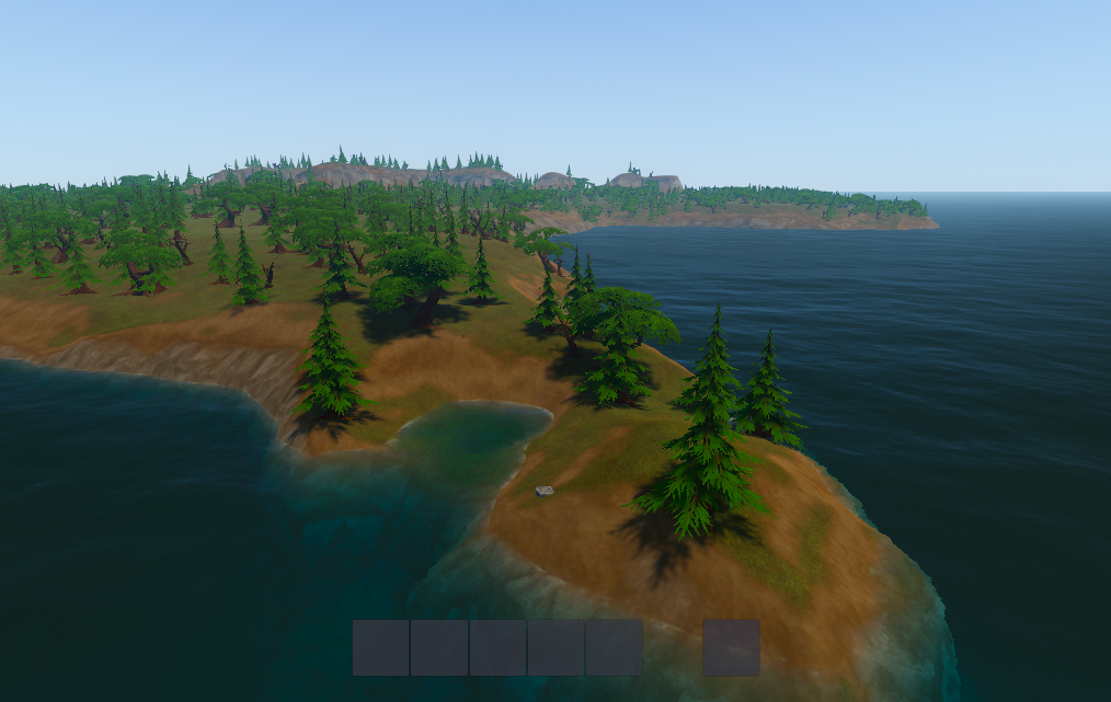
 

image.png.53c0b8380b776deaba1ffaf96b15b5f3.png

image.png.1dc76d3fcc030764ab14cd7f279ce651.png

I don't use Unity but I'm well versed in 3D art. Are you able to bake the high poly normals onto the low poly, then smooth shade your low poly so you don't see quad edges, then apply your good looking texture?

Programmer and 3D Artist

Advertisement

This looks great. Judging from the scale of the faceting in the top image, it appears to be a one meter (plus/minus a little) grid. That is equal to the best resolution, hard to come by DEM (VHR). Irregardless of using real world data, I'm not sure we would call this resolution low poly. Poor accuracy, moderate to coarse resolution DEMS are 30 meter(ASTER GDEM) and 90 meter(SRTM) respectively.

Could be a matter of interpretation, but I'd say you're currently closer to a standard resolution terrain and have quite a bit of room to move to 'low poly'. Still, I'm not sure how much distance you'd gain at the horizon by increasing your terrain grid size because of increased number of standard detail objects (trees, rocks, characters, etc.) and ignoring distance level of detail schemes.

The 'vertex lit' part I understand is more to point. Again, looks really good. Applies equally to the smooth textured version which makes it a tough call. Between the two images, the high hills in the distance are almost indistinguishable. You might be looking at a mixed technique when it's all said and done to get a balance between your other art assets.


references:
 

Dev careful. Pixel on board.

This topic is closed to new replies.

Advertisement