On 18.4.2018 at 5:51 PM, Gezu said:
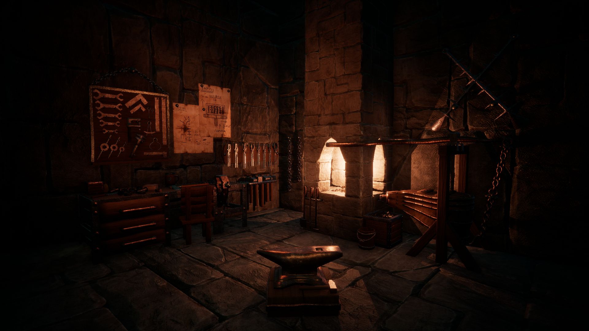
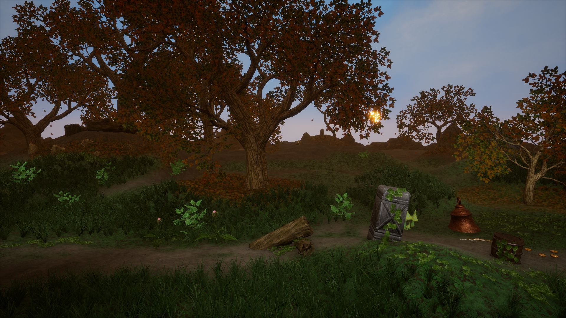
My aim is to create different looking and feeling area types while keeping the same art style.
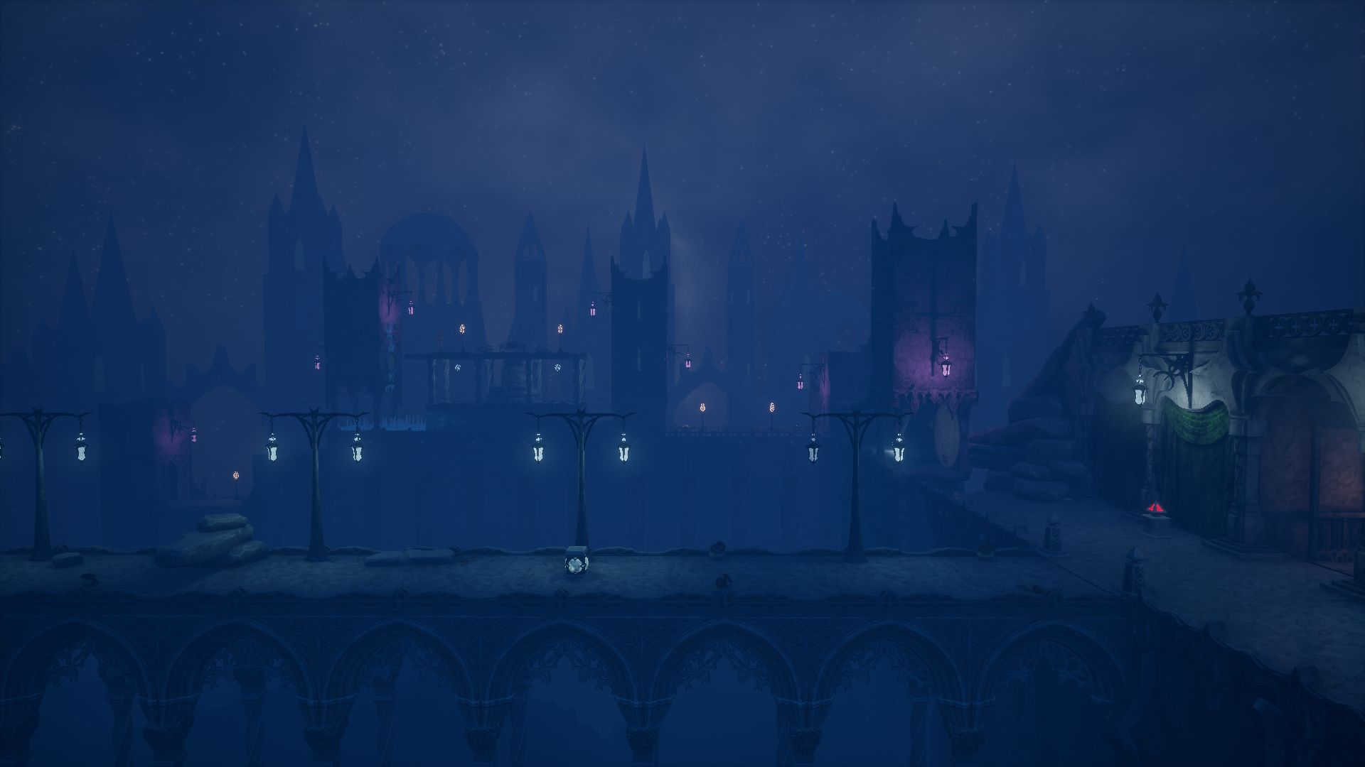
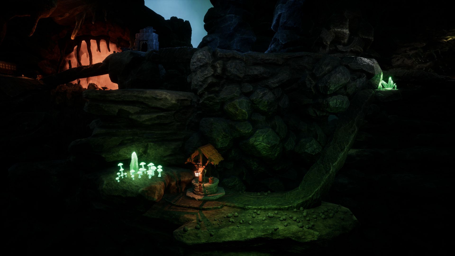
The first (a bit) and the last image (a lot) look different than the others, mainly because they lack shadows.
The first image could be fixed simply with more contrast (making dark regions darker).
The last image could be fixed with shadows for the trees, coming from the sun in the back ground.
Also first and last image seem to have no vignette effect, but the other 3 do.
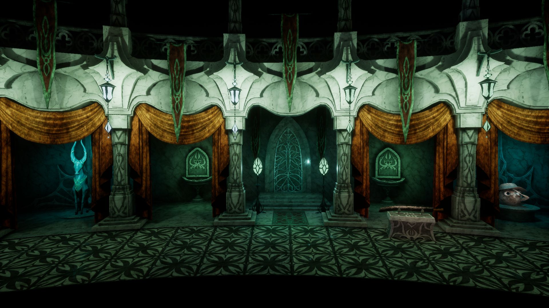
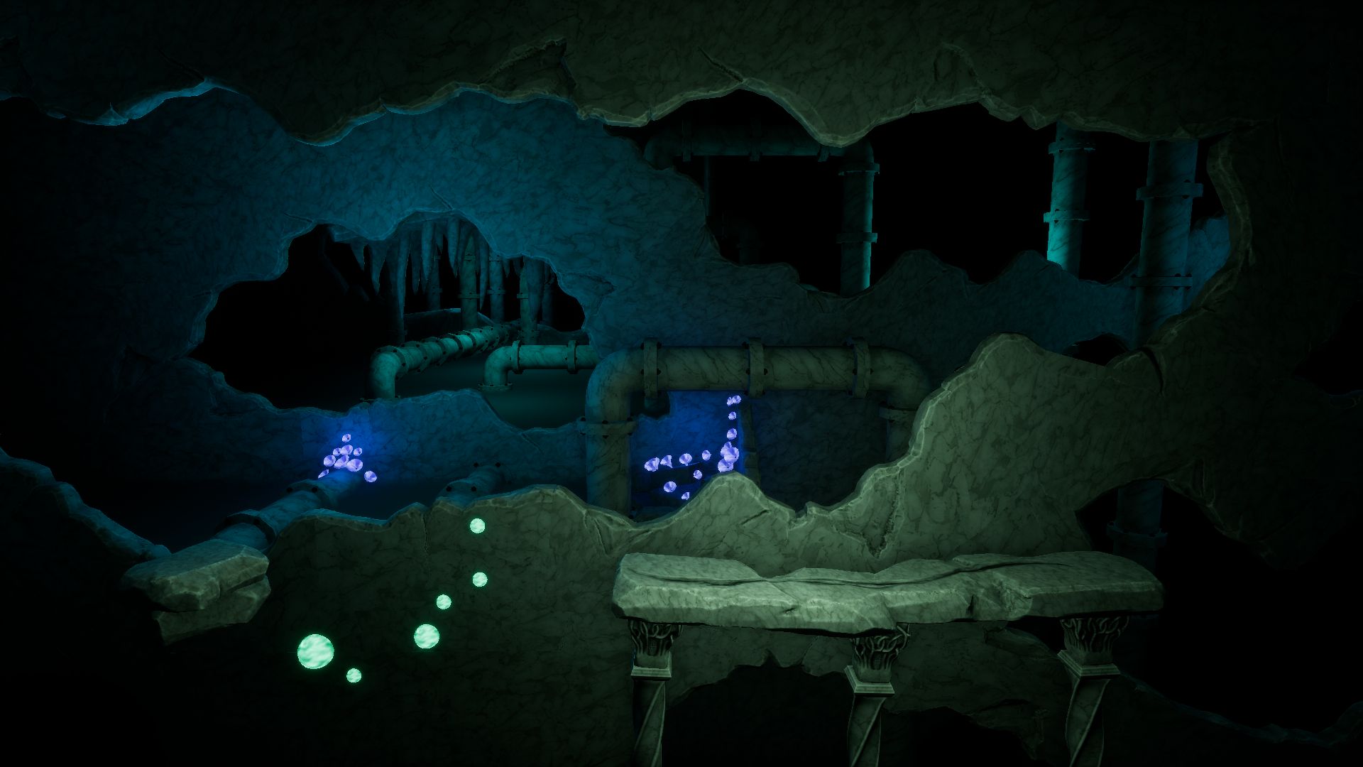
But i do not say i like the 3 middle images more, here i would like to see more color bleeding instead just darkening. (You could achieve this by using more saturated / brighter colors for GI baking or in general, but then tone the image down to the desired dark appeal with post processing like tone mapping.)
The bridge in the first image looks too repetive to me - a second and different arc element would be nice for some variation.
In general all looks good, but the video on your web page looks much better than the small screenshots in this post. This could indicate that you focus too much on high frequency details, and too less on low frequency overall variation / composition. If you think i'm right, this is something you can not fix quickly, more something to keep in mind for future work. Scaling down images is a good trick to detect this, and this just happened unintended because the forum displays small images.
Good work ")