Which of these two design looks better?
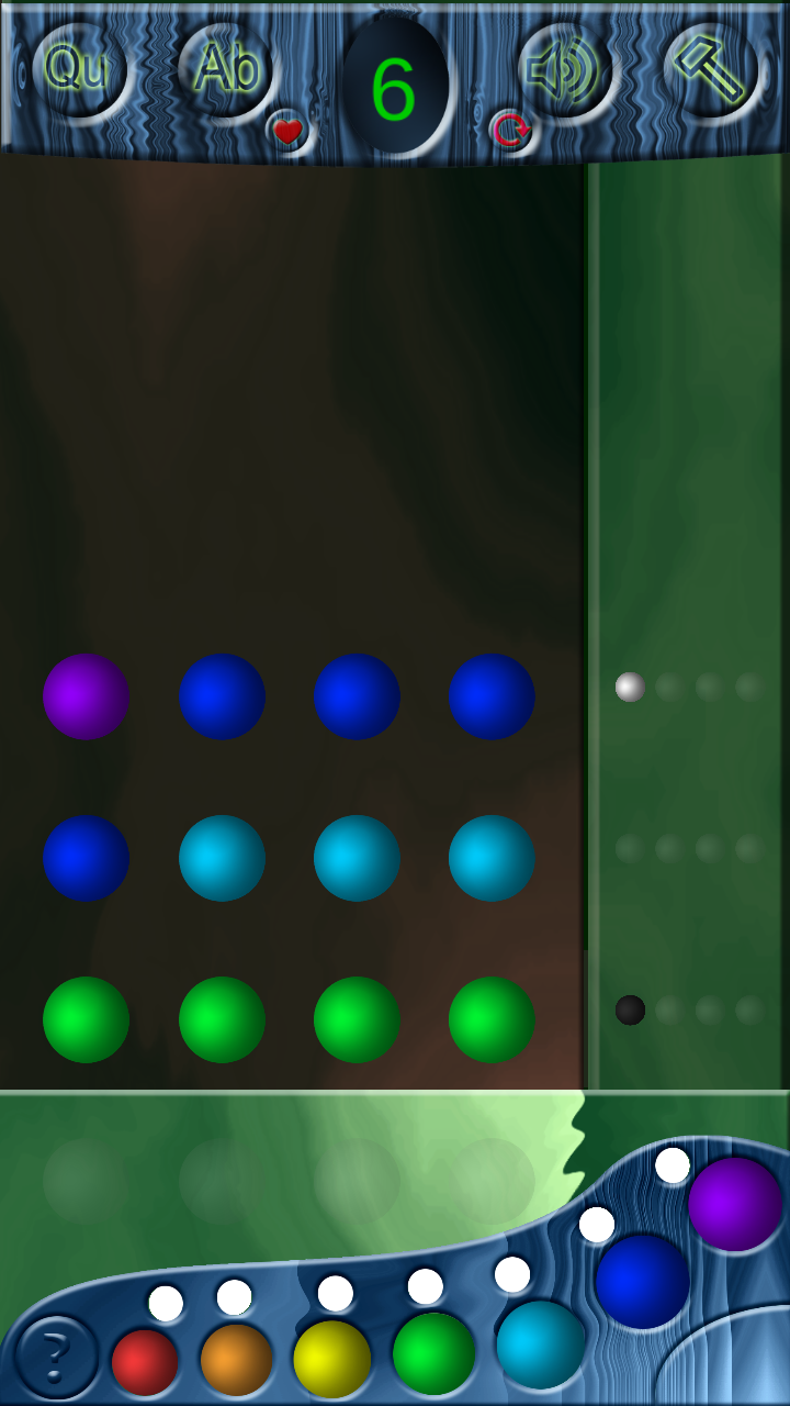
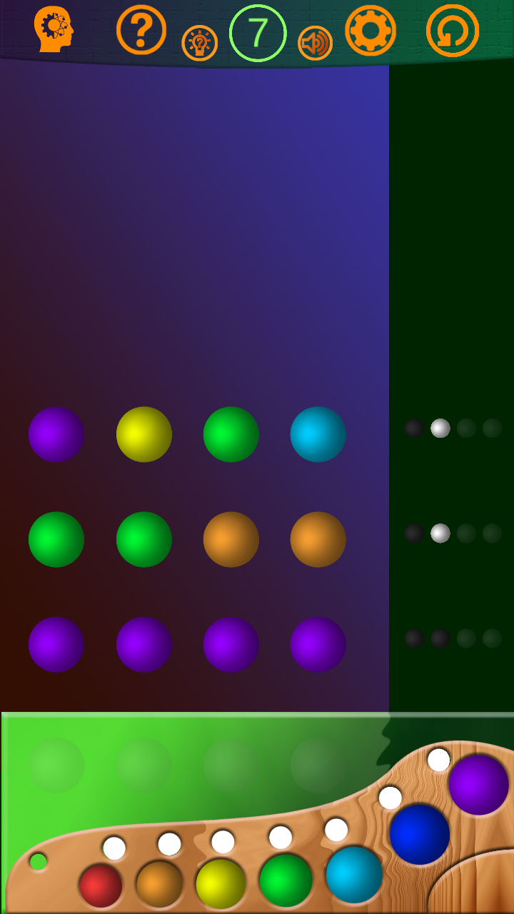


0:3. Clear enough.I'll take the second as a base. Thanks.

A little late...but make that 0:4. The "wood" waves at the top of the first one kinda ruin it. Generally the style itself doesn't matter as long as it is consistent(and it fits the game), and that wavy thing is different from everything else I see.
I hope I fix style problem to next week, and publish a new version. Thanks a lot to all)

I mean no offense and I'm truly sorry I have to say this but none of the other comments have been remotely helpful: both look absolutely terrible. In your shoes I would find a designer friend to teach me, read up on some basic color theory and read up on some basic rules of composition. I estimate 6 months of hard work until you get to a market-ready level.
I prefer the 2nd design concept. The trend today is simplistic, flat, metro look The very top colour scheme, green against the orange does not feel right. The green at the bottom with the palette is lovely. My suggestion for the top is use the same colour as the green at the bottom and make the accent icons Monochromatic. For the middle maybe bright it up abit as well. Try a straight 90* degrees gradient for the middle. Other than that excellent work! I'll keep eyes open for future posts.
Lolli xoxo
Great tips! In some kind way both
10 hours ago, zarloo said:look absolutely terrible
but I hope I'll can change it to pretty look with your help, friends.