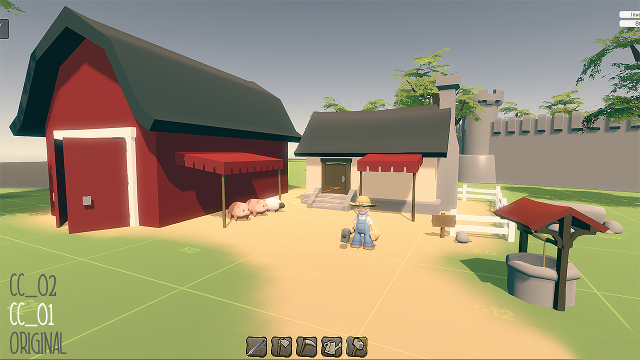
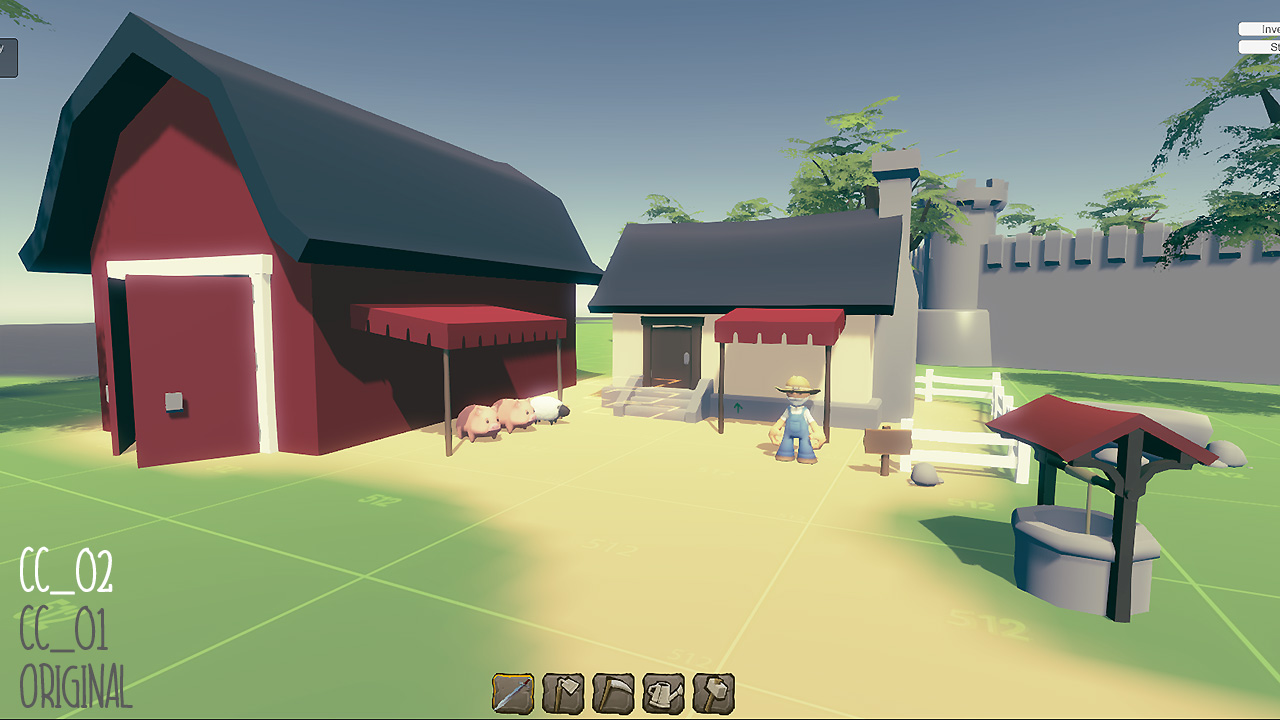
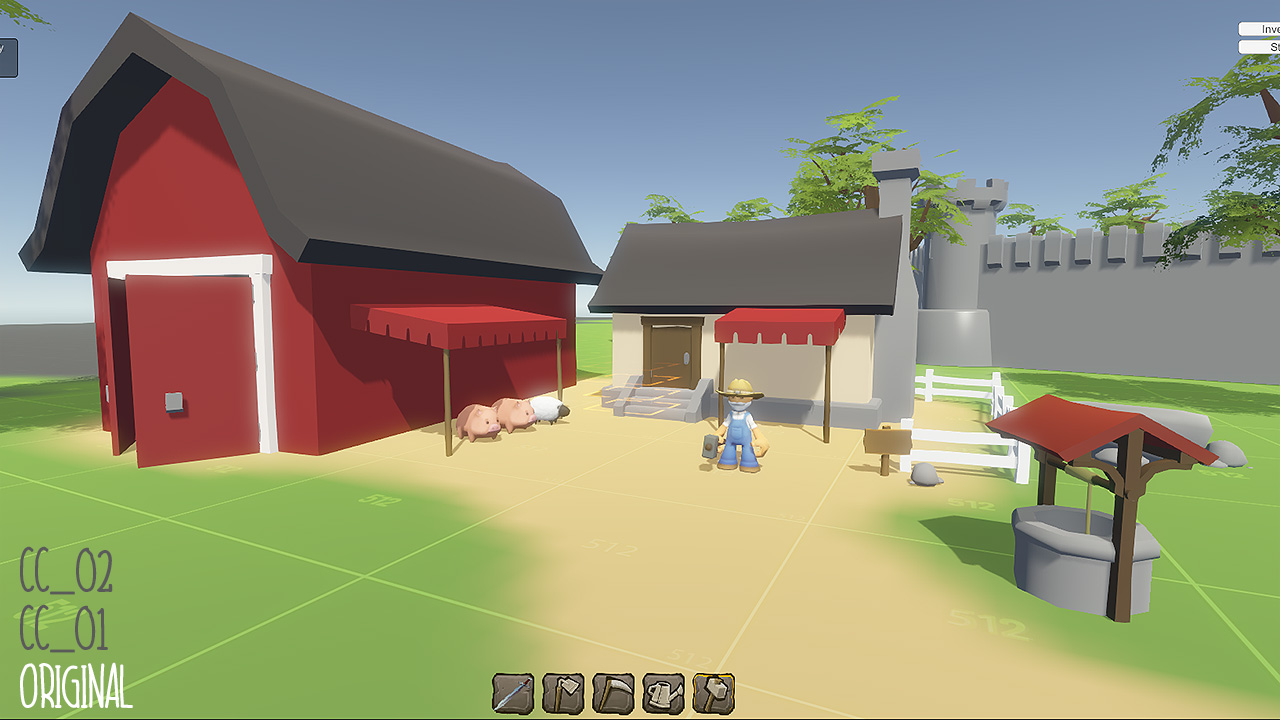
Looks great and I would prefer 01, because the game have a happy mood and should therefor utilize warm colors in my opinion.
Some ideas coming to mind which could improve the overall look beyond changing the color correction:
1. I would change the color composition of the base scene (before applying color correction) to a harmonic color pallet. You have a lot of colors in here now (red barn,green grass, yellowish ground, grey wall, blue sky ). Something from red-orange to yellow up to yellow-green, even for the sky.
2. Avoid grey, the walls in the background fill in a large portion of the scene, still it is background, therefor it should not be too prominent.
3. From a technical view I would avoid specular highlights (wall again). In my opinion a "dry, paper look" you can archive by using just pastel colors, AO and diffuse lighting is always a good start.


")