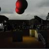
To be honest, I don't really like the first picture. The space background is pretty, but beyond that I really can't tell what's going on in the image--that background is eating everything in front of it.
I'd suggest using a simplistic, highly-stylized art style--and sticking to it. You want people to think "art style" rather than "wow, lazy MSPaint graphics," and deviating from such an art style with even a single asset has a tendency to tip people's perception toward the latter, IMO. For instance, I like the rectangular cows. Combined with the rounded edges on the anthropomorphic sneaker-wearing one, the ellipse UFO, and the relatively smoothly blended ground textures, however, it's not... cohesive. If they were all rectangular or all rounded, and either all textured or all flat, I think it'd look a lot better.


