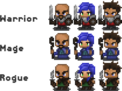
Pixel art for my RPG game
https://market.andro...BackyardZombies
I think you're asking two different things here: a critique of the artwork and a critique of the gameplay. I think you would get a better response if you got a moderator to move this thread to the Visual Arts forum, and then made another thread here asking more specifically about the gameplay.
As for the pixel art, I would say it's pretty good, although I would make the swords higher contrast so you can see them on mid-tone backgrounds, and that the blue hair is way too close to the blue mage's outfit.
-Mark the Artist
Digital Art and Technical Design
Developer Journal
I think I'd like to see the chins alittle less square and more rounded, and the right arms (well, on our left) stretch out from the bodies abit to far (Also the 1 pixel width part of the dagger I think will look abit odd like the blade is 'hovering' when made to a smaller scale). Other than that they are quite good and simple for the style.
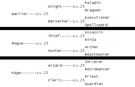
I think the main thing to keep in mind with class trees is to try and make each path a viable option, in similar games players get frustrated if they spend 50 levels working towards Paladin only to find out Paladin is inferior to Spellsword. The obvious conundrum is you also want to make each path different enough to each other to have players want to try new combinations each game.
Hi. Regarding the art, there are some improvements you can make. Mainly making the light source more apparent.

But here's the rub. Look at the total colors for these two versions:

178 vs. 33 colors for the original and repainted versions, respectively.
With this you can see that detail doesn't depend on the large amount of colors you may be using, but primarily where you place those pixels; If they describe shape, volume and texture in the most color-economical way possible.
178 vs. 33 colors for the original and repainted versions, respectively.
With this you can see that detail doesn't depend on the large amount of colors you may be using, but primarily where you place those pixels; If they describe shape, volume and texture in the most color-economical way possible.
Impressive!
I've noticed there is no dark outline? How does it look over a background?
The background is from a random RPGMaker game:

If we look at the characters that come with RPGMaker we can see how to do a proper outline. These graphics are painted by very skilled artists:

For some parts of her hair like the brightest ones (the edges facing the light, in other terms), her skirt and feet, we can see that the artist doesn't even use an outline, he just let's it like that.
That's why it's called "selective". Outlining very bright parts or simply outlining the entire shape wouldn't look as good.
Anyway, RPGMaker's character have a bigger tile size, so it's easier to do outlining. The default RPGM character is 32x32px (same tilesize as the map's), while SmashGames's are 20x26 I think.
Clever!
Also, would you say the outline is black? I've always been wondering whether I should use pitch black, or some kind of a dark tone that fits with the overall character design?
Clever!
Also, would you say the outline is black? I've always been wondering whether I should use pitch black, or some kind of a dark tone that fits with the overall character design?
When you're talking about the darkest pixels of the outline, it seems to be pitch black (0,0,0) indeed (the outline surrounding that girl character's gloves for instance). But then you have parts of that girl like her hair, where the outline is of an actual dark color and not just black (with a hue that's analogous to the hair, like a really dark hair color). I personally feel this variation looks way more natural than using black for all outline pixels.
I understand this as "Selective Outlining". I certainly don't have the groundings to explain it, being very inexperient with pixel art, but the effect is explained in the following article. Search for SelOut on section IV. Things to Avoid:
http://www.pixeljoint.com/forum/forum_posts.asp?TID=11299&PID=139322#139322
(If you're interested in the craft the rest of the article is a great read, too.)
The science behind SelOut (or "outline breaking" as it's also called) has to do with the visual sensation of expansion or contraction of shapes based on a light-to-dark contrast.
These great tutorials explain a bit:
http://2dwillneverdie.com/tutorial/spriting-basics-anti-aliasing/
http://2dwillneverdie.com/tutorial/line-weight-thickness-in-sprites/
As for your pixal art,I think it's pretty good,cute and attracting.
http://www.game-silkroad.com
info_game@silkroadcg.com


