Hi,
I have recently been involved in the Computer RPG "Dawn" as Concept Artist (and even composer of its main theme, but that's another story ;)) Unfortunately the two project starters behind it realized it was too demanding and decided to pursue other dreamgames.
Anyway, in this thread I'm planning to post some Concept Art of mine and other artworks that's related to gaming.
I'm happy about Comments and Critiques, always looking to improve. Don't hesitate to contact me if you're interested in a collaboration and would need Concept Art/Painting for a cutscene or similar. I've primarily painted and drawn Fantasy and Sci-Fi, but might consider doing other genres as well. Currently not doing anything above "Teen" rating though (not interested in being involved in games with 18+ content).
No matter what I hope my art can be inspiring and of interest to game developers. Cheers
---
Silver Forest (2D digital, Concept Art for CRPG project "Dawn")
My Gamerelated Art
Another Concept Piece for the "Dawn" CRPG Project:
Belemar Mountains (2D digital). C&C always appreciated
JMB Creative Art
2D artist
2D artist
Hmm, you have a very painting-influenced style, that's an interesting contrast to a lot of the digital art I see. I'm liking the second one better, the tree trunks and area around the building were too curved and smooth for me. Thought I did like the iris and the texturing in the trees and sky. The second one gives me more of a sense of depth, though I'm a bit confused by the way the fog line or whatever that is lays along the top of the mountain range. And the waterfall and pool on the right is a bit too green to harmonize with the sky, especially since there are no trees around it. Water that isn't a hot spring takes its color mainly as a reflection of the sky and nearby objects.
Not that I can keep all that lighting theory in mind when I paint a landscape, sigh.
I want to help design a "sandpark" MMO. Optional interactive story with quests and deeply characterized NPCs, plus sandbox elements like player-craftable housing and lots of other crafting. If you are starting a design of this type, please PM me. I also love pet-breeding games.
Thanks a lot for your feedback.
Yes, I do have a weakness for traditional oil paintings, especially from Renaissance up to Impressionism.
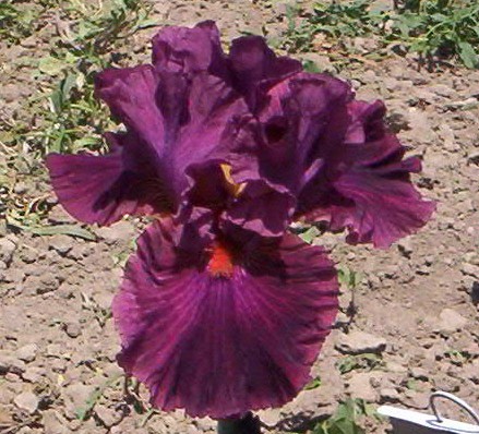
Is the flower an Iris? I must admit that I just made something up. The place I was supposed to visualize was the Silver Forest, the place where the elves in the game would live and I think it was supposed to be very mist-covered.
The first one is earlier and I agree that I had learned more about conveying depth. Still hadn't begun working in a more limited palette though, these days I focus more on just a few colors and whether they give a "warm" or "cold" impression that can enhance the mood I'm after.
Also tried a whole bunch of tools for these, had especially discovered how fun it is to cover parts of the painting with an airbrush!
Here's a personal work that was painted even earlier than these two:
Moonrise (2D digital)
JMB Creative Art
2D artist
2D artist
Heh, I assumed the flower was one of these:
As for the moonrise picture, I particularly like the glowing yellow liquid, but I'm a bit confused by what the direction of motion is supposed to be - the wisps from the plants seem to be pulled toward the moon, but the meteors are shooting the opposite direction, and the clouds are either holding still or moving to the right. Also the yellow cloud/pyramid thing around the moon confuses me (mainly the petal-shaped edges) because I don't get a sense of 3D ness from it so I'm not sure how it's supposed to fit into the sky or what the cloud is. Could be some kind of gateway where the moon is showing through a rip in the sky, or could be a cloud of magic like that being sucked from the plants, or I dunno what.
I want to help design a "sandpark" MMO. Optional interactive story with quests and deeply characterized NPCs, plus sandbox elements like player-craftable housing and lots of other crafting. If you are starting a design of this type, please PM me. I also love pet-breeding games.
I like your style, very interesting.
Some things that jumped out at me:
-Lighting, is some of them the light sources aren't represented quite right. I presume on the first piece the shrine or alter in the middle is a light source (being bring magical or what ever). This should jump off the page as a focal point but is drawn back by the colours used, add a better colour contrast and higher chroma would make it more luminous and stand out better. You do similar things in your other pieces, the water in the second one is getting there (idk if you intended it to be self luminous or just highly reflective, it looks closer too self luminous).
-On the first one again. the light intensity for me doesn't feel consistent, the yellow patches in the grass are showing to be brighter than things closer to the shrine/alter.
-Colour palette could be wider, unless you're going for cartoon styles (which doesn't lend itself to an impressionistic style) you want to have wider colour ranges.
-Watch the over use of smudge tool, i can be a create ally but also makes your image flat. this is very evident in the second one.
Convert your images to greyscale to check your values, you want to show a good range of values, most common mistake it not representing enough.
That all being said, i very much like how you did the tree foliage and sky on the frist one, shows great improvement from the third one (which i think you said was older). I picked on the first one more because it shows a much stronger skill set, and would be great to see more.
This topic is closed to new replies.
Advertisement
Popular Topics
Advertisement
Recommended Tutorials
Advertisement