Hey im a programmer and me and my friend are making a 2D game in XNA where basicly you run. i wont go into detail because the game doesnt have too much fuctionality right now but i created what i hope to be the Main Menu background for our game. so i made several versions but im wanted to see your feedback on them and if i should completly go a different way or if they arent to bad. :)
remember im a programmer and not an artist so i was just seeing some people reactions. i used adobe photoshop and adobe illustrator. and there are also going to be options since this is the main menu, so imagine singleplayer,multiplayer,options and lettering under the title
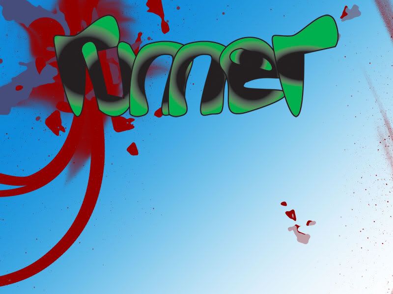
I think the higher contrast with the clouds background makes it easier to read the words than the bloodspattered background. The circular gradient used on the words is a bit difficult to read regardless of background, and the fact that the loop of the e is filled in is particularly visually confusing.
I want to help design a "sandpark" MMO. Optional interactive story with quests and deeply characterized NPCs, plus sandbox elements like player-craftable housing and lots of other crafting. If you are starting a design of this type, please PM me. I also love pet-breeding games.
I wont talk about the letters in detail, but you should arrange the menu by the game you're making. From the blood scene I would assume you are running from a killer or something, and the clouds could show that maybe you are running on clouds till they rain out (so they get gone).Also the letters should be appropriate to your overall design. Maybe simulate motion blur...
I have played earlier a flash game called DinoRun where you are dinosaur that is running from "doom" and trying to survive.
Time is measured by stuff you do. Don't waste minutes on nothing, have more time.
I think you should go to www.dafont.com, install a couple fonts you like, and see which best suits the style you're going for. It'll help it look a little more professional -- even if it is a silly little game. ;)
I like the idea of the first background better (Cloud pictures look cheap IMHO), but you need to arrange it in a way that it doesn't interfere in the foreground. You might want to reduce the contrast of the background. The effect on the letters really hurts readability, you should try something else. Going from black to a color in the way you did seems wrong to me somehow, I'm not sure how to explain it.
Try adding a white outline instead of black, that might help.