Reminiscing
There was a part of game development, well in the field of Art in general, which seemed intimidating; with good reason. For a solo developer, not well versed in the world of painting, it always felt that stylized art was a sort of taboo to think of. It's one thing calling yourself an artisan or a creative, another to put that into practice: Everyone can be judgmental, have opinions about topics they not necessarily now much about (or even think they do), but not everyone is willing to participate; to hide their shortcomings.
A long time ago, have dabbled a little with making hand-painted textures, but did not go far with it. To be more precise, only made one or two small "seamless" textures, for a 2D plane or two. Remember how challenging it was to make it look good and not be repetitive; also hadn't had any of the tools to tile it, and had to fiddle with offsets (which is the equivalent to working in the dark).
The debate
My skillet is purely from intuition, some vague muscle memory from the past (back in elementary drawing, etc.), and a mixture of random bits of know-hows scattered across. Not exactly a solid foundation for creating art, even though the core concept of abilities, the wanting to do it all, was all there. Heck, that's how the attempt of composing an entire album (hour long) came to be (without previous acknowledgements, or having the right tools, experience, etc.), despite all odds. Sort of (as had music experience before, just not composing). Would not dare to do any of this, if weren't convinced in the ability to be able to create something other than a stick figure. Especially knowing how looks are incredibly important in this field.
The more thought was put into it, the more convincing the idea became of a "What if,". That being said, there was another factor that kept these notions at bay: Time. Knew, that going the route of stylized art would mean a lot more time spent on asset creation. How much exactly? About 2 months or more, just to create an island (discussed below). This was exponentially more than what was usually spent on art (in my previous projects, which never more than a week or two), and sounded outright ludicrous. Not mentioning the finesse that it required to–successfully–pull it off at a certain level.
Putting on the swimsuit and discovering the depths
There was this idea of creating a small path of land (it later becoming the largest of scales that were ever done as stylized art), of which the story would revolve around: The whole premise of the "then" untitled game was that the player would become a tree, and made sure it grew up. Of course, the concept has evolved way-beyond this simple idea (thanks to the influence of a game called "Kena: Bridge of Spirits" (look it up if you haven't heard of it, it has amazing animation)), and has gotten increasingly complex. For obvious reasons, as in knowing better *laughs*, have kept that idea for the future, if the game succeeds expectations (for a possible sequel perhaps).
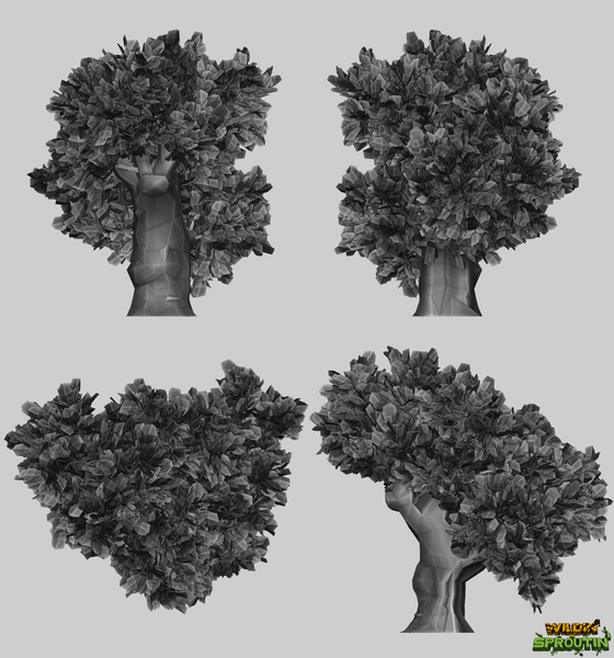
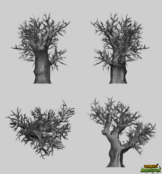
In hindsight, had no idea how labor intense and challenging this seemingly small project will become. The goal was to first make a single tree, and try to paint it, or at least try to make it stylized. Some research went into this, by analyzing other artists work, techniques, and so forth. There was a brief moment where it was thought to scrap the idea of painting it by hand and use procedural generated textures (made in Blender). The results were, well . . . for a lack of better term, looked crap.
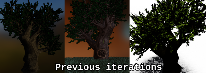
The number one issue was that Blender (using 2.92) has no built in tools for UV manipulation (as in very limited); and even the included plugins are far from ideal. And as this tree had UV islands all over the place (to keep it somewhat "intact", and to have a consistent texel density), the materials just could not flow proper; had to use techniques, such as manipulating the normals to make it look right. That being said, my shader skills weren't top notch, and by mixing those with hand-painted inserts (such as the leaves and the cut branches), it just didn't look right (as you can clearly see). Was going-back and forth between painting and on how to tackle this problem, as modeling the tree was done in the blink of an eye, and was keen to keep on going. Blender also only offers one default brush, and working with it is quite cumbersome (even with using texture masks). Thought that there was no easy way of doing it: Even tried multiple free software, to paint on 3D, but nothing worked.
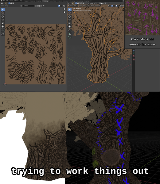
Then, just as a form of testing, jumped into Krita, and scribbled away. The results were better than thought, and convinced me to continue using said software. Albeit, by going full 2D introduced a whole other set of issues, namely: Now the individual island needed to be traced by hand, in order to appear somewhat-seamless, to reduce distortion and its "ugliness", and had to be tested on the regular (to make sure it also followed the flow of the tree). All in the name of top-notch quality!
Look at the size of that . . . texture! And keeping it consistent
Although the texture size for the tree is relatively low, 2048x2048 pixels, it turned out to be quite the difficult to paint across: It felt gigantic, considering the amount of detail that went into it (usually 3-5 pixel wide). The amount of care that transferred into the painting was nuts: There were numerous layers for each light passes (dark, light), each sections (outer border, inner border), gradations and overlays/fixes. On one side, it helped keep everything backwards compatible, by keeping the layers separate, but it did not help much when it came to actually paint the thing.
There were times when my index finger just straight up decided to cramp up, after clicking for longer periods of time (as each stroke required a press, which meant thousands of small movements per minute), and forced me to stop. If you can afford it, buy a digital pen and a tablet. It not just gives you a better grip, as working with a mouse is awkward, but also gives you a better angle on simply how you paint things (greater control over where the brush is, how fast it moves, etc.).
Then there was the challenge of figuring out a way to keep everything somewhat consistent. To give you a better perspective, often a day went by solely spending it on a 128x128 portion of the texture. And by the time you'd get to a connecting island (that may or may not be next to the one you were working on before, ugh) days, even weeks have passed. Also, consistency came up in the form of keeping the textures similar across multiple models. There was a point where all felt impossible, sort of painting the whole world (like the 2 skies; which is a reminder that the second sky is not being swapped out in the build). And there were the numerous fixes, remakes, and more fixes on top of another (changing the size, adding vines, changing the leaves, etc.).
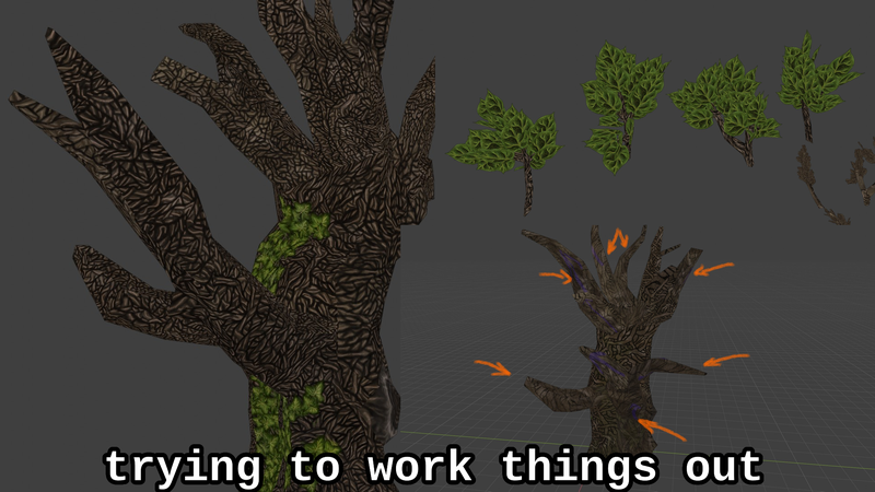
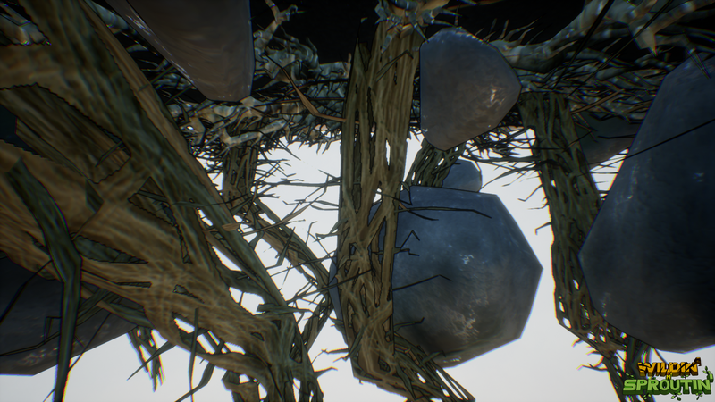
By the time the tree was complete, the entire thing was remade. Overall, had to decrease the amount of detail that went into it, as it just took way too long (having to paint on multiple passes). Would've done it, but as this wasn't the only thing to do, some sacrifices had to be done; even thought this looks amazing (for my level of skills, if it can be said); as shown below. The goal was to see if people would "buy" into the idea of the game, or not. If it does work, than things can be changed at a later stage. Just to illustrate the madeness of the picture below: different sizes, opacity and layering was used to give the illusion of depth (meaning that each dividing line had to be painted over dozens of times, with different brushes; that worked for a while, but keeping up with the workload had to come first; was an "executive" decision, by the management). Also, the details kept on getting smaller and smaller, which by the end the lower section of the trunk was complete, made it look as if the tree was made out of thin vines, rather than bark. Further down there's another good example of this endless chase: the sky textures might look the same, but were created seperately. Any other normal person would just do a color overlay and be done with it; but no, the gradations had to be done by hand, to create the illusion of a seamless connection between the upper and lower part of the sky (as the sky is made up of two separate spheres).
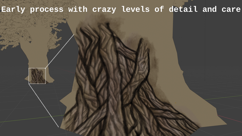
Especially knowing that a lot more assets were yet to be made: Skymap, foliage, ground, roots, etc. Was fun making it all, and hope one day the can be revisited, to make them proper! Actually, might remake them sooner, as now (whilst writing this blog) it started to bug me (having second thougts about this) that the art that made the final cut "isn't good enough", and people will simply pass by it. Dis it if you will. This is a constant reminder of never being good enough to be marketable.
It's like a double edged sword: Make it look 1000%, but on a tiny scale, or 100% across the board and have a finished product. Quality should prevail, but as a solo developer, who wishes to earn money from it all, one day (because after so many years, have yet to earn my first dollar), and even establish their own studio, its just too much. And still getting agonized by it all: Will this be enough to finally cath the eye of the public? Honestly, don't think so. But without going any deeper in despair, let's just show some images (later on). Oh and also, if you're interested in how the final product has come about, there's been a Tracker set up. Where most of the progress could be followed in real time.
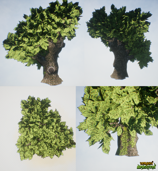
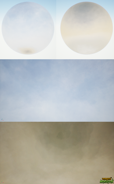
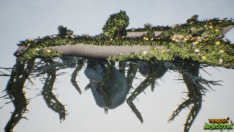
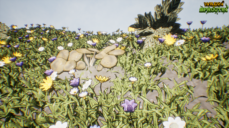
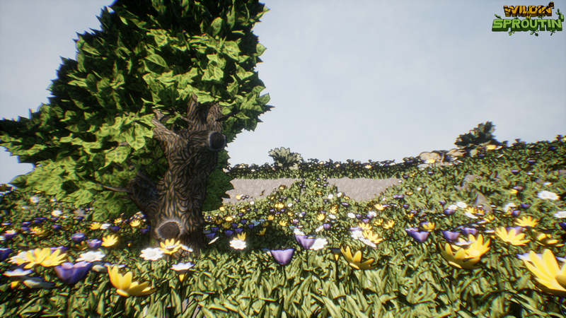
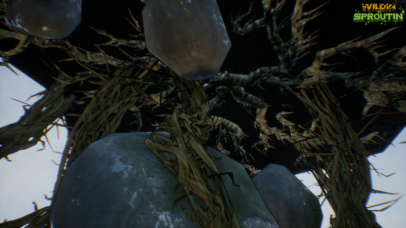
All samples above are from the game itself, no alteration has been done to the screenshots. Textures are PBR based, and all hand-painted!
The tale of early access and introducing the game
With the advent of the island (which is technically just a path of land, and happens to be floating in midair; unintentionally), was too keen not to share the greater vision for it. Namely, to introduce the game where it'll be used: Wildin' n' Sproutin'. A short explanatory video has been put together (please excuse my voice, am far from 100% these days, and it's difficult to speak even), which you can see below:
(Link in case broken: https://youtu.be/bEqh9gModWs)
The main reason why it was decided to push this concept out in the wild (as a downloadable content), to do the exact opposite what was done with my previous project (Endomorium). Was overly keen to not release it, only as a full product, at the end of the production cycle. There was this concrete notion of "doing it right", by not shipping the title early; only when it's done. Looking back, it was not the best decisions ever made*, as some issues (with the UI for example), could've been found out earlier, and probably could've saved the production; single handedly. Not excluding the fact of getting useful feedback from the community; among many others, like fixing bugs.
[*probably due to the fact that Indie Games are generally thought of as a lesser products: Broken & incomplete. By releasing a full product, it was believed to be the right choice.]
Also, hoping that with this "outstanding and radical" move, the project can grow a little beyond its current proportions (in terms of production quality, not scope), and truly be something else.
The design
Wanted to make a game that was somewhat different to what my previous ventures were. And provide an alternative to . . . Well, let me paste the teaser for the game here, to explain it all:
Have you ever thought of becoming someone or something else to escape it all? To be, for just a brief moment, free from the weight of your problems. Leaving anger, fear and sadness behind. Have you ever thought to be a cat, to jump high and hide in a cozy spot, a dog to bark at a postman or chase the wind like a bird? Or whatever else your heart desires. Have you ever felt a deep connection with nature, felt peace among the woods? Have you ever wondered what the leaves whispered and what the mountains roared? To see what would it be to live by nature's command. To become one with the spirits of Mother Nature: Born from a seedlin', raised by the wind and the shine, battlin' the elements to reach high in the sky. To breathe as one with the woods: to become a tree.
This whole idea stems from wanting to be someone else, something different. And wanting to try that out. To stir up the imagination of others. To see, what's it like to be, other than a person. To have a different purpose in life. To be one with nature, and to be able to see things differently . . .
As mentioned before, the scope has been kept "small", even though there's a lot more where this could expand to; solely going by the fact that it has this MOBA thread to it. Won't bore you with the details, but let's just say the limit is the sky. Especially knowing, that the "arena", the background, the type of trees, the abilities, the minions/creatures, the weather, etc., could be changed, to give more variety to the game; and give it more replay-ability.
Am eager to find out, if this new approach of wanting to create a more fantastical game is what would others also enjoy. As for some reason, Warcraft 3, and its style has stuck with me. And, as seen in the video, has influenced the creation of this idea: To fight and see these creatures roaming across the land, occasionally gobbled up by the roots and the branches of a tree. By carefully timing its abilities.

