We've been working with Unity and their built-in tilemap system for a few months now and we're very satisfied with it. There is a learning curve, but that's to be expected.
Thoughts on spritesheet spacing and sizing:
Well we ran into the infamous white line/black line issue which seems to pop back up every now and again. The only way I've found to 100% get rid of this is to give all of your sprite sheets at least 1 pixel of padding in between every individual sprite. Which is a little bit of a pain but hey it works. 100% of the time so far, when I build the project and run it in a sensible resolution (the editor always has some weird resolution it's running in) the issue with the pixel bleed goes away.
That being said, there are different reasons for spacing out your sprites. All of our sprites are hand-drawn pixel art so we set a solid rule at the start: All characters are 16x32 pixels. And we stuck with this very well up until a recent bit of rework. The issue came when we created our character customizer system and suddenly the 16x32 pixels was fine for a pretty narrow body and hair style...But we wanted big hairs. The other issue that added to this rework was our harvesting animation, often times our characters go way outside of the 16x32 area because they're swinging an axe.
The solution in my head was always a coding solution, I can find a way to get the center point of any sprite and just set that as a manual process. This was a really big waste of time.
Our solution was to revise our 16x32 rule to be more specific: All characters must be base sized 16x32 pixels, which ensures that nothing is more complex than it needs to be and work can get done quickly without much complication. But all characters may occupy a space larger than 16x32 pixels IF their center point always tracks to the same spot on the character.
For example:
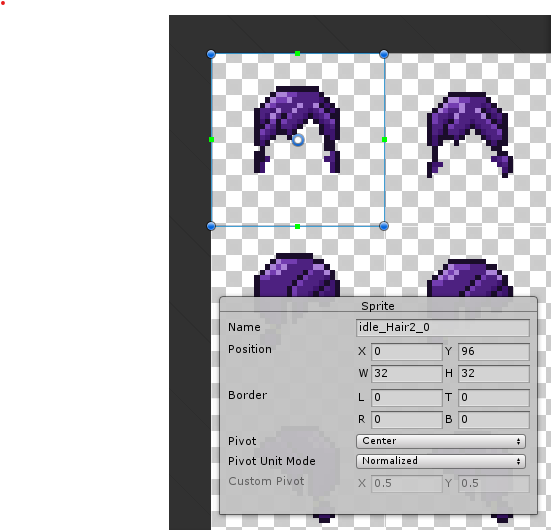
Below is a picture one of our hair sprites int he sprite editor. The sprite generally takes up that 16x32 rule, but is centered on a 32x32 square. Meaning if we wanted to get more crazy hair, clothes etc we can.

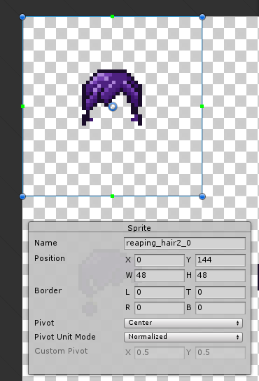
Compare that to our example on the harvesting animation for the same hair style:

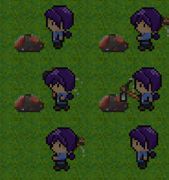
The size of this sprite is 48x48, which doesn't match our original idle facing down sprite. But it doesn't matter because our center point is ALWAYS relatively in the same spot. Now when our character transitions from a idle standing animation to a harvesting animation they don't teleport a few pixels in whatever direction. All of this saves us a ton of work post processing. Manual adjustments which would take hours are now eliminated in the art design process.
Easily one of the most elementary fixes we've implemented so far, and so satisfying:


