[color=#333333]
Choosing a font is never easy and for Epistory, it nearly drove me mad. We didn't have to find only one font, but
[/color][color=#333333]three. Three fonts that needed to match together, follow constraints and have their own identity.
[/color]
[color=#333333]
We had just a few constraints:
[/color][color=#333333][font=symbol][size=2]. [/font][/color][color=#333333]
To support a wide range of symbols (French, Portuguese, Polish accents, Russian symbols...)
[/color][color=#333333][font=symbol][size=2]. [/font][/color][color=#333333]
To always be easily readable
[/color][color=#333333][font=symbol][size=2]. [/font][/color][color=#333333]
To give an idea or a hint of its purpose
[/color]
[color=#333333]
...Simple.
[/color]
[color=#333333]
Typing Font[/color]
[color=#333333]
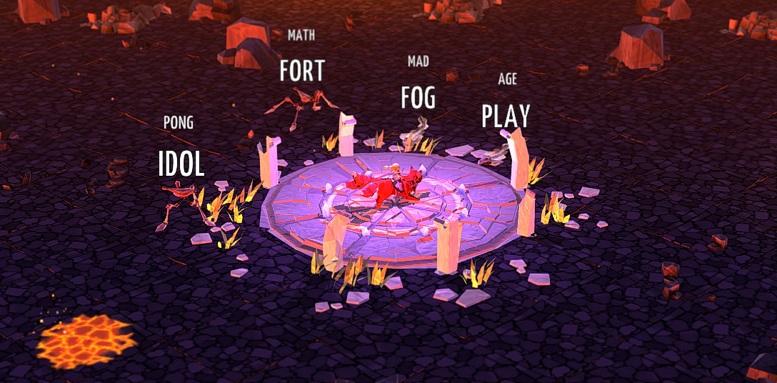
The first font we decided to work on was the typable one: the font that will lead players through the game and on which the gameplay relies. The difficulty was to have a font readable on which we could add different kinds of feedback: such as the kind of magic needed, the right magic selected and so on.
[/color]
[color=#333333]
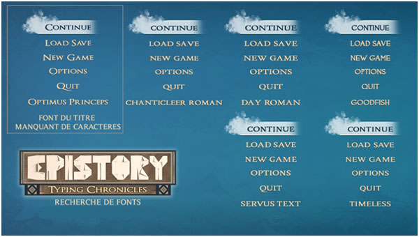
We also wanted to suggest that the font belonged to a book, so we chose a font with serifs. "Optimus princeps", already used for the subtitle in our logo, was our first selection but there were too many missing symbols.
[/color][color=#333333]Instead, it became our reference for our future selections.
[/color]

[color=#333333]
Serifs turned out to be a bad idea. The problem we encountered with those fonts was that they were not easy to read at all. I'll spare you from all the steps we passed through because it will be a long and annoying description of research. Instead, I'd prefer to simply explain why we choose "YanoneKaffesatz".
[/color]
[color=#333333]
At first we added constraints in order to determine with precision our needs:
[/color][color=#333333][font=symbol][size=2]. [/font][/color][color=#333333]
Find a vertical font that allows us to add long words without taking too much space
[/color][color=#333333][font=symbol][size=2]. [/font][/color][color=#333333]
Simple, no serifs, no extravagance to increase the readability
[/color][color=#333333][font=symbol][size=2]. [/font][/color][color=#333333]
Large enough for adding FX (but not too much)
[/color]
[color=#333333]
After that, our decision came naturally. We forget it too often, but sometimes "feeling it" is the most important way.
[/color]
[color=#333333]
Feeling the Font[/color]
[color=#333333]
When your brain drives you mad with all its "what if", it's time to turn it off and focus on what the font makes you feel.
[/color]
[color=#333333]
The "YanoneKaffesatz" was, for me, the perfect font for many reasons. The regularity of the letters suits to a "book", to a story, and the roundness feels "womanly". Eech letter is readable, serene... perfect for when half-dozen monsters come to you.
[/color]


[color=#333333]
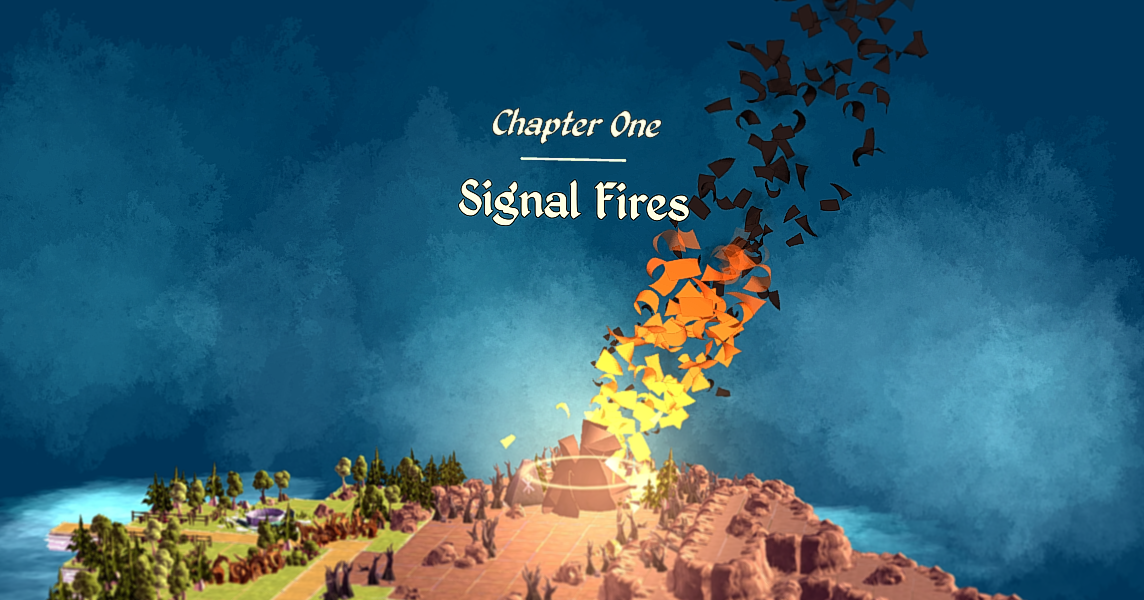
For the main story font, which appears drawn on the world, our research didn't last as long as for the first font. We noticed quickly that "Kingthings Petrock" would suit to our needs. Like "Yanone", it was large enough to be readable in the bright grassland as well as in the dark cave, not too fanciful, but it also has the style of an illuminated manuscript, suits the story we wanted to tell.
[/color]

[color=#333333]
The Secret Font[/color]
[color=#333333]
Our last font one keeps a secret... it's a whisper, it's like it isn't really there and as soon as you see it, it's already gone...
[/color]
[color=#333333]
I chose this one only by instinct. I wanted something womanly, something personal, handwritten but not conventional. It had to be attractive... and disturbing as well. When I found "luna" I knew right away that it was the font I was looking for.
[/color]

[color=#333333]
With Unity, I added some effects to this jarring, mysterious text: a little cloudiness that makes it less material and increases the impression of strangeness. The reasons why I chose it are pretty much spoilers so I won't expand on that subject.
[/color]
[color=#333333]
I spent weeks - maybe months - on these choices, but I've learned a lot. Principally to trust myself. I've done my best on it and sold a part of my soul for the game.
[/color]
[color=#333333]

