Holy crap is judging things way more time consuming than I thought! I don't have a real job right now so I could dedicate most of my time towards this. I don't see how real judges find the time!
For Theme, I was looking for a clever twist and multiple ways that death was useful. Making it useful in one way got you around 14-16 points where being clever or exploring multiple ways of how death can be useful got you more points.
For FTUE, I started everyone at 10 and docked points for bugs or frustration. Everything else I think I explained well in my original post.
For Eck Points (Judge points) I awarded overall experience and little features I thought were cool. Surprisingly there were no Firefly references this year which is an automatic 5 Eck Points! For shame people!
I decided to leave these entries sorted the same way slicer4ever has them on the judging thread. But here's a link to my spreadsheet with the scores so you can sort it and see how people ranked up in different categories:
Eck's Rating Spreadsheet
The Winner:
hu3 team - rodolfodth, devn00b were my winners. They chose this week's humble bundle for their prize. I'll leave it to them to split the games up among themselves.
I'm also handing out free copies of my Floating Combat Text asset to the top 4 Unity teams.
hu3 team - rodolfodth, devn00b
Mud Pit - Lactose! (passed because he didn't have a need for it)
The Big Fat Chicken - brunoscholz, KalVasFlam
Slaughterhouse Gaming - riuthamus, shadowisadog, ByteTroll
Unicore - Orymus3
Excellent work everyone! Please enjoy my comments while you wait for the official rulings.
The Scores:
Team: Slaughterhouse Gaming - riuthamus, shadowisadog, ByteTroll
Game: Vault Stone
Gameplay/fun: 13/25
Graphics: 20/20
Theme: 15/20
Audio: 8/10
FTUE: 4/10
Participation: 10/10
Judges Score: 5/5
Total: 75/100
Thoughts:
[spoiler]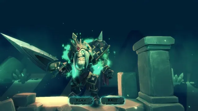
You're death, and you're off to kill some pesky humans. You run around, kill things, and turn them into limited duration skeletons and the guards respawn. It seems like they'll respawn endlessly, and I couldn't tell if there was a way to beat the game yet. There's not enough gameplay here to be really fun, but it's still worth checking out.
Graphics are spectacular. There were some graphical issues on my computer, but it's not the newest rig in the field, so I didn't count that against your team. I saw how it was supposed to look. Fantastic job as always. If I were an official judge, I'd have tried to played this on a better computer and rated as-is instead of what it's supposed to be. But I'm not, so there! 
Theme was good. I like that death was a resource that you were able to spend. More spells would have been cooler or a way to make death useful for the enemies somehow could have earned your team more points.
Audio was good and the music was really nice. I almost gave a 7 here, but if you'd have started your music track on the title screen it would have squarely been in the 8 range so I rounded up to 8.
FTUE the first time I fired it up at max settings, it took minutes to load and then it was choppy as hell. I scaled back the graphics to minimal, and it went to reasonable load times. The splash screen was cut off on my standard monitor, so I played in 1280 x 720 windowed mode. The way the hotkeys were setup, I thought 1 was auto-attack and 2 was animate dead so I didn't figure out how to animate until after I was almost dead. I started again, and had a much better run. I finally stumbled across the instructions screen when I tried to quit. A readme.txt or a button for the instruction screen on the main menu would have been great.
Overall, it was a very beautiful entry, but one more day of features/clean-up probably would have bumped your score by 10 points. Still, this is a very good entry that your team should be proud of.
[/spoiler]
Team: Koding Nights - dkoding
Game: Death is Awesome
Gameplay/fun: 21/25
Graphics: 16/20
Theme: 20/20
Audio: 9/10
FTUE: 8/10
Participation: 10/10
Judges Score: 4/5
Total: 88/100
Thoughts:
[spoiler]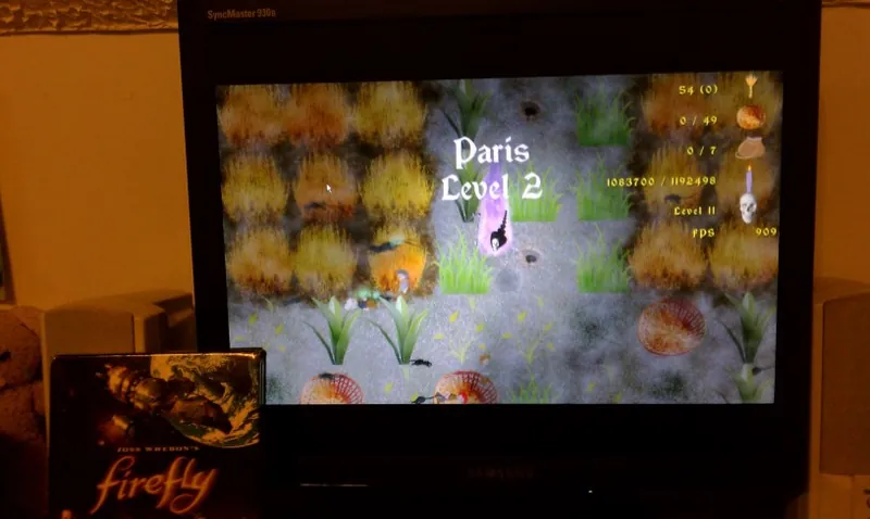
You play as Death Jr. during the plauge. Business was so good that it's turning bad. Not enough people are surviving to keep your numbers up, so your parents end you top-side to go help. You kill stuff, you level up, you harvest grain as well as souls. The intro story is well written and funny. And the gameplay is pretty good with a controller. All good stuff.
Graphics were good and sometimes humurous. The mom and dad skulls made me laugh. The animated blue plasma effect was really nice.
Death was useful in multiple ways. Killing the plague rats helped the people. Killing things leveled you up. Death harvested the grain making himself useful to the humans. Very nice job.
Audio was good. Everything seemed to mesh nicely together from music to the various sound effects.
Everything was near perfect, but it crashed on me the very first time I played it right when I swiped at a plague rat for my first hit. After that, the only issue was it seemed like if I tried to replay the same level the rats would only need to eat a piece or two of grain making that level unbeatable. I did finally manage to beat a later level, so that was cool.
For the Eck Points, I gave you three for making a great game, and one more for being my favorite theme.
Overall, this was a very good entry that was both fun and interesting. I would have liked a few less levels and an overall victory condition. Also, for the graphics and audio, I would have liked to see specific attribution to the resources that you used in the readme.txt file. Most of the stuff I find online has some kind of attribution license, but you just linked to the core sites. Great job!
[/spoiler]
Team: AngeReveur - AngeReveur
Game: Death is Useful
Gameplay/fun: 20/25
Graphics: 19/20
Theme: 13/20
Audio: 8/10
FTUE: 8/10
Participation: 10/10
Judges Score: 5/5
Total: 83/100
Thoughts:
[spoiler]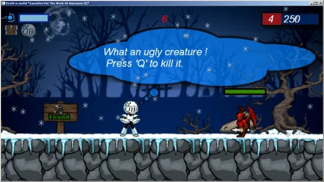
You play as a knight who discovers Death is missing. You free him from a block of ice and then things can start dieing again. This is a well executed platformer with good controls. Some parts were tough and the boss fight took me a while to beat, but I eventually made it. Fun game!
Graphics were great for a game jam. Simple animations on the enemies, but a very nice animation for our main hero.
For theme, I don't think it was very central to the game. You set death free, and he gives you a power-up.
Audio was good and had a retro feel that fit together with the chosen art-style. I still can't believe you haven't played Ghosts and Goblins. Posted Image
FTUE was great. The credits button crashed for me, but I was able to open up the included text file. In the boss fight, jumping up to the top central platform, and then falling back to the ground actually kills you. It took me a few tries before I figured that out. And I got into a weird situation going from hardest difficulty to medium where it kept killing me the instant I spawned and I racked up 500+ deaths in no time. Had to restart the game.
For the Eck points, I gave you 3 points for an overall great game and the other 1 for going to great pains with your credits/attribution of your used resources, and 1 more to ease the rough score I gave for theme.
Overall this was a great entry, but I felt the theme was a little lacking. Still, the game was really fun and you did a great job![/spoiler]
Team: Something fun - ryan20fun
Game: Chaotic Ball Carnage
Gameplay/fun: 9/25
Graphics: 9/20
Theme: 7/20
Audio: 5/10
FTUE: 5/10
Participation: 10/10
Judges Score: 5/5
Total: 50/100
Thoughts:
[spoiler]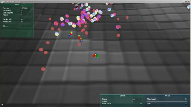
Gameplay/Fun was a little lacking for me. The controls were responsive, but I wasn't sure what I was supposed to do.
Graphics were minimal, lots of spheres with varying textures. The playing field was a little blurry and overall the graphics didn't seem very cohesive.
I had some trouble telling what was going on (probably the point in Chaotic ball Carnage), so I didn't understand how death was useful until I dug through some of your blog posts.
For audio, the music was nice, but the sound effects weren't all that great.
FTUE I really had trouble telling what was going on, but I think everything is working. All the little inspector windows made me feel like I was editing your game instead of playing it. I hadn't known I died since I was still able to move my sphere, I just couldn't shoot anymore.
Considering you only had one week without the benefit of a big-dog-daddy engine, I'd still say it was a good effort.[/spoiler]
Team: Differentname - Differentname
Game: Lich
Gameplay/fun: 22/25
Graphics: 17/20
Theme: 19/20
Audio: 6/10
FTUE: 10/10
Participation: 10/10
Judges Score: 5/5
Total: 89/100
Thoughts:
[spoiler]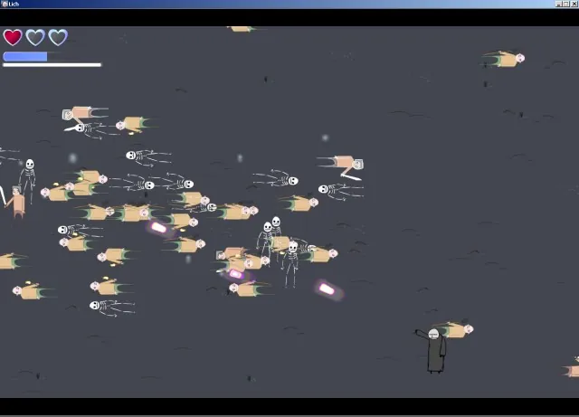
You're a necromancer and the local townsfolk are trying to lynch you. You have a melee swipe, a blast, and can animate dead. Collecting souls makes you temporarily more powerful and advances you to the next stage, plus the spirit world is pretty cool. Very fun game.
Graphics were good. The sprites were simple, but really nice. No animations, but the UI and terrain were clean.
I really liked the theme. Death was useful in multiple ways. Killing townsfolk generated mana to collect and bodies to animate. Dying yourself let you collect the mana, and also let you return to life with full health.
Audio was a little on the simple side, but fit nicely with the game. Unfortunately there was no music.
I didn't encounter any issues with your game. The ingame tutorial was nice and the difficulty ramped up so you could get used to the concepts.
For the Eck points, I gave the full five for making a great game, doing everything yourself, and just an overall polished game.
Overall, this is a really great game that really nailed the theme. Sadly there wasn't any music. Some free music could have got you a few more points here and probably won the Unofficial Eck Judging contest. Sad day! Anyway, this game was one of my favorites and you should be very proud of this game.[/spoiler]
Team: Ovensparrow - MarioLuigiMan, Onigiri Flash
Game: DeathJam
Gameplay/fun: 5/25
Graphics: 12/20
Theme: 2/20
Audio: 5/10
FTUE: 4/10
Participation: 4/10
Judges Score: 1/5
Total: 33/100
Thoughts:
[spoiler]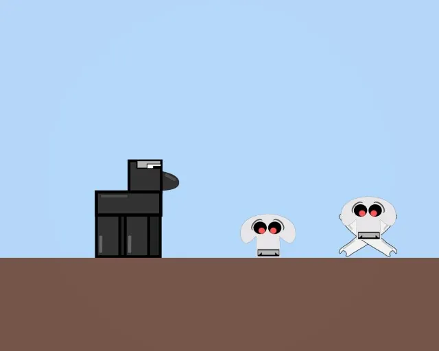
Gameplay/Fun just wasn't there. You're a horse, pushing around skulls and crossbones to a huge green rectangle. But the horse moves about 5 times as fast as the camera so you're quickly off the screen. The only reason the last level was tough was because the horse couldn't push the crossbones fast enough and sometimes it would get stuck next to a wall where you couldn't do anything.
Graphics were really good for the few sprites that were there. There wasn't a background and the terrain was a flat color, but I liked what I saw.
I think you missed the theme by a wide mark. There was a skull, and the music was spooky, other than that I don't see how death was useful in your game.
The music was great and seemed appropriately spooky, but there weren't any sound effects at all.
For FTUE, the menu screen seemed like a placeholder, and the camera couldn't keep up with my horse. I was also able to jump off a level and just kept falling. I was also a little put off by being asked for a donation to downlod your game jam game.
Participation was light, so I docked some points there.
For Eck points, I gave you 2 more points for the music.
Overall, this entry wasn't very good. The sprites were nice looking and the music was great, but the game came up short. Next year I'd focus more on theme and gameplay because those two areas really hurt you.
[/spoiler]
Team: New Old Things - endurion
Game: Bunny Hop
Gameplay/fun: 19/25
Graphics: 14/20
Theme: 18/20
Audio: 7/10
FTUE: 10/10
Participation: 10/10
Judges Score: 5/5
Total: 83/100
Thoughts:
[spoiler]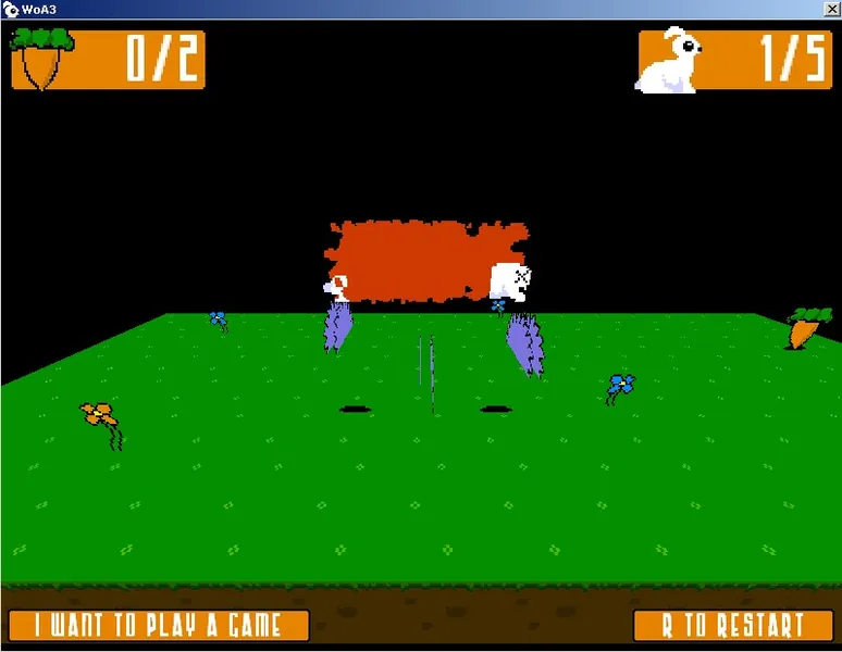
Gameplay/Fun was nice. You're a bunny (family of bunnies?) trying to get all the carrots for a level, some of which must make the ultimate sacrfice so that others may eat... Those bunnies were the greatest heroes of them all. There were a lot of levels and even some challenging ones.
Graphics were okay, the animations were simple, but I think they all fit together nicely. Lots of blood. It looks like developer art, but that's just fine in a game jam. Good job sir!
For theme, death was useful in a couple of different ways. A bunny could clog up the various traps or leave pieces of its corpse on pressure switches to progress through the level. Or you could use it as a warp back to the spawn point for time based puzzles. I think this was a good interpretation.
The audio was good with two tracks of background music and multiple sound effects for death. The jump sound started getting on my nerves after a while, but it also reminded me of the olden days so I didn't dock you any points.
FTUE, everything worked just fine. All the controls were intuitive and you even allowed us to configure our own controls! Very nice since jump should be SPACE. 
For Eck points, I gave you three for making a great game, one for having configurable controls, and the last point for the clever levels.
Overall this was a very good entry. There were tons of levels (maybe a few too many), but they were enjoyable. Solid scores in all the categories led to a really nice experience. Excellent work!
[/spoiler]
Team: Mud Pit - Lactose!
Game: Death and Flowers
Gameplay/fun: 19/25
Graphics: 20/20
Theme: 13/20
Audio: 8/10
FTUE: 10/10
Participation: 10/10
Judges Score: 5/5
Total: 85/100
Thoughts:
[spoiler][attachment=28786:DeathAndFlowers]
Gameplay/Fun was good. You're death, and apparently you're tired of existing with a bunch of dead flowers in your shifting labyrinth of a house. You navigate the levels by swapping rooms around in the level (very nice mechanic and smoothly executed). Later on you make use of your scythe to administer justice to pesky weeds.
Graphics were great. The levels were beautiful and detailed with each section having a run-down and pretty version. The UI for room swaps was also done very nicely.
For theme, death was the main character, and he waters flowers, so technically death is useful. The art and theme is cute, but other than Death loving pretty flowers there wasn't much of a twist on the theme. If the theme was something about spatial orientation, you would have nailed this.
The music was a catchy tune that really fit the mood. There were only a few sound effects, but they were good too.
Perfect FTUE. I really liked how you called out your own name on the splash screen. The intro was short and sweet while the main mechanic of the game was just super slick. I also liked how smooth the camera was.
For Eck points, I gave the full points for making a great game and the cool room switching mechanic.
Overall this was an awesome entry. The graphics were top-notch, the gameplay was smooth, and I could see you turning this into a real game. For me the theme was just a little off the mark though and I hated docking the points. Luckily, I'm not a for reals judge so this won't affect your final score! And it looks like you've done well enough to earn my Floating Combat Text asset, so I don't feel too bad. Huzzah! 
[/spoiler]
Team: Oddfellow Games - WASDMagician
Game: reincarnage
Gameplay/fun: 12/25
Graphics: 14/20
Theme: 13/20
Audio: 5/10
FTUE: 8/10
Participation: 10/10
Judges Score: 2/5
Total: 64/100
Thoughts:
[spoiler]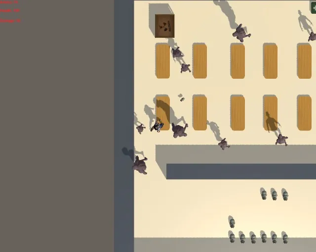
Gameplay/Fun was ok. Your power goes out and you have to fight your way through rooms full of zombies to turn the power back on. Then you have to make your way back. The zombies take more shots to kill than you have time to spare so you lead them around and blow past them when you can. It's not very challenging even though you die alot.
Graphics were great for the two models, but the terrain was pretty sparse and the Z-bomb was a little odd.
For theme, Death was useful sort-of. Getting near death speeds up your attacks and raises your damage multiplier. Dying also gives you an ammo boost.
There wasn't any music, and the death sound effect was a little annoying, but the rest of the sound effects were fine.
For FTUE, I kept getting hung on the walls and the AI was a little strange. There were so many enemies you couldn't get past them. Killing the zombies seemed like a waste of time though since they respawned so quickly. Best strategy was to funnel them through a choke point and hit your z-bomb and run through.
Overall, the gameplay was a little light, but with a day's worth of balancing and polish, I think it could have been much more fun. Still, it was a decent entry, so good job.
[/spoiler]
Team: SpaghettiSauce - __Toz__
Game: A Death a Dozen
Gameplay/fun: 20/25
Graphics: 18/20
Theme: 16/20
Audio: 5/10
FTUE: 9/10
Participation: 10/10
Judges Score: 5/5
Total: 83/100
Thoughts:
[spoiler]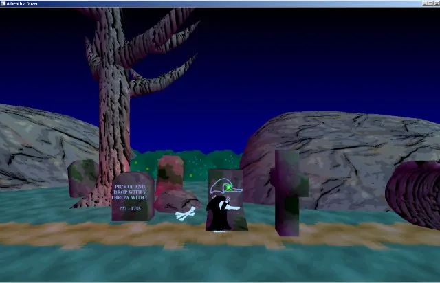
Gameplay/Fun was good. You're an undead platypus (or maybe Death was a platypus) and you're just moving through some platform levels. You collect piles of bones to act as extra lives (bodies) for bypassing level elements.
Graphics were great for a game jam. The main character was clean and animated. The summon bones animation was particularly funny to me. WHEE! And the levels were detailed and populated. You say you were being lazy in the sillouette level, but I thought that was a nice effect.
For theme, Death was useful because when you died you left a pile of bones on the ground that you could use to reach higher elevations or survive on pit spikes. I wish there was a little more along these lines, but still I think this was a good take on theme.
At first, I really liked the music, but as I was playing the level, I wound up turning it off. Unfortunately, there were no sound effects.
FTUE, I didn't have any installation issues, but a couple of times I got ""stuck"" because I couldn't jump over an obstacle because of friction, and the sillouette level was a little annoying to beat even though it looked like a simple stair case.
Overall this was a great entry. This game was a fun little platformer with light puzzle elements and the visuals and level design were something to be proud of.[/spoiler]
Team: Thaumic Games - Thaumaturge
Game: Powerthief
Gameplay/fun: 18/25
Graphics: 17/20
Theme: 15/20
Audio: 6/10
FTUE: 8/10
Participation: 10/10
Judges Score: 5/5
Total: 79/100
Thoughts:
[spoiler]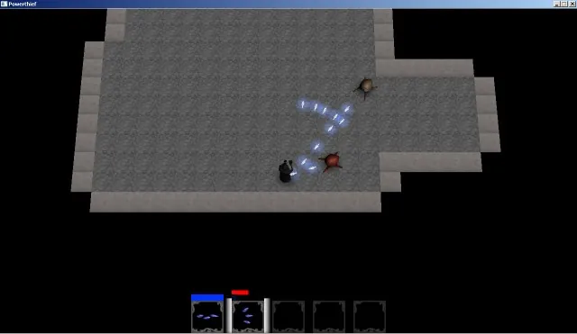
The Gameplay I thought was really cool. You're a sorcerer in a dungeon crawl with lots of different spells, and different enemies. You even gain another spell after beating a few rooms, but it was just too hard to be really fun. I'm not sure if it's my Random Number generator, but the basic enemy started out with firebird and he just kicks the crap out of me. If I was a little faster or the bird was a little slower it would have been more enjoyable.
Graphics were good. The models were decent and the spell effects were really nice looking. The game lagged a bit when I had forced the enemies to take firewall and 5 of us were shooting them everywhere.
Death was indeed useful... But for my enemies! That was an interesting take that I haven't seen yet. It was useful most of the time, until I saw how I could give them all firewall. 
The title music was nice, but you probably should have put that in with the game too. Most of the sound effects were great, but the firebird was kicking my butt and started getting annoying. My dogs didn't like it either and they went crazy looking for the source. Still, decent for a game jam.
FTUE was really nice. I really liked the tutorial text scrawled onto the dungeon floor. The credits screen was nice too. I did get knocked out of the arena once when there was lots of firewalls coming at me. And the game was just a little bit too difficult.
You participated too much! You more than met the 10 points here. You probably could have squeezed out more points in other areas if you weren't busy being so supportive and helpful of others.
For Eck points, you had a great game and you gave a few ideas out to your competitors so I gave you the full 5.
Overall this was a strong entry, but a little bit too difficult. When I playtested an earlier version, I was able to get to a boss level, but with this build I think I made it to the 5th or 6th room on my best run. Next year, if you're going to keep the game so difficult, I recommend a cheat mechanic for judges so they can see all of your game.
P.S. I'm really good at video games! >.<[/spoiler]
Team: StoutWalrus - ArThor
Game: Orc Party
Gameplay/fun: 20/25
Graphics: 17/20
Theme: 17/20
Audio: 0/10
FTUE: 8/10
Participation: 9/10
Judges Score: 5/5
Total: 76/100
Thoughts:
[spoiler]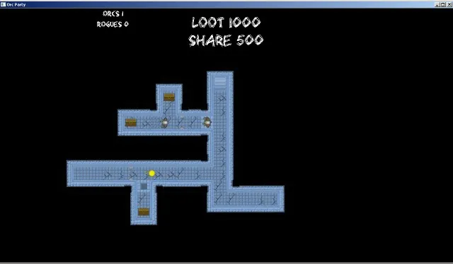
I thought the gameplay was really interesting. You're an ork warlord and you're looting a dungeon. You send your minions to walk ahead and clog a trap or navigate a dangerous hall, grab some loot and come back. Then you move on to the next level.
The graphics were good. Multiple orks have animated sprites, and the dungeon tiles were easy on the eyes. I also felt the font was a good thematic choice for orks.
Death was useful in a couple of different ways. The main way was by clogging traps. The other more sinister way was to bump up your warlord's share of the loot by killing off those unnecessary extra orks just eating up a share. Nice job.
No audio whatsoever. 
For FTUE, the controls were a little clunky. Sometimes door sprites didn't animate properly to show that they were open, and the controls were a little unintuitive. The menu system was great though.
For Eck points, I gave you the full five points for making a great game and some extra points for doing everything yourself.
Overall this game was a solid entry. The lack of sound really hurt you, but I could still see a lot of potential here. A few more ork types and some sound could really bump up your score. Excellent work![/spoiler]
Team: Unicore - Orymus3
Game: Death is Useful(unsure?)
Gameplay/fun: 18/25
Graphics: 12/20
Theme: 14/20
Audio: 7/10
FTUE: 9/10
Participation: 10/10
Judges Score: 5/5
Total: 75/100
Thoughts:
[spoiler]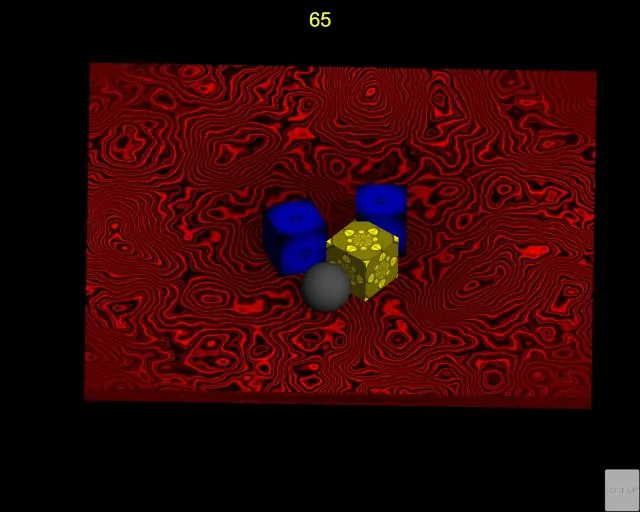
Orymus3 was under extreme time constraints and only logged around 15 hours, but still managed to deliver a decent game. Gameplay I marked at the decent-good range, I accidentally read part of the spoiler and saw there was an achievement for 200+ points so I tried to get that while using the Keyboard. It was really hard and sometimes frustrating, but I didn't give up. After about 50-60 tries I got knocked out of the arena somehow and ticked up to over 400 points but I couldn't die so I couldn't snag that score.  I plugged in my game pad and on the fourth try, got over 200 points.
It looks like I say almost everything is decent, but that's kind of they keyword for my scoring. (abysmall, bad, poor, decent, good, great, amazing)
Graphics decent. Nothing spectacular in the game, just some textured primitives, but the title screen was cool looking.
Theme is decent. The mechanic for extending your playtime isn't anything ground breaking, but there was also the secret message that got me to play a little longer.
Audio is decent. I felt the creepy death sound was pretty cool.
First Time User Experience - Great! I had to dock you 1 point since I got knocked completely out of the arena and had to alt-f4 to close the game. I also couldn't click the Give Up button during game play. But the documentation covered everything and there was even an in-game tutorial.
Participation - Perfect. Even with such limited time, you still manged to do good writeups on your own game and even threw a few meaningful comments for other people's games.
Eck points - Full credit. Orymus3 said he was sad I couldn't compete and that he hoped I would make a belated entry with my cool idea. Plus he had very limited time but still entered something anyway.
All in all, a 75 is on the high-end of decent. Good job Orymus3![/spoiler]
Team: BecauseNerdsCanBSexy2 - Alienguard
Game: apocowlypse
Gameplay/fun: 15/25
Graphics: 17/20
Theme: 5/20
Audio: 8/10
FTUE: 10/10
Participation: 6/10
Judges Score: 5/5
Total: 66/100
Thoughts:
[spoiler]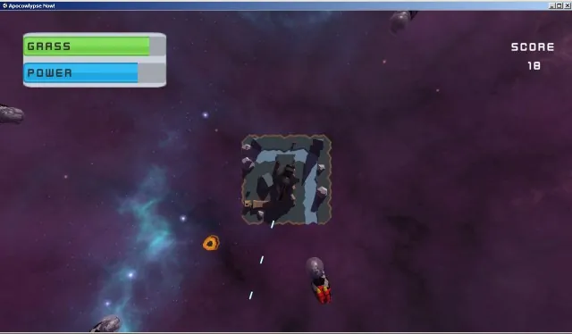
So, you're the last surviving colony of humans protecting the last patch of grass from space cows. The game was pretty fun, but the gameplay was a little too simple. All you do is shoot the cows as they fly in on their jetpacks.
The graphics were great. The base looked interesting, the background was nice, and there were cows in space suits with jet-packs.
Theme... Death is useful. I guess it's useful to kill all those space cows, but that's not really all that dedicated to the theme.
The wacky music was perfect for the bizarre theme and the sound effects were really good. That right-click sound was a little too weird though.
I didn't have any problems with the game, the UI was clean, and the menus were nice. Good job on the credits screen too.
For Eck points, I gave you the full five points because normally wacky-gonzo stuff doesn't do it for me, but you broke past my silliness barrier and I had fun with your game.
Overall this was a solid entry. Not sticking to the theme is what really cost you a bunch of points. The gameplay was a little on the simple side, but the quality of the other areas were top-notch even without considering it was only a week's effort. Great job![/spoiler]
Team: YAG - lede, zylick, and janderson2005
Game: Orcs Vs Zombies
Gameplay/fun: 8/25
Graphics: 13/20
Theme: 10/20
Audio: 5/10
FTUE: 5/10
Participation: 10/10
Judges Score: 4/5
Total: 55/100
Thoughts:
[spoiler]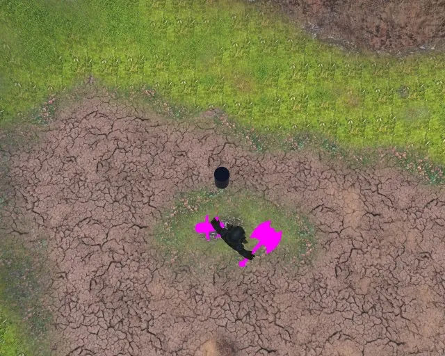
I'm not sure that I have the final version, I read the last blog and it sounds like there are more features implemented than what I saw. Specifically it said you got single player working, but it wouldn't let me click on anything. The only thing I could play successfully was the tutorial. :/
So you're a cylinder (zombie?) and you're at war with the orks. You kill orks and animate hot-pink textureless mini-zombies to kill more orks. When you kill the last ork, you go to a text win-screen with a green square. You move your cylinder next to the unanimated ork to fight and eventually the ork dies and you can reanimate him. The tutorial wasn't very fun but the controls were simple.
For the graphics and models that were there, they were nice. But the ork axe was magenta and so were the minion zombies.
For theme I think you were on the right track. Animating dead seems to be a common take on this, there just wasn't much more there.
The music and ambient sound effects were nice, but there weren't any other sounds. I agree with you that searching for free sounds to use takes up a ton of time, but what you found really worked.
For FTUE, models were missing, textures were missing, after I beat the tutorial I had to alt-f4 to quit and restart, single player didn't work, the button was grayed out and wouldn't let me click on it. Multiplayer spawned me on a field by myself (as I might expect), but your blog said hoardes of orks would need to be overcome. I didn't see any and eventually hit alt-f4.
I gave you the 4 judge points mainly because I think you uploaded the wrong version or maybe I'm doing something wrong. :/
This is the start of a decent game, but there were too many missing pieces for me to give it a good judging. Next year, I'd limit the scope and polish a smaller feature set.[/spoiler]
Team: mousetail - mousetail
Game: Lazer of death
Gameplay/fun: 19/25
Graphics: 15/20
Theme: 11/20
Audio: 7/10
FTUE: 8/10
Participation: 10/10
Judges Score: 5/5
Total: 75/100
Thoughts:
[spoiler]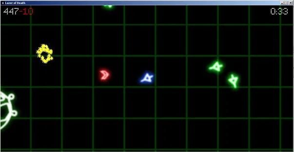
In this game, you're a fighter pilot blastinating other ships asteroids style and collecting as many yellow asterisks as the time limit allows. If you get killed, the timer stops and you get sent to another dimension where you try to collect yellow asterisks and avoid invincible asteroids. If you die in the alternate dimension, you get tossed back into realspace and the timer continues. The gameplay is simple, but still pretty fun. The enemies are varied though not very challenging.
The graphics were nice. All the ships were glowy outlines on a simple tron grid which reminded me of Geometry Wars. The asterisks seemed a little out of place, but other than that, the graphics were clean and meshed well together.
For theme, I felt that death wasn't very useful. Death had a use in that you could die in real-space to get to the bonus level to collect coins, but I could almost always get more coins in real space.
The music was great, and there were a couple of good sound effects, but the explosion felt delayed by about a quarter of a second and there was no sound for firing your weapon. As fast as you fired, this may have been a good thing but it was oddly silent.
FTUE I still feel the bonus level is a little confusing. Some documentation on what's going on or in-game tutorial would have been nice. I didn't even know I was supposed to collect the yellow asterisks at first. But the game never crashed.
I gave you the full five Eck Points for doing everything yourself and making a decent game.
Overall this was a good, fun game. Great job![/spoiler]
Team: Aletheia Game Studios - Cefleet, Matthew P., Rebecca V.
Game: To die is to gain
Gameplay/fun: 15/25
Graphics: 17/20
Theme: 14/20
Audio: 7/10
FTUE: 8/10
Participation: 10/10
Judges Score: 5/5
Total: 76/100
Thoughts:
[spoiler]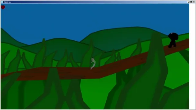
So you're a person in an odd state. You have 2 lives but you can't move until after you lose one life. So a black mushroom guy comes up and obligingly kills you. You can't jump until later on in the level when you power up to get a third heart (and lose two). The gameplay was a little frustrating with the mushroom guys' jumps and walk speeds just a little too quick. They also change speeds when they hit hills making it tough to get a rythm down for sprinting underneath them.
The models and animations were nice. I especially liked the resurrection animation. The cut scenes were interesting but it was difficult to tell what was going on 100% of the time, some text dialogue there may have helped. The levels were well populated unlike some featureless entries we had this year. Nice job.
Death is useful because the more times you die the more powers you get. You could also use a life to bypass enemies that didn't jump. It was weird that basic movement was a ""power"". Supposedly later on you got to jump and grow really big, but I didn't get to see that.
The intro music was good and followed the action of the cut scene, and you had a separate track for the game which was nice. There was only one sound effect that I encountered which was dying and that was fine too. Nice job.
FTUE, I was a little confused what was going on and died a bunch. Then one time I started the game and the mushroom guy kept jumping over me and I couldn't move until he finally killed me and I could move. I had to dig through some journal entries to figure out the details of what was happening. A readme.txt could have helped here. But there were no bugs that I saw.
I gave you the full 5 points for being a teacher and working with kids in the Week of Awesome. From your journals it sounds like you guys had a great time.
Overall, the game had some interesting mechanics, cool animations, decent graphics, and nice looking levels. The gameplay could have been made a little bit easier, or maybe you could have put in a cheat mechanic to allow judges to see more of your game. But this is an entry you should be proud of.[/spoiler]
Team: Casey Hardman - Casey Hardman
Game: Soulwielder
Gameplay/fun: 18/25
Graphics: 16/20
Theme: 13/20
Audio: 0/10
FTUE: 8/10
Participation: 6/10
Judges Score: 4/5
Total: 65/100
Thoughts:
[spoiler]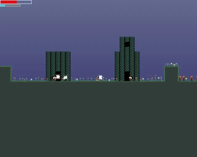
So you're an alien with a ray gun. Little brown guys(fast zombies?) are running around and killing people. You shoot them with your laser and collect their souls to heal and power your big blast. The game is decently fun, but a little tough to control.
The graphics are simple animated sprites, but they're cute. The panicing and screaming humans make me laugh. The levels had decent looking buildings in the background which reminded me of Zelda II. Good job.
Death is useful because you harvest souls to heal and you can use them to power your soul cannon. You collect souls from the zombies, or from the harmless panicing humans. It seems like it's just beneficial to slaughter everything. I wish there was a reason to make a choice here or maybe something different you could do with each soul (bad guys had red souls, good guys had white).
It looks like he didn't have any time for audio. 
For FTUE, the instructions were a little unclear. I spent a few minutes trying to jump over the tall hill, eventually I accidentally did it and was able to progress a little further. Later on I figured out that I needed to jump, hit up and right, and then hit space to dash diagnolly up and add momentum. The game menu was also a little bare bones.
I gave you 3 Eck points for a solid game, and a bonus one for the terrified human sprite. It makes me laugh. 
This was a fun little platformer. Some free people screams and pew pew sounds could have earned you several more points. Controlling my guy was a little difficult with all the keyboard commands, but I eventually got the hang of it. Nice job.[/spoiler]
Team: That Big Fat Chicken - brunoscholz, KalVasFlam
Game: A gift from Hermes
Gameplay/fun: 19/25
Graphics: 18/20
Theme: 12/20
Audio: 10/10
FTUE: 8/10
Participation: 7/10
Judges Score: 5/5
Total: 79/100
Thoughts:
[spoiler]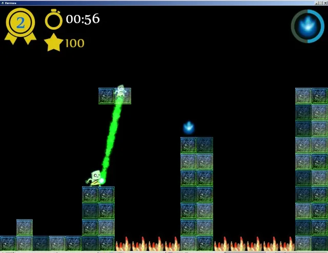
In this game, you're a greek hero commanded by Hermes to go on a quest. Collect the blue smoke! To do this, you throw your soul around and can teleport to it before it disappears. Once you collect the blue smoke you can move on to the next level. The game was fun, but a little too easy. Levels 4 and 5 had interesting tricks to them that could have been developed into more levels if there were time.
The intro cut-scene was epicly amazing. The menu and level selection was polished and professional. The sprite for the hero and his animations were great, and the level/UI was good. Very nice job!
I felt the theme missed the mark by a bit. In the game itself, death isn't useful at all, but the setup for the game kills the hero and gives him this power I think. I would have liked the theme better if your hero had to die in the game to bypass certain obstacles then return to life. As it stand, death happens in the main characters backstory.
The intro music was amazing, the title and game music were great, and the couple of sound effects were nice too.
For FTUE, I had to restart the game a few times. Whenever I died, I never respawned and had to restart the game from level 1. One time I replayed level 1 and then couldn't play anything else. A win screen would have been nice too. I also didn't know I could throw my ghost through blocks for most of the game since the red ones on level 1 block your spirit-throw. When I jumped towards them, my guy got stuck on them so I thought that's why they were special. I figured it out later though. A simple tutorial level that explains what the blocks did would be great. A win screen would have been nice too.
I gave you the full five Eck points for the cut scene alone. That thing was awesome. 
This is a very strong game and I could see you turning it into a real game with the talent on your team. Very nice work guys.[/spoiler]
Team: Mussi - Mussi
Game: Dype
Gameplay/fun: 16/25
Graphics: 0/20
Theme: 2/20
Audio: 0/10
FTUE: 9/10
Participation: 10/10
Judges Score: 5/5
Total: 42/63/100
Thoughts:
[spoiler]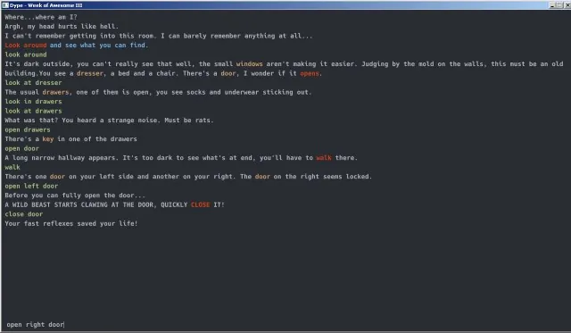
This is a text based adventure. For all you young whiper-snapers it's what we used to play before we had things like graphics. After a quick interactive tutorial, you find yourself in a house and have to escape. It's a simple little text adventure (they're tougher to make than they look!) One cool thing about this game was how the text events would be doled out instead of a big wall of text all at once. You hear rats moving around in the house while you're doing other things. There was also a time-limited part where you have to close a door or be eaten by a wild beast.
Graphics... Well, it's a text-based adventure. There are no graphics or audio for that matter. The text was colored to call out various pieces which was nice. Reminded me of my BBS game playing days.
You aren't going to win the competition with a text based game, but this was a very nice execution. I used my spread sheet to see what your score would have been if no entries earned points for graphics or audio and you were tied with nerds can be sexy too. That's where I got the 64 version from so you could judge where you placed at.
Death didn't seem to be useful at all. It didn't end the game so you got to try again which is where I gave you the 2 points.
I gave you 5 Eck points for making a text based game. It hit a nostalgia button which was nice and I even had a little fun playing it. It seems like you have a nice framework built for futer text-based games if you have the inclination to pursue them. I really liked this entry. Nice work![/spoiler]
Team: CodeMus - IYP, GTE, newtechnology, iDingo
Game: Post of Death
Gameplay/fun: 12/25
Graphics: 15/20
Theme: 12/20
Audio: 6/10
FTUE: 6/10
Participation: 10/10
Judges Score: 3/5
Total: 64/100
Thoughts:
[spoiler]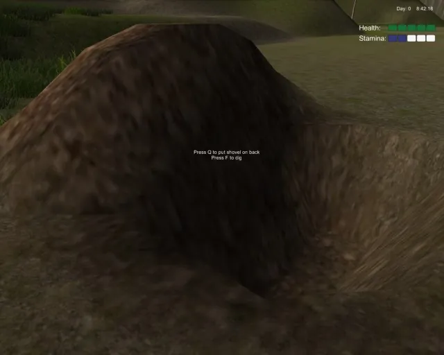
In this game, you're a husband looking for his lost wife who has gone missing while studying strange creatures. You go off to find her and find her abandoned campsite. You have a dream that you need to bury yourself alive and so we do. You then have about a minute to find your body in the spirit world before dieing for good. The game isn't very fun just yet. I think it was probably too big a concept to tackle in a week.
The graphics are good though. The terrain looked nice and there were buildings, furniture, and a nice water effect.
I'm not 100% sure how death was useful. You bury yourself alive to enter into the spirit world only to find your body a little later to return yourself to life. In the normal world if enough time ticks by, you take 3 hits of your 5 health.
The music was creepy and weird, and I thought that suited the horror mood the game was going for. There wasn't much else in the way of sound effects, but this was one of the few UI's with a button sound.
For FTUE, I had some issues. I had to go digging through blog posts to figure out what I should do. A readme.txt or tutorial would have been great. I had trouble entering the doors and walking up short hills. I think my shovel was getting caught on things? And I fell through the world a couple of times after laying down in a bad grave.
I gave you 3 Eck points for trying to tackle a first person game and getting as far as you did with it. Good job.
Overall, the game wasn't quite finished enough. I think a day's worth of polish and some better instructions would have gone a long way towards boosting your score.[/spoiler]
Team: Calinabris - Calinabris
Game: Snake Snack
Gameplay/fun: 10/25
Graphics: 13/20
Theme: 10/20
Audio: 5/10
FTUE: 7/10
Participation: 5/10
Judges Score: 5/5
Total: 55/100
Thoughts:
[spoiler]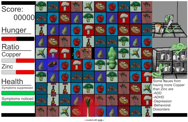
This is a combination of Match-3 and Snake with educational elements that teach us a little about animal testing and copper/zinc imbalances. You have a hunger meter which empties, matching three gives you food but it can cause a copper/zinc imbalance. At that point you can try to balance out your meters with food, or eat some medicine based on animal testing. I didn't have much fun playing it. The game was a little too slow paced and I couldn't get a gague on which foods would give more zinc or more copper so I couldn't make good choices.
The graphics were all pretty decent, but they didn't really mesh together as a whole. The mice falling out of the cages when you triggered an imbalance was a nice effect.
Death is useful in that animal testing causes deaths in animals and we benefit from it. You have a choice to either use medication or balance it yourself with diet choices. This was kind of a stretch, but I appreciate the message.
There was music and a few sound effects decent enough for game-jamness.
For FTUE, there were lots of little bugs, and some big ones. Sometimes food would get created even though 3 random tiles were selected. Sometimes eating a food would give more zinc than copper and sometimes it was the other way around. When medicine came out, you couldn't swap tiles that were underneath medicine. Sometimes my snake would eat food that was across the board.
For Eck points, I gave you points for doing an educational game for something you believe in.
Overall, I don't think the match-3 and snake melded well together and the speed was so slow as to not matter. I tried to balance my levels out with food to spare the poor lab mice, but the tiles moved so slow that I couldn't do it before dieing.[/spoiler]
Team: hu3 team - rodolfodth, devn00b
Game: Try. Die. Repeat.
Gameplay/fun: 22/25
Graphics: 20/20
Theme: 15/20
Audio: 9/10
FTUE: 9/10
Participation: 10/10
Judges Score: 5/5
Total: 90/100
Thoughts:
[spoiler]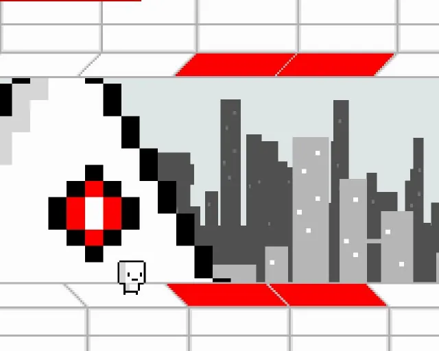
You play as test subjects in Evil Labs deadly experiments. You have an unlimited number of cubers for the first level covering traps with the bodies of previous test subjects. The second level you're racing the big bad evil triangian to the finish line and have to navigate the level near-perfectly to do it. Your goal is to beat the test to prevent Evil Labs from going through with their plans. The game was good fun and the humor reminded me a bit of Portal.
The graphics were really great. The sprites had a retro feel, and they were simple, but the cubers had tons of different styles, and the entire style was very cohesive. The cut scenes were beautiful. I want to say the graphics were simple, but that's not the right word. I think elegant is more appropriate.
Death is useful in that you clog up traps with a cuber test subject so the next guy can pass through. Several entries have gone this route, but the execution was nice.
The music was excellent. They evoke the proper emotions and line up great with the cut-scenes. The text-to-speech voice was a brilliant idea that served as an efficient way to add voice-overs and it added to the humor.
For FTUE, everything was nearly perfect. You had the option to skip the first intro, but I had to sit through the second cut scene every time which was a little annoying while I ground my cubers through the wood chipper.
For Eck points, I had to give you the full 5. Everything looked so polished and was super slick.
Overall, this was an excellent entry. The game was fun and funny. The cut scenes were excellent and it was hard to imagine all of this was done within a single week. I wouldn't be surprised if I saw it on Steam in a few weeks. Spectacular!
[/spoiler]
Team: Great White North Productions - XXChester
Game: Army of the Undead
Gameplay/fun: 11/25
Graphics: 14/20
Theme: 15/20
Audio: 5/10
FTUE: 8/10
Participation: 10/10
Judges Score: 4/5
Total: 67/100
Thoughts:
[spoiler]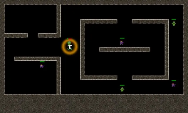
So you're a ghost and there are monsters in your dungeon. Time to kill them and make some buddies! The game mechanics were a little too simple to be fun, but the game has potential. The main problem was the super short ranged attack for both you and the monster. All you can do is trade licks and then spawn a new ghost after you kill him. Being able to walk through walls was nice though.
The title screen graphics were cool, but the in-game graphics were a little basic. The attack effect was a nice pulse explosiony thing.
Death is useful in that you're a ghost and you can walk through walls. You can also lure enemies away and turn invisible to sneak away. After you kill an enemy, it spawns a new ghost unit for you to control.
The ""music"" was a creepy whispering, clinking, audio track that was great. The sound effect was an explosion which seemed out of place.
For FTUE, I ran into a couple of problems. Moving multiple ghosts, they'd all stack up exactly on top of each other so I couldn't tell how many ghosts I had or select a particular ghost. And in the rooms with 2 monsters my second ghost would get killed before I could queue up orders for him to attack. My strategy was basically stealth, get next to the unit, blastinate and it seemed like that could win the game for me.
Overall, the poor unit control and simple game-play made the game not quite fun. Reading the journal entries it looks like you struggled with some pathfinding issues that ate up a bunch of time. I think this game has potential and a day or two of balance would have made a big difference.[/spoiler]
Team: Slaughterhouse Gaming - riuthamus, shadowisadog, ByteTroll
Game: Vault Stone
Gameplay/fun: 13/25
Graphics: 20/20
Theme: 15/20
Audio: 8/10
FTUE: 4/10
Participation: 10/10
Judges Score: 5/5
Total: 75/100
Thoughts:
[spoiler]

You're death, and you're off to kill some pesky humans. You run around, kill things, and turn them into limited duration skeletons and the guards respawn. It seems like they'll respawn endlessly, and I couldn't tell if there was a way to beat the game yet. There's not enough gameplay here to be really fun, but it's still worth checking out.
Graphics are spectacular. There were some graphical issues on my computer, but it's not the newest rig in the field, so I didn't count that against your team. I saw how it was supposed to look. Fantastic job as always. If I were an official judge, I'd have tried to played this on a better computer and rated as-is instead of what it's supposed to be. But I'm not, so there!
Theme was good. I like that death was a resource that you were able to spend. More spells would have been cooler or a way to make death useful for the enemies somehow could have earned your team more points.
Audio was good and the music was really nice. I almost gave a 7 here, but if you'd have started your music track on the title screen it would have squarely been in the 8 range so I rounded up to 8.
FTUE the first time I fired it up at max settings, it took minutes to load and then it was choppy as hell. I scaled back the graphics to minimal, and it went to reasonable load times. The splash screen was cut off on my standard monitor, so I played in 1280 x 720 windowed mode. The way the hotkeys were setup, I thought 1 was auto-attack and 2 was animate dead so I didn't figure out how to animate until after I was almost dead. I started again, and had a much better run. I finally stumbled across the instructions screen when I tried to quit. A readme.txt or a button for the instruction screen on the main menu would have been great.
Overall, it was a very beautiful entry, but one more day of features/clean-up probably would have bumped your score by 10 points. Still, this is a very good entry that your team should be proud of.
[/spoiler]
Team: Koding Nights - dkoding
Game: Death is Awesome
Gameplay/fun: 21/25
Graphics: 16/20
Theme: 20/20
Audio: 9/10
FTUE: 8/10
Participation: 10/10
Judges Score: 4/5
Total: 88/100
Thoughts:
[spoiler]

You play as Death Jr. during the plauge. Business was so good that it's turning bad. Not enough people are surviving to keep your numbers up, so your parents end you top-side to go help. You kill stuff, you level up, you harvest grain as well as souls. The intro story is well written and funny. And the gameplay is pretty good with a controller. All good stuff.
Graphics were good and sometimes humurous. The mom and dad skulls made me laugh. The animated blue plasma effect was really nice.
Death was useful in multiple ways. Killing the plague rats helped the people. Killing things leveled you up. Death harvested the grain making himself useful to the humans. Very nice job.
Audio was good. Everything seemed to mesh nicely together from music to the various sound effects.
Everything was near perfect, but it crashed on me the very first time I played it right when I swiped at a plague rat for my first hit. After that, the only issue was it seemed like if I tried to replay the same level the rats would only need to eat a piece or two of grain making that level unbeatable. I did finally manage to beat a later level, so that was cool.
For the Eck Points, I gave you three for making a great game, and one more for being my favorite theme.
Overall, this was a very good entry that was both fun and interesting. I would have liked a few less levels and an overall victory condition. Also, for the graphics and audio, I would have liked to see specific attribution to the resources that you used in the readme.txt file. Most of the stuff I find online has some kind of attribution license, but you just linked to the core sites. Great job!
[/spoiler]
Team: AngeReveur - AngeReveur
Game: Death is Useful
Gameplay/fun: 20/25
Graphics: 19/20
Theme: 13/20
Audio: 8/10
FTUE: 8/10
Participation: 10/10
Judges Score: 5/5
Total: 83/100
Thoughts:
[spoiler]

You play as a knight who discovers Death is missing. You free him from a block of ice and then things can start dieing again. This is a well executed platformer with good controls. Some parts were tough and the boss fight took me a while to beat, but I eventually made it. Fun game!
Graphics were great for a game jam. Simple animations on the enemies, but a very nice animation for our main hero.
For theme, I don't think it was very central to the game. You set death free, and he gives you a power-up.
Audio was good and had a retro feel that fit together with the chosen art-style. I still can't believe you haven't played Ghosts and Goblins. Posted Image
FTUE was great. The credits button crashed for me, but I was able to open up the included text file. In the boss fight, jumping up to the top central platform, and then falling back to the ground actually kills you. It took me a few tries before I figured that out. And I got into a weird situation going from hardest difficulty to medium where it kept killing me the instant I spawned and I racked up 500+ deaths in no time. Had to restart the game.
For the Eck points, I gave you 3 points for an overall great game and the other 1 for going to great pains with your credits/attribution of your used resources, and 1 more to ease the rough score I gave for theme.
Overall this was a great entry, but I felt the theme was a little lacking. Still, the game was really fun and you did a great job![/spoiler]
Team: Something fun - ryan20fun
Game: Chaotic Ball Carnage
Gameplay/fun: 9/25
Graphics: 9/20
Theme: 7/20
Audio: 5/10
FTUE: 5/10
Participation: 10/10
Judges Score: 5/5
Total: 50/100
Thoughts:
[spoiler]

Gameplay/Fun was a little lacking for me. The controls were responsive, but I wasn't sure what I was supposed to do.
Graphics were minimal, lots of spheres with varying textures. The playing field was a little blurry and overall the graphics didn't seem very cohesive.
I had some trouble telling what was going on (probably the point in Chaotic ball Carnage), so I didn't understand how death was useful until I dug through some of your blog posts.
For audio, the music was nice, but the sound effects weren't all that great.
FTUE I really had trouble telling what was going on, but I think everything is working. All the little inspector windows made me feel like I was editing your game instead of playing it. I hadn't known I died since I was still able to move my sphere, I just couldn't shoot anymore.
Considering you only had one week without the benefit of a big-dog-daddy engine, I'd still say it was a good effort.[/spoiler]
Team: Differentname - Differentname
Game: Lich
Gameplay/fun: 22/25
Graphics: 17/20
Theme: 19/20
Audio: 6/10
FTUE: 10/10
Participation: 10/10
Judges Score: 5/5
Total: 89/100
Thoughts:
[spoiler]

You're a necromancer and the local townsfolk are trying to lynch you. You have a melee swipe, a blast, and can animate dead. Collecting souls makes you temporarily more powerful and advances you to the next stage, plus the spirit world is pretty cool. Very fun game.
Graphics were good. The sprites were simple, but really nice. No animations, but the UI and terrain were clean.
I really liked the theme. Death was useful in multiple ways. Killing townsfolk generated mana to collect and bodies to animate. Dying yourself let you collect the mana, and also let you return to life with full health.
Audio was a little on the simple side, but fit nicely with the game. Unfortunately there was no music.
I didn't encounter any issues with your game. The ingame tutorial was nice and the difficulty ramped up so you could get used to the concepts.
For the Eck points, I gave the full five for making a great game, doing everything yourself, and just an overall polished game.
Overall, this is a really great game that really nailed the theme. Sadly there wasn't any music. Some free music could have got you a few more points here and probably won the Unofficial Eck Judging contest. Sad day! Anyway, this game was one of my favorites and you should be very proud of this game.[/spoiler]
Team: Ovensparrow - MarioLuigiMan, Onigiri Flash
Game: DeathJam
Gameplay/fun: 5/25
Graphics: 12/20
Theme: 2/20
Audio: 5/10
FTUE: 4/10
Participation: 4/10
Judges Score: 1/5
Total: 33/100
Thoughts:
[spoiler]

Gameplay/Fun just wasn't there. You're a horse, pushing around skulls and crossbones to a huge green rectangle. But the horse moves about 5 times as fast as the camera so you're quickly off the screen. The only reason the last level was tough was because the horse couldn't push the crossbones fast enough and sometimes it would get stuck next to a wall where you couldn't do anything.
Graphics were really good for the few sprites that were there. There wasn't a background and the terrain was a flat color, but I liked what I saw.
I think you missed the theme by a wide mark. There was a skull, and the music was spooky, other than that I don't see how death was useful in your game.
The music was great and seemed appropriately spooky, but there weren't any sound effects at all.
For FTUE, the menu screen seemed like a placeholder, and the camera couldn't keep up with my horse. I was also able to jump off a level and just kept falling. I was also a little put off by being asked for a donation to downlod your game jam game.
Participation was light, so I docked some points there.
For Eck points, I gave you 2 more points for the music.
Overall, this entry wasn't very good. The sprites were nice looking and the music was great, but the game came up short. Next year I'd focus more on theme and gameplay because those two areas really hurt you.
[/spoiler]
Team: New Old Things - endurion
Game: Bunny Hop
Gameplay/fun: 19/25
Graphics: 14/20
Theme: 18/20
Audio: 7/10
FTUE: 10/10
Participation: 10/10
Judges Score: 5/5
Total: 83/100
Thoughts:
[spoiler]

Gameplay/Fun was nice. You're a bunny (family of bunnies?) trying to get all the carrots for a level, some of which must make the ultimate sacrfice so that others may eat... Those bunnies were the greatest heroes of them all. There were a lot of levels and even some challenging ones.
Graphics were okay, the animations were simple, but I think they all fit together nicely. Lots of blood. It looks like developer art, but that's just fine in a game jam. Good job sir!
For theme, death was useful in a couple of different ways. A bunny could clog up the various traps or leave pieces of its corpse on pressure switches to progress through the level. Or you could use it as a warp back to the spawn point for time based puzzles. I think this was a good interpretation.
The audio was good with two tracks of background music and multiple sound effects for death. The jump sound started getting on my nerves after a while, but it also reminded me of the olden days so I didn't dock you any points.
FTUE, everything worked just fine. All the controls were intuitive and you even allowed us to configure our own controls! Very nice since jump should be SPACE.
For Eck points, I gave you three for making a great game, one for having configurable controls, and the last point for the clever levels.
Overall this was a very good entry. There were tons of levels (maybe a few too many), but they were enjoyable. Solid scores in all the categories led to a really nice experience. Excellent work!
[/spoiler]
Team: Mud Pit - Lactose!
Game: Death and Flowers
Gameplay/fun: 19/25
Graphics: 20/20
Theme: 13/20
Audio: 8/10
FTUE: 10/10
Participation: 10/10
Judges Score: 5/5
Total: 85/100
Thoughts:
[spoiler][attachment=28786:DeathAndFlowers]
Gameplay/Fun was good. You're death, and apparently you're tired of existing with a bunch of dead flowers in your shifting labyrinth of a house. You navigate the levels by swapping rooms around in the level (very nice mechanic and smoothly executed). Later on you make use of your scythe to administer justice to pesky weeds.
Graphics were great. The levels were beautiful and detailed with each section having a run-down and pretty version. The UI for room swaps was also done very nicely.
For theme, death was the main character, and he waters flowers, so technically death is useful. The art and theme is cute, but other than Death loving pretty flowers there wasn't much of a twist on the theme. If the theme was something about spatial orientation, you would have nailed this.
The music was a catchy tune that really fit the mood. There were only a few sound effects, but they were good too.
Perfect FTUE. I really liked how you called out your own name on the splash screen. The intro was short and sweet while the main mechanic of the game was just super slick. I also liked how smooth the camera was.
For Eck points, I gave the full points for making a great game and the cool room switching mechanic.
Overall this was an awesome entry. The graphics were top-notch, the gameplay was smooth, and I could see you turning this into a real game. For me the theme was just a little off the mark though and I hated docking the points. Luckily, I'm not a for reals judge so this won't affect your final score! And it looks like you've done well enough to earn my Floating Combat Text asset, so I don't feel too bad. Huzzah!
[/spoiler]
Team: Oddfellow Games - WASDMagician
Game: reincarnage
Gameplay/fun: 12/25
Graphics: 14/20
Theme: 13/20
Audio: 5/10
FTUE: 8/10
Participation: 10/10
Judges Score: 2/5
Total: 64/100
Thoughts:
[spoiler]

Gameplay/Fun was ok. Your power goes out and you have to fight your way through rooms full of zombies to turn the power back on. Then you have to make your way back. The zombies take more shots to kill than you have time to spare so you lead them around and blow past them when you can. It's not very challenging even though you die alot.
Graphics were great for the two models, but the terrain was pretty sparse and the Z-bomb was a little odd.
For theme, Death was useful sort-of. Getting near death speeds up your attacks and raises your damage multiplier. Dying also gives you an ammo boost.
There wasn't any music, and the death sound effect was a little annoying, but the rest of the sound effects were fine.
For FTUE, I kept getting hung on the walls and the AI was a little strange. There were so many enemies you couldn't get past them. Killing the zombies seemed like a waste of time though since they respawned so quickly. Best strategy was to funnel them through a choke point and hit your z-bomb and run through.
Overall, the gameplay was a little light, but with a day's worth of balancing and polish, I think it could have been much more fun. Still, it was a decent entry, so good job.
[/spoiler]
Team: SpaghettiSauce - __Toz__
Game: A Death a Dozen
Gameplay/fun: 20/25
Graphics: 18/20
Theme: 16/20
Audio: 5/10
FTUE: 9/10
Participation: 10/10
Judges Score: 5/5
Total: 83/100
Thoughts:
[spoiler]

Gameplay/Fun was good. You're an undead platypus (or maybe Death was a platypus) and you're just moving through some platform levels. You collect piles of bones to act as extra lives (bodies) for bypassing level elements.
Graphics were great for a game jam. The main character was clean and animated. The summon bones animation was particularly funny to me. WHEE! And the levels were detailed and populated. You say you were being lazy in the sillouette level, but I thought that was a nice effect.
For theme, Death was useful because when you died you left a pile of bones on the ground that you could use to reach higher elevations or survive on pit spikes. I wish there was a little more along these lines, but still I think this was a good take on theme.
At first, I really liked the music, but as I was playing the level, I wound up turning it off. Unfortunately, there were no sound effects.
FTUE, I didn't have any installation issues, but a couple of times I got ""stuck"" because I couldn't jump over an obstacle because of friction, and the sillouette level was a little annoying to beat even though it looked like a simple stair case.
Overall this was a great entry. This game was a fun little platformer with light puzzle elements and the visuals and level design were something to be proud of.[/spoiler]
Team: Thaumic Games - Thaumaturge
Game: Powerthief
Gameplay/fun: 18/25
Graphics: 17/20
Theme: 15/20
Audio: 6/10
FTUE: 8/10
Participation: 10/10
Judges Score: 5/5
Total: 79/100
Thoughts:
[spoiler]

The Gameplay I thought was really cool. You're a sorcerer in a dungeon crawl with lots of different spells, and different enemies. You even gain another spell after beating a few rooms, but it was just too hard to be really fun. I'm not sure if it's my Random Number generator, but the basic enemy started out with firebird and he just kicks the crap out of me. If I was a little faster or the bird was a little slower it would have been more enjoyable.
Graphics were good. The models were decent and the spell effects were really nice looking. The game lagged a bit when I had forced the enemies to take firewall and 5 of us were shooting them everywhere.
Death was indeed useful... But for my enemies! That was an interesting take that I haven't seen yet. It was useful most of the time, until I saw how I could give them all firewall.
The title music was nice, but you probably should have put that in with the game too. Most of the sound effects were great, but the firebird was kicking my butt and started getting annoying. My dogs didn't like it either and they went crazy looking for the source. Still, decent for a game jam.
FTUE was really nice. I really liked the tutorial text scrawled onto the dungeon floor. The credits screen was nice too. I did get knocked out of the arena once when there was lots of firewalls coming at me. And the game was just a little bit too difficult.
You participated too much! You more than met the 10 points here. You probably could have squeezed out more points in other areas if you weren't busy being so supportive and helpful of others.
For Eck points, you had a great game and you gave a few ideas out to your competitors so I gave you the full 5.
Overall this was a strong entry, but a little bit too difficult. When I playtested an earlier version, I was able to get to a boss level, but with this build I think I made it to the 5th or 6th room on my best run. Next year, if you're going to keep the game so difficult, I recommend a cheat mechanic for judges so they can see all of your game.
P.S. I'm really good at video games! >.<[/spoiler]
Team: StoutWalrus - ArThor
Game: Orc Party
Gameplay/fun: 20/25
Graphics: 17/20
Theme: 17/20
Audio: 0/10
FTUE: 8/10
Participation: 9/10
Judges Score: 5/5
Total: 76/100
Thoughts:
[spoiler]

I thought the gameplay was really interesting. You're an ork warlord and you're looting a dungeon. You send your minions to walk ahead and clog a trap or navigate a dangerous hall, grab some loot and come back. Then you move on to the next level.
The graphics were good. Multiple orks have animated sprites, and the dungeon tiles were easy on the eyes. I also felt the font was a good thematic choice for orks.
Death was useful in a couple of different ways. The main way was by clogging traps. The other more sinister way was to bump up your warlord's share of the loot by killing off those unnecessary extra orks just eating up a share. Nice job.
No audio whatsoever.
For FTUE, the controls were a little clunky. Sometimes door sprites didn't animate properly to show that they were open, and the controls were a little unintuitive. The menu system was great though.
For Eck points, I gave you the full five points for making a great game and some extra points for doing everything yourself.
Overall this game was a solid entry. The lack of sound really hurt you, but I could still see a lot of potential here. A few more ork types and some sound could really bump up your score. Excellent work![/spoiler]
Team: Unicore - Orymus3
Game: Death is Useful(unsure?)
Gameplay/fun: 18/25
Graphics: 12/20
Theme: 14/20
Audio: 7/10
FTUE: 9/10
Participation: 10/10
Judges Score: 5/5
Total: 75/100
Thoughts:
[spoiler]

Orymus3 was under extreme time constraints and only logged around 15 hours, but still managed to deliver a decent game. Gameplay I marked at the decent-good range, I accidentally read part of the spoiler and saw there was an achievement for 200+ points so I tried to get that while using the Keyboard. It was really hard and sometimes frustrating, but I didn't give up. After about 50-60 tries I got knocked out of the arena somehow and ticked up to over 400 points but I couldn't die so I couldn't snag that score.
It looks like I say almost everything is decent, but that's kind of they keyword for my scoring. (abysmall, bad, poor, decent, good, great, amazing)
Graphics decent. Nothing spectacular in the game, just some textured primitives, but the title screen was cool looking.
Theme is decent. The mechanic for extending your playtime isn't anything ground breaking, but there was also the secret message that got me to play a little longer.
Audio is decent. I felt the creepy death sound was pretty cool.
First Time User Experience - Great! I had to dock you 1 point since I got knocked completely out of the arena and had to alt-f4 to close the game. I also couldn't click the Give Up button during game play. But the documentation covered everything and there was even an in-game tutorial.
Participation - Perfect. Even with such limited time, you still manged to do good writeups on your own game and even threw a few meaningful comments for other people's games.
Eck points - Full credit. Orymus3 said he was sad I couldn't compete and that he hoped I would make a belated entry with my cool idea. Plus he had very limited time but still entered something anyway.
All in all, a 75 is on the high-end of decent. Good job Orymus3![/spoiler]
Team: BecauseNerdsCanBSexy2 - Alienguard
Game: apocowlypse
Gameplay/fun: 15/25
Graphics: 17/20
Theme: 5/20
Audio: 8/10
FTUE: 10/10
Participation: 6/10
Judges Score: 5/5
Total: 66/100
Thoughts:
[spoiler]

So, you're the last surviving colony of humans protecting the last patch of grass from space cows. The game was pretty fun, but the gameplay was a little too simple. All you do is shoot the cows as they fly in on their jetpacks.
The graphics were great. The base looked interesting, the background was nice, and there were cows in space suits with jet-packs.
Theme... Death is useful. I guess it's useful to kill all those space cows, but that's not really all that dedicated to the theme.
The wacky music was perfect for the bizarre theme and the sound effects were really good. That right-click sound was a little too weird though.
I didn't have any problems with the game, the UI was clean, and the menus were nice. Good job on the credits screen too.
For Eck points, I gave you the full five points because normally wacky-gonzo stuff doesn't do it for me, but you broke past my silliness barrier and I had fun with your game.
Overall this was a solid entry. Not sticking to the theme is what really cost you a bunch of points. The gameplay was a little on the simple side, but the quality of the other areas were top-notch even without considering it was only a week's effort. Great job![/spoiler]
Team: YAG - lede, zylick, and janderson2005
Game: Orcs Vs Zombies
Gameplay/fun: 8/25
Graphics: 13/20
Theme: 10/20
Audio: 5/10
FTUE: 5/10
Participation: 10/10
Judges Score: 4/5
Total: 55/100
Thoughts:
[spoiler]

I'm not sure that I have the final version, I read the last blog and it sounds like there are more features implemented than what I saw. Specifically it said you got single player working, but it wouldn't let me click on anything. The only thing I could play successfully was the tutorial. :/
So you're a cylinder (zombie?) and you're at war with the orks. You kill orks and animate hot-pink textureless mini-zombies to kill more orks. When you kill the last ork, you go to a text win-screen with a green square. You move your cylinder next to the unanimated ork to fight and eventually the ork dies and you can reanimate him. The tutorial wasn't very fun but the controls were simple.
For the graphics and models that were there, they were nice. But the ork axe was magenta and so were the minion zombies.
For theme I think you were on the right track. Animating dead seems to be a common take on this, there just wasn't much more there.
The music and ambient sound effects were nice, but there weren't any other sounds. I agree with you that searching for free sounds to use takes up a ton of time, but what you found really worked.
For FTUE, models were missing, textures were missing, after I beat the tutorial I had to alt-f4 to quit and restart, single player didn't work, the button was grayed out and wouldn't let me click on it. Multiplayer spawned me on a field by myself (as I might expect), but your blog said hoardes of orks would need to be overcome. I didn't see any and eventually hit alt-f4.
I gave you the 4 judge points mainly because I think you uploaded the wrong version or maybe I'm doing something wrong. :/
This is the start of a decent game, but there were too many missing pieces for me to give it a good judging. Next year, I'd limit the scope and polish a smaller feature set.[/spoiler]
Team: mousetail - mousetail
Game: Lazer of death
Gameplay/fun: 19/25
Graphics: 15/20
Theme: 11/20
Audio: 7/10
FTUE: 8/10
Participation: 10/10
Judges Score: 5/5
Total: 75/100
Thoughts:
[spoiler]

In this game, you're a fighter pilot blastinating other ships asteroids style and collecting as many yellow asterisks as the time limit allows. If you get killed, the timer stops and you get sent to another dimension where you try to collect yellow asterisks and avoid invincible asteroids. If you die in the alternate dimension, you get tossed back into realspace and the timer continues. The gameplay is simple, but still pretty fun. The enemies are varied though not very challenging.
The graphics were nice. All the ships were glowy outlines on a simple tron grid which reminded me of Geometry Wars. The asterisks seemed a little out of place, but other than that, the graphics were clean and meshed well together.
For theme, I felt that death wasn't very useful. Death had a use in that you could die in real-space to get to the bonus level to collect coins, but I could almost always get more coins in real space.
The music was great, and there were a couple of good sound effects, but the explosion felt delayed by about a quarter of a second and there was no sound for firing your weapon. As fast as you fired, this may have been a good thing but it was oddly silent.
FTUE I still feel the bonus level is a little confusing. Some documentation on what's going on or in-game tutorial would have been nice. I didn't even know I was supposed to collect the yellow asterisks at first. But the game never crashed.
I gave you the full five Eck Points for doing everything yourself and making a decent game.
Overall this was a good, fun game. Great job![/spoiler]
Team: Aletheia Game Studios - Cefleet, Matthew P., Rebecca V.
Game: To die is to gain
Gameplay/fun: 15/25
Graphics: 17/20
Theme: 14/20
Audio: 7/10
FTUE: 8/10
Participation: 10/10
Judges Score: 5/5
Total: 76/100
Thoughts:
[spoiler]

So you're a person in an odd state. You have 2 lives but you can't move until after you lose one life. So a black mushroom guy comes up and obligingly kills you. You can't jump until later on in the level when you power up to get a third heart (and lose two). The gameplay was a little frustrating with the mushroom guys' jumps and walk speeds just a little too quick. They also change speeds when they hit hills making it tough to get a rythm down for sprinting underneath them.
The models and animations were nice. I especially liked the resurrection animation. The cut scenes were interesting but it was difficult to tell what was going on 100% of the time, some text dialogue there may have helped. The levels were well populated unlike some featureless entries we had this year. Nice job.
Death is useful because the more times you die the more powers you get. You could also use a life to bypass enemies that didn't jump. It was weird that basic movement was a ""power"". Supposedly later on you got to jump and grow really big, but I didn't get to see that.
The intro music was good and followed the action of the cut scene, and you had a separate track for the game which was nice. There was only one sound effect that I encountered which was dying and that was fine too. Nice job.
FTUE, I was a little confused what was going on and died a bunch. Then one time I started the game and the mushroom guy kept jumping over me and I couldn't move until he finally killed me and I could move. I had to dig through some journal entries to figure out the details of what was happening. A readme.txt could have helped here. But there were no bugs that I saw.
I gave you the full 5 points for being a teacher and working with kids in the Week of Awesome. From your journals it sounds like you guys had a great time.
Overall, the game had some interesting mechanics, cool animations, decent graphics, and nice looking levels. The gameplay could have been made a little bit easier, or maybe you could have put in a cheat mechanic to allow judges to see more of your game. But this is an entry you should be proud of.[/spoiler]
Team: Casey Hardman - Casey Hardman
Game: Soulwielder
Gameplay/fun: 18/25
Graphics: 16/20
Theme: 13/20
Audio: 0/10
FTUE: 8/10
Participation: 6/10
Judges Score: 4/5
Total: 65/100
Thoughts:
[spoiler]

So you're an alien with a ray gun. Little brown guys(fast zombies?) are running around and killing people. You shoot them with your laser and collect their souls to heal and power your big blast. The game is decently fun, but a little tough to control.
The graphics are simple animated sprites, but they're cute. The panicing and screaming humans make me laugh. The levels had decent looking buildings in the background which reminded me of Zelda II. Good job.
Death is useful because you harvest souls to heal and you can use them to power your soul cannon. You collect souls from the zombies, or from the harmless panicing humans. It seems like it's just beneficial to slaughter everything. I wish there was a reason to make a choice here or maybe something different you could do with each soul (bad guys had red souls, good guys had white).
It looks like he didn't have any time for audio.
For FTUE, the instructions were a little unclear. I spent a few minutes trying to jump over the tall hill, eventually I accidentally did it and was able to progress a little further. Later on I figured out that I needed to jump, hit up and right, and then hit space to dash diagnolly up and add momentum. The game menu was also a little bare bones.
I gave you 3 Eck points for a solid game, and a bonus one for the terrified human sprite. It makes me laugh.
This was a fun little platformer. Some free people screams and pew pew sounds could have earned you several more points. Controlling my guy was a little difficult with all the keyboard commands, but I eventually got the hang of it. Nice job.[/spoiler]
Team: That Big Fat Chicken - brunoscholz, KalVasFlam
Game: A gift from Hermes
Gameplay/fun: 19/25
Graphics: 18/20
Theme: 12/20
Audio: 10/10
FTUE: 8/10
Participation: 7/10
Judges Score: 5/5
Total: 79/100
Thoughts:
[spoiler]

In this game, you're a greek hero commanded by Hermes to go on a quest. Collect the blue smoke! To do this, you throw your soul around and can teleport to it before it disappears. Once you collect the blue smoke you can move on to the next level. The game was fun, but a little too easy. Levels 4 and 5 had interesting tricks to them that could have been developed into more levels if there were time.
The intro cut-scene was epicly amazing. The menu and level selection was polished and professional. The sprite for the hero and his animations were great, and the level/UI was good. Very nice job!
I felt the theme missed the mark by a bit. In the game itself, death isn't useful at all, but the setup for the game kills the hero and gives him this power I think. I would have liked the theme better if your hero had to die in the game to bypass certain obstacles then return to life. As it stand, death happens in the main characters backstory.
The intro music was amazing, the title and game music were great, and the couple of sound effects were nice too.
For FTUE, I had to restart the game a few times. Whenever I died, I never respawned and had to restart the game from level 1. One time I replayed level 1 and then couldn't play anything else. A win screen would have been nice too. I also didn't know I could throw my ghost through blocks for most of the game since the red ones on level 1 block your spirit-throw. When I jumped towards them, my guy got stuck on them so I thought that's why they were special. I figured it out later though. A simple tutorial level that explains what the blocks did would be great. A win screen would have been nice too.
I gave you the full five Eck points for the cut scene alone. That thing was awesome.
This is a very strong game and I could see you turning it into a real game with the talent on your team. Very nice work guys.[/spoiler]
Team: Mussi - Mussi
Game: Dype
Gameplay/fun: 16/25
Graphics: 0/20
Theme: 2/20
Audio: 0/10
FTUE: 9/10
Participation: 10/10
Judges Score: 5/5
Total: 42/63/100
Thoughts:
[spoiler]

This is a text based adventure. For all you young whiper-snapers it's what we used to play before we had things like graphics. After a quick interactive tutorial, you find yourself in a house and have to escape. It's a simple little text adventure (they're tougher to make than they look!) One cool thing about this game was how the text events would be doled out instead of a big wall of text all at once. You hear rats moving around in the house while you're doing other things. There was also a time-limited part where you have to close a door or be eaten by a wild beast.
Graphics... Well, it's a text-based adventure. There are no graphics or audio for that matter. The text was colored to call out various pieces which was nice. Reminded me of my BBS game playing days.
You aren't going to win the competition with a text based game, but this was a very nice execution. I used my spread sheet to see what your score would have been if no entries earned points for graphics or audio and you were tied with nerds can be sexy too. That's where I got the 64 version from so you could judge where you placed at.
Death didn't seem to be useful at all. It didn't end the game so you got to try again which is where I gave you the 2 points.
I gave you 5 Eck points for making a text based game. It hit a nostalgia button which was nice and I even had a little fun playing it. It seems like you have a nice framework built for futer text-based games if you have the inclination to pursue them. I really liked this entry. Nice work![/spoiler]
Team: CodeMus - IYP, GTE, newtechnology, iDingo
Game: Post of Death
Gameplay/fun: 12/25
Graphics: 15/20
Theme: 12/20
Audio: 6/10
FTUE: 6/10
Participation: 10/10
Judges Score: 3/5
Total: 64/100
Thoughts:
[spoiler]

In this game, you're a husband looking for his lost wife who has gone missing while studying strange creatures. You go off to find her and find her abandoned campsite. You have a dream that you need to bury yourself alive and so we do. You then have about a minute to find your body in the spirit world before dieing for good. The game isn't very fun just yet. I think it was probably too big a concept to tackle in a week.
The graphics are good though. The terrain looked nice and there were buildings, furniture, and a nice water effect.
I'm not 100% sure how death was useful. You bury yourself alive to enter into the spirit world only to find your body a little later to return yourself to life. In the normal world if enough time ticks by, you take 3 hits of your 5 health.
The music was creepy and weird, and I thought that suited the horror mood the game was going for. There wasn't much else in the way of sound effects, but this was one of the few UI's with a button sound.
For FTUE, I had some issues. I had to go digging through blog posts to figure out what I should do. A readme.txt or tutorial would have been great. I had trouble entering the doors and walking up short hills. I think my shovel was getting caught on things? And I fell through the world a couple of times after laying down in a bad grave.
I gave you 3 Eck points for trying to tackle a first person game and getting as far as you did with it. Good job.
Overall, the game wasn't quite finished enough. I think a day's worth of polish and some better instructions would have gone a long way towards boosting your score.[/spoiler]
Team: Calinabris - Calinabris
Game: Snake Snack
Gameplay/fun: 10/25
Graphics: 13/20
Theme: 10/20
Audio: 5/10
FTUE: 7/10
Participation: 5/10
Judges Score: 5/5
Total: 55/100
Thoughts:
[spoiler]

This is a combination of Match-3 and Snake with educational elements that teach us a little about animal testing and copper/zinc imbalances. You have a hunger meter which empties, matching three gives you food but it can cause a copper/zinc imbalance. At that point you can try to balance out your meters with food, or eat some medicine based on animal testing. I didn't have much fun playing it. The game was a little too slow paced and I couldn't get a gague on which foods would give more zinc or more copper so I couldn't make good choices.
The graphics were all pretty decent, but they didn't really mesh together as a whole. The mice falling out of the cages when you triggered an imbalance was a nice effect.
Death is useful in that animal testing causes deaths in animals and we benefit from it. You have a choice to either use medication or balance it yourself with diet choices. This was kind of a stretch, but I appreciate the message.
There was music and a few sound effects decent enough for game-jamness.
For FTUE, there were lots of little bugs, and some big ones. Sometimes food would get created even though 3 random tiles were selected. Sometimes eating a food would give more zinc than copper and sometimes it was the other way around. When medicine came out, you couldn't swap tiles that were underneath medicine. Sometimes my snake would eat food that was across the board.
For Eck points, I gave you points for doing an educational game for something you believe in.
Overall, I don't think the match-3 and snake melded well together and the speed was so slow as to not matter. I tried to balance my levels out with food to spare the poor lab mice, but the tiles moved so slow that I couldn't do it before dieing.[/spoiler]
Team: hu3 team - rodolfodth, devn00b
Game: Try. Die. Repeat.
Gameplay/fun: 22/25
Graphics: 20/20
Theme: 15/20
Audio: 9/10
FTUE: 9/10
Participation: 10/10
Judges Score: 5/5
Total: 90/100
Thoughts:
[spoiler]

You play as test subjects in Evil Labs deadly experiments. You have an unlimited number of cubers for the first level covering traps with the bodies of previous test subjects. The second level you're racing the big bad evil triangian to the finish line and have to navigate the level near-perfectly to do it. Your goal is to beat the test to prevent Evil Labs from going through with their plans. The game was good fun and the humor reminded me a bit of Portal.
The graphics were really great. The sprites had a retro feel, and they were simple, but the cubers had tons of different styles, and the entire style was very cohesive. The cut scenes were beautiful. I want to say the graphics were simple, but that's not the right word. I think elegant is more appropriate.
Death is useful in that you clog up traps with a cuber test subject so the next guy can pass through. Several entries have gone this route, but the execution was nice.
The music was excellent. They evoke the proper emotions and line up great with the cut-scenes. The text-to-speech voice was a brilliant idea that served as an efficient way to add voice-overs and it added to the humor.
For FTUE, everything was nearly perfect. You had the option to skip the first intro, but I had to sit through the second cut scene every time which was a little annoying while I ground my cubers through the wood chipper.
For Eck points, I had to give you the full 5. Everything looked so polished and was super slick.
Overall, this was an excellent entry. The game was fun and funny. The cut scenes were excellent and it was hard to imagine all of this was done within a single week. I wouldn't be surprised if I saw it on Steam in a few weeks. Spectacular!
[/spoiler]
Team: Great White North Productions - XXChester
Game: Army of the Undead
Gameplay/fun: 11/25
Graphics: 14/20
Theme: 15/20
Audio: 5/10
FTUE: 8/10
Participation: 10/10
Judges Score: 4/5
Total: 67/100
Thoughts:
[spoiler]

So you're a ghost and there are monsters in your dungeon. Time to kill them and make some buddies! The game mechanics were a little too simple to be fun, but the game has potential. The main problem was the super short ranged attack for both you and the monster. All you can do is trade licks and then spawn a new ghost after you kill him. Being able to walk through walls was nice though.
The title screen graphics were cool, but the in-game graphics were a little basic. The attack effect was a nice pulse explosiony thing.
Death is useful in that you're a ghost and you can walk through walls. You can also lure enemies away and turn invisible to sneak away. After you kill an enemy, it spawns a new ghost unit for you to control.
The ""music"" was a creepy whispering, clinking, audio track that was great. The sound effect was an explosion which seemed out of place.
For FTUE, I ran into a couple of problems. Moving multiple ghosts, they'd all stack up exactly on top of each other so I couldn't tell how many ghosts I had or select a particular ghost. And in the rooms with 2 monsters my second ghost would get killed before I could queue up orders for him to attack. My strategy was basically stealth, get next to the unit, blastinate and it seemed like that could win the game for me.
Overall, the poor unit control and simple game-play made the game not quite fun. Reading the journal entries it looks like you struggled with some pathfinding issues that ate up a bunch of time. I think this game has potential and a day or two of balance would have made a big difference.[/spoiler]




P.S. If you did download my Autosave Asset for Unity, I would appreciate a comment/review in the original thread here:
http://www.gamedev.net/blog/1922/entry-2261335-woa-iii-free-autosave-asset-for-unity/
There were at least 10 downloads, but no comments saying thanks! >.< I reviewed your game, it's the least you can do! :)
Did it install okay?
Did you have any issues?
Did Unity crash and did it save you any work?