Previous article: When a game teaches you UPDATE 20th of March 2014: Algo-Bot has been Greenlit yesterday on Steam DISCLAIMER: Before reading this article I'd like to make you understand that every Kickstarter campaign is different. I can't guarantee that my pieces of advice are success' keys when a Kickstarter depends in part on luck factor. If you'd like to help us, upvote our game on our Steam Greenlight page
here (before Valve decides to drop the service).
ABOUT ALGO-BOT
Giving you a bit of context, Algo-Bot is a challenging 3D puzzle game in where programming logic is the player's weapon. Players don't directly control the robots (yes you can control several ones) but instead, players manipulate sequential commands to order them around and complete the level objectives. In the beginning, players are limited to telling the robots where to go: straight, left, right... But as players progress in the game, it gets much more complicated with the introduction of more advanced elements such as functions, variables, conditions, and other, more advanced, programming principles. OK now you know what kind of game is it and how different / similar we are to other games. Now let's move on the Kickstarter topic.
GAME OVER
In January Fishing Cactus launched Algo-Bot on Kickstarter. It was our first experience on the platform and we were pretty confident about the success of our game. Why wouldn't it be a success? Even as a niche game, everyone who played it liked it. We were ready. Our Kickstarter page was nice, our video looked very pro. Moreover we read all about "how to run a successful Kickstarter" annnnnd we failed... Things happen! When I say that we failed it's not completely right. Less than two weeks after the launch day, all of us secretly knew that it wouldn't make it but when you worked so hard on something it's even harder to admit your defeat. We had two solutions: run it to the end and fail or cancel it. After analyzing the situation, the second option looked more appropriate and more in control of our fate.
Step 1: Cancel a Kickstarter
To cancel your project you have to push that cancel button on the page. I noticed that it felt a bit like pushing the green button to launch your project. You feel excited, insecure and full of doubts. You ask your team twice if they are really sure they want to cancel it. It's like: "ok I'm doing it" "I'm really doing it! Is everyone sure about it?" "I mean it, I'll do it". Then you press it and it feels so wrong and so right at the same time. You failed but you learnt so much from it.
Step 2: Analyze the situation
When you are running a Kickstarter you have access to quite a complete dashboard. You can see who your backers are, where your traffic comes from, your funding progress and what pledges are the most popular. You can't see how many people have visited your page but you can evaluate it by seeing how many times people clicked on your video. This dashboard is really helpful during and after the Kickstarter. The first day, our backers were mostly people living in our country which is not a lot when you live in Belgium. They were friends, family members, people from our network or people who simply found us via the geo-localization on Kickstarter's home page. The others found our project thanks to the fact that they are Kickstarter regulars and they probably sorted the game category by launch date. Or, you suddenly appeared in the by default "sorted by magic", which, according to Kickstarter, shows you what's bubbling up right now across categories and subcategories.
"It's not about money. It's about backers"
That first day we raised 2% of our goal which is clearly not enough. According to many sources, if you haven't reached 10% within the first 24 hours you're screwed unless you're Notch... or Tim Schafer. Are you Notch? No you're not-ch. Anyway, what experience taught us is that your success is not about money, it's about backers. Of course, the money you raise that first day is important but less than the number of your backers. Having two backers at $500 is way less powerful than one hundred backers at $10. It shows that your project is valuable and it helps you catch the staff attention to potentially become featured. That first day, your goal is not to raise money but to raise a community. There are approximately 20 new game projects on Kickstarter every 24 hours and the "discover" page sorted by launch date, contains 20 projects on it. It means that the shelf life of your project lowers every time there's a new project on the page. Of course, backers are still able to find your project by scrolling down and press "load more" but it requires involvement from the backer and a very catchy picture ;) So, these first 24 hours are crucial and won't give you a single breathing space. One more thing: keep in mind that Kickstarter is extremely viral. If backers love your project, make sure they will spread the word around them. So, past the first day, unless you're featured, don't count on Kickstarter to drive a huge traffic towards your page. Same thing happens with magazines. If you are not on a big one like Mashable, Forbes or Rock Paper Shotgun don't believe you'll create a buzz with one isolated article. It will drive 10 maybe 20 backers but that won't be enough compared to what Facebook, Twitter, and blogs can generate. With all these elements in hands, we were able to spot some of our mistakes:
Message and
visibilityStep 3: Spot the errors
The visibility
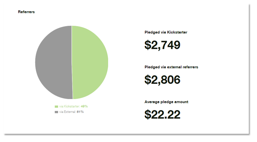
The first error we made was to think that our network was enough to bring backers. You can see on the picture below that our network drove 2% more money than Kickstarter. But it only says that our friends are generous. Like I said earlier, money is not our goal. We want to know who our backers are and where they come from. Like many Kickstarter we built a small community around the game, approx. 600 people but clearly not enough to support the launch of the campaign.
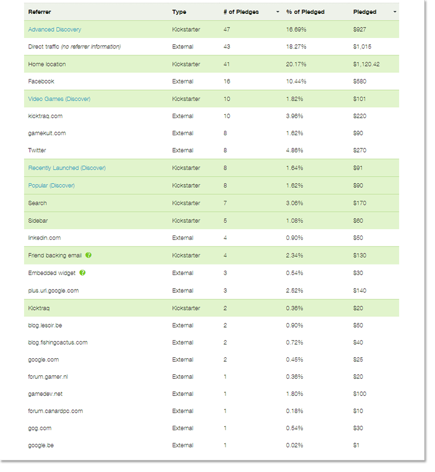
According to the tab below, our backers mainly come from Kickstarter, social networks only come at the second place and videogame websites at the third place. It proves us that our social networking has really gone wrong. What's funny is remembering us being glad to see that more and more backers found us via Kickstarter when it clearly meant that nobody was talking about our game outside of Kickstarter. Ouch!
The message
Preview Talking about Kickstarter traffic, one of our biggest error was to broadcast the wrong message about our game.
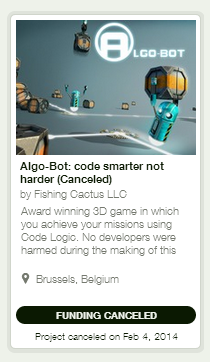
On the preview of our game you can read "Code smarter. Not Harder" It doesn't say anything about the game. It only says that it's something about coding, targeted for a niche. Moreover, it makes the target confusing. Is this game for programmers? Is this even a game? Then you read the small description. "Awards winning 3D game in which you achieve your missions using Code Logic. No developers were harmed during the making of this" What the description tells us about the project?
- It's an awards winning game
- It's a game and it's 3D
For the moment, we are just right with our message and it's not confusing at all. It brings value to the game and helps to justify the $60,000 goal.
- Achieve your missions using Code Logic
- No developers were harmed during the making of this (...)
The third message confirms that this game is about coding. But, it doesn't say more than the title already told us. Does this game teach you code logic? Is it for beginners or experts? Is it for kids? And what exactly "code logic" is? The little joke at the end shows that we are funny or try to be. But it's not relevant here because it says nothing about the game. You have 130 characters (136 but fit to 130 to avoid display issues), use them wisely!
Project page As said earlier, you can't see how many people have visited your page but you can estimate it by knowing how many people played your video.
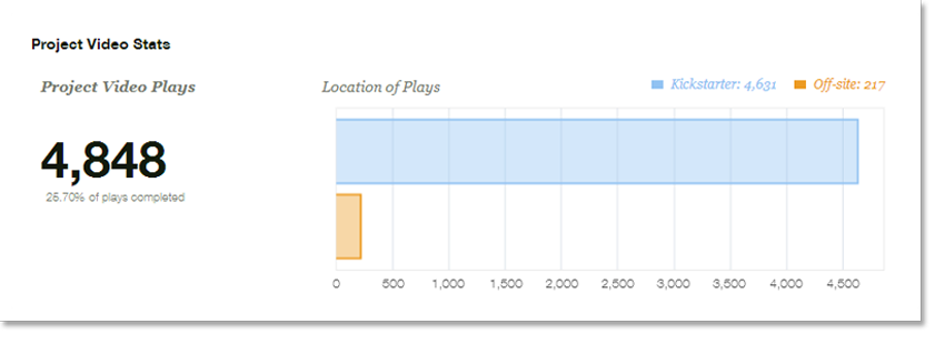
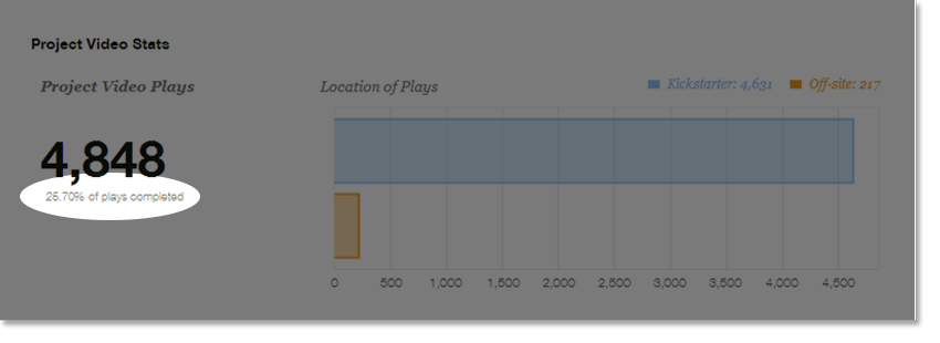
4,848 people played our video. That's cool but that's not what is important to us right now. Playing a Kickstarter video requires an investment from the potential backer. Before playing it, he will scroll down your page to get an overview of your project and see if it's of interest. To stay faithful to the theme "coding", we found nice code related titles for our paragraphs. I said code related but it wasn't really coding. It just looked like it and we kept it simple enough to be accessible to non-programmers. So, "Genesis" became "cmd starts Algo-Bot 1.0" and "Gameplay" became "bool Algo-Bot (string world, string characters, string controls)". We keep thinking that it was funny but it was a very bad idea. Private jokes are PRIVATE jokes and we lost a lot of potential backers here because they were lost and didn't know what it was about. They just couldn't find their way through the "coding" mess. Seeing titles like that is scary when you are not use to it. At that moment we lost all the puzzle lovers, parents who wanted to teach programming to their kids and only kept the programmers. When a programmer made us notice about the issue, we made the required amends but it was just too late because the 24 first hours were such a long time ago. The more fearless from them maybe read the first paragraph and certaintly came with this: "that teaches basic coding and logic skills: aha! Game that teaches stuff.... hmmm.... many of teaching games suck!" and in the best case "but it sounds interesting enough. So let's see how it looks and what it is all about". According to the backers who read our texts, they were way too long so, instead of reading what it is about they would rather to play the video.
Video Our backers really enjoyed our video. One said that it was the best Kickstarter video ever. We thank him for that but obviously our video wasn't that good because it didn't describe the product well enough. Gameplay is the key. Our video starts with an animated sequence that runs for 1:30 but it is too long especially because it is placed directly at the start and fails to show gameplay prominently. You have to wait 2:10 to see 40 seconds of gameplay which is not enough to understand how the gameplay exactly works. Come to the point as quickly as possible. Show how the actual game looks and what the gameplay is like straight away. I'll add that our video doesn't communicate if coding knowledge is required which is very important for noobies and puzzle-lovers. Again, it doesn't tell the viewer who the target audience of the game is. At the very end we say where the game is going when it gets funding, what is already finished and what is still needed, most of our backers missed it, we should have placed it well before as it was a key element. To finish with our video, I'll highlight that 4:56 minutes (including the irrelevant 10 seconds of ending) wasn't a clever length for a Kickstarter. When you are not going straight to the point people will skip some part or just stop the video which isn't good at all. We now know that one of the statistics that Kickstarter uses to determine who gets featured on the main page is the number of "Finished plays" which means the number of time your video has been entirely seen. So, keep your video simple, stupid and SHORT.
One last thing, about the gameplay video this time, comment it or attach a background music. We did a gameplay video with no sound and it was awfully boring to watch. Many of our potential backers stopped it after a few seconds.
Goal and Stretch-Goals We set our goal at $60,000. For this sum of money we promised to deliver several features such as a level editor, the ability to code in-game and a lot of polish. While the gameplay is in an OK state and rather well defined now, the overall aspects of the game require more improvements: sounds, UI, integrate a better lighting system, more life with some particle FX, user friendly interface, increase the reactivity of the game and finally extend the story and plot of the game to make it more interesting for the long run. After considering it, we should have lowered our goal and put more features as stretch-goals.
Rewards For this part we asked our 250 backers some feedback. According to their judgment, the prices were quite good but the pledges looked messy because there were too many superfluous rewards between interesting ones. Let's see what our dashboard says about our rewards and compare it with what our backers say.
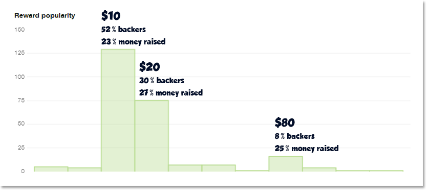
You can see on the tab our three most popular rewards. 52% of our backers pledged for the digital downloadable copy for PC. They told us that they didn't care about rewards. This pledge was an early bird limited at 800 which was a too high number for an early bird when you are not famous. Then, 30% pledged another early bird limited at 500. For $20 they would have received the following digital rewards (in bold the rewards that really interested them):
- Exclusive wallpapers
- Infinite gratitude
- Digital downloadable copy for PC
- Algo-Bot papercraft
- Your name in the credits
- Participate in project development surveys
- Vote for the future programming language the game will support
What does it tell us? Our niche wanted to be part of it! They wanted to influence the development and not just have their names in the credits. It brings us back to the core of Kickstarter. It's not about selling your game. It's about sharing a dream.
"It's not about selling your game. It's about sharing a dream."
The last pledge confirms it well. For $80 they would have an early access to our level editor and submit their levels for the final version of the game. They didn't care about the t-shirt or the poster. What they really wanted was to participate! To sum up what backers really want:
- Participate in your project (surveys, level editor, vote, design an element of the game,...)
- Alpha/Beta access with a decent price
- Multiple copies of the game
- Physical rewards
"Well what? But you just say that they didn't care about your goodies!" Calm down, I said that OUR NICHE didn't care about goodies but it's important to have some physical rewards for people outside your niche. Imagine an uncle wanted to offer the game to his niece. He thinks that it's a really good idea but he's afraid that his niece won't appreciate the gift at first sight but... Oh wait! What is this? A cute plushie of the robot! That would complete the gift nicely! See? Another problem was the way we presented it. Each time we wrote the entire previous pledge plus the new rewards. I don't say that it's bad. It's actually good to do it... when you have a decent number of rewards in the pledge. So, prefer to write it like that "previous pledge + new gifts" if you plant to have a lot more. To finish, don't just tell your rewards on the rewards column. Add a more visual description of your pledges on the page and a tab because some people are more comfortable with it.
PRESS START TO CONTINUE
One possible next article will
talk about the reboot plan. Meanwhile, we launched the game on
Steam Greenlight with the wish to build a strong community on it. Never forget that building a community before running a Kickstarter is very important.
 According to the tab below, our backers mainly come from Kickstarter, social networks only come at the second place and videogame websites at the third place. It proves us that our social networking has really gone wrong. What's funny is remembering us being glad to see that more and more backers found us via Kickstarter when it clearly meant that nobody was talking about our game outside of Kickstarter. Ouch!
 On the preview of our game you can read "Code smarter. Not Harder" It doesn't say anything about the game. It only says that it's something about coding, targeted for a niche. Moreover, it makes the target confusing. Is this game for programmers? Is this even a game? Then you read the small description. "Awards winning 3D game in which you achieve your missions using Code Logic. No developers were harmed during the making of this" What the description tells us about the project?
  4,848 people played our video. That's cool but that's not what is important to us right now. Playing a Kickstarter video requires an investment from the potential backer. Before playing it, he will scroll down your page to get an overview of your project and see if it's of interest. To stay faithful to the theme "coding", we found nice code related titles for our paragraphs. I said code related but it wasn't really coding. It just looked like it and we kept it simple enough to be accessible to non-programmers. So, "Genesis" became "cmd starts Algo-Bot 1.0" and "Gameplay" became "bool Algo-Bot (string world, string characters, string controls)". We keep thinking that it was funny but it was a very bad idea. Private jokes are PRIVATE jokes and we lost a lot of potential backers here because they were lost and didn't know what it was about. They just couldn't find their way through the "coding" mess. Seeing titles like that is scary when you are not use to it. At that moment we lost all the puzzle lovers, parents who wanted to teach programming to their kids and only kept the programmers. When a programmer made us notice about the issue, we made the required amends but it was just too late because the 24 first hours were such a long time ago. The more fearless from them maybe read the first paragraph and certaintly came with this: "that teaches basic coding and logic skills: aha! Game that teaches stuff.... hmmm.... many of teaching games suck!" and in the best case "but it sounds interesting enough. So let's see how it looks and what it is all about". According to the backers who read our texts, they were way too long so, instead of reading what it is about they would rather to play the video. Video Our backers really enjoyed our video. One said that it was the best Kickstarter video ever. We thank him for that but obviously our video wasn't that good because it didn't describe the product well enough. Gameplay is the key. Our video starts with an animated sequence that runs for 1:30 but it is too long especially because it is placed directly at the start and fails to show gameplay prominently. You have to wait 2:10 to see 40 seconds of gameplay which is not enough to understand how the gameplay exactly works. Come to the point as quickly as possible. Show how the actual game looks and what the gameplay is like straight away. I'll add that our video doesn't communicate if coding knowledge is required which is very important for noobies and puzzle-lovers. Again, it doesn't tell the viewer who the target audience of the game is. At the very end we say where the game is going when it gets funding, what is already finished and what is still needed, most of our backers missed it, we should have placed it well before as it was a key element. To finish with our video, I'll highlight that 4:56 minutes (including the irrelevant 10 seconds of ending) wasn't a clever length for a Kickstarter. When you are not going straight to the point people will skip some part or just stop the video which isn't good at all. We now know that one of the statistics that Kickstarter uses to determine who gets featured on the main page is the number of "Finished plays" which means the number of time your video has been entirely seen. So, keep your video simple, stupid and SHORT.
  One last thing, about the gameplay video this time, comment it or attach a background music. We did a gameplay video with no sound and it was awfully boring to watch. Many of our potential backers stopped it after a few seconds. Goal and Stretch-Goals We set our goal at $60,000. For this sum of money we promised to deliver several features such as a level editor, the ability to code in-game and a lot of polish. While the gameplay is in an OK state and rather well defined now, the overall aspects of the game require more improvements: sounds, UI, integrate a better lighting system, more life with some particle FX, user friendly interface, increase the reactivity of the game and finally extend the story and plot of the game to make it more interesting for the long run. After considering it, we should have lowered our goal and put more features as stretch-goals. Rewards For this part we asked our 250 backers some feedback. According to their judgment, the prices were quite good but the pledges looked messy because there were too many superfluous rewards between interesting ones. Let's see what our dashboard says about our rewards and compare it with what our backers say.
  You can see on the tab our three most popular rewards. 52% of our backers pledged for the digital downloadable copy for PC. They told us that they didn't care about rewards. This pledge was an early bird limited at 800 which was a too high number for an early bird when you are not famous. Then, 30% pledged another early bird limited at 500. For $20 they would have received the following digital rewards (in bold the rewards that really interested them):



Very insightful, Sophie.
I think it is all about having a community and creating some hype before Kickstarter as you mentioned at the end.