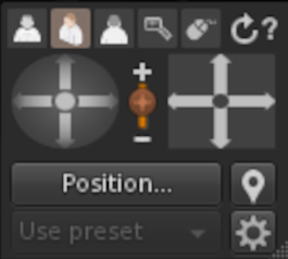
I'm trying to do better than this. That's 2X size. All these just control the camera.
- The arrows in the circle do “orbit camera”.
- The arrows in the square do “move camera”
- The three blurry humanoid figures indicate which camera position is in use.
- Magnifier is “zoom in”.
- Vertical slider is “zoom”
- The “mouse” symbol puts you into “mouselook” mode, where the mouse drives the camera.
- The circular arrow resets to defaults.
- The “position”, “use presets”, and “gear” buttons bring up dialogs with more options.
- “?” opens a help page.
- I haven't tried the “placemark” icon.
You can resize this thing by dragging the lower right corner. It doesn't help.
So basically we have two joystick-like controls, a a slider, a six button set of radio buttons, and some other miscellaneous buttons.
I'm thinking of, first, having a “More…" button that brings up a dialog for all of those elements at the bottom, just to declutter things a bit. Those are hardly ever used. The zoom slider duplicates the mouse thumbwheel. If I can sense that a thumbwheel mouse is connected, I may make that disappear. Then we have a 6-button set that needs to be made to look like it's a 1 of N selection. I'm tempted to make that a text dropdown - hover text is “Viewpoint”, and options are “Over shoulder”, “Above head”, “Face”, “Closeup”, “Mouselook”, and “Reset”. Trying to do that with tiny icons just doesn't work.
All this goes in a bottom toolbar that disappears when not in use. Moving the mouse cursor to the top or bottom of the screen makes the toolbar and top menu bar appear. Otherwise you have a clean screen.
Comments.


