Looking for sprite feedback

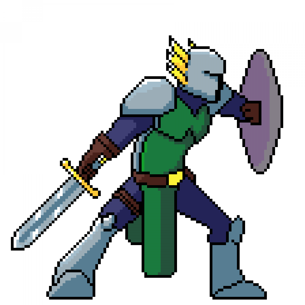
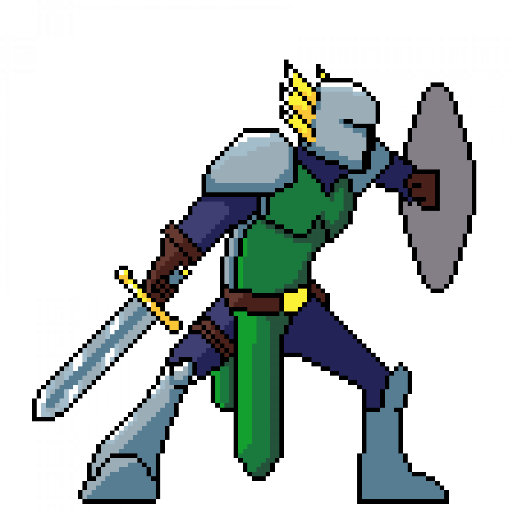
Erm, my son grandson said “he's got a big green willy”! I can't help but see it now. Otherwise it looks good.
JumbyApps said:
Erm, my son grandson said “he's got a big green willy”! I can't help but see it now. Otherwise it looks good.
Yeah, ease down on the highlights down there, so it looks flatter - I think that might help.
I think his left leg looks very thin compared to his arms, but his left arm looks very thin compared to his right overarm (it's as if disappears under his shoulderpad without any mass being present over there).
His suit seems to go all the way up to his chin. That might be intentional, depending on what equipment he has available…
Perhaps his back is arched a bit too much, creating that curve below his chest. The curve could be slightly longer and a bit more linear - would make his posture more powerful and he'd look less like me when in front of my computer.
Belt buckle is off-center - might be intentional.
Play more around with your highlights and shadows perhaps? It's a cool style, but with those being in place on other parts, I really want to see what it'd look like if the whole piece was shaded.
hahaha, yeah, that willy…
Agree to limbs thickness issues.
Also: The sword should be in straight line with the arm which holds it. Simply to make it appear strong and mighty. Just like that w… you know :D
@SuperVGA I am looking at a lot of your feedback, the one thing I am struggling to convey is the blue is more is a cloth underneath the armor, Trying to have a better way to convey that. I don't know if its me but making the chest more linear ends up looking wrong, almost too stiff


