Advertisement

Graphics and Art Style

Started by October 13, 2018 06:13 PM
9 comments, last by JFTC 6 years, 2 months ago

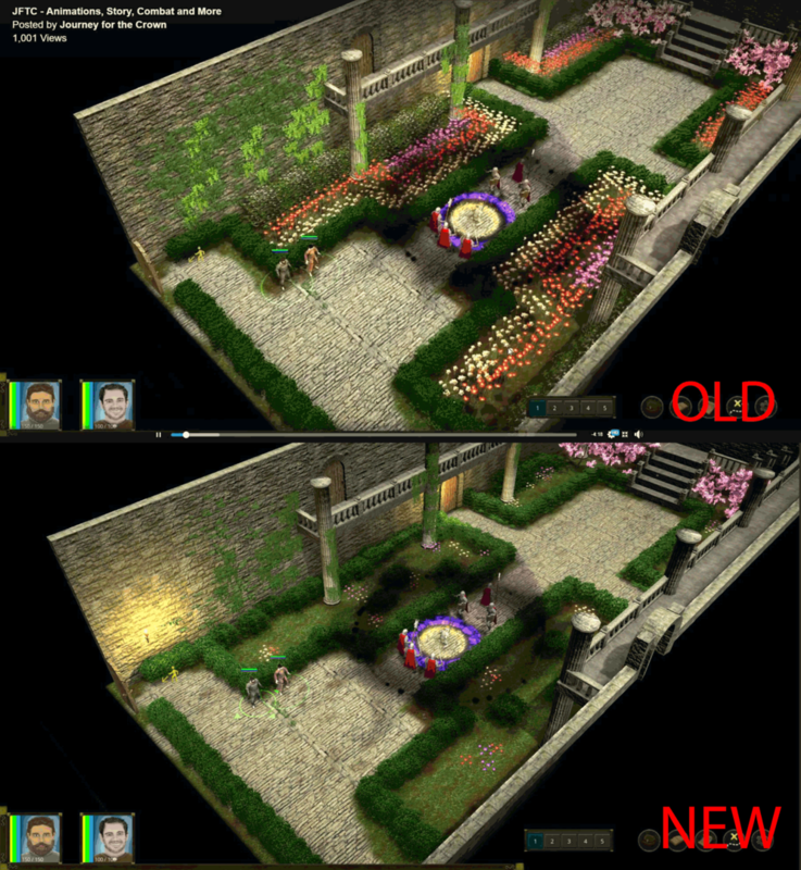
I've recently made a post on Facebook and some people mentioned the art style of my game was in need of a change. I took what some of them had to say and tried to improved it to some degree(lighting, reduced flowers and took adjusted some of the texture repetition out. Most were not that difficult to change. I don't want to redo the entire game to pixel art as it's a 3D game. I do have my entire graphics set into atlas textures so change the look isn't that difficult. I could go more detail, or the flip side and make it look low poly.

Here are some before and after pics see below:

If you want to see the facebook post to see the video here is the link.

https://www.facebook.com/journeyforthecrown/posts/2257878904286470

Youtube you can view the video here. https://www.youtube.com/watch?v=PvvPzRceTGo&t=39s

Any suggestions let me know. Thanks a lot.

Graphics1.png

Dear Scott Browne,

At the risk of becoming an outcast, I actually like the old better than the new. If I am the only one, then please don't listen to my opinion. I am also hoping by making a comment others will be willing to share which one he or she likes better. Like I mentioned, if I am the only one whom likes the old one better, than please ignore me. Either way, this artwork looks good to me.


-Kevin

Warm regards,

Perez the Programmer

Advertisement

Thanks Kevin. It really helps that you did say something. I wasn't sure the old was all that bad myself. But I will never turn down any advice and I'm still plugging in different looks to see the difference. I did notice all of the designers were cartoonists or favored that art style so perhaps that is how the like it. 

Thanks sharing your opinion. Enjoy your weekend :)

It depends on the intended purpose of the space (I mean, intended by its imaginary architect and keepers - not by the human who wrote the design). If the space is a beautiful public garden, then the first one seems more appropriate. If the space is an unostentatious space for contemplation or meetings, then the newer one works for that. 

A space for ceremonies? Somber, or joyful?

-- Tom Sloper -- sloperama.com


On 10/14/2018 at 4:49 AM, Tom Sloper said:

It depends on the intended purpose of the space (I mean, intended by its imaginary architect and keepers - not by the human who wrote the design).

Regarding the purpose of this space, think about people: the old version shows a much higher time and money budget for gardening (those flowers don't grow themselves) while the revised version shows a rather lower effort (neat but plain). Whose courtyard is it? Who is the gardener?

Design advice:

  • Brick textures are still too repetitive
  • the round table (?) in the middle is too large for its space, put more pavement around it (and compensate it with more grass around the walls, particularly in the corners by the flowering trees)
  • The columns are extremely inappropriate. If you insist about them, they should end below the balcony; arches or pillars would probably look better.

Omae Wa Mou Shindeiru

It's a castle garden so it was designed for whatever they use them for, meetings weddings etc. It would be designed by a gardener. I think I will bring some flowers back and just do a better job at making it look better. I'll work on that brick again. 

Advertisement
7 hours ago, LorenzoGatti said:

the round table (?) in the middle is too large for its space, put more pavement around it

Agreed. Is it a fountain, or just a floor decoration, or a table? Hard to tell. If fountain or table, there isn't sufficient walking room around it.

3 hours ago, Scott Browne said:

It would be designed by a gardener. I think I will bring some flowers back

Good.

-- Tom Sloper -- sloperama.com

1 hour ago, Tom Sloper said:

Agreed. Is it a fountain, or just a floor decoration, or a table? Hard to tell. If fountain or table, there isn't sufficient walking room around it.

Good.

It's actually neither. It's supposed to be a field around the king trapping him and his men. I think it may be hard but tell just by the pictures. But with what you said I still think I could do a better job. I choose that spot as I needed a funnel like spot for this scene where you're trapped and invaded. Blocking the path was part of the plan. 

If you like to take a look here is the link. Perhaps it would make more sense?

https://www.youtube.com/watch?v=PvvPzRceTGo&t=39s

It looks fantastic to me.

Things I would consider tweaking :

  • As said some of the wall textures the repetition is very obvious (and actually is a little distracting to the characters as the wall textures are a little too 'busy'). My personal solution to this might be either to get more creative with the lighting (baked lightmaps / ambient occlusion or longer shadows etc) or multitexture / on the fly baked megatexture or both of these. You could also try simply make the textures less busy in photoshop, or change the uv mapping scale etc.
  • Small point - the dragon is too black compared to the surroundings, it doesn't seem even remotely physically correct, even for a magic dragon lol.
  • 2d character portraits aren't quite as polished as the 3d (maybe you can get a specialist painter to do these for you?)

Overall though it looks great, like you've rewritten baldur's gate / neverwinter nights engine. :)


35 minutes ago, lawnjelly said:

It looks fantastic to me.

Things I would consider tweaking :

  • As said some of the wall textures the repetition is very obvious (and actually is a little distracting to the characters as the wall textures are a little too 'busy'). My personal solution to this might be either to get more creative with the lighting (baked lightmaps / ambient occlusion or longer shadows etc) or multitexture / on the fly baked megatexture or both of these. You could also try simply make the textures less busy in photoshop, or change the uv mapping scale etc.
  • Small point - the dragon is too black compared to the surroundings, it doesn't seem even remotely physically correct, even for a magic dragon lol.
  • 2d character portraits aren't quite as polished as the 3d (maybe you can get a specialist painter to do these for you?)

Overall though it looks great, like you've rewritten baldur's gate / neverwinter nights engine. :)


Thanks for the feedback. I'll see what I can do about your points as they seem valid to me. The portraits, I did those in about an hour or so each. They'll def get more polished. I was hoping the size was going to make it hard notice the different but I have no problem adding more detail to them. It's probably one of the most enjoyable parts of drawing :)

Ya I loved Baldur's Gate. It's one of my favorite games. 

This topic is closed to new replies.

Advertisement