What follows are some really UGLY mock-ups, so please don't worry about critiquing the visual design.
I'm designing the economic system for my game and I've mocked up what I think are the required minimum features/etc. that will be needed to string it all together. I'm wondering if I've forgotten anything that will prevent the system from working. The Goal is a straight forward minimalist Auction, Stock Market, and Banking System that my game will use to control the flow of 92 elemental resources and the ###s of Items that they will be able to construct from them.
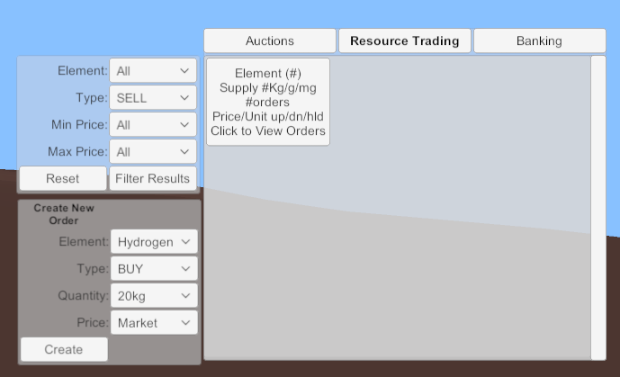
The following image constitutes the feature set of the main menu of the Trading Screen.
On the upper left are the Order Filter options. On the lower left are the Create New Order Options.
Imagine something like an interactive periodic table here instead of this crudeness.

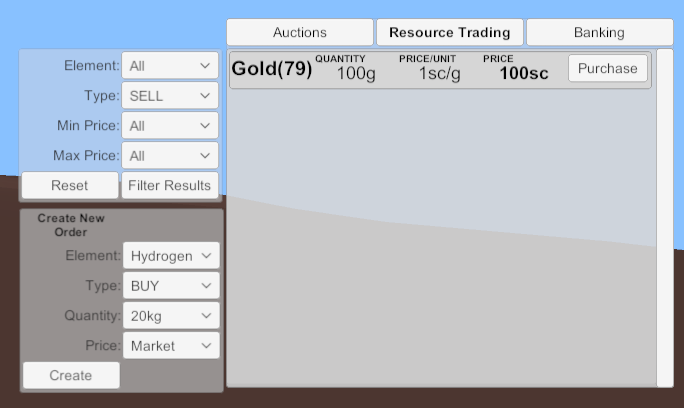
Once a filter is chosen or after clicking on an Element:
The Orders view... ![]() There will be all the necessary trending indicators and maybe even graphs and whatnot too so, don't worry about that.
There will be all the necessary trending indicators and maybe even graphs and whatnot too so, don't worry about that.
Am I missing anything that I would need to account for on the data side and display for the user, to have a functional Stock Trade interface?

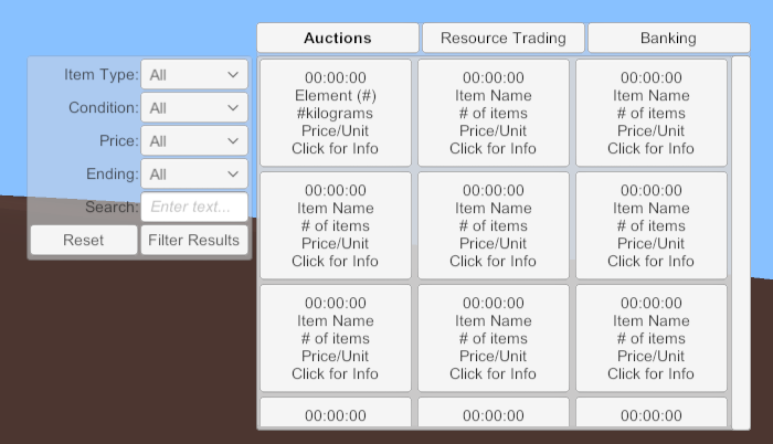
Auctions: Just a simplistic timed auction system, anything I forgot here? When you click on a specific item it will take you to a more detailed page for that auction, nothing special. Two different base item types, elements(resources) and Items(game items).

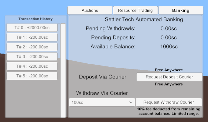
Banking: Clicking on a transaction history item will take you to a detail page with ... details.

I'm sure I missed something silly, or critical... Been staring at it for too many hours now. Help! ![]()
Thanks in advance!
EDIT: Create Auction options, view/edit/etc.. those will be in there too.


