So my little team and I are working on a small tactical RPG type game, but I'm conflicted on how to position the battle GUI on the character portraits and such. Should it be "bar-like" or fanciful or? And where would one place the "GUI" parts on the character portrait. (And if you want, critique my art as well, but mainly need some input on positions of GUI components for such battles)
A Battle GUI? (Input)
What's the difference from a tactical RPG from a non-tactical one? For me, any RPG has some kind of tactical component, just some have more than others.
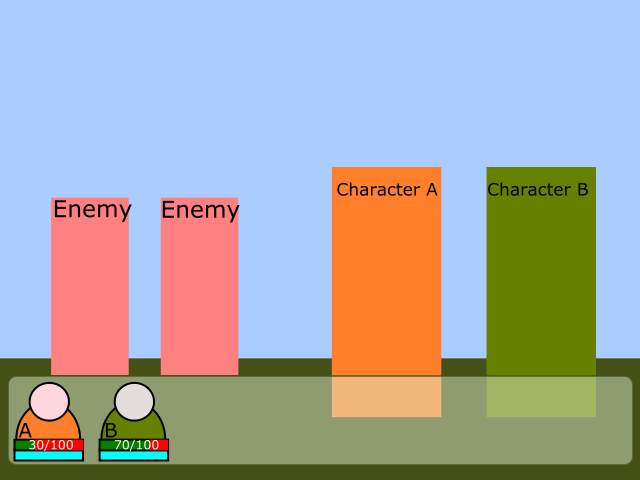
It's a little hard to understand what your problem is based on that image. It looks like you just opened the character avatar image and put two bars over it. But how the rest of the battle screen fits over it? How are the enemiws and characters positioned? Are they side by side (think Final Fantasy 6) or the enemies are in front of you (like EarthBound)? Will you show enemy heealth? Will show numbers or just the bars? Can you create a mock up of the whole battle screen (with backgrounds, player characters and enemies)? Doesn't need to be detailed, just so we can see what you're trying to achieve. Don't just test the bars and avatars, test also menu positions and messages.
Did you took a look at other RPGs, to get some inspiration? Check for example Grandia:
The numbers are big probably for readability, you could try something smaller.
Or Golden Sun:
If you want to show avatars next to the bars, you could cut the lower part, showing it like a bust statue. Something like this (mocked quickly):

Also, keep the numbers. Bars are ok, but numbers are better to parse. In a bar (especially in a small one), its hard to tell the difference between 300 and 500 when your max hp is 10000.
Also, I would recommend you to create another topic to ask about the art style, so you keep the subjects separated. And show more of the art, because we have a small sample to critique (only one image). Based on this single sample, I say it's ok, though a bit much "generic anime character" for my taste. If thats what you want, go for it.
Something like the bottom image is what critique I'm seeking for. u wu To help me understand where I should place the GUI on top of the character. So thanks for that!
Um I mean tactical as in an actual tactical RPG. What else do you call them? Strategy type? Like Phantom Brave for example. ^^ Sprites will be moved along the grid and the placement of your characters (who can move along the grid per turn) has a lot to do with the gameplay. It's not just "turn based" punch-you punch-me format.
I plan to keep the numbers as well (shown inside the bars) because numbers help me gauge my actual health/mp consumption.
Sorry. Animu is the only style I know how to draw. ^^;; My style looks kinda of like a mix between oldish late 90's, early 2000's animu and newer animu, straight from a screenshot/game of that nature. And I'm not sure if I can change that but okay............I didn't mean attack the style cause I understand it's never going to appeal to anything other than diehard kinds of animu fans of course. ![]() I more meant if there's anything objectively bad such as a shading part or for example, how you said maybe I should cut off the bottom part to fit the gauges better. ^^
I more meant if there's anything objectively bad such as a shading part or for example, how you said maybe I should cut off the bottom part to fit the gauges better. ^^
2 hours ago, ShiEksdee said:Um I mean tactical as in an actual tactical RPG. What else do you call them? Strategy type? Like Phantom Brave for example. ^^ Sprites will be moved along the grid and the placement of your characters (who can move along the grid per turn) has a lot to do with the gameplay. It's not just "turn based" punch-you punch-me format.
Now I understand. I knew these by other names (something like "turn based strategy games", but not exactly the same). And that changes a lot the possibilities of the UI. My previous answer was based on a more classic JRPG, like older Final Fantasies or Golden Sun above.
3 hours ago, ShiEksdee said:I plan to keep the numbers as well (shown inside the bars) because numbers help me gauge my actual health/mp consumption.
Good. Those numbers will help your players also, especially in the case of a tactical RPG. For this types of games, numbers are generally very useful. Don't hide them from the player unless they're completely useless (like having a "one-hit-kills-instantly" mechanic for all battles). For all the games of this genre I played, numbers were way more useful, and bars something like "quick reference".
What other tactical games did you looked at? There's plenty to use as a reference. Or you're looking for something totally different from them?
In your game, the "bar" format can be whatever you want. If it's not deeply tied to your code, you should be able to change it easily. Could be bars, circles, arcs (kind of like Grandia above), etc. It's better to come up with some rough ideas and show them to others (to your team, here in gamedev.net or even to friends). Do you have a full battle screen (even if the game doesn't work)? If yes, paste your bar over it and tweak some variations. If not, create a mock battle screen and test it.
Consider also other aspects of the gameplay, and how much info the player needs at a given time. For example, does the bars need to be shown all the time or it is enough to show only when a character is selected (and the player can see the stats for any character at theyr turn, as there is no time pressure) ? . Are the battle parties big (+20 characters in a single battle), which makes the screen crowded? For not selected characters, is showing the health bar of enough or the player also needs to see the character mana/MP?
3 hours ago, ShiEksdee said:Sorry. Animu is the only style I know how to draw. ^^;; My style looks kinda of like a mix between oldish late 90's, early 2000's animu and newer animu, straight from a screenshot/game of that nature. And I'm not sure if I can change that but okay............I didn't mean attack the style cause I understand it's never going to appeal to anything other than diehard kinds of animu fans of course.
I more meant if there's anything objectively bad such as a shading part or for example, how you said maybe I should cut off the bottom part to fit the gauges better. ^^
My comment wasn't that your art is bad. Far from that, it looks good for me. It's just that I've seen it so many times (not only in games) that I'm kind of tired from it, and it doesn't stand out alone. But maybe your characters in the battle field (not in the avatars) look better, so they may compensate this. But, looking only to this image, I can't know that.
But for the art part (colors, shading, etc), I suggest you create another topic. Focus this one on UI.
No full battle screen yet. That's what we're working on. u wu A sort of testing demo for our battles. I was making up the GUI so they can use it to test with.
In my imagination, the portraits only would show up when the character is selected or targeted by an enemy? (But I am not in complete control over this aspect, so I shall have more in the coming months when we're able to reveal that sort of info - I'm mostly the artist behind the game here)
I think our system will have a few different aspects from various games, but the pawns/players will be fewer in number than many of them. Sort of more like a old school RPG but with some tactical battle elements in it (where movement and landscapes about the playing field make a difference) I put in a suggestion that I'd love a change turn battle system where you can knock an enemy out of their turn and vice versa. I really enjoyed this kind of thing in turn based RPGs I've played (Grandia Xtreme is one of them). However, I'm not sure that's going to make it in. It's up to the more higher ups!
So the battle system's tactics relies more on strategizing over terrain and other elements than managing lots of "troops". If that makes sense. I believe there are only 3 characters by the first game's end (it's in small chapters, about a 10-15 hour game for the first).
And well your critique, if you can even call it that? Of my style isn't helpful because you say you've seen it before and yet I HAVEN'T and I'm a die hard animu fan. ![]() If you can point out factual flaws that's fine, but it sounds more like you're saying I do the animu art so well that it can be recognized as its own professional animu in the industry, yet you're tired of animu styles. So I'm not sure if I should take it as a compliment or what haha. My style is very much a blend of the older and new animu, so you get a sort of nostalgic old animu and a fresh new animu feel from it (I've been told people can see hints of InuYasha, .hack, and SAO type features of it, however, aside from .hack my influences are more towards Star Ocean EX coupled with some elements from some of my friends artworks and various old RPGs like Lunar for example! Except I want mine to have that "it could be in an animu screenshot" feel. Since we MAY add some animation later on~ I am practicing to be an animator at this time.)
If you can point out factual flaws that's fine, but it sounds more like you're saying I do the animu art so well that it can be recognized as its own professional animu in the industry, yet you're tired of animu styles. So I'm not sure if I should take it as a compliment or what haha. My style is very much a blend of the older and new animu, so you get a sort of nostalgic old animu and a fresh new animu feel from it (I've been told people can see hints of InuYasha, .hack, and SAO type features of it, however, aside from .hack my influences are more towards Star Ocean EX coupled with some elements from some of my friends artworks and various old RPGs like Lunar for example! Except I want mine to have that "it could be in an animu screenshot" feel. Since we MAY add some animation later on~ I am practicing to be an animator at this time.)


