On 10/21/2017 at 2:55 PM, FreneticPonE said:That's nice in theory, unfortunately the final brightness your textures end up as onscreen are only somewhat correlated to their albedo in the stored texture. IE a bright near white texture can end up darker than a fairly dark texture if the white one is in darkness and the dark one brightly lit in the actual environment (assuming a large hdr range). Thus you'd end up with banding on the near white texture while the brightly lit dark texture gets no benefit from the perceptual compression.
I'd just stick with srgb for final tonemapping and final perception, instead of source data.
It's certainly true that there's no direct relationship between diffuse albedo color and the final monitor output intensity, due to the things you mentioned as well as a few other factors (grading, specular lighting, the lighting environment, BRDF, TV response and processing, etc.). But in many cases you're going to have radiance = albedo * irradiance / Pi, and so the albedo is going to *roughly* have a linear effect on the output intensity assuming that the output radiance ends up getting mapped to the visible range after exposure. And so you're still going to benefit from distributing your precision non-linearly to roughly map the logarithmic response of the human eye.
As an example, I created a simple gradient in Photoshop that was authored in sRGB space:

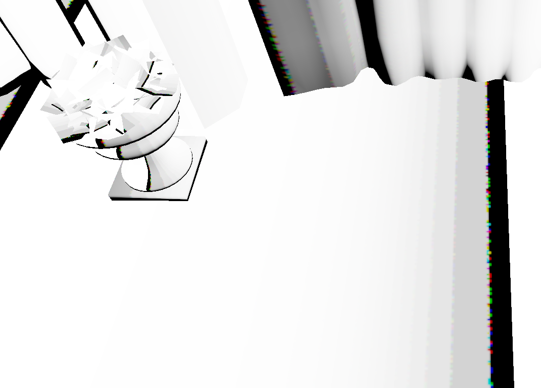
I then used this as the albedo map for all meshes in Sponza, and applied some standard diffuse lighting + exposure + filmic tone mapping. Here's what it looks like when it's stored with sRGB transfer function applied, with an 8-bit-per-channel SRGB format that enables automatic conversion to linear:
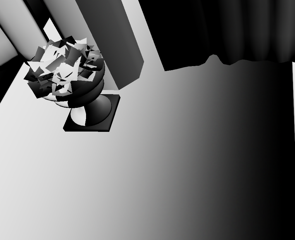
And now here's what it looks like if I apply the inverse sRGB transfer function before creating the texture (converting it to linear space) and then store the result in an 8-bit-per-channel UNORM texture:

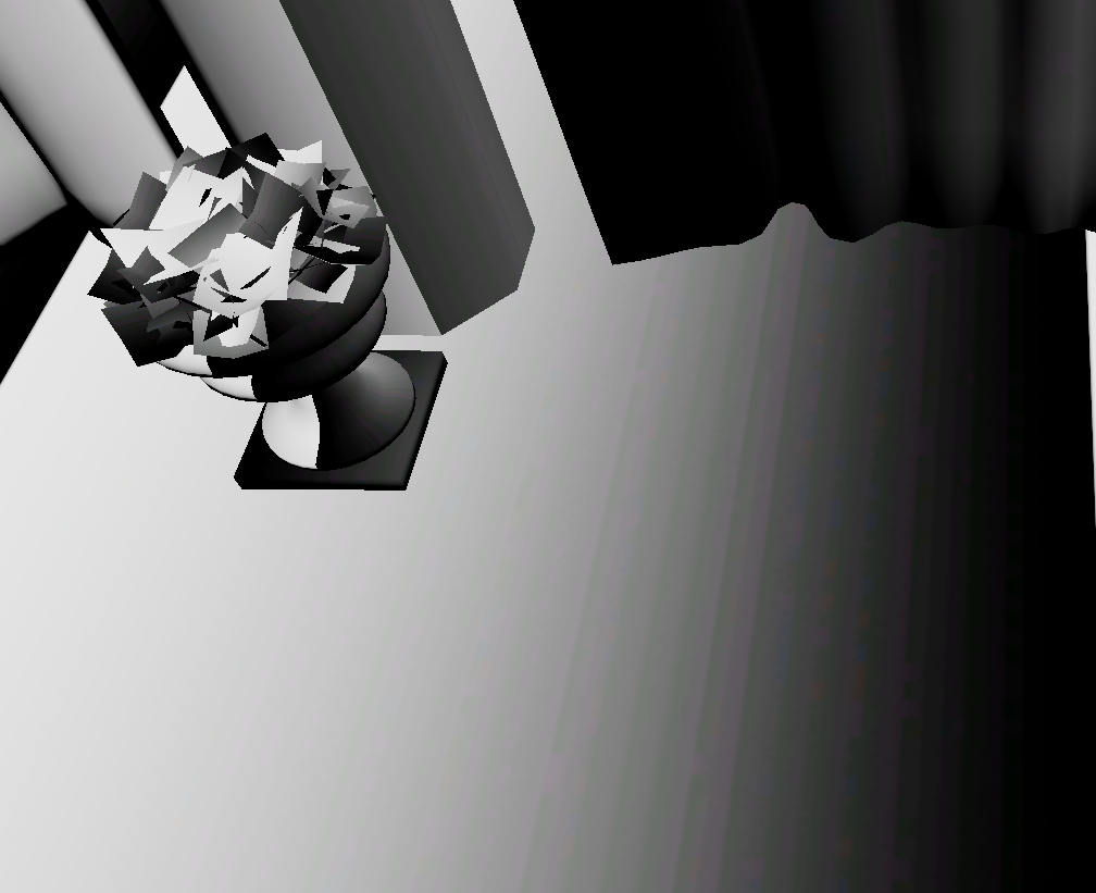
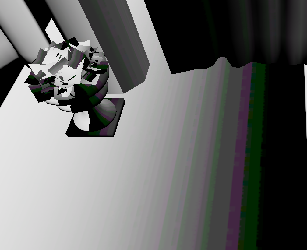
The increased banding is very obvious. It gets even worse if you use BC formats that have even less effective precision:
BC1_UNORM_SRGB:
BC1_UNORM:
For completeness, here's the "high exposure" case where only the high end of the albedo texture ends up being in the visible range:
UNORM_SRGB:
UNORM: